iOS

apple-loses-its-appeal-of-a-scathing-contempt-ruling-in-ios-payments-case

Apple loses its appeal of a scathing contempt ruling in iOS payments case

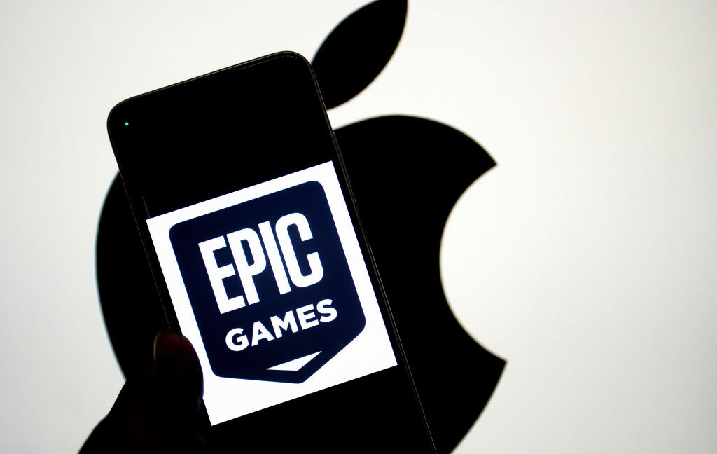
Back in April, District Court Judge Yvonne Gonzalez Rogers delivered a scathing judgment finding that Apple was in “willful violation” of her 2021 injunction intended to open up iOS App Store payments. That contempt of court finding has now been almost entirely upheld by the Ninth Circuit Court of Appeals, a development that Epic Games’ Tim Sweeney tells Ars he hopes will “do a lot of good for developers and start to really change the App Store situation worldwide, I think.”

The ruling, signed by a panel of three appellate court judges, affirmed that Apple’s initial attempts to charge a 27 percent fee to iOS developers using outside payment options “had a prohibitive effect, in violation of the injunction.” Similarly, Apple’s restrictions on how those outside links had to be designed were overly broad; the appeals court suggests that Apple can only ensure that internal and external payment options are presented in a similar fashion.

The appeals court also agreed that Apple acted in “bad faith” by refusing to comply with the injunction, rejecting viable, compliant alternatives in internal discussions. And the appeals court was also not convinced by Apple’s process-focused arguments, saying the district court properly evaluated materials Apple argued were protected by attorney-client privilege.

While the district court barred Apple from charging any fees for payments made outside of its App Store, the appeals court now suggests that Apple should still be able to charge a “reasonable fee” based on its “actual costs to ensure user security and privacy.” It will be up to Apple and the district court to determine what that kind of “reasonable fee” should look like going forward.

Speaking to reporters Thursday night, though, Epic founder and CEO Tim Sweeney said he believes those should be “super super minor fees,” on the order of “tens or hundreds of dollars” every time an iOS app update goes through Apple for review. That should be more than enough to compensate the employees reviewing the apps to make sure outside payment links are not scams and lead to a system of “normal fees for normal businesses that sell normal things to normal customers,” Sweeney said.

Apple loses its appeal of a scathing contempt ruling in iOS payments case Read More »

the-eu-made-apple-adopt-new-wi-fi-standards,-and-now-android-can-support-airdrop

The EU made Apple adopt new Wi-Fi standards, and now Android can support AirDrop

Last year, Apple finally added support for Rich Communications Services (RCS) texting to its platforms, improving consistency, reliability, and security when exchanging green-bubble texts between the competing iPhone and Android ecosystems. Today, Google is announcing another small step forward in interoperability, pointing to a slightly less annoying future for friend groups or households where not everyone owns an iPhone.

Google has updated Android’s Quick Share feature to support Apple’s AirDrop, which allows users of Apple devices to share files directly using a local peer-to-peer Wi-Fi connection. Apple devices with AirDrop enabled and set to “everyone for 10 minutes” mode will show up in the Quick Share device list just like another Android phone would, and Android devices that support this new Quick Share version will also show up in the AirDrop menu.

Google will only support this feature on the Pixel 10 series, at least to start. The company is “looking forward to improving the experience and expanding it to more Android devices,” but it didn’t announce anything about a timeline or any hardware or software requirements. Quick Share also won’t work with AirDrop devices working in the default “contacts only” mode, though Google “[welcomes] the opportunity to work with Apple to enable ‘Contacts Only’ mode in the future.” (Reading between the lines: Google and Apple are not currently working together to enable this, and Google confirmed to The Verge that Apple hadn’t been involved in this at all.)

Like AirDrop, Google notes that files shared via Quick Share are transferred directly between devices, without being sent to either company’s servers first.

Google shared a little more information in a separate post about Quick Share’s security, crediting Android’s use of the memory-safe Rust programming language with making secure file sharing between platforms possible.

“Its compiler enforces strict ownership and borrowing rules at compile time, which guarantees memory safety,” writes Google VP of Platforms Security and Privacy Dave Kleidermacher. “Rust removes entire classes of memory-related bugs. This means our implementation is inherently resilient against attackers attempting to use maliciously crafted data packets to exploit memory errors.”

The EU made Apple adopt new Wi-Fi standards, and now Android can support AirDrop Read More »

apple-releases-ios-261,-macos-26.1,-other-updates-with-liquid-glass-controls-and-more

Apple releases iOS 26.1, macOS 26.1, other updates with Liquid Glass controls and more

After several weeks of testing, Apple has released the final versions of the 26.1 update to its various operating systems. Those include iOS, iPadOS, macOS, watchOS, tvOS, visionOS, and the HomePod operating system, all of which switched to a new unified year-based version numbering system this fall.

This isn’t the first update that these operating systems have gotten since they were released in September, but it is the first to add significant changes and tweaks to existing features, addressing the early complaints and bugs that inevitably come with any major operating system update.

One of the biggest changes across most of the platforms is a new translucency control for Liquid Glass that tones it down without totally disabling the effect. Users can stay with the default Clear look to see the clearer, glassier look that allows more of the contents underneath Liquid Glass to show through, or the new Tinted look to get a more opaque background that shows only vague shapes and colors to improve readability.

For iPad users, the update re-adds an updated version of the Slide Over multitasking mode, which uses quick swipes to summon and dismiss an individual app on top of the apps you’re already using. The iPadOS 26 version looks a little different and includes some functional changes compared to the previous version—it’s harder to switch which app is being used in Slide Over mode, but the Slide Over window can now be moved and resized just like any other iPadOS 26 app window.

Apple releases iOS 26.1, macOS 26.1, other updates with Liquid Glass controls and more Read More »

upcoming-ios-and-macos-26.1-update-will-let-you-fog-up-your-liquid-glass

Upcoming iOS and macOS 26.1 update will let you fog up your Liquid Glass

Apple’s new Liquid Glass user interface design was one of the most noticeable and divisive features of its major software updates this year. It added additional fluidity and translucency throughout iOS, iPadOS, macOS, and Apple’s other operating systems, and as we noted in our reviews, the default settings weren’t always great for readability.

The upcoming 26.1 update for all of those OSes is taking a step toward addressing some of the complaints, though not by changing things about the default look of Liquid Glass. Rather, the update is adding a new toggle that will let users choose between a Clear and Tinted look for Liquid Glass, with Clear representing the default look and Tinted cranking up the opacity and contrast.

The new toggle adds a half-step between the default visual settings and the “reduce transparency” setting, which, aside from changing a bunch of other things about the look and feel of the operating system, is buried further down inside the Accessibility options. The Tinted toggle does make colors and vague shapes visible beneath the glass panes, preserving the general look of Liquid Glass while also erring on the side of contrast and visibility, where the “reduce transparency” setting is more of an all-or-nothing blunt instrument.

Upcoming iOS and macOS 26.1 update will let you fog up your Liquid Glass Read More »

reviewing-ios-26-for-power-users:-reminders,-preview,-and-more

Reviewing iOS 26 for power users: Reminders, Preview, and more


These features try to turn iPhones into more powerful work and organization tools.

iOS 26 came out last week, bringing a new look and interface alongside some new capabilities and updates aimed squarely at iPhone power users.

We gave you our main iOS 26 review last week. This time around, we’re taking a look at some of the updates targeted at people who rely on their iPhones for much more than making phone calls and browsing the Internet. Many of these features rely on Apple Intelligence, meaning they’re only as reliable and helpful as Apple’s generative AI (and only available on newer iPhones, besides). Other adjustments are smaller but could make a big difference to people who use their phone to do work tasks.

Reminders attempt to get smarter

The Reminders app gets the Apple Intelligence treatment in iOS 26, with the AI primarily focused on making it easier to organize content within Reminders lists. Lines in Reminders lists are often short, quickly jotted-down blurbs rather than lengthy, detailed complex instructions. With this in mind, it’s easy to see how the AI can sometimes lack enough information in order to perform certain tasks, like logically grouping different errands into sensible sections.

But Apple also encourages applying the AI-based Reminders features to areas of life that could hold more weight, such as making a list of suggested reminders from emails. For serious or work-critical summaries, Reminders’ new Apple Intelligence capabilities aren’t reliable enough.

Suggested Reminders based on selected text

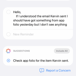
iOS 26 attempts to elevate Reminders from an app for making lists to an organization tool that helps you identify information or important tasks that you should accomplish. If you share content, such as emails, website text, or a note, with the app, it can create a list of what it thinks are the critical things to remember from the text. But if you’re trying to extract information any more advanced than an ingredients list from a recipe, Reminders misses the mark.

iOS 26 Suggested Reminders

Sometimes I tried sharing longer text with Reminders and didn’t get any suggestions.

Credit: Scharon Harding

Sometimes I tried sharing longer text with Reminders and didn’t get any suggestions. Credit: Scharon Harding

Sometimes, especially when reviewing longer text, Reminders was unable to think of suggested reminders. Other times, the reminders that it suggested, based on lengthy messages, were off-base.

For instance, I had the app pull suggested reminders from a long email with guidelines and instructions from an editor. Highlighting a lot of text can be tedious on a touchscreen, but I did it anyway because the message had lots of helpful information broken up into sections that each had their own bold subheadings. Additionally, most of those sections had their own lists (some using bullet points, some using numbers). I hoped Reminders would at least gather information from all of the email’s lists. But the suggested reminders ended up just being the same text from three—but not all—of the email’s bold subheadings.

When I tried getting suggested reminders from a smaller portion of the same email, I surprisingly got five bullet points that covered more than just the email’s subheadings but that still missed key points, including the email’s primary purpose.

Ultimately, the suggested Reminders feature mostly just boosts the app’s ability to serve as a modern shopping list. Suggested Reminders excels at pulling out ingredients from recipes, turning each ingredient into a suggestion that you can tap to add to a Reminders list. But being able to make a bulleted list out of a bulleted list is far from groundbreaking.

Auto-categorizing lines in Reminders lists

Since iOS 17, Reminders has been able to automatically sort items in grocery lists into distinct categories, like Produce and Proteins. iOS 26 tries taking things further by automatically grouping items in a list into non-culinary sections.

The way Reminders groups user-created tasks in lists is more sensible—and useful—than when it tries to create task suggestions based on shared text.

For example, I made a long list of various errands I needed to do, and Reminders grouped them into these categories: Administrative Tasks, Household Chores, Miscellaneous, Personal Tasks, Shopping, and Travel & Accommodation. The error rate here is respectable, but I would have tweaked some things. For one, I wouldn’t use the word “administrative” to refer to personal errands. The two tasks included under Administrative Tasks would have made more sense to me in Personal Tasks or Miscellaneous, even though those category names are almost too vague to have a distinct meaning.

Preview comes to iOS

With the iOS debut of Preview, Apple brings an app for viewing and editing PDFs and images to iPhones, which macOS users have had for years. As a result, many iPhone users will find the software easy and familiar to use.

But for iPhone owners who have long relied on Files for viewing, marking, and filling out PDFs and the like, Preview doesn’t bring many new capabilities. Anything that you can do in Preview, you could have done by viewing the same document in Files in an older version of iOS, save for a new crop tool and a dedicated button for showing information about the document.

That’s the point, though. When an iPhone has two discrete apps that can read and edit files, it’s far less frustrating to work with multiple documents. While you’re annotating a document in Preview, the Files app is still available, allowing you to have more than one document open at once. It’s a simple adjustment but one that vastly improves multitasking.

More Shortcuts options

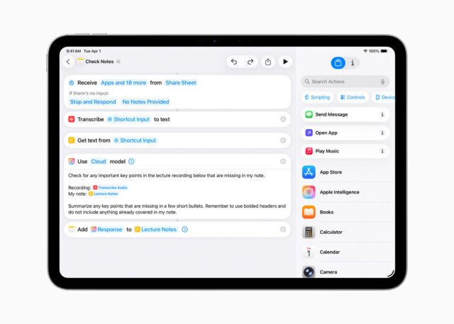
Shortcuts gets somewhat more capable in iOS 26. That’s assuming you’re interested in using ChatGPT or Apple Intelligence generative AI in your automated tasks. You can tag in generative AI to create a shortcut that includes summarizing text in bullet points and applying that bulleted list to the shortcut’s next task, for instance.

An example of a Shortcut that uses generative AI.

Credit: Apple

An example of a Shortcut that uses generative AI. Credit: Apple

There are inherent drawbacks here. For one, Apple Intelligence and ChatGPT, like many generative AI tools, are subject to inaccuracies and can frequently overlook and/or misinterpret critical information. iOS 26 makes it easier for power users to incorporate a rewrite of a long text that has a more professional tone into a Shortcut. But that doesn’t mean that AI will properly communicate the information, especially when used across different scenarios with varied text.

You have three options for building Shortcuts that include the use of AI models. Using ChatGPT or Apple Intelligence via Apple’s Private Cloud Compute, which runs the model on an Apple server, requires an Internet connection. Alternatively, you can use an on-device model without connecting to the web.

You can run more advanced models via Private Cloud Compute than you can with Apple Intelligence on-device. In Apple’s testing, models via Private Cloud Compute perform better on things like writing summaries and composition compared to on-device models.

Apple says personal user data sent to Private Cloud Compute “isn’t accessible to anyone other than the user—not even to Apple.” Apple has a strong, yet flawed, reputation for being better about user privacy than other Big Tech firms. But by offering three different models to use with Shortcuts, iOS 26 ensures greater functionality, options, and control.

Something for podcasters

It’s likely that more people rely on iPads (or Macs) than iPhones for podcasting. Nevertheless, a new local capture feature introduced to both iOS 26 and iPadOS 26 makes it a touch more feasible to use iPhones (and iPads especially) for recording interviews for podcasts.

Before the latest updates, iOS and iPadOS only allowed one app to access the device’s microphone at a time. So, if you were interviewing someone via a videoconferencing app, you couldn’t also use your iPhone or iPad to record the discussion, since the videoconferencing app is using your mic to share your voice with whoever is on the other end of the call. Local capture on iOS 26 doesn’t include audio input controls, but its inclusion gives podcasters a way to record interviews or conversations on iPhones without needing additional software or hardware. That capability could save the day in a pinch.

Photo of Scharon Harding

Scharon is a Senior Technology Reporter at Ars Technica writing news, reviews, and analysis on consumer gadgets and services. She’s been reporting on technology for over 10 years, with bylines at Tom’s Hardware, Channelnomics, and CRN UK.

Reviewing iOS 26 for power users: Reminders, Preview, and more Read More »

ios-26-review:-a-practical,-yet-playful,-update

iOS 26 review: A practical, yet playful, update


More than just Liquid Glass

Spotlighting the most helpful new features of iOS 26.

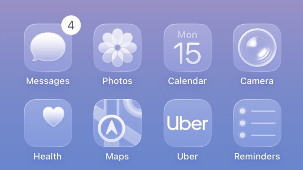
The new Clear icons look in iOS 26 can make it hard to identify apps, since they’re all the same color. Credit: Scharon Harding

iOS 26 became publicly available this week, ushering in a new OS naming system and the software’s most overhauled look since 2013. It may take time to get used to the new “Liquid Glass” look, but it’s easier to appreciate the pared-down controls.

Beyond a glassy, bubbly new design, the update’s flashiest new features also include new Apple Intelligence AI integration that varies in usefulness, from fluffy new Genmoji abilities to a nifty live translation feature for Phones, Messages, and FaceTime.

New tech is often bogged down with AI-based features that prove to be overhyped, unreliable, or just not that useful. iOS 26 brings a little of each, so in this review, we’ll home in on the iOS updates that will benefit both mainstream and power users the most.

Table of Contents

Let’s start with Liquid Glass

If we’re talking about changes that you’re going to use a lot, we should start with the new Liquid Glass software design that Apple is applying across all of its operating systems. iOS hasn’t had this much of a makeover since iOS 7. However, where iOS 7 applied a flatter, minimalist effect to windows and icons and their edges, iOS 26 adds a (sometimes frosted) glassy look and a mildly fluid movement to actions such as pulling down menus or long-pressing controls. All the while, windows look like they’re reflecting the content underneath them. When you pull Safari’s menu atop a webpage, for example, blurred colors from the webpage’s images and text are visible on empty parts of the menu.

Liquid Glass is now part of most of Apple’s consumer devices, including Macs and Apple TVs, but the dynamic visuals and motion are especially pronounced as you use your fingers to poke, slide, and swipe across your iPhone’s screen.

For instance, when you use a tinted color theme or the new clear theme for Home Screen icons, colors from the Home Screen’s background look like they’re refracting from under the translucent icons. It’s especially noticeable when you slide to different Home Screen pages. And in Safari, the address bar shrinks down and becomes more translucent as you scroll to read an article.

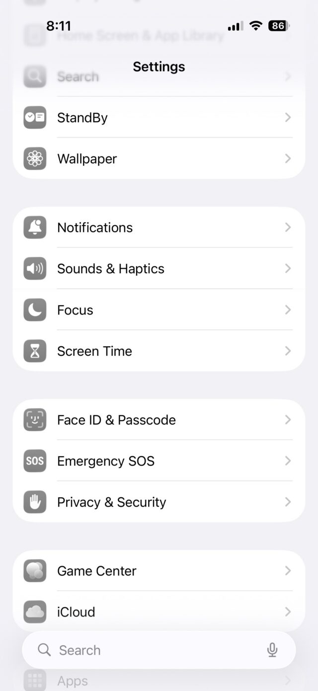
Because the theme is incorporated throughout the entire OS, the Liquid Glass effect can be cheesy at times. It feels forced in areas such as Settings, where text that just scrolled past looks slightly blurred at the top of the screen.

Liquid Glass makes the top of the Settings menu look blurred.

Liquid Glass makes the top of the Settings menu look blurred.

Credit: Scharon Harding

Liquid Glass makes the top of the Settings menu look blurred. Credit: Scharon Harding

Other times, the effect feels fitting, like when pulling the Control Center down and its icons appear to stretch down to the bottom of the screen and then quickly bounce into their standard size as you release your finger. Another place Liquid Glass flows nicely is in Photos. As you browse your pictures, colors subtly pop through the translucent controls at the bottom of the screen.

This is a matter of appearance, so you may have your own take on whether Liquid Glass looks tasteful or not. But overall, it’s the type of redesign that’s distinct enough to be a fun change, yet mild enough that you can grow accustomed to it if you’re not immediately impressed.

Liquid Glass simplifies navigation (mostly)

There’s more to Liquid Glass than translucency. Part of the redesign is simplifying navigation in some apps by displaying fewer controls.

Opening Photos is now cleaner at launch, bringing you to all of your photos instead of the Collections section, like iOS 18 does. At the bottom are translucent tabs for Library and Collections, plus a Search icon. Once you start browsing, the Library and Collections tabs condense into a single icon, and Years, Months, and All tabs appear, maintaining a translucence that helps keep your focus on your pictures.

You can still bring up more advanced options (such as Flash, Live, Timer) with one tap. And at the top of the camera’s field of view are smaller toggles for night mode and flash. But for when you want to take a quick photo, iOS 26 makes it easier to focus on the necessities while keeping the extraneous within short reach.

Similarly, the initial controls displayed at the bottom of the screen when you open Camera are pared down from six different photo- and video-shooting modes to the two that really matter: Photo and Video.

iOS 26 camera app

If you long-press Photo, options for the Time-Lapse, Slow-Mo, Cinematic, Portrait, Spatial, and Pano modes appear.

Credit: Scharon Harding

If you long-press Photo, options for the Time-Lapse, Slow-Mo, Cinematic, Portrait, Spatial, and Pano modes appear. Credit: Scharon Harding

iOS 26 takes the same approach with Video mode by focusing on the essentials (zoom, resolution, frame rate, and flash) at launch.New layout options for navigating Safari, however, slowed me down. In a new Compact view, the address bar lives at the bottom of the screen without a dedicated toolbar, giving the web page more screen space. But this setup makes accessing common tasks, like opening a new or old tab, viewing bookmarks, or sharing a link, tedious because they’re hidden behind a menu button.

If you tend to have multiple browser tabs open, you’ll want to stick with the classic layout, now called Top (where the address bar is at the top of the screen and the toolbar is at the bottom) or the Bottom layout (where the address bar and toolbar are at the bottom of the screen).

On the more practical side of Safari updates is a new ability to turn any webpage into a web app, making favorite and important URLs accessible quickly and via a dedicated Home Screen icon. This has been an iOS feature for a long time, but until now the pages always opened in Safari. Users can still do this if they like, but by default these sites now open as their own distinct apps, with dedicated icons in the app switcher. Web apps open full-screen, but in my experience, back and forward buttons only come up if you go to a new website. Sliding left and right replaces dedicated back and forward controls, but sliding isn’t as reliable as just tapping a button.

Viewing Ars Technica as a web app.

Viewing Ars Technica as a web app.

Credit: Scharon Harding

Viewing Ars Technica as a web app. Credit: Scharon Harding

iOS 26 remembers that iPhones are telephones

With so much focus on smartphone chips, screens, software, and AI lately, it can be easy to forget that these devices are telephones. iOS 26 doesn’t overlook the core purpose of iPhones, though. Instead, the new operating system adds a lot to the process of making and receiving phone calls, video calls, and text messages, starting with the look of the Phone app.

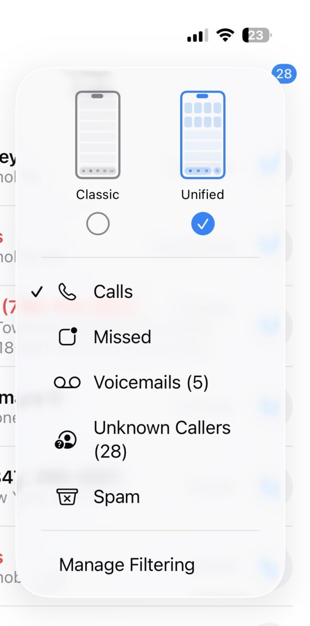
Continuing the streamlined Liquid Glass redesign, the Phone app on iOS 26 consolidates the bottom controls from Favorites, Recents, Contacts, Keypad, and Voicemail, to Calls (where voicemails also live), Contacts, and Keypad, plus Search.

I’d rather have a Voicemails section at the bottom of the screen than Search, though. The Voicemails section is still accessible by opening a menu at the top-right of the screen, but it’s less prominent, and getting to it requires more screen taps than before.

On Phone’s opening screen, you’ll see the names or numbers of missed calls and voicemails in red. But voicemails also have a blue dot next to the red phone number or name (along with text summarizing or transcribing the voicemail underneath if those settings are active). This setup caused me to overlook missed calls initially. Missed calls with voicemails looked more urgent because of the blue dot. For me, at first glance, it appeared as if the blue dots represented unviewed missed calls and that red numbers/names without a blue dot were missed calls that I had already viewed. It’s taking me time to adjust, but there’s logic behind having all missed phone activity in one place.

Fighting spam calls and messages

For someone like me, whose phone number seems to have made it to every marketer and scammers’ contact lists, it’s empowering to have iOS 26’s screening features help reduce time spent dealing with spam.

The phone can be set to automatically ask callers with unsaved numbers to state their name. As this happens, iOS displays the caller’s response on-screen, so you can decide if you want to answer or not. If you’re not around when the phone rings, you can view the transcript later and then mark the caller as known, if desired. This has been my preferred method of screening calls and reduces the likelihood of missing a call I want to answer.

There are also options for silencing calls and voicemails from unknown numbers and having them only show in a section of the app that’s separate from the Calls tab (and accessible via the aforementioned Phone menu).

iOS 26's new Phone menu

A new Phone menu helps sort important calls from calls that are likely spam.

Credit: Scharon Harding

A new Phone menu helps sort important calls from calls that are likely spam. Credit: Scharon Harding

You could also have iOS direct calls that your cell phone carrier identifies as spam to voicemail and only show the missed calls in the Phone menu’s dedicated Spam list. I found that, while the spam blocker is fairly reliable, silencing calls from unsaved numbers resulted in me missing unexpected calls from, say, an interview source or my bank. And looking through my spam and unknown callers lists sounds like extra work that I’m unlikely to do regularly.

Messages

iOS 26 applies the same approach to Messages. You can now have texts from unknown senders and spam messages automatically placed into folders that are separate from your other texts. It’s helpful for avoiding junk messages, but it can be confusing if you’re waiting for something like a two-factor authentication text, for example.

Elsewhere in Messages is a small but effective change to browsing photos, links, and documents previously exchanged via text. Upon tapping the name of a person in a conversation in Messages, you’ll now see tabs for viewing that conversation’s settings (such as the recipient’s number and a toggle for sending read receipts), as well as separate tabs for photos and links. Previously, this was all under one tab, so if you wanted to find a previously sent link, you had to scroll through the conversation’s settings and photos. Now, you can get to links with a couple of quick taps. Additionally, with iOS 26 you can finally set up custom iMessage backgrounds, including premade ones and ones that you can make from your own photos or by using generative AI. It’s not an essential update but is an easy way to personalize your iPhone by brightening up texts.

Hold Assist

Another time saver is Hold Assist. It makes calling customer service slightly more tolerable by allowing you to hang up during long wait times and have your iPhone ring when someone’s ready to talk to you. It’s a feature that some customer service departments have offered for years already, but it’s handy to always have it available.

You have to be quick to respond, though. One time I answered the phone after using Hold Assist, and the caller informed me that they had said “hello” a few times already. This is despite the fact that iOS is supposed to let the agent know that you’ll be on the phone shortly. If I had waited a couple more seconds to pick up the phone, it’s likely that the customer service rep would have hung up.

Live translations

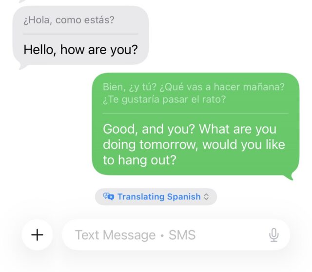
One of the most novel features that iOS 26 brings to iPhone communication is real-time translations for Spanish, Mandarin, French, German, Italian, Japanese, Korean, and Portuguese. After downloading the necessary language libraries, iOS can translate one of those languages to another in real time when you’re talking on the phone or FaceTime or texting.

The feature worked best in texts, where the software doesn’t have to deal with varying accents, people speaking fast or over one another, stuttering, or background noise. Translated texts and phone calls always show the original text written in the sender’s native language, so you can double-check translations or see things that translations can miss, like acronyms, abbreviations, and slang.

iOS 26 Translating some basic Spanish.

Translating some basic Spanish.

Credit: Scharon Harding

Translating some basic Spanish. Credit: Scharon Harding

During calls or FaceTime, Live Translation sometimes struggled to keep up while it tried to manage the nuances and varying speeds of how different people speak, as well as laughs and other interjections.

However, it’s still remarkable that the iPhone can help remove language barriers without any additional hardware, apps, or fees. It will be even better if Apple can improve reliability and add more languages.

Spatial images on the Home and Lock Screen

The new spatial images feature is definitely on the fluffier side of this iOS update, but it is also a practical way to spice up your Lock Screen, Home Screen, and the Home Screen’s Photos widget.

Basically, it applies a 3D effect to any photo in your library, which is visible as you move your phone around in your hand. Apple says that to do this, iOS 26 uses the same generative AI models that the Apple Vision Pro uses and creates a per-pixel depth map that makes parts of the image appear to pop out as you move the phone within six degrees of freedom.

The 3D effect is more powerful on some images than others, depending on the picture’s composition. It worked well on a photo of my dog sitting in front of some plants and behind a leaf of another plant. I set the display time so that it appears tucked behind her fur, and when I move the phone around, the dog and the leaf in front of her appear to move around, while the background plants stay still.

But in images with few items and sparser backgrounds, the spatial effect looks unnatural. And oftentimes, the spatial effect can be quite subtle.

Still, for those who like personalizing their iPhone with Home and Lock Screen customization, spatial scenes are a simple and harmless way to liven things up. And, if you like the effect enough, a new spatial mode in the Camera app allows you to create new spatial photos.

A note on Apple Intelligence notification summaries

As we’ve already covered in our macOS 26 Tahoe review, Apple Intelligence-based notification summaries haven’t improved much since their 2024 debut in iOS 18 and macOS 15 Sequoia. After problems with showing inaccurate summaries of news notifications, Apple updated the feature to warn users that the summaries may be inaccurate. But it’s still hit or miss when it comes to how easy it is to decipher the summaries.

I did have occasional success with notification summaries in iOS 26. For instance, I understood a summary of a voicemail that said, “Payment may have appeared twice; refunds have been processed.” Because I had already received a similar message via email (a store had accidentally charged me twice for a purchase and then refunded me), I knew I didn’t need to open that voicemail.

Vague summaries sometimes tipped me off as to whether a notification was important. A summary reading “Townhall meeting was hosted; call [real phone number] to discuss issues” was enough for me to know that I had a voicemail about a meeting that I never expressed interest in. It wasn’t the most informative summary, but in this case, I didn’t need a lot of information.

However, most of the time, it was still easier to just open the notification than try to decipher what Apple Intelligence was trying to tell me. Summaries aren’t really helpful and don’t save time if you can’t fully trust their accuracy or depth.

Playful, yet practical

With iOS 26, iPhones get a playful new design that’s noticeable and effective but not so drastically different that it will offend or distract those who are happy with the way iOS 18 works. It’s exciting to experience one of iOS’s biggest redesigns, but what really stands out are the thoughtful tweaks that bring practical improvements to core features, like making and receiving phone calls and taking pictures.

Some additions and changes are superfluous, but the update generally succeeds at improving functionality without introducing jarring changes that isolate users or force them to relearn how to use their phone.

I can’t guarantee that you’ll like the Liquid Glass design, but other updates should make it simpler to do some of the most important tasks with iPhones, and it should be a welcome improvement for long-time users.

Photo of Scharon Harding

Scharon is a Senior Technology Reporter at Ars Technica writing news, reviews, and analysis on consumer gadgets and services. She’s been reporting on technology for over 10 years, with bylines at Tom’s Hardware, Channelnomics, and CRN UK.

iOS 26 review: A practical, yet playful, update Read More »

apple-brings-openai’s-gpt-5-to-ios-and-macos

Apple brings OpenAI’s GPT-5 to iOS and macOS

OpenAI’s GPT-5 model went live for most ChatGPT users this week, but lots of people use ChatGPT not through OpenAI’s interface but through other platforms or tools. One of the largest deployments is iOS, the iPhone operating system, which allows users to make certain queries via GPT-4o. It turns out those users won’t have to wait long for the latest model: Apple will switch to GPT-5 in iOS 26, iPadOS 26, and macOS Tahoe 26, according to 9to5Mac.

Apple has not officially announced when those OS updates will be released to users’ devices, but these major releases have typically been released in September in recent years.

The new model had already rolled out on some other platforms, like the coding tool GitHub Copilot via public preview, as well as Microsoft’s general-purpose Copilot.

GPT-5 purports to hallucinate 80 percent less and heralds a major rework of how OpenAI positions its models; for example, GPT-5 by default automatically chooses whether to use a reasoning-optimized model based on the nature of the user’s prompt. Free users will have to accept whatever the choice is, while paid ChatGPT accounts allow manually picking which model to use on a prompt-by-prompt basis. It’s unclear how that will work in iOS; will it stick to GPT-5’s non-reasoning mode all the time, or will it utilize GPT-5 “(with thinking)”? And if it supports the latter, will paid ChatGPT users be able to manually pick like they can in the ChatGPT app, or will they be limited to whatever ChatGPT deems appropriate, like free users? We don’t know yet.

Apple brings OpenAI’s GPT-5 to iOS and macOS Read More »

apple-intelligence-news-summaries-are-back,-with-a-big-red-disclaimer

Apple Intelligence news summaries are back, with a big red disclaimer

Apple has released the fourth developer betas of iOS 26, iPadOS 26, macOS 26 and its other next-generation software updates today. And along with their other changes and fixes, the new builds are bringing back Apple Intelligence notification summaries for news apps.

Apple disabled news notification summaries as part of the iOS 18.3 update in January. Incorrect summaries circulating on social media prompted news organizations to complain to Apple, particularly after one summary said that Luigi Mangione, alleged murderer of UnitedHealthcare CEO Brian Thompson, had died by suicide (he had not and has not).

Upon installing the new update, users of Apple Intelligence-compatible devices will be asked to enable or disable three broad categories of notifications: those for “News & Entertainment” apps, for “Communication & Social” apps, and for all other apps. The operating systems will list sample apps based on what you currently have installed on your device.

All Apple Intelligence notification summaries continue to be listed as “beta,” but Apple’s main change here is a big red disclaimer when you enable News & Entertainment notification summaries, pointing out that “summarization may change the meaning of the original headlines.” The notifications also get a special “summarized by Apple Intelligence” caption to further distinguish them from regular, unadulterated notifications.

Apple Intelligence news summaries are back, with a big red disclaimer Read More »

apple-releases-new-beta-builds-of-all-its-flashy-new-liquid-glass-ified-os-updates

Apple releases new beta builds of all its flashy new Liquid Glass-ified OS updates

Should you install these betas?

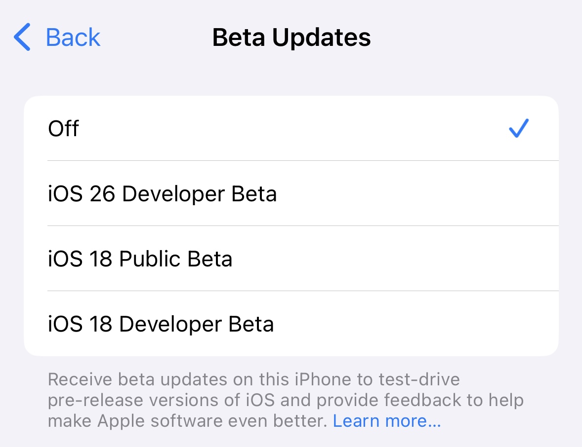
Selecting from among several beta OS versions in the Settings app on iOS 18. Credit: Andrew Cunningham

We are not highlighting this second round of developer betas because we think you should go out and install them on the Macs, iPhones, iPads, and Apple Watches that you use daily. These are still early versions, and they’re likely to have significant performance, battery, and stability problems relative to the current publicly available versions of the software.

But generally speaking, these second developer builds are the first ones I install on my secondary test devices—a collection of mostly older devices that have been replaced but are still considered current enough to run the new update. The initial builds are usually little more than a tech demo and can have major show-stopping bugs (an M1 iPad Air with the first developer beta on it simply stopped responding to any input, including a hard restart, and I needed to set it aside so its battery could drain all the way before I could do anything else with it), but the second betas tend to be somewhat more amenable to normal everyday use.

The new iOS and iPadOS betas will run on just about any hardware that can currently install and run iOS and iPadOS 18, with a couple of older exceptions. The macOS beta will run on any Apple Silicon Mac and on a handful of Intel Macs released in 2019 and 2020. The other betas will generally run on anything that supports the current versions, with some caveats (Liquid Glass effects only show up on newer Apple TV 4K boxes, for example, while the first-gen Apple TV 4K and the old 1080p Apple TV will run the update but without Liquid Glass).

If you don’t have spare devices you can dedicate to testing, we’d recommend waiting until the public beta in July before you even think about running any of these betas, and only after backing up all the important data on those devices. Rolling back to an older software version is doable, but a bit of a pain. Alternatively, those with Apple Silicon Macs who want to test the latest versions could try setting up a virtual machine using an app like VirtualBuddy or one of the others that leverages Apple’s built-in Virtualization framework.

Apple releases new beta builds of all its flashy new Liquid Glass-ified OS updates Read More »

coming-to-apple-oses:-a-seamless,-secure-way-to-import-and-export-passkeys

Coming to Apple OSes: A seamless, secure way to import and export passkeys

Credit: Apple

As the video explains:

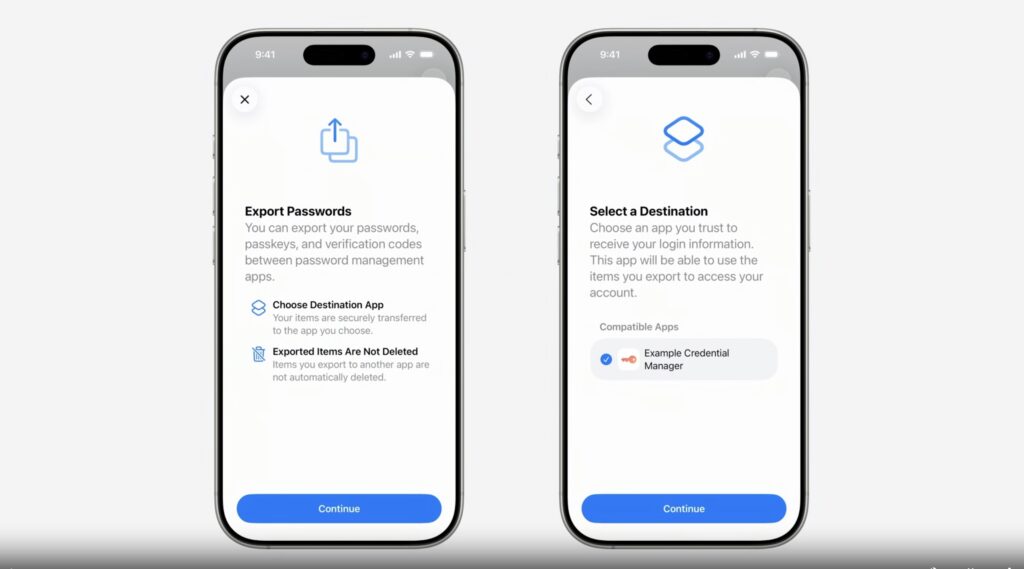
This new process is fundamentally different and more secure than traditional credential export methods, which often involve exporting an unencrypted CSV or JSON file, then manually importing it into another app. The transfer process is user initiated, occurs directly between participating credential manager apps and is secured by local authentication like Face ID.

This transfer uses a data schema that was built in collaboration with the members of the FIDO Alliance. It standardizes the data format for passkeys, passwords, verification codes, and more data types.

The system provides a secure mechanism to move the data between apps. No insecure files are created on disk, eliminating the risk of credential leaks from exported files. It’s a modern, secure way to move credentials.

The push to passkeys is fueled by the tremendous costs associated with passwords. Creating and managing a sufficiently long, randomly generated password for each account is a burden on many users, a difficulty that often leads to weak choices and reused passwords. Leaked passwords have also been a chronic problem.

Passkeys, in theory, provide a means of authentication that’s immune to credential phishing, password leaks, and password spraying. Under the latest “FIDO2” specification, it creates a unique public/private encryption keypair during each website or app enrollment. The keys are generated and stored on a user’s phone, computer, YubiKey, or similar device. The public portion of the key is sent to the account service. The private key remains bound to the user device, where it can’t be extracted. During sign-in, the website or app server sends the device that created the key pair a challenge in the form of pseudo-random data. Authentication occurs only when the device signs the challenge using the corresponding private key and sends it back.

This design ensures that there is no shared secret that ever leaves the user’s device. That means there’s no data to be sniffed in transit, phished, or compromised through other common methods.

As I noted in December, the biggest thing holding back passkeys at the moment is their lack of usability. Apps, OSes, and websites are, in many cases, islands that don’t interoperate with their peers. Besides potentially locking users out of their accounts, the lack of interoperability also makes passkeys too difficult for many people.

Apple’s demo this week provides the strongest indication yet that passkey developers are making meaningful progress in improving usability.

Coming to Apple OSes: A seamless, secure way to import and export passkeys Read More »

apple’s-craig-federighi-on-the-long-road-to-the-ipad’s-mac-like-multitasking

Apple’s Craig Federighi on the long road to the iPad’s Mac-like multitasking


Federighi talks to Ars about why the iPad’s Mac-style multitasking took so long.

Apple press photograph of iPads running iPadOS 26

iPads! Running iOS 26! Credit: Apple

iPads! Running iOS 26! Credit: Apple

CUPERTINO, Calif.—When Apple Senior Vice President of Software Engineering Craig Federighi introduced the new multitasking UI in iPadOS 26 at the company’s Worldwide Developers Conference this week, he did it the same way he introduced the Calculator app for the iPad last year or timers in the iPad’s Clock app the year before—with a hint of sarcasm.

“Wow,” Federighi enthuses in a lightly exaggerated tone about an hour and 19 minutes into a 90-minute presentation. “More windows, a pointier pointer, and a menu bar? Who would’ve thought? We’ve truly pulled off a mind-blowing release!”

This elicits a sensible chuckle from the gathered audience of developers, media, and Apple employees watching the keynote on the Apple Park campus, where I have grabbed myself a good-but-not-great seat to watch the largely pre-recorded keynote on a gigantic outdoor screen.

Federighi is acknowledging—and lightly poking fun at—the audience of developers, pro users, and media personalities who have been asking for years that Apple’s iPad behave more like a traditional computer. And after many incremental steps, including a big swing and partial miss with the buggy, limited Stage Manager interface a couple of years ago, Apple has finally responded to requests for Mac-like multitasking with a distinctly Mac-like interface, an improved file manager, and better support for running tasks in the background.

But if this move was so forehead-slappingly obvious, why did it take so long to get here? This is one of the questions we dug into when we sat down with Federighi and Senior Vice President of Worldwide Marketing Greg Joswiak for a post-keynote chat earlier this week.

It used to be about hardware restrictions

People have been trying to use iPads (and make a philosophical case for them) as quote-unquote real computers practically from the moment they were introduced 15 years ago.

But those early iPads lacked so much of what we expect from modern PCs and Macs, most notably robust multi-window multitasking and the ability for third-party apps to exchange data. The first iPads were almost literally just iPhone internals connected to big screens, with just a fraction of the RAM and storage available in the Macs of the day; that necessitated the use of a blown-up version of the iPhone’s operating system and the iPhone’s one-full-screen-app-at-a-time interface.

“If you want to rewind all the way to the time we introduced Split View and Slide Over [in iOS 9], you have to start with the grounding that the iPad is a direct manipulation touch-first device,” Federighi told Ars. “It is a foundational requirement that if you touch the screen and start to move something, that it responds. Otherwise, the entire interaction model is broken—it’s a psychic break with your contract with the device.”

Mac users, Federighi said, were more tolerant of small latency on their devices because they were already manipulating apps on the screen indirectly, but the iPads of a decade or so ago “didn’t have the capacity to run an unlimited number of windowed apps with perfect responsiveness.”

It’s also worth noting the technical limitations of iPhone and iPad apps at the time, which up until then had mostly been designed and coded to match the specific screen sizes and resolutions of the (then-manageable) number of iDevices that existed. It simply wasn’t possible for the apps of the day to be dynamically resized as desktop windows are, because no one was coding their apps that way.

Apple’s iPad Pros—and, later, the iPad Airs—have gradually adopted hardware and software features that make them more Mac-like. Credit: Andrew Cunningham

Of course, those hardware limitations no longer exist. Apple’s iPad Pros started boosting the tablets’ processing power, RAM, and storage in earnest in the late 2010s, and Apple introduced a Microsoft Surface-like keyboard and stylus accessories that moved the iPad away from its role as a content consumption device. For years now, Apple’s faster tablets have been based on the same hardware as its slower Macs—we know the hardware can do more because Apple is already doing more with it elsewhere.

“Over time the iPad’s gotten more powerful, the screens have gotten larger, the user base has shifted into a mode where there is a little bit more trackpad and keyboard use in how many people use the device,” Federighi told Ars. “And so the stars kind of aligned to where many of the things that you traditionally do with a Mac were possible to do on an iPad for the first time and still meet iPad’s basic contract.”

On correcting some of Stage Manager’s problems

More multitasking in iPadOS 26. Credit: Apple

Apple has already tried a windowed multitasking system on modern iPads once this decade, of course, with iPadOS 16’s Stage Manager interface.

Any first crack at windowed multitasking on the iPad was going to have a steep climb. This was the first time Apple or its developers had needed to contend with truly dynamically resizable app windows in iOS or iPadOS, the first time Apple had implemented a virtual memory system on the iPad, and the first time Apple had tried true multi-monitor support. Stage Manager was in such rough shape that Apple delayed that year’s iPadOS release to keep working on it.

But the biggest problem with Stage Manager was actually that it just didn’t work on a whole bunch of iPads. You could only use it on new expensive models—if you had a new cheap model or even an older expensive model, your iPad was stuck with the older Slide Over and Split View modes that had been designed around the hardware limitations of mid-2010s iPads.

“We wanted to offer a new baseline of a totally consistent experience of what it meant to have Stage Manager,” Federighi told Ars. “And for us, that meant four simultaneous apps on the internal display and an external display with four simultaneous apps. So, eight apps running at once. And we said that’s the baseline, and that’s what it means to be Stage Manager; we didn’t want to say ‘you get Stage Manager, but you get Stage Manager-lite here or something like that. And so immediately that established a floor for how low we could go.”

Fixing that was one of the primary goals of the new windowing system.

“We decided this time: make everything we can make available,” said Federighi, “even if it has some nuances on older hardware, because we saw so much demand [for Stage Manager].”

That slight change in approach, combined with other behind-the-scenes optimizations, makes the new multitasking model more widely compatible than Stage Manager is. There are still limits on those devices—not to the number of windows you can open, but to how many of those windows can be active and up-to-date at once. And true multi-monitor support would remain the purview of the faster, more-expensive models.

“We have discovered many, many optimizations,” Federighi said. “We re-architected our windowing system and we re-architected the way that we manage background tasks, background processing, that enabled us to squeeze more out of other devices than we were able to do at the time we introduced Stage Manager.”

Stage Manager still exists in iPadOS 26, but as an optional extra multitasking mode that you have to choose to enable instead of the new windowed multitasking system. You can also choose to turn both multitasking systems off entirely, preserving the iPad’s traditional big-iPhone-for-watching-Netflix interface for the people who prefer it.

“iPad’s gonna be iPad”

The $349 base-model iPad is one that stands to gain the most from iPadOS 26. Credit: Andrew Cunningham

However, while the new iPadOS 26 UI takes big steps toward the Mac’s interface, the company still tries to treat them as different products with different priorities. To date, that has meant no touch screens on the Mac (despite years of rumors), and it will continue to mean that there are some Mac things that the iPad will remain unable to do.

“But we’ve looked and said, as [the iPad and Mac] come together, where on the iPad the Mac idiom for doing something, like where we put the window close controls and maximize controls, what color are they—we’ve said why not, where it makes sense, use a converged design for those things so it’s familiar and comfortable,” Federighi told Ars. “But where it doesn’t make sense, iPad’s gonna be iPad.”

There will still be limitations and frustrations when trying to fit an iPad into a Mac-shaped hole in your computing setup. While tasks can run in the background, for example, Apple only allows apps to run workloads with a definitive endpoint, things like a video export or a file transfer. System agents or other apps that perform some routine on-and-off tasks continuously in the background aren’t supported. All the demos we’ve seen so far are also on new, high-end iPad hardware, and it remains to be seen how well the new features behave on low-end tablets like the 11th-generation A16 iPad, or old 2019-era hardware like the iPad Air 3.

But it does feel like Apple has finally settled on a design that might stick and that adds capability to the iPad without wrecking its simplicity for the people who still just want a big screen for reading and streaming.

Photo of Andrew Cunningham

Andrew is a Senior Technology Reporter at Ars Technica, with a focus on consumer tech including computer hardware and in-depth reviews of operating systems like Windows and macOS. Andrew lives in Philadelphia and co-hosts a weekly book podcast called Overdue.

Apple’s Craig Federighi on the long road to the iPad’s Mac-like multitasking Read More »

apple-drops-support-for-just-three-iphone-and-ipad-models-from-ios-and-ipados-26

Apple drops support for just three iPhone and iPad models from iOS and iPadOS 26

Every year, Apple releases new versions of iOS and iPadOS, and most years those updates also end support for a handful of devices that are too old or too slow or otherwise incapable of running the new software.

Though this year’s macOS 26 Tahoe release was unkind to Intel Macs, the iOS 26 and iPadOS 26 releases are more generous, dropping support for just two iPhone models and a single iPad. The iOS 26 update won’t run on 2018’s iPhone XR or XS, and iPadOS 26 won’t run on 2019’s 7th-generation iPad. Any other device that can currently run iOS or iPadOS 18 will be able to upgrade to the new versions and pick up the new Liquid Glass look, among other features.

Apple never provides explicit reasoning for why it drops the devices it drops, though they can usually be explained by some combination of age and technical capability. The 7th-gen iPad, for example, was still using a 2017-vintage Apple A10X chip despite being introduced a number of years later.

The iPhone XR and XS, on the other hand, use an Apple A12 chip, the same one used by several still-supported iPads.

Apple usually provides security-only patches for dispatched iDevices for a year or two after they stop running the newest OS, though the company never publishes timelines for these updates, and the iPhone and iPad haven’t been treated as reliably as Macs have. Still, if you do find yourself relying on one of those older devices, you can still probably wring a bit of usefulness out of it before you start missing out on critical security patches.

Apple drops support for just three iPhone and iPad models from iOS and iPadOS 26 Read More »