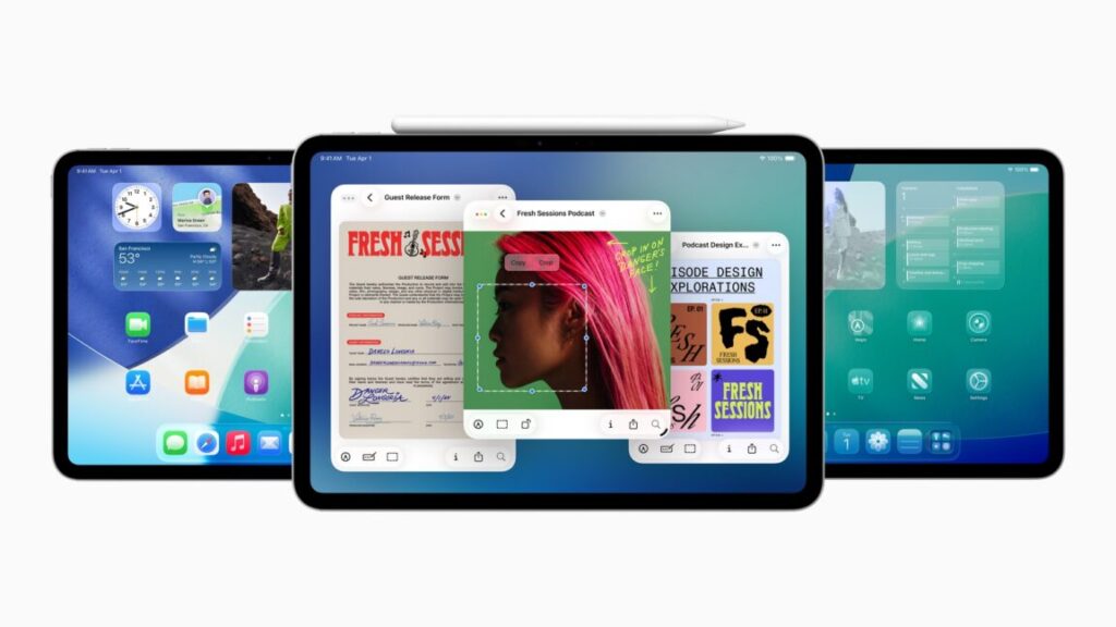
Apple’s biggest product event of the year happens in September, when the company puts out a new batch of iPhones and Apple Watches and other odds and ends. But in most years, Apple either has another smaller event or just a handful of additional product announcements later in the fall in October or November—usually the focus is on the Mac, the iPad, or both.
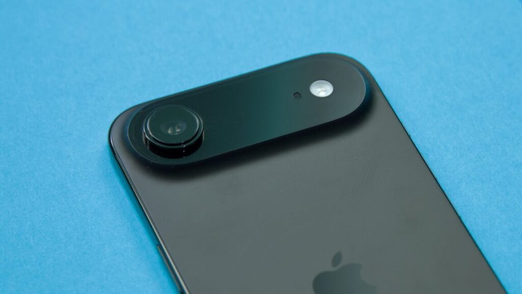
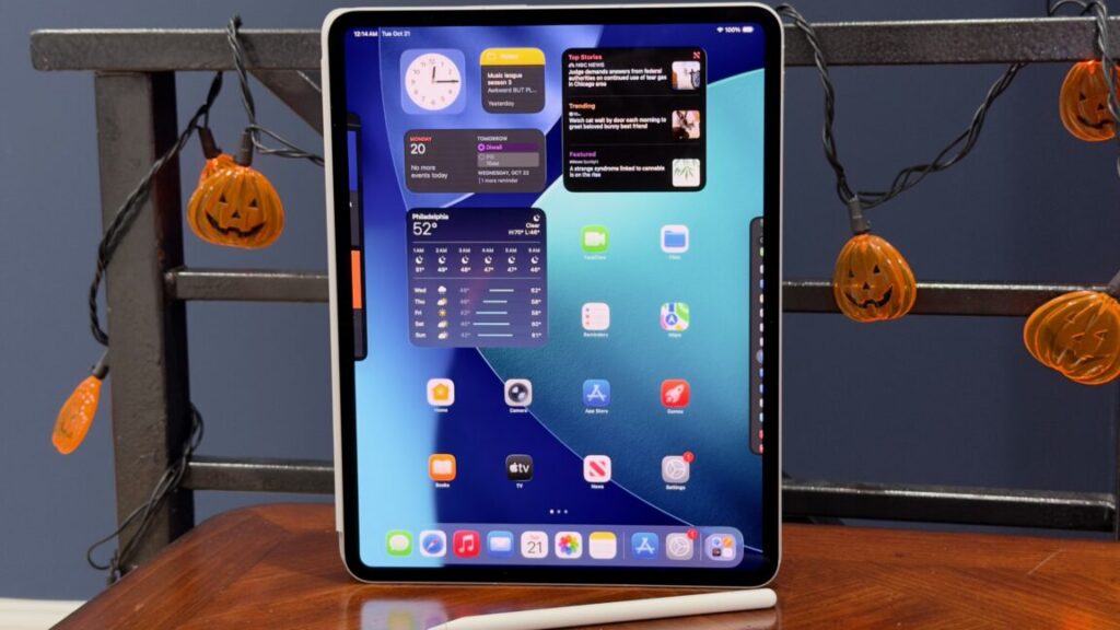
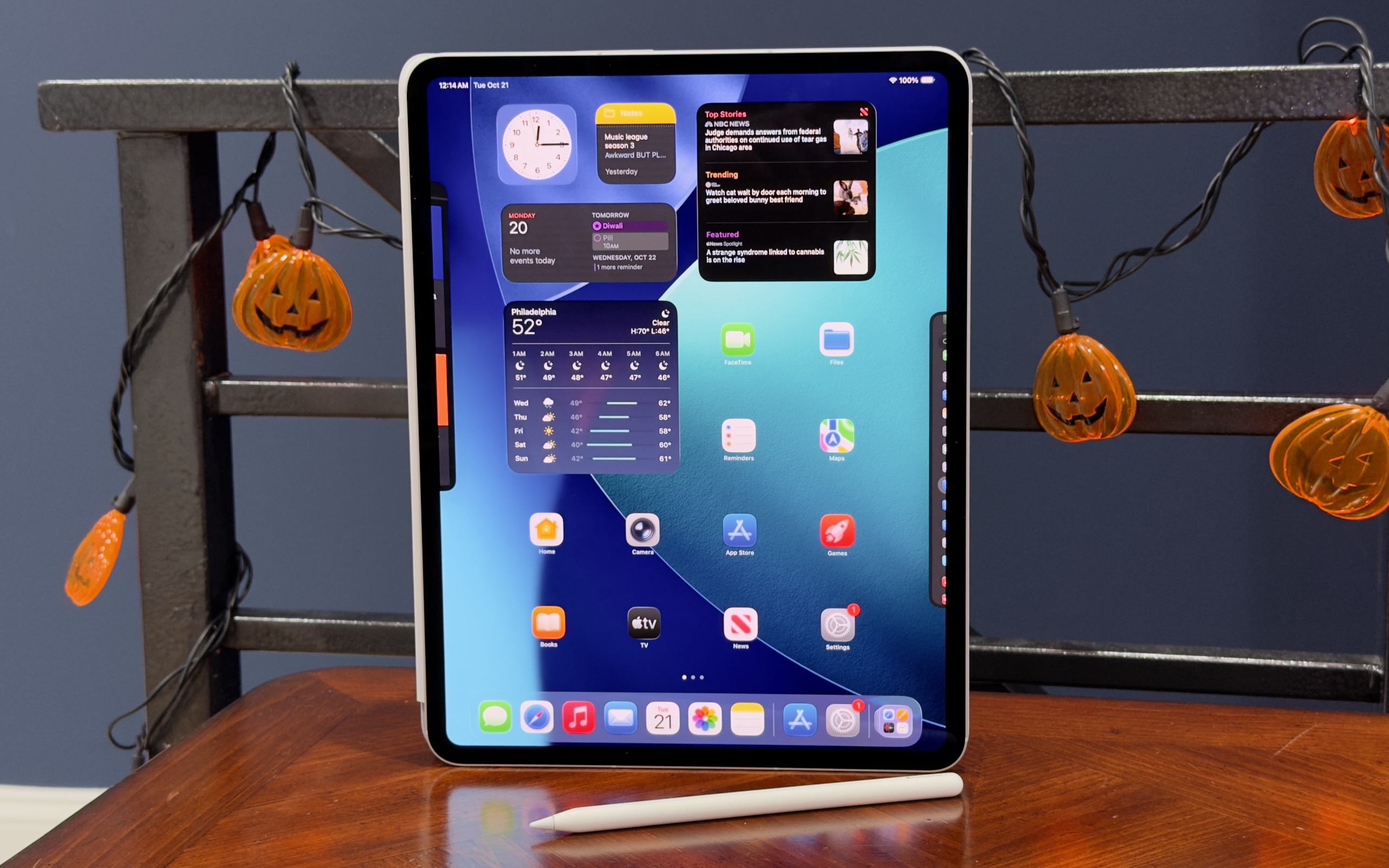
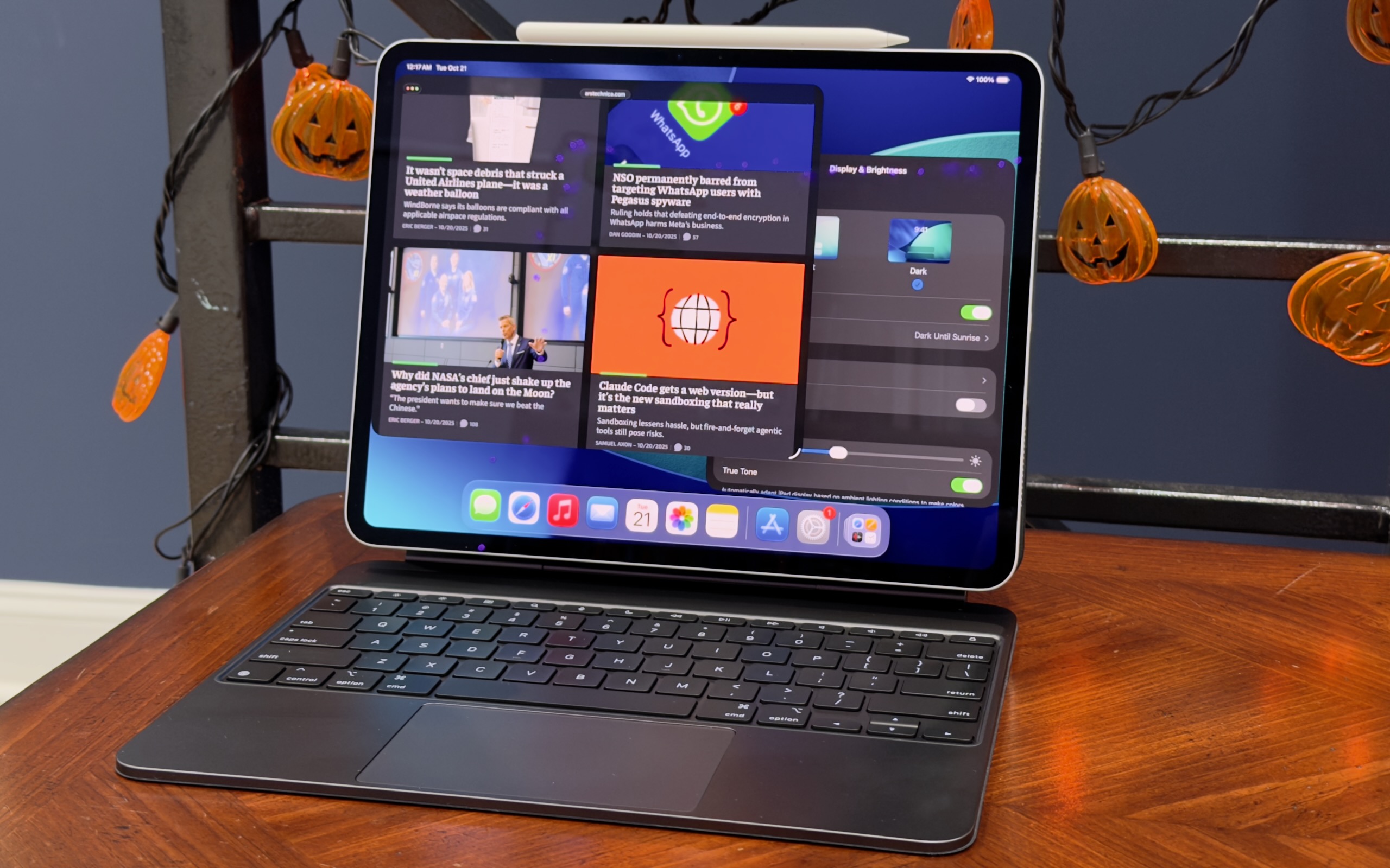
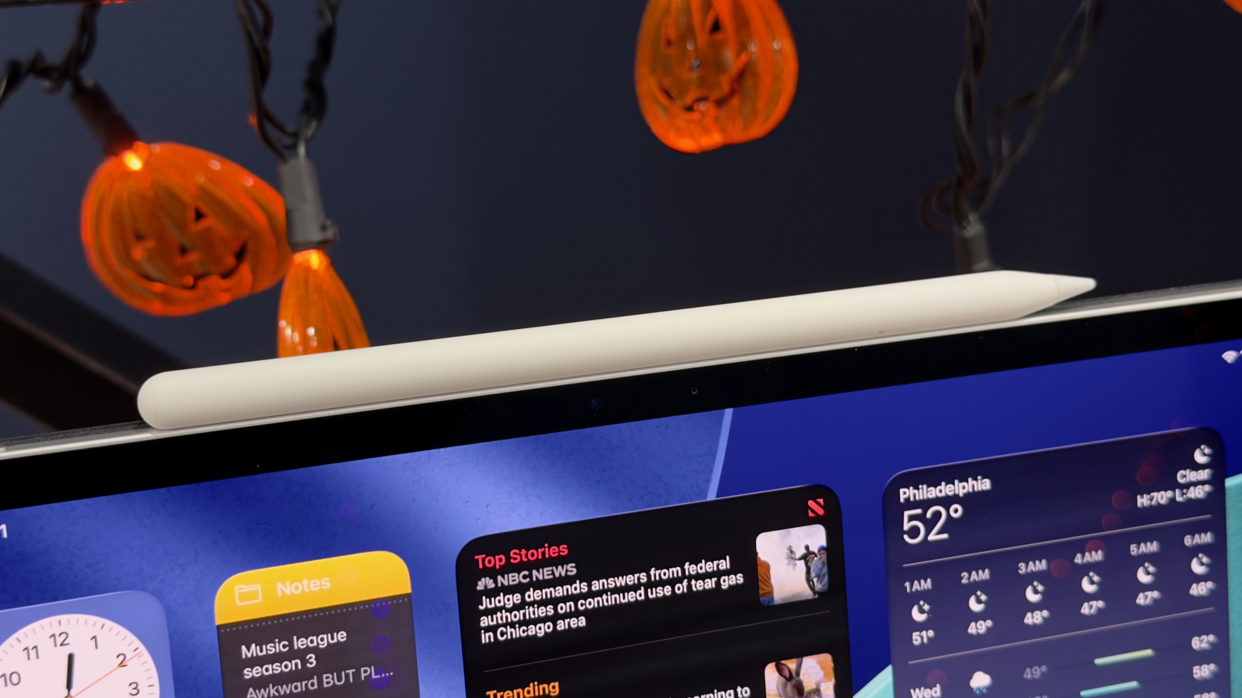
It seems like a new iPad Pro could be one of the announcements on tap. Russian YouTube channel Wylsacom has posted an unboxing video and early tour of what appears to be a retail boxed version of a new 256GB 13-inch iPad Pro, as well as an M5 processor that we haven’t seen in any other Apple product yet. This would be the first new iPad Pro since May of 2024, when Apple introduced the current M4 version.
The same channel also got ahold of the M4 MacBook Pro early, so it seems likely that this is genuine. And while the video is mostly dedicated to complaining about packaging, the wattage of the included power adapter, and how boring it is that Apple doesn’t introduce dramatic design changes every generation, it does also give us some early performance numbers for the new M5.
While we don’t have details on the chip’s manufacturing process or other changes, quick Geekbench 6 runs show the M5 in this iPad Pro improving CPU performance by roughly 10 to 15 percent and GPU performance by about 34 percent, compared to the M4 in the old iPad Pro.
This M5 includes three high-performance CPU cores and six high-efficiency CPU cores, the same core count as the 256GB and 512GB versions of the M4 iPad Pro (the 1TB and 2TB iPads and the M4 Macs all get one additional performance core, for a total of four, and we’d bet it’s the same way for the M5). We don’t know how many GPU cores the M5 has, though given the larger performance improvements it’s at least theoretically possible that Apple has added additional graphics cores on top of the 10 that the M4 includes. Higher clock speeds, faster RAM, architectural improvements, or a mix of all three could also explain the jump.
Now that iOS 26, macOS 26 Tahoe, and Apple’s other big software updates for the year are out in public, Apple’s efforts for the next few months will shift to fixing bugs and adding individual new features. The first of those bug fix updates has arrived this week in the form of iOS 26.0.1, macOS 26.0.1, iPadOS 26.0.1, and equivalent updates for most of the devices across Apple’s ecosystem.
The release notes for most of the updates focus on device- and platform-specific early adopter problems, particularly for buyers of the new iPhone 17, iPhone 17 Pro, and iPhone Air.
The iOS 26.0.1 update fixes a bug that could prevent phones from connecting to cellular networks, a bug that could cause app icons to appear blank, and the VoiceOver feature becoming disabled on devices that have it on. Camera, Wi-Fi, and Bluetooth bugs with the new iPhones have also been patched. The iPadOS update also fixes a bug that was causing the floating software keyboard to move around.
Tech firms pressed to explain if H-1B workers are paid less than US workers.
Senators are demanding answers from Big Tech companies accused of “filing thousands of H-1B skilled labor visa petitions after conducting mass layoffs of American employees.”
In letters sent to Amazon, Meta, Apple, Google, and Microsoft—among some of the largest sponsors of H-1B visas—Senators Chuck Grassley (R-Iowa) and Dick Durbin (D-Ill.) requested “information and data from each company regarding their recruitment and hiring practices, as well as any variation in salary and benefits between H-1B visa holders and American employees.”
The letters came shortly after Grassley sent a letter to Department of Homeland Security Secretary Kristi Noem requesting that DHS stop “issuing work authorizations to student visa holders.” According to Grassley, “foreign student work authorizations put America at risk of technological and corporate espionage,” in addition to allegedly “contributing to rising unemployment rates among college-educated Americans.”
If DHS refuses to stop authorizing the visas, Grassley requested a “detailed explanation of what legal authority DHS is relying on to issue these authorizations.” He suggested that the authorization violates a law intended to ensure that only highly skilled workers and top talents that can’t be found in the US are granted visas.
In the letters to tech firms, senators emphasized that the unemployment rate in America’s tech sector is “well above” the overall jobless rate.
Amazon perhaps faces the most scrutiny. US Citizenship and Immigration Services data showed that Amazon sponsored the most H-1B visas in 2024 at 14,000, compared to other criticized firms like Microsoft and Meta, which each sponsored 5,000, The Wall Street Journal reported. Senators alleged that Amazon blamed layoffs of “tens of thousands” on the “adoption of generative AI tools,” then hired more than 10,000 foreign H-1B employees in 2025.
The letter similarly called out Meta for its “year of efficiency,” laying off “a quarter of its workforce” between 2022 and 2023. Meta followed that with more layoffs impacting 3,500 employees in 2025, Senators noted, while receiving approval to hire more than 5,000 H-1B employees.
Senators also pushed Google to explain why it “laid off tens-of-thousands of employees in recent years” despite “enjoying record profits.”
“With all of the homegrown American talent relegated to the sidelines, we find it hard to believe that [you] cannot find qualified American tech workers to fill these positions,” senators scolded tech firms, demanding responses by October 10.
That’s the same deadline that Grassley gave Noem to respond about stopping student visa authorizations. If Noem agrees, that would likely also include cutting off “a pathway for students to work in the US for around 12 to 36 months immediately after completing their degree,” Hindustan Times reported, noting that students from India were likely to be most harmed by the proposed change.
Asked for comment on whether Noem would meet the deadline, DHS told Ars that “Congressional correspondence will be handled through official channels.”
Ars reached out to tech firms, but only Microsoft immediately responded, declining to comment.
Trump’s $100,000 H-1B visa fee spooks startups
On X, Grassley noted that the recent pressure campaign revives an effort to change H-1B visa approval processes that he and Durbin have worked to oppose since 2023.
Back then, the senators introduced the H-1B and L-1 Visa Reform Act, alleging that “for years” companies have “used legal loopholes to displace qualified American workers and replace them with foreign workers who are paid subpar wages and put in exploitative working conditions.”
That legislation sought to “put an end” to “abuses” by placing new wage requirements on employers and new education requirements, only approving visas for specialty occupations that required “a bachelor’s degree or higher.” If passed, employers risked fines for violating wage requirements.
But despite having bipartisan support and a stamp of approval from Sen. Bernie Sanders (I-Vt.)—who has long argued H-1B visas “replace American” workers “with cheaper international workers,” The Guardian noted—the bill died after being referred to the Committee on the Judiciary.
Now the White House is forcing changes after Donald Trump issued an executive order last week requiring all companies sponsoring new H-1B employees to pay a $100,000 fee to bring them into the US, which started Sunday.
Trump claimed the fee was necessary to stop the H-1B nonimmigrant visa program from being “deliberately exploited to replace, rather than supplement, American workers with lower-paid, lower-skilled labor.”
To support this, the order cited data showing that the number of “foreign STEM workers in the United States has more than doubled between 2000 and 2019, increasing from 1.2 million to almost 2.5 million, while overall STEM employment has only increased 44.5 percent during that time.”
Attacking the tech sector in particular, the order also noted that “the share of IT workers in the H-1B program grew from 32 percent” in 2003 to “an average of over 65 percent” in the last five years. According to Trump, tech firms are incentivized to “close their IT divisions, fire their American staff, and outsource IT jobs to lower-paid foreign workers,” due to “artificially lower labor costs” the H-1B program supposedly creates.
“American IT workers have reported they were forced to train the foreign workers who were taking their jobs and to sign nondisclosure agreements about this indignity as a condition of receiving any form of severance,” Trump’s order said. “This suggests H-1B visas are not being used to fill occupational shortages or obtain highly skilled workers who are unavailable in the United States.”
By imposing the $100,000 fee, Trump claims that companies will be forced to use the H-1B program the way “it was intended”—motivated to pay more for certain foreign workers in order “to fill jobs for which highly skilled and educated American workers are unavailable.” Speaking last Friday, Trump suggested that money collected from the fees would be used to “reduce taxes” and “reduce debt,” The Guardian reported.
The order also proposed a new weighted lottery system, where applications for visas for jobs with the highest wages would be more likely to be approved than lower-wage jobs. For some firms, changes to the system may feel personal, as The Guardian noted that Alphabet chief executive Sundar Pichai and Microsoft chief executive Satya Nadella “were at one point H-1B visa holders.”
Most tech companies haven’t commented directly on the order, with Netflix founder Reed Hastings standing out among the few voicing support for the change, while other firms internally warned workers to limit travel until companies understood how the process could impact existing H-1B employees. Since then, the White House has confirmed that only new applicants will be impacted by the changes.
Previously, tech firms only had to pay somewhere between $1,700 to $4,500, “depending on whether the visa was expedited,” The Guardian reported. Now facing a much larger fee to hire foreign talent, smaller tech firms have complained that Trump’s policy advantages Big Tech firms with deeper pockets, The New York Times reported. The fee may also deter companies from coming into the US, the Times reported.
Some believe that Trump’s policy is short-sighted, with startups particularly panicked. While Big Tech firms can afford to pay the fees, the US risks falling behind in innovation and tech leadership, critics told the Times, as “Silicon Valley relies on a steady stream of start-ups to advance new ideas and technologies.”
Ashley is a senior policy reporter for Ars Technica, dedicated to tracking social impacts of emerging policies and new technologies. She is a Chicago-based journalist with 20 years of experience.
let’s not confuse “more interesting” with “better”
The least exciting iPhone this year is also the best value for the money.
The iPhone 17 Pro isn’t flashy but it’s probably the best of this year’s upgrades. Credit: Andrew Cunningham
Apple seems determined to leave a persistent gap between the cameras of its Pro iPhones and the regular ones, but most other features—the edge-to-edge-screen design with FaceID, the Dynamic Island, OLED display panels, Apple Intelligence compatibility—eventually trickle down to the regular-old iPhone after a generation or two of timed exclusivity.
One feature that Apple has been particularly slow to move down the chain is ProMotion, the branding the company uses to refer to a screen that can refresh up to 120 times per second rather than the more typical 60 times per second. ProMotion isn’t a necessary feature, but since Apple added it to the iPhone 13 Pro in 2021, the extra fluidity and smoothness, plus the always-on display feature, have been big selling points for the Pro phones.
This year, ProMotion finally comes to the regular-old iPhone 17, years after midrange and even lower-end Android phones made the swap to 90 or 120 Hz display panels. And it sounds like a small thing, but the screen upgrade—together with a doubling of base storage from 128GB to 256GB—makes the gap between this year’s iPhone and iPhone Pro feel narrower than it’s been in a long time. If you jumped on the Pro train a few years back and don’t want to spend that much again, this might be a good year to switch back. If you’ve ever been tempted by the Pro but never made the upgrade, you can continue not doing that and miss out on relatively little.
The iPhone 17 has very little that we haven’t seen in an iPhone before, compared to the redesigned Pro or the all-new Air. But it’s this year’s best upgrade, and it’s not particularly close.
You’ve seen this one before
Externally, the iPhone 17 is near-identical to the iPhone 16, which itself used the same basic design Apple had been using since the iPhone 12. The most significant update in that five-year span was probably the iPhone 15, which switched from the display notch to the Dynamic Island and from the Lightning port to USB-C.
The iPhone 12 generation was also probably the last time the regular iPhone and the Pro were this similar. Those phones used the same basic design, the same basic chip, and the same basic screen, leaving mostly camera-related improvements and the Max model as the main points of differentiation. That’s all broadly true of the split between the iPhone 17 and the 17 Pro, as well.
The iPhone Air and Pro both depart from the last half-decade of iPhone designs in different ways, but the iPhone 17 sticks with the tried-and-true. Credit: Andrew Cunningham
The iPhone 17’s design has changed just enough since last year that you’ll need to find a new iPhone 17-compatible case and screen protector for your phone rather than buying something that fits a previous-generation model (it’s imperceptibly taller than the iPhone 16). The screen size has been increased from 6.1 inches to 6.3, the same as the iPhone Pro. But the aluminum-framed-glass-sandwich design is much less of a departure from recent precedent than either the iPhone Air or the Pro.
The screen is the real star of the show in the iPhone 17, bringing 120 Hz ProMotion technology and the Pro’s always-on display feature to the regular iPhone for the first time. According to Apple’s spec sheets (and my eyes, admittedly not a scientific measurement), the 17 and the Pro appear to be using identical display panels, with the same functionally infinite contrast, resolution (2622 x 1206), and brightness specs (1,000 nits typical, 1,600 nits for HDR, 3,000 nits peak in outdoor light).
It’s easy to think of the basic iPhone as “the cheap one” because it is the least expensive of the four new phones Apple puts out every year, but $799 is still well into premium-phone range, and even middle-of-the-road phones from the likes of Google and Samsung have been shipping high-refresh-rate OLED panels in cheaper phones than this for a few years now. By that metric, it’s faintly ridiculous that Apple isn’t shipping something like this in its $600 iPhone 16e, but in Apple’s ecosystem, we’ll take it as a win that the iPhone 17 doesn’t cost more than the 16 did last year.
Holding an iPhone 17 feels like holding any other regular-sized iPhone made within the last five years, with the exceptions of the new iPhone Air and some of the heavier iPhone Pros. It doesn’t have the exceptionally good screen-size-to-weight ratio or the slim profile of the Air, and it doesn’t have the added bulk or huge camera plateau of the iPhone 17 Pro. It feels about like it looks: unremarkable.
Camera
iPhone 15 Pro, main lens, 1x mode, outdoor light. If you’re just shooting with the main lens, the Air and iPhone 17 win out in color and detail thanks to a newer sensor and ISP. Andrew Cunningham
The iPhone Air’s single camera has the same specs and uses the same sensor as the iPhone 17’s main camera, so we’ve already written a bit about how well it does relative to the iPhone Pro and to an iPhone 15 Pro from a couple of years ago.
Like the last few iPhone generations, the iPhone 17’s main camera uses a 48 MP sensor that saves 24 MP images, using a process called “pixel binning” to decide which pixels are saved and which are discarded when shrinking the images down. To enable an “optical quality” 2x telephoto mode, Apple crops a 12 MP image out of the center of that sensor without doing any resizing or pixel binning. The results are a small step down in quality from the regular 1x mode, but they’re still native resolution images with no digital zoom, and the 2x mode on the iPhone Air or iPhone 17 can actually capture fine detail better than an older iPhone Pro in situations where you’re shooting an object that’s close by and the actual telephoto lens isn’t used.
The iPhone 15 Pro. When you shoot a nearby subject in 2x or even 3x mode, the Pro phones give you a crop of the main sensor rather than switching to the telephoto lens. You need to be farther from your subject for the phone to engage the telephoto lens. Andrew Cunningham
One improvement to the iPhone 17’s camera sensor this year is that the ultrawide camera is also upgraded to a 48 MP sensor so that it can benefit from the same shrinking-and-pixel-binning strategy Apple uses for the main camera. In the iPhone 16, this secondary sensor was still just 12 MP.
Compared to the iPhone 15 Pro and iPhone 16 we have here, wide shots on the iPhone 17 benefit mainly from the added detail you capture in higher-resolution 24- or 48-MP images. The difference is slightly more noticeable with details in the background of an image than with details in the foreground, as visible in the Lego castle surrounding Lego Mario.
The older the phone you’re using is, the more you’ll benefit from sensor and image signal processing improvements. Bits of dust and battle damage on Mario are most distinct on the iPhone 17 than the iPhone 15 Pro, for example, but aside from the resolution, I don’t notice much of a difference between the iPhone 16 and 17.
A true telephoto lens is probably the biggest feature the iPhone 17 Pro has going for it relative to the basic iPhone 17, and Apple has amped it up with its own 48 MP sensor this year. We’ll reuse the 4x and 8x photos from our iPhone Air review to show you what you’re missing—the telephoto camera captures considerably more fine detail on faraway objects, but even as someone who uses the telephoto on the iPhone 15 Pro constantly, I would have to think pretty hard about whether that camera is worth $300, even once you add in the larger battery, ProRAW support, and other things Apple still holds back for the Pro phones.
Specs and speeds and battery
Our iPhone Air review showed that the main difference between the iPhone 17’s Apple A19 chip and the A19 Pro used in the iPhone Air and iPhone Pro is RAM. The iPhone 17 sticks with 8GB of memory, whereas both Air and Pro are bumped up to 12GB.
There are other things that the A19 Pro can enable, including ProRes video support and 10Gbps USB 3 file transfer speeds. But many of those iPhone Pro features, including the sixth GPU core, are mostly switched off for the iPhone Air, suggesting that we could actually be looking at the exact same silicon with a different amount of RAM packaged on top.
Regardless, 8GB of RAM is currently the floor for Apple Intelligence, so there’s no difference in features between the iPhone 17 and the Air or the 17 Pro. Browser tabs and apps may be ejected from memory slightly less frequently, and the 12GB phones may age better as the years wear on. But right now, 8GB of memory puts you above the amount that most iOS 26-compatible phones are using—Apple is still optimizing for plenty of phones with 6GB, 4GB, or even 3GB of memory. 8GB should be more than enough for the foreseeable future, and I noticed zero differences in day-to-day performance between the iPhone 17 and the iPhone Air.
All phones were tested with Adaptive Power turned off.
The iPhone 17 is often actually faster than the iPhone Air, despite both phones using five-core A19-class GPUs. Apple’s thinnest phone has less room to dissipate heat, which leads to more aggressive thermal throttling, especially for 3D apps like games. The iPhone 17 will often outperform Apple’s $999 phone, despite costing $200 less.
All of this also ignores one of the iPhone 17’s best internal upgrades: a bump from 128GB of storage to 256GB of storage at the same $799 starting price as the iPhone 16. Apple’s obnoxious $100-or-$200-per-tier upgrade pricing for storage and RAM is usually the worst part about any of its products, so any upgrade that eliminates that upcharge for anyone is worth calling out.
On the battery front, we didn’t run specific tests, but the iPhone 17 did reliably make it from my typical 7: 30 or 7: 45 am wakeup to my typical 1: 00 or 1: 30 am bedtime with 15 or 20 percent left over. Even a day with Personal Hotspot use and a few dips into Pokémon Go didn’t push the battery hard enough to require a midday top-up. (Like the other new iPhones this year, the iPhone 17 ships with Adaptive Power enabled, which can selectively reduce performance or dim the screen and automatically enables Low Power Mode at 20 percent, all in the name of stretching the battery out a bit and preventing rapid drops.)
Better battery life out of the box is already a good thing, but it also means more wiggle room for the battery to lose capacity over time without seriously inconveniencing you. This is a line that the iPhone Air can’t quite cross, and it will become more and more relevant as your phone approaches two or three years in service.
The one to beat
Apple’s iPhone 17. Credit: Andrew Cunningham
The screen is one of the iPhone Pro’s best features, and the iPhone 17 gets it this year. That plus the 256GB storage bump is pretty much all you need to know; this will be a more noticeable upgrade for anyone with, say, the iPhones 12-to-14 than the iPhone 15 or 16 was. And for $799—$200 more than the 128GB version of the iPhone 16e and $100 more than the 128GB version of the iPhone 16—it’s by far the iPhone lineup’s best value for money right now.
This is also happening at the same time as the iPhone Pro is getting a much chonkier new design, one I don’t particularly love the look of, even though I appreciate the functional camera and battery upgrades it enables. This year’s Pro feels like a phone targeted toward people who are actually using it in a professional photography or videography context, where in other years, it’s felt more like “the regular iPhone plus a bunch of nice, broadly appealing quality-of-life stuff that may or may not trickle down to the regular iPhone over time.”
In this year’s lineup, you get the iPhone Air, which seems to be trying to do something new at the expense of basics like camera quality and battery life. You get the iPhone 17 Pro, which feels like it was specifically built for anyone who looks at the iPhone Air and thinks, “I just want a phone with a bigger battery and a better camera, and I don’t care what it looks like or how light it is” (hello, median Ars Technica readers and employees). And the iPhone 17 is there quietly undercutting them both, as if to say, “Would anyone just like a really good version of the regular iPhone?”
Next and last on our iPhone review list this year: the iPhone 17 Pro. Maybe spending a few days up close with it will help me appreciate the design more?
The good
The exact same screen as this year’s iPhone Pro for $300 less, including 120 Hz ProMotion, variable refresh rates, and an always-on screen.
Same good main camera as the iPhone Air, plus the added flexibility of an improved wide-angle camera.
Good battery life.
A19 is often faster than iPhone Air’s A19 Pro thanks to better heat dissipation.
Jumps from 128GB to 256GB of storage without increasing the starting price.
The bad
8GB of RAM instead of 12GB. 8GB is fine, but more is also good!
I slightly prefer last year’s versions of most of these color options.
No two-column layout for apps in landscape mode.
The telephoto lens seems like it will be restricted to the iPhone Pro forever.
The ugly
People probably won’t be able to tell you have a new iPhone?
Andrew is a Senior Technology Reporter at Ars Technica, with a focus on consumer tech including computer hardware and in-depth reviews of operating systems like Windows and macOS. Andrew lives in Philadelphia and co-hosts a weekly book podcast called Overdue.
These features try to turn iPhones into more powerful work and organization tools.
iOS 26 came out last week, bringing a new look and interface alongside some new capabilities and updates aimed squarely at iPhone power users.
We gave you our main iOS 26 review last week. This time around, we’re taking a look at some of the updates targeted at people who rely on their iPhones for much more than making phone calls and browsing the Internet. Many of these features rely on Apple Intelligence, meaning they’re only as reliable and helpful as Apple’s generative AI (and only available on newer iPhones, besides). Other adjustments are smaller but could make a big difference to people who use their phone to do work tasks.
Reminders attempt to get smarter
The Reminders app gets the Apple Intelligence treatment in iOS 26, with the AI primarily focused on making it easier to organize content within Reminders lists. Lines in Reminders lists are often short, quickly jotted-down blurbs rather than lengthy, detailed complex instructions. With this in mind, it’s easy to see how the AI can sometimes lack enough information in order to perform certain tasks, like logically grouping different errands into sensible sections.
But Apple also encourages applying the AI-based Reminders features to areas of life that could hold more weight, such as making a list of suggested reminders from emails. For serious or work-critical summaries, Reminders’ new Apple Intelligence capabilities aren’t reliable enough.
Suggested Reminders based on selected text
iOS 26 attempts to elevate Reminders from an app for making lists to an organization tool that helps you identify information or important tasks that you should accomplish. If you share content, such as emails, website text, or a note, with the app, it can create a list of what it thinks are the critical things to remember from the text. But if you’re trying to extract information any more advanced than an ingredients list from a recipe, Reminders misses the mark.
Sometimes I tried sharing longer text with Reminders and didn’t get any suggestions.
Credit: Scharon Harding
Sometimes I tried sharing longer text with Reminders and didn’t get any suggestions. Credit: Scharon Harding
Sometimes, especially when reviewing longer text, Reminders was unable to think of suggested reminders. Other times, the reminders that it suggested, based on lengthy messages, were off-base.
For instance, I had the app pull suggested reminders from a long email with guidelines and instructions from an editor. Highlighting a lot of text can be tedious on a touchscreen, but I did it anyway because the message had lots of helpful information broken up into sections that each had their own bold subheadings. Additionally, most of those sections had their own lists (some using bullet points, some using numbers). I hoped Reminders would at least gather information from all of the email’s lists. But the suggested reminders ended up just being the same text from three—but not all—of the email’s bold subheadings.
When I tried getting suggested reminders from a smaller portion of the same email, I surprisingly got five bullet points that covered more than just the email’s subheadings but that still missed key points, including the email’s primary purpose.
Ultimately, the suggested Reminders feature mostly just boosts the app’s ability to serve as a modern shopping list. Suggested Reminders excels at pulling out ingredients from recipes, turning each ingredient into a suggestion that you can tap to add to a Reminders list. But being able to make a bulleted list out of a bulleted list is far from groundbreaking.
Auto-categorizing lines in Reminders lists
Since iOS 17, Reminders has been able to automatically sort items in grocery lists into distinct categories, like Produce and Proteins. iOS 26 tries taking things further by automatically grouping items in a list into non-culinary sections.
The way Reminders groups user-created tasks in lists is more sensible—and useful—than when it tries to create task suggestions based on shared text.
For example, I made a long list of various errands I needed to do, and Reminders grouped them into these categories: Administrative Tasks, Household Chores, Miscellaneous, Personal Tasks, Shopping, and Travel & Accommodation. The error rate here is respectable, but I would have tweaked some things. For one, I wouldn’t use the word “administrative” to refer to personal errands. The two tasks included under Administrative Tasks would have made more sense to me in Personal Tasks or Miscellaneous, even though those category names are almost too vague to have a distinct meaning.
Preview comes to iOS
With the iOS debut of Preview, Apple brings an app for viewing and editing PDFs and images to iPhones, which macOS users have had for years. As a result, many iPhone users will find the software easy and familiar to use.
But for iPhone owners who have long relied on Files for viewing, marking, and filling out PDFs and the like, Preview doesn’t bring many new capabilities. Anything that you can do in Preview, you could have done by viewing the same document in Files in an older version of iOS, save for a new crop tool and a dedicated button for showing information about the document.
That’s the point, though. When an iPhone has two discrete apps that can read and edit files, it’s far less frustrating to work with multiple documents. While you’re annotating a document in Preview, the Files app is still available, allowing you to have more than one document open at once. It’s a simple adjustment but one that vastly improves multitasking.
More Shortcuts options
Shortcuts gets somewhat more capable in iOS 26. That’s assuming you’re interested in using ChatGPT or Apple Intelligence generative AI in your automated tasks. You can tag in generative AI to create a shortcut that includes summarizing text in bullet points and applying that bulleted list to the shortcut’s next task, for instance.
An example of a Shortcut that uses generative AI.
Credit: Apple
An example of a Shortcut that uses generative AI. Credit: Apple
There are inherent drawbacks here. For one, Apple Intelligence and ChatGPT, like many generative AI tools, are subject to inaccuracies and can frequently overlook and/or misinterpret critical information. iOS 26 makes it easier for power users to incorporate a rewrite of a long text that has a more professional tone into a Shortcut. But that doesn’t mean that AI will properly communicate the information, especially when used across different scenarios with varied text.
You have three options for building Shortcuts that include the use of AI models. Using ChatGPT or Apple Intelligence via Apple’s Private Cloud Compute, which runs the model on an Apple server, requires an Internet connection. Alternatively, you can use an on-device model without connecting to the web.
You can run more advanced models via Private Cloud Compute than you can with Apple Intelligence on-device. In Apple’s testing, models via Private Cloud Compute perform better on things like writing summaries and composition compared to on-device models.
Apple says personal user data sent to Private Cloud Compute “isn’t accessible to anyone other than the user—not even to Apple.” Apple has a strong, yet flawed, reputation for being better about user privacy than other Big Tech firms. But by offering three different models to use with Shortcuts, iOS 26 ensures greater functionality, options, and control.
Something for podcasters
It’s likely that more people rely on iPads (or Macs) than iPhones for podcasting. Nevertheless, a new local capture feature introduced to both iOS 26 and iPadOS 26 makes it a touch more feasible to use iPhones (and iPads especially) for recording interviews for podcasts.
Before the latest updates, iOS and iPadOS only allowed one app to access the device’s microphone at a time. So, if you were interviewing someone via a videoconferencing app, you couldn’t also use your iPhone or iPad to record the discussion, since the videoconferencing app is using your mic to share your voice with whoever is on the other end of the call. Local capture on iOS 26 doesn’t include audio input controls, but its inclusion gives podcasters a way to record interviews or conversations on iPhones without needing additional software or hardware. That capability could save the day in a pinch.
Scharon is a Senior Technology Reporter at Ars Technica writing news, reviews, and analysis on consumer gadgets and services. She’s been reporting on technology for over 10 years, with bylines at Tom’s Hardware, Channelnomics, and CRN UK.
In June, the company announced changes to its app store policy in an attempt to avoid being further penalized by Brussels.
Apple argues the bloc’s digital rules have made it harder to do business in Europe and worsened consumers’ experience.
In a post on Thursday, the company said the DMA was leaving European consumers with fewer choices and creating an unfair competitive landscape—contrary to the law’s own goals.
For example, Apple said it had had to delay certain features, such as live translation via its AirPods, to make sure they complied with the DMA’s requirement for “interoperability.” The EU rules specify that apps and devices made by one company need to work with those made by competitors.
“Despite our concerns with the DMA, teams across Apple are spending thousands of hours to bring new features to the European Union while meeting the law’s requirements. But it’s become clear that we can’t solve every problem the DMA creates,” the company said.
A European Commission spokesperson said it was normal that companies sometimes “need more time to make their products compliant” and that the commission was helping companies to do so.
The spokesperson also said that “DMA compliance is not optional, it’s an obligation.”
The EU is set to scrutinize if Apple, Google, and Microsoft are failing to adequately police financial fraud online, as it steps up efforts to police how Big Tech operates online.
The EU’s tech chief Henna Virkkunen told the Financial Times that on Tuesday, the bloc’s regulators would send formal requests for information to the three US Big Tech groups as well as global accommodation platform Booking Holdings, under powers granted under the Digital Services Act to tackle financial scams.
“We see that more and more criminal actions are taking place online,” Virkkunen said. “We have to make sure that online platforms really take all their efforts to detect and prevent that kind of illegal content.”
The move, which could later lead to a formal investigation and potential fines against the companies, comes amid transatlantic tensions over the EU’s digital rulebook. US President Donald Trump has threatened to punish countries that “discriminate” against US companies with higher tariffs.
Virkkunnen stressed the commission looked at the operations of individual companies, rather than where they were based. She will scrutinize how Apple and Google are handling fake applications in their app stores, such as fake banking apps.
She said regulators would also look at fake search results in the search engines of Google and Microsoft’s Bing. The bloc wants to have more information about the approach Booking Holdings, whose biggest subsidiary Booking.com is based in Amsterdam, is taking to fake accommodation listings. It is the only Europe-based company among the four set to be scrutinized.
Ads prominently displayed on search engines are impersonating a wide range of online services in a bid to infect Macs with a potent credential stealer, security companies have warned. The latest reported target is users of the LastPass password manager.
Late last week, LastPass said it detected a widespread campaign that used search engine optimization to display ads for LastPass macOS apps at the top of search results returned by search engines, including Google and Bing. The ads led to one of two fraudulent GitHub sites targeting LastPass, both of which have been taken down. The pages provided links promising to install LastPass on MacBooks. In fact, they installed a macOS credential stealer known as Atomic Stealer, or alternatively, Amos Stealer.
Dozens targeted
“We are writing this blog post to raise awareness of the campaign and protect our customers while we continue to actively pursue takedown and disruption efforts, and to also share indicators of compromise (IoCs) to help other security teams detect cyber threats,” LastPass said in the post.
LastPass is hardly alone in seeing its well-known brand exploited in such ads. The compromise indicators LastPass provided listed other software or services being impersonated as 1Password, Basecamp, Dropbox, Gemini, Hootsuite, Notion, Obsidian, Robinhood, Salesloft, SentinelOne, Shopify, Thunderbird, and TweetDeck. Typically, the ads offer the software in prominent fonts. When clicked, the ads lead to GitHub pages that install versions of Atomic that are disguised as the official software being falsely advertised.
At multiple points over many years, Apple executives have taken great pains to point out that they think touchscreen Macs are a silly idea. But it remains one of those persistent Mac rumors that crops up over and over again every couple of years, from sources that are reliable enough that they shouldn’t be dismissed out of hand.
Today’s contribution comes from supply chain analyst Ming Chi-Kuo, who usually has some insight into what Apple is testing and manufacturing. Kuo says that touchscreen MacBook Pros are “expected to enter mass production by late 2026,” and that the devices will also shift to using OLED display panels instead of the Mini LED panels on current-generation MacBook Pros.
Kuo says that Apple’s interest in touchscreen Macs comes from “long-term observation of iPad user behavior.” Apple’s tablet hardware launches in the last few years have also included keyboard and touchpad accessories, and this year’s iPadOS 26 update in particular has helped to blur the line between the touch-first iPad and the keyboard-and-pointer-first Mac. In other words, Apple has already acknowledged that both kinds of input can be useful when combined in the same device; taking that same jump on the Mac feels like a natural continuation of work Apple is already doing.
Touchscreens became much more common on Windows PCs starting in 2012 when Windows 8 was released, itself a response to Apple’s introduction of the iPad a couple of years before. Microsoft backed off on almost all of Windows 8’s design decisions in the following years after the dramatic UI shift proved unpopular with traditional mouse-and-keyboard users, but touchscreen PCs like Microsoft’s Surface lineup have persisted even as the software has changed.
Spotlighting the most helpful new features of iOS 26.
The new Clear icons look in iOS 26 can make it hard to identify apps, since they’re all the same color. Credit: Scharon Harding
iOS 26 became publicly available this week, ushering in a new OS naming system and the software’s most overhauled look since 2013. It may take time to get used to the new “Liquid Glass” look, but it’s easier to appreciate the pared-down controls.
Beyond a glassy, bubbly new design, the update’s flashiest new features also include new Apple Intelligence AI integration that varies in usefulness, from fluffy new Genmoji abilities to a nifty live translation feature for Phones, Messages, and FaceTime.
New tech is often bogged down with AI-based features that prove to be overhyped, unreliable, or just not that useful. iOS 26 brings a little of each, so in this review, we’ll home in on the iOS updates that will benefit both mainstream and power users the most.
Table of Contents
Let’s start with Liquid Glass
If we’re talking about changes that you’re going to use a lot, we should start with the new Liquid Glass software design that Apple is applying across all of its operating systems. iOS hasn’t had this much of a makeover since iOS 7. However, where iOS 7 applied a flatter, minimalist effect to windows and icons and their edges, iOS 26 adds a (sometimes frosted) glassy look and a mildly fluid movement to actions such as pulling down menus or long-pressing controls. All the while, windows look like they’re reflecting the content underneath them. When you pull Safari’s menu atop a webpage, for example, blurred colors from the webpage’s images and text are visible on empty parts of the menu.
Liquid Glass is now part of most of Apple’s consumer devices, including Macs and Apple TVs, but the dynamic visuals and motion are especially pronounced as you use your fingers to poke, slide, and swipe across your iPhone’s screen.
For instance, when you use a tinted color theme or the new clear theme for Home Screen icons, colors from the Home Screen’s background look like they’re refracting from under the translucent icons. It’s especially noticeable when you slide to different Home Screen pages. And in Safari, the address bar shrinks down and becomes more translucent as you scroll to read an article.
Because the theme is incorporated throughout the entire OS, the Liquid Glass effect can be cheesy at times. It feels forced in areas such as Settings, where text that just scrolled past looks slightly blurred at the top of the screen.
Liquid Glass makes the top of the Settings menu look blurred.
Credit: Scharon Harding
Liquid Glass makes the top of the Settings menu look blurred. Credit: Scharon Harding
Other times, the effect feels fitting, like when pulling the Control Center down and its icons appear to stretch down to the bottom of the screen and then quickly bounce into their standard size as you release your finger. Another place Liquid Glass flows nicely is in Photos. As you browse your pictures, colors subtly pop through the translucent controls at the bottom of the screen.
This is a matter of appearance, so you may have your own take on whether Liquid Glass looks tasteful or not. But overall, it’s the type of redesign that’s distinct enough to be a fun change, yet mild enough that you can grow accustomed to it if you’re not immediately impressed.
Liquid Glass simplifies navigation (mostly)
There’s more to Liquid Glass than translucency. Part of the redesign is simplifying navigation in some apps by displaying fewer controls.
Opening Photos is now cleaner at launch, bringing you to all of your photos instead of the Collections section, like iOS 18 does. At the bottom are translucent tabs for Library and Collections, plus a Search icon. Once you start browsing, the Library and Collections tabs condense into a single icon, and Years, Months, and All tabs appear, maintaining a translucence that helps keep your focus on your pictures.
You can still bring up more advanced options (such as Flash, Live, Timer) with one tap. And at the top of the camera’s field of view are smaller toggles for night mode and flash. But for when you want to take a quick photo, iOS 26 makes it easier to focus on the necessities while keeping the extraneous within short reach.
Similarly, the initial controls displayed at the bottom of the screen when you open Camera are pared down from six different photo- and video-shooting modes to the two that really matter: Photo and Video.
If you long-press Photo, options for the Time-Lapse, Slow-Mo, Cinematic, Portrait, Spatial, and Pano modes appear.
Credit: Scharon Harding
If you long-press Photo, options for the Time-Lapse, Slow-Mo, Cinematic, Portrait, Spatial, and Pano modes appear. Credit: Scharon Harding
iOS 26 takes the same approach with Video mode by focusing on the essentials (zoom, resolution, frame rate, and flash) at launch.New layout options for navigating Safari, however, slowed me down. In a new Compact view, the address bar lives at the bottom of the screen without a dedicated toolbar, giving the web page more screen space. But this setup makes accessing common tasks, like opening a new or old tab, viewing bookmarks, or sharing a link, tedious because they’re hidden behind a menu button.
If you tend to have multiple browser tabs open, you’ll want to stick with the classic layout, now called Top (where the address bar is at the top of the screen and the toolbar is at the bottom) or the Bottom layout (where the address bar and toolbar are at the bottom of the screen).
On the more practical side of Safari updates is a new ability to turn any webpage into a web app, making favorite and important URLs accessible quickly and via a dedicated Home Screen icon. This has been an iOS feature for a long time, but until now the pages always opened in Safari. Users can still do this if they like, but by default these sites now open as their own distinct apps, with dedicated icons in the app switcher. Web apps open full-screen, but in my experience, back and forward buttons only come up if you go to a new website. Sliding left and right replaces dedicated back and forward controls, but sliding isn’t as reliable as just tapping a button.
Viewing Ars Technica as a web app.
Credit: Scharon Harding
Viewing Ars Technica as a web app. Credit: Scharon Harding
iOS 26 remembers that iPhones are telephones
With so much focus on smartphone chips, screens, software, and AI lately, it can be easy to forget that these devices are telephones. iOS 26 doesn’t overlook the core purpose of iPhones, though. Instead, the new operating system adds a lot to the process of making and receiving phone calls, video calls, and text messages, starting with the look of the Phone app.
Continuing the streamlined Liquid Glass redesign, the Phone app on iOS 26 consolidates the bottom controls from Favorites, Recents, Contacts, Keypad, and Voicemail, to Calls (where voicemails also live), Contacts, and Keypad, plus Search.
I’d rather have a Voicemails section at the bottom of the screen than Search, though. The Voicemails section is still accessible by opening a menu at the top-right of the screen, but it’s less prominent, and getting to it requires more screen taps than before.
On Phone’s opening screen, you’ll see the names or numbers of missed calls and voicemails in red. But voicemails also have a blue dot next to the red phone number or name (along with text summarizing or transcribing the voicemail underneath if those settings are active). This setup caused me to overlook missed calls initially. Missed calls with voicemails looked more urgent because of the blue dot. For me, at first glance, it appeared as if the blue dots represented unviewed missed calls and that red numbers/names without a blue dot were missed calls that I had already viewed. It’s taking me time to adjust, but there’s logic behind having all missed phone activity in one place.
Fighting spam calls and messages
For someone like me, whose phone number seems to have made it to every marketer and scammers’ contact lists, it’s empowering to have iOS 26’s screening features help reduce time spent dealing with spam.
The phone can be set to automatically ask callers with unsaved numbers to state their name. As this happens, iOS displays the caller’s response on-screen, so you can decide if you want to answer or not. If you’re not around when the phone rings, you can view the transcript later and then mark the caller as known, if desired. This has been my preferred method of screening calls and reduces the likelihood of missing a call I want to answer.
There are also options for silencing calls and voicemails from unknown numbers and having them only show in a section of the app that’s separate from the Calls tab (and accessible via the aforementioned Phone menu).
A new Phone menu helps sort important calls from calls that are likely spam.
Credit: Scharon Harding
A new Phone menu helps sort important calls from calls that are likely spam. Credit: Scharon Harding
You could also have iOS direct calls that your cell phone carrier identifies as spam to voicemail and only show the missed calls in the Phone menu’s dedicated Spam list. I found that, while the spam blocker is fairly reliable, silencing calls from unsaved numbers resulted in me missing unexpected calls from, say, an interview source or my bank. And looking through my spam and unknown callers lists sounds like extra work that I’m unlikely to do regularly.
Messages
iOS 26 applies the same approach to Messages. You can now have texts from unknown senders and spam messages automatically placed into folders that are separate from your other texts. It’s helpful for avoiding junk messages, but it can be confusing if you’re waiting for something like a two-factor authentication text, for example.
Elsewhere in Messages is a small but effective change to browsing photos, links, and documents previously exchanged via text. Upon tapping the name of a person in a conversation in Messages, you’ll now see tabs for viewing that conversation’s settings (such as the recipient’s number and a toggle for sending read receipts), as well as separate tabs for photos and links. Previously, this was all under one tab, so if you wanted to find a previously sent link, you had to scroll through the conversation’s settings and photos. Now, you can get to links with a couple of quick taps. Additionally, with iOS 26 you can finally set up custom iMessage backgrounds, including premade ones and ones that you can make from your own photos or by using generative AI. It’s not an essential update but is an easy way to personalize your iPhone by brightening up texts.
Hold Assist
Another time saver is Hold Assist. It makes calling customer service slightly more tolerable by allowing you to hang up during long wait times and have your iPhone ring when someone’s ready to talk to you. It’s a feature that some customer service departments have offered for years already, but it’s handy to always have it available.
You have to be quick to respond, though. One time I answered the phone after using Hold Assist, and the caller informed me that they had said “hello” a few times already. This is despite the fact that iOS is supposed to let the agent know that you’ll be on the phone shortly. If I had waited a couple more seconds to pick up the phone, it’s likely that the customer service rep would have hung up.
Live translations
One of the most novel features that iOS 26 brings to iPhone communication is real-time translations for Spanish, Mandarin, French, German, Italian, Japanese, Korean, and Portuguese. After downloading the necessary language libraries, iOS can translate one of those languages to another in real time when you’re talking on the phone or FaceTime or texting.
The feature worked best in texts, where the software doesn’t have to deal with varying accents, people speaking fast or over one another, stuttering, or background noise. Translated texts and phone calls always show the original text written in the sender’s native language, so you can double-check translations or see things that translations can miss, like acronyms, abbreviations, and slang.
Translating some basic Spanish.
Credit: Scharon Harding
Translating some basic Spanish. Credit: Scharon Harding
During calls or FaceTime, Live Translation sometimes struggled to keep up while it tried to manage the nuances and varying speeds of how different people speak, as well as laughs and other interjections.
However, it’s still remarkable that the iPhone can help remove language barriers without any additional hardware, apps, or fees. It will be even better if Apple can improve reliability and add more languages.
Spatial images on the Home and Lock Screen
The new spatial images feature is definitely on the fluffier side of this iOS update, but it is also a practical way to spice up your Lock Screen, Home Screen, and the Home Screen’s Photos widget.
Basically, it applies a 3D effect to any photo in your library, which is visible as you move your phone around in your hand. Apple says that to do this, iOS 26 uses the same generative AI models that the Apple Vision Pro uses and creates a per-pixel depth map that makes parts of the image appear to pop out as you move the phone within six degrees of freedom.
The 3D effect is more powerful on some images than others, depending on the picture’s composition. It worked well on a photo of my dog sitting in front of some plants and behind a leaf of another plant. I set the display time so that it appears tucked behind her fur, and when I move the phone around, the dog and the leaf in front of her appear to move around, while the background plants stay still.
But in images with few items and sparser backgrounds, the spatial effect looks unnatural. And oftentimes, the spatial effect can be quite subtle.
Still, for those who like personalizing their iPhone with Home and Lock Screen customization, spatial scenes are a simple and harmless way to liven things up. And, if you like the effect enough, a new spatial mode in the Camera app allows you to create new spatial photos.
A note on Apple Intelligence notification summaries
As we’ve already covered in our macOS 26 Tahoe review, Apple Intelligence-based notification summaries haven’t improved much since their 2024 debut in iOS 18 and macOS 15 Sequoia. After problems with showing inaccurate summaries of news notifications, Apple updated the feature to warn users that the summaries may be inaccurate. But it’s still hit or miss when it comes to how easy it is to decipher the summaries.
I did have occasional success with notification summaries in iOS 26. For instance, I understood a summary of a voicemail that said, “Payment may have appeared twice; refunds have been processed.” Because I had already received a similar message via email (a store had accidentally charged me twice for a purchase and then refunded me), I knew I didn’t need to open that voicemail.
Vague summaries sometimes tipped me off as to whether a notification was important. A summary reading “Townhall meeting was hosted; call [real phone number] to discuss issues” was enough for me to know that I had a voicemail about a meeting that I never expressed interest in. It wasn’t the most informative summary, but in this case, I didn’t need a lot of information.
However, most of the time, it was still easier to just open the notification than try to decipher what Apple Intelligence was trying to tell me. Summaries aren’t really helpful and don’t save time if you can’t fully trust their accuracy or depth.
Playful, yet practical
With iOS 26, iPhones get a playful new design that’s noticeable and effective but not so drastically different that it will offend or distract those who are happy with the way iOS 18 works. It’s exciting to experience one of iOS’s biggest redesigns, but what really stands out are the thoughtful tweaks that bring practical improvements to core features, like making and receiving phone calls and taking pictures.
Some additions and changes are superfluous, but the update generally succeeds at improving functionality without introducing jarring changes that isolate users or force them to relearn how to use their phone.
I can’t guarantee that you’ll like the Liquid Glass design, but other updates should make it simpler to do some of the most important tasks with iPhones, and it should be a welcome improvement for long-time users.
Scharon is a Senior Technology Reporter at Ars Technica writing news, reviews, and analysis on consumer gadgets and services. She’s been reporting on technology for over 10 years, with bylines at Tom’s Hardware, Channelnomics, and CRN UK.
The Game Overlay in macOS Tahoe. Credit: Andrew Cunningham
Tahoe’s new Game Overlay doesn’t add features so much as it groups existing gaming-related features to make them more easily accessible.
The overlay makes itself available any time you start a game, either via a keyboard shortcut or by clicking the rocketship icon in the menu bar while a game is running. The default view includes brightness and volume settings, toggles for your Mac’s energy mode (for turning on high-performance or low-power mode, when they’re available), a toggle for Game Mode, and access to controller settings when you’ve got one connected.
The second tab in the overlay displays achievements, challenges, and leaderboards for the game you’re playing—though only if they offer Apple’s implementation of those features. Achievements for games installed from Steam, for example, aren’t visible. And the last tab is for social features, like seeing your friends list or controlling chat settings (again, when you’re using Apple’s implementation).
More granular notification summaries
I didn’t think the Apple Intelligence notification summaries were very useful when they launched in iOS 18 and macOS 15 Sequoia last year, and I don’t think iOS 26 or Tahoe really changes the quality of those summaries in any immediately appreciable way. But following a controversy earlier this year where the summaries botched major facts in breaking news stories, Apple turned notification summaries for news apps off entirely while it worked on fixes.
Those fixes, as we’ve detailed elsewhere, are more about warning users of potential inaccuracies than about preventing those inaccuracies in the first place.
Apple now provides three broad categories of notification summaries: those for news and entertainment apps, those for communication and social apps, and those for all other kinds of apps. Summaries for each category can be turned on or off independently, and the news and entertainment category has a big red disclaimer warning users to “verify information” in the individual news stories before jumping to conclusions. Summaries are italicized, get a special icon, and a “summarized by Apple Intelligence” badge, just to make super-ultra-sure that people are aware they’re not taking in raw data.
Personally, I think if Apple can’t fix the root of the problem in a situation like this, then it’s best to take the feature out of iOS and macOS entirely rather than risk giving even one person information that’s worse or less accurate than the information they already get by being a person on the Internet in 2025.
As we wrote a few months ago, asking a relatively small on-device language model to accurately summarize any stack of notifications covering a wide range of topics across a wide range of contexts is setting it up to fail. It does work OK when summarizing one or two notifications, or when summarizing straightforward texts or emails from a single person. But for anything else, be prepared for hit-or-miss accuracy and usefulness.
Relocated volume and brightness indicators
The pop-ups you see when adjusting the system volume or screen brightness have been redesigned and moved. The indicators used to appear as large rounded squares, centered on the lower half of your primary display. The design had changed over the years, but this was where they’ve appeared throughout the 25-year existence of Mac OS X.
Now, both indicators appear in the upper-right corner of the screen, glassy rectangles that pop out from items on the menu bar. They’ll usually appear next to the Control Center menu bar item, but the volume indicator will pop out of the Sound icon if it’s visible.
New low battery alert
Tahoe picks up an iPhone-ish low-battery alert on laptops. Credit: Andrew Cunningham
Tahoe tweaks the design of macOS’ low battery alert notification. A little circle-shaped meter (in the same style as battery meters in Apple’s Batteries widgets) shows you in bright red just how close your battery is to being drained.
This notification still shows up separately from others and can’t be dismissed, though it doesn’t need to be cleared and will go away on its own. It starts firing off when your laptop’s battery hits 10 percent and continues to go off when you drop another percentage point from there (it also notified me without the percentage readout changing, seemingly at random, as if to annoy me badly enough to plug my computer in more quickly).
The notification frequency and the notification thresholds can’t be changed, if this isn’t something you want to be reminded about or if it’s something you want to be reminded about even earlier. But you could possibly use the battery level trigger in Shortcuts to customize your Mac’s behavior a bit.
Recovery mode changes
A new automated recovery tool in macOS Tahoe’s recovery volume. Credit: Andrew Cunningham
Tahoe’s version of the macOS Recovery mode gets a new look to match the rest of the OS, but there are a few other things going on, too.
If you’ve ever had a problem getting your Mac to boot, or if you’ve ever just wanted to do a totally fresh install of the operating system, you may have run into the Mac’s built-in recovery environment before. On an Apple Silicon Mac, you can usually access it by pressing and holding the power button when you start up your Mac and clicking the Options button to start up using the hidden recovery volume rather than the main operating system volume.
Tahoe adds a new tool called the Device Recovery Assistant to the recovery environment, accessible from the Utilities menu. This automated tool “will look for any problems” with your system volume “and attempt to resolve them if found.”
Maybe the Recovery Assistant will actually solve your boot problems, and maybe it won’t—it doesn’t tell you much about what it’s doing, beyond needing to unlock FileVault on my system volume to check it out. But it’s one more thing to try if you’re having serious problems with your Mac and you’re not ready to countenance a clean install yet.
The web browser in the recovery environment is still WebKit, but it’s not Safari-branded anymore, and it sheds a lot of Safari features you wouldn’t want or need in a temporary OS. Credit: Andrew Cunningham
Apple has made a couple of other tweaks to the recovery environment, beyond adding a Liquid Glass aesthetic. The recovery environment’s built-in web browser is simply called Web Browser, and while it’s still based on the same WebKit engine as Safari, it doesn’t have Safari’s branding or its settings (or other features that are extraneous to a temporary recovery environment, like a bookmarks menu). The Terminal window picks up the new Clear theme, new SF Mono Terminal typeface, and the new default 120-row-by-30-column size.
A new disk image format
Not all Mac users interact with disk images regularly, aside from opening them up periodically to install an app or restore an old backup. But among other things, disk images are used by Apple’s Virtualization framework, which makes it relatively simple to run macOS and Linux virtual machines on the platform for testing and other things. But the RAW disk image format used by older macOS versions can come with quite severe performance penalties, even with today’s powerful chips and fast PCI Express-connected SSDs.
Enter the Apple Sparse Image Format, or ASIF. Apple’s developer documentation says that because ASIF images’ “intrinsic structure doesn’t depend on the host file system’s capabilities,” they “transfer more efficiently between hosts or disks.” The upshot is that reading files from and writing files to these images should be a bit closer to your SSD’s native performance (Howard Oakley at The Eclectic Light Company has some testing that suggests significant performance improvements in many cases, though it’s hard to make one-to-one comparisons because testing of the older image formats was done on older hardware).
The upshot is that disk images should be capable of better performance in Tahoe, which will especially benefit virtual machines that rely on disk images. This could benefit the lightweight virtualization apps like VirtualBuddy and Viable that mostly exist to provide a front end for the Virtualization framework, as well as virtualization apps like Parallels that offer support for Windows.
Quantum-safe encryption support
You don’t have a quantum computer on your desk. No one does, outside of labs where this kind of technology is being tested. But when or if they become more widely used, they’ll render many industry-standard forms of encryption relatively easy to break.
“He wanted to make [computers] more usable and friendly to people who weren’t geeks.”
Consider the cul-de-sac. It leads off the main street past buildings of might-have-been to a dead-end disconnected from the beaten path. Computing history, of course, is filled with such terminal diversions, most never to be fully realized, and many for good reason. Particularly when it comes to user interfaces and how humans interact with computers, a lot of wild ideas deserved the obscure burials they got.
But some deserved better. Nearly every aspiring interface designer believed the way we were forced to interact with computers was limiting and frustrating, but one man in particular felt the emphasis on design itself missed the forest for the trees. Rather than drowning in visual metaphors or arcane iconographies doomed to be as complex as the systems they represented, the way we deal and interact with computers should stress functionality first, simultaneously considering both what users need to do and the cognitive limits they have. It was no longer enough that an interface be usable by a human—it must be humane as well.
What might a computer interface based on those principles look like? As it turns out, we already know.
The man was Jef Raskin, and this is his cul-de-sac.
The Apple core of the Macintosh
It’s sometimes forgotten that Raskin was the originator of the Macintosh project in 1979. Raskin had come to Apple with a master’s in computer science from Penn State University, six years as an assistant professor of visual arts at the University of California, San Diego (UCSD), and his own consulting company. Apple co-founder Steve Jobs subsequently hired Raskin’s company to write the Apple II’s BASIC programming manual, and Raskin joined Apple as manager of publications in 1978.
Raskin’s work on documentation and testing, combined with his technical acumen, gave him outsized influence within the young company. As the 40-column uppercase-only Apple II was ill-suited for Raskin’s writing, Apple developed a text editor and an 80-column display card, and Raskin leveraged his UCSD contacts to port UCSD Pascal and the p-System virtual machine to the Apple II when Steve Wozniak developed the Apple II’s floppy disk drives. (Apple sold this as Apple Pascal, and many landmark software programs like the Apple Presents Apple tutorial were written in it.)
But Raskin nevertheless concluded that a complex computer (by the standards of the day) could never exist in quantity, nor be usable by enough people to matter. In his 1979 essay “Computers by the Millions,” he argued against systems like the Apple II and the in-development Apple III that relied on expansion slots and cards for many advanced features. “What was not said was that you then had the rather terrible task of writing software to support these new ‘boards,’” he wrote. “Even the more sophisticated operating systems still required detailed understanding of the add-ons… This creates a software nightmare.”
Instead, he felt that “personal computers will be self-contained, complete, and essentially un-expandable. As we’ll see, this strategy not only makes it possible to write complete software but also makes the hardware much cheaper and producible.” Ultimately, Raskin believed, only a low-priced, low-complexity design could be manufactured in large enough numbers for a future world and be functional there.
The original Macintosh was designed as an embodiment of some of these concepts. Apple chairman Mike Markkula had a $500 (around $2,200 in 2025) game machine concept in mind called “Annie,” named after the Playboy comic character and intended as a low-end system paired with the Apple II—starting at around double that price at the time—and the higher-end Apple III and Lisa, which were then in development. Raskin wasn’t interested in developing a game console, but he did suggest to Markkula that a $500 computer could have more appeal, and he spent several months writing specifications and design documents for the proposed system before it was approved.
“My message,” wrote Raskin in The Book of Macintosh, “is that computers are easy to use, and useful in everyday life, and I want to see them out there, in people’s hands, and being used.” Finding female codenames sexist, he changed Annie to Macintosh after his favorite variety of apple, though using a variant spelling to avoid a lawsuit with the previously existing McIntosh Laboratory. (His attempt was ultimately for naught, as Apple later ended up having to license the trademark from the hi-fi audio manufacturer and then purchase it outright anyway.)
Raskin’s small team developed the hardware at Apple’s repurposed original Cupertino offices separate from the main campus. Initially, he put together a rough all-in-one concept, originally based on an Apple II (reportedly serial number 2) with a “jury-rigged” monitor. This evolved into a prototype chiefly engineered by Burrell Smith, selecting for its CPU the 8-bit Motorola 6809 as an upgrade from the Apple II’s MOS 6502 but still keeping costs low.
Similarly, a color display and a larger amount of RAM would have also added expense, so the prototype had a small 256×256 monochrome CRT driven by the ubiquitous Motorola 6845 CRTC, plus 64K of RAM. A battery and built-in printer were considered early on but ultimately rejected. The interface emphasized text and keyboard: There was no mouse, and the display was character-based instead of graphical.
Raskin was aware of early graphical user interfaces in development, particularly Xerox PARC’s, and he had even contributed to early design work on the Lisa, but he believed the mouse was inferior to trackballs and tablets and felt such pointing devices were more appropriate for graphics than text. Instead, function keys allowed the user to select built-in applications, and the machine could transparently shift between simple text entry or numeric evaluation in a “calculator-based language” depending on what the user was typing.
During the project’s development, Apple management had recurring concerns about its progress, and it was nearly canceled several times. This changed in late 1980 when Jobs was removed from the Lisa project by President Mike Scott, after which Jobs moved to unilaterally take over the Macintosh, which at that time was otherwise considered a largely speculative affair.
Raskin initially believed the change would be positive, as Jobs stated he was only interested in developing the hardware, and his presence and interest quickly won the team new digs and resources. New team member Bud Tribble suggested that it should be able to take advantage of the Lisa’s powerful graphics routines by migrating to its Motorola 68000, and by February 1981, Smith was able to duly redesign the prototype for the more powerful CPU while maintaining its lower-cost 8-bit data bus.
This new prototype expanded graphics to 384×256, allowed the use of more RAM, and ran at 8 MHz, making the prototype noticeably faster than the 5 MHz Lisa yet substantially cheaper. However, by sharing so much of Lisa’s code, the interface practically demanded a pointing device, and the mouse was selected, even though Raskin had so carefully tried to avoid it. (Raskin later said he did prevail with Jobs on the mouse only having one button, which he believed would be easier for novices, though other Apple employees like Larry Tesler have contested his influence on this decision.)
As Jobs started to take over more and more portions of the project, the two men came into more frequent conflict, and Raskin eventually quit Apple for good in March 1982. The extent of Raskin’s residual impact on the Macintosh’s final form is often debated, but the resulting 1984 Macintosh 128K is clearly a different machine from what Raskin originally envisioned. Apple acknowledged Raskin’s contributions in 1987 by presenting him with one of the six “millionth” Macintoshes, which he auctioned off in 1999 along with the Apple II used in the original concept.
A Swyftly tilting project
After Raskin’s departure from Apple, he established Information Appliance, Inc. in Palo Alto to develop his original concept on his own terms. By this time, it was almost a foregone conclusion that microcomputers would sooner or later make their way to everyone; indeed, home computer pioneers like Jack Tramiel’s Commodore were already selling inexpensive “computers by the millions”—literally. With the technology now evolving at a rapid pace, Raskin wanted to concentrate more on the user interface and the concept’s built-in functionality, reviving the ideas he believed had become lost in the Macintosh’s transition. He christened it with a new name: Swyft.
In terms of industrial design, the Swyft owed a fair bit to Raskin’s prior prototype as it was also an all-in-one machine, using a built-in 9” monochrome CRT display. Unlike the Macintosh, however, the screen was set back at an angle and the keyboard was built-in; it also had a small handle at the base of its sloped keyboard making it at least notionally portable.
Disk technology had advanced, so it sported a 3.5-inch floppy drive (also like the Macintosh, albeit hidden behind a door), though initially the prototype used a less-powerful 8-bit MOS 6502 CPU running at 2MHz. The 6502’s 64K addressing limit and the additional memory banking logic it required eventually proved inadequate, and the CPU was changed during development to the Motorola 68008, a cheaper version of the 68000 with an 8-bit data bus and a maximum address space of 1MB. Raskin intended the Swyft to act like an always-on appliance, always ready and always instant, so it had a lower-power mode and absolutely no power switch.
Instead of Pascal or assembly language, Swyft’s ROM operating system was primarily written in Forth. To reduce the size of the compiled code, developer Terry Holmes created a “tokenized” version that embedded smaller tokens instead of execution addresses into Forth word definitions, trading the overhead of an additional lookup step (which was written in hand-coded assembly and made very quick) for a smaller binary size. This modified dialect was called tForth (for “token,” or “Terry”). The operating system supported the hardware and the demands of the on-screen bitmapped display, which could handle true proportional text.
Swyft’s user interface was also radically different and was based on a “document” metaphor. Most computers of that time and today, mobile devices included, divide functionality among separate applications that access files. Raskin believed this approach was excessive and burdensome, writing in 1986 that “[b]y choosing to focus on computers rather than the tasks we wanted done, we inherited much of the baggage that had accumulated around earlier generations of computers. It is more a matter of style and operating systems that need elaborate user interfaces to support huge application programs.”
He expanded on this point in his 2000 book The Humane Interface: “[Y]ou start in the generating application. Your first step is to get to the desktop. You must also know which icons correspond to the desired documents, and you or someone else had to have gone through the steps of naming those documents. You will also have to know in which folder they are stored.”
Raskin thus conceived of a unified workspace in which everything was stored, accessed through one single interface appearing to the user as a text editor editing one single massive document. The editor was intelligent and could handle different types of text according to its context, and the user could subdivide the large document workspace into multiple subdocuments, all kept together. (This even included Forth code, which the user could write and evaluate in place to expand the system as they wished.) Data received from the serial port was automatically “typed” into the same document, and any or all text could be sent over the serial port or to a printer. Instead of function keys, a USE FRONT key acted like an Option or Command key to access special features.
Because everything was kept in one place, when the user saved the system state to a floppy disk, their entire workspace was frozen and stored in its entirety. Swyft additionally tagged the disk with a unique identifier so it knew when a disk was changed. When that disk was reinserted and resumed, the user picked up exactly where they left off, at exactly the same point, with everything they had been working on. Since everything was kept together and loaded en masse, there was no need for a filesystem.
Swyft also lacked a mouse—or indeed any conventional means of moving the cursor around. To navigate through the document, Swyft instead had LEAP keys, which when pressed alone would “creep” forward or backward by single characters. But when held down, you could type a string of characters and release the key, and the system would search forward or backward for that string and highlight it, jumping entire pages and subdocuments if necessary.
If you knew what was in a particular subdocument, you could find it or just LEAP forward to the next document marker to scan through what was there. Additionally, by leaping to one place, leaping again to another, and then pressing both LEAP keys together, you could select text as well. The steps to send, delete, change, or copy anything in the document are the same for everything in the document. “So the apparent simplicity [of other systems] is arrived at only after considerable work has been done and the user has shouldered a number of mental burdens,” wrote Raskin, adding, “the conceptual simplicity of the methods outlined here would be preferable. In most cases, the work required is also far less.”
Get something on sale faster, said Tom Swyftly
While around 60 Swyft prototypes of varying functionality were eventually made, IAI’s backers balked at the several million dollars additionally required to launch the product under the company’s own name. To increase their chances of a successful return on investment, they demanded a licensee for the design instead that would insulate the small company from the costs of manufacturing and sales. They found it in Japanese manufacturer Canon, which had expanded from its core optical and imaging lines into microcomputers but had spent years unsuccessfully trying to crack the market. However, possibly because of its unusual interface, Canon unexpectedly put its electronic typewriter division in charge of the project, and the IAI team began work with Canon’s engineers to refine the hardware for mass production.
SwyftCard advertisement in Byte, October 1985, with Jef Raskin and Steve Wozniak.
In the meantime, IAI investors prevailed upon management to find a way to release some of the Swyft technology early in a less expensive incarnation. This concept eventually turned into an expansion card for the Apple IIe. Raskin’s team was able to adapt some of the code written for the Swyft to the new device, but because the IIe is also a 6502-based system and is itself limited to a 64K address space, it required its own onboard memory banking hardware as well. With the card installed, the IIe booted into a scaled-down Swyft environment using its onboard 16K EPROM, with the option of disabling it temporarily to boot regular Apple software. Unlike the original Swyft, the Apple II SwyftCard does not use the bitmap display and appears strictly in 80-column non-proportional text. The SwyftCard went on sale in 1985 for $89.95, approximately $270 in 2025 dollars.
The initial SwyftCard tutorial page. Credit: Cameron Kaiser
The SwyftCard’s unified workspace can be subdivided into various “subdocuments,” which appear as hard page breaks with equals signs. Although up to 200 pages were supported, in practice, the available workspace limits you to about 15 or 20, “densely typed.” It came with a built-in tutorial which began with orienting you to the LEAP keys (i.e., the two Apple keys) and how to navigate: hold one of them down and type the text to leap to (or equals signs to jump to the next subdocument), or tap them repeatedly to slowly “creep.”
The two-tone cursor. Credit: Cameron Kaiser
Swyft and the SwyftCard implement a two-phased cursor, which the SwyftCard calls either “wide” or “narrow.” By default, the cursor is “narrow,” alternating between a solid and a partially filled block. As you type, the cursor splits into a “wide” form—any text shown in inverse, usually the last character you entered, is what is removed when you press DELETE, with the blinking portion after the inverse text indicating the insertion point. When you creep or leap, the cursor merges back into the “narrow” form. When narrow, DELETE deletes right as a true delete, instead of a backspace. If you selected text by pressing both LEAP keys together, those become highlighted in inverse and can be cut and pasted.
The SwyftCard software defines a USE FRONT key (i.e., the Control key) as well. This was most noticeable as a quick key combination for saving your work to disk, to which the entire workspace was saved in one go with no filenames (i.e., one disk equated one workspace), though it had many other such functions within the program. Since it could be tricky to juggle floppies without overwriting them, the software also took pains to ensure each formatted disk was tagged with a unique identifier to avoid accidental erasure. It also implemented serial communications such that you could dial up a remote system and use USE FRONT-SEND to send it or be dialed into and receive text into the workspace automatically.
SwyftCards didn’t sell in massive numbers, but their users loved them, particularly the speed and flexibility the system afforded. David Thornburg (the designer of the KoalaPad tablet), writing for A+ in November 1985, said it “accomplished something that I never knew was possible. It not only outperforms any Apple II word-processing system, but it lets the Apple IIe outperform the Macintosh… Will Rogers was right: it does take genius to make things simple.”
The Swyft and SwyftCard, however, were as much philosophy as interface; they represented Raskin’s clear desire to “abolish the application.” Rather than starting a potentially different interface to do a particular task, the task should be part of the machine’s standard interface and be launched by direct command. Similarly, even within the single user interface, there should be no “modes” and no switching between different minor behaviors: the interface ought to follow the same rules as much of the time as possible.
“Modes are a significant source of errors, confusion, unnecessary restrictions, and complexity in interfaces,” Raskin wrote in The Humane Interface, illustrating it with the example of “at one moment, tapping Return inserts a return character into the text, whereas at another time, tapping Return cases the text typed immediately prior to that tap to be executed as a command.”
Even a device as simple as a push-button flashlight is modal, argued Raskin, because “[i]f you do not know the present state of the flashlight, you cannot predict what a press of the flashlight’s button will do.” Even if an individual application itself is notionally modeless, Raskin presented the real-world example of Command-N commonly used to open a new document but AOL’s client using Command-M for a new E-mail message; the situation “that gives rise to a mode in this example consists of having a particular application active. The problem occurs when users employ the Command-N command habitually,” he wrote.
Ultimately, wrote Raskin, “[a]n interface is humane if it is responsive to human needs and considerate of human frailties.” In this case, the particular frailty Raskin concentrated on is the natural unconscious human tendency to form habitual behaviors. Because such habits are hard to break, command actions and gestures in an interface should be consistent enough that their becoming habitual makes them more effective, allowing a user to “do the task without having to think about it… We must design interfaces that (1) deliberately take advantage of the human trait of habit development and (2) allow users to develop habits that smooth the flow of their work.” If a task is always accomplished the same way, he asserted, then when the user has acquired the habit of doing so, they will have simultaneously mastered that task.
The Canon Cat’s one and only life
Raskin’s next computer preserved many such ideas from the Swyft, but it only did so in spite of the demands of Canon management, who forced multiple changes during development. Although the original Swyft (though not the SwyftCard) had true proportional text and at least the potential for user-created graphics, Canon’s electric typewriter division was then in charge of the project and insisted on non-proportional fixed-width text and no graphics, because that’s all the official daisywheel printer could generate—even though the system’s bitmapped display remained. (A laser printer option was later added but was nevertheless still limited to text.)
Raskin wanted to use a Mac-like floppy drive that could automatically detect floppy disk insertion, but Canon required the system to use their own floppy drives, which didn’t. Not every change during development was negative. Much of the more complicated Swyft logic board was consolidated into smaller custom gate array chips for mass production, along with the use of a regular 68000 instead of the more limited 68008, which was also cheaper in volume despite only being run at 5MHz.
However, against his repeated demands to the contrary and lengthy explanations of the rationale, Raskin was dismayed to find the device was nevertheless fitted with a power switch; Canon’s engineering staff said they simply thought an error had been made and added it, and by then, it was too late in development to remove it.
Canon management also didn’t understand the new machine’s design philosophy, treating it as an overgrown word processor (dubbed a “WORK Processor [sic]”) instead of the general-purpose computer Raskin intended, and required its programmability in Forth to be removed. This was unpopular with Raskin’s team, so rather than remove it completely, they simply hid it behind an unlikely series of keystrokes and excised it from the manual. On the other hand, because Canon considered it an overgrown word processor, it seemed entirely consistent to keep the Swyft’s primary interface intact otherwise, including its telecommunication features. The new system also got a new name: the Cat.
Canon Cat advertising brochure.
Thus was released the Canon Cat, announced in July 1987, for $1,495 (about $4,150 in 2025 dollars ). The released version came with 256K of RAM, with sockets to add an optional 128K more for 384K total, shared between the video circuitry, Forth dictionary, settings, and document text, all of which could be stored to the 3.5-inch floppy. (Another row of solder pads could potentially hold yet another 128K, but no shipping Cat ever populated it.)
Its 256K of system ROM contained the entirety of the editor and tForth runtime, plus built-in help screens, all immediately available as soon as you turned it on. An additional 128K ROM provided a 90,000-word dictionary to which the user could add words that were also automatically saved to the same disk. The system and dictionary ROMs came in versions for US and UK English, French, and German.
The Canon Cat. Cameron Kaiser
Like the Swyft it was based on, the Cat was an all-in-one system. The 9-inch monochrome CRT was retained, but the floppy drive no longer had a door, and the keyboard was extended with several special keys. In particular, the LEAP keys, as befitting their central importance, were given a row to themselves in an eye-catching shade of pink.
Function key combinations with USE FRONT are printed on the front of the keycaps. The Cat provided both a 1200 baud modem and a 9600bps RS-232 connector for serial data; it could dial out or be dialed into to upload text. Text transmitted to the Cat via the serial port was inserted into the document as if it had been typed in at the console. A Centronics-style printer port connected Canon’s official printer options, though many printers were compatible.
The Cat can be (imperfectly) emulated with MAME; the Internet Archive has a preconfigured Wasm version with Canon ROMs that you can also run in your browser. Note that the current MAME driver, as of this writing, will freeze if the emulated Cat makes a beep, and the ROM’s default keyboard layout assumes you’re using a real Cat, not a PC or Mac. These minor issues can be worked around in the emulated Cat’s setup menu by setting the problem signal to Flash (without a beep) and the keyboard to ASCII. The screenshots here are taken from MAME and adjusted to resemble the Cat’s display aspect ratio.
The Swyft and SwyftCard’s editing paradigm transferred to the Canon Cat nearly exactly. Preserved is the “wide” and “narrow” cursor, showing both the deletion range and the insertion point, as well as the use of the LEAP keys to creep, search, and select text ranges. (In MAME, the emulated LEAP keys are typically mapped to both Alt or Option keys.) SHIFT-LEAP can also be used to scroll the screen line by line, tapping LEAP repeatedly with SHIFT down to continue motion, and the Cat additionally implements a single level of undo with a dedicated UNDO key. The USE FRONT key also persisted, usually mapped in MAME to the Control key(s). Text could be bolded or underlined.
Similarly, the Cat inherits the same “multiple document interface” as the Swyfts: the workspace can be arbitrarily divided into documents, here using the DOCUMENT/PAGE key (mapped usually to Page Down in MAME), and the next or previous document can be LEAPed to by using the DOCUMENT/PAGE key as the target.
However, the Cat has an expanded interface compared to the SwyftCard, with a ruler (in character positions) at the bottom, text and keyboard modes, and open areas for on-screen indicators when disk access or computations are in progress.
Calculating data with the Canon Cat. Credit: Cameron Kaiser
Although Canon had mandated that the Cat’s programmability be suppressed, the IAI team nevertheless maintained the ability to compute expressions, which Canon permitted as an extension of the editor metaphor. Simple arithmetic such as 355/113 could be calculated in place by selecting the text and pressing USE FRONT-CALC (Control-G), which yields the answer with a dotted underline to indicate the result of a computation. (Here, the answer is computed to the default two decimal digits of precision, which is configurable.) Pressing USE FRONT-CALC within that answer reopens the expression to change it.
Computations weren’t merely limited to simple figures, though; the Cat also allowed users to store the result of a computation to a variable and reference that variable in other computations. If the variables underlying a particular computation were changed, its result would automatically update.
A spreadsheet built with expressions on the Cat. Credit: Cameron Kaiser
This capability, along with the Cat’s non-proportional font, made it possible to construct simple spreadsheets right in the editor using nothing more than expressions and the TAB key to create rows and columns. Cells can be referred to by expressions in other cells using a special function use() with relative coordinates. Constant values in “cells” can simply be entered as plain text; if recalculation is necessary, USE FRONT-CALC will figure it out. The Cat could also maintain and sort simple line lists, which, when combined with the LEARN macro facility, could be used to automate common tasks like mail merges.
The Canon Cat’s built-in on-line help facility. Credit: Cameron Kaiser
The Cat also maintained an extensive set of help screens built into ROM that the SwyftCard, for capacity reasons, was forced to load from floppy disk. Almost every built-in function had a documentation screen accessible from USE FRONT-HELP (Control-N): keep USE FRONT down, release the N key, and then press another key to learn about it. When the USE FRONT key is also released, the Cat instantly returns to the editor. Similarly, if the Cat beeped to indicate an error, pressing USE FRONT-HELP could also explain why. Errors didn’t trigger a modal dialogue or lock out system functions; you could always continue.
Internally, the current workspace contained not only the visible text documents but also any custom words the user added to the dictionary and any additional tForth words defined in memory. Ordinarily, there wouldn’t be any, given that Canon didn’t officially permit the user to program their own software, but there were a very small number of software applications Canon itself distributed on floppy disk: CATFORM, which allowed the user to create, fill out, and print form templates, and CATFILE, Canon’s official mailing list application. Dealers were instructed to provide new users with copies, though the Cat here didn’t come with them. Dealers also had special floppies of their own for in-store demos and customization.
The backdoor to Canon Cat tForth. Credit: Cameron Kaiser
Still, IAI’s back door to Forth quietly shipped in every Cat, and the clue was a curious omission in the online help: USE FRONT-ANSWER. This otherwise unexplained and unused key combination was the gateway. If you entered the string Enable Forth Language, highlighted it, and evaluated it with USE FRONT-ANSWER (not CALC; usually Control-Backspace in MAME), you’d get a Forth ok prompt, and the system was now yours. Reset the Cat or type re to return to the editor.
With Forth enabled, you could either enter code at the prompt, or do so within the editor and press USE FRONT-ANSWER to evaluate it, putting any output into the document just like Applesoft BASIC did on the SwyftCard. Through the Forth interface it was possible to define your own words, saved as part of the workspace, or even hack in 68000 machine code and completely take control of the machine. Extensive documentation on the Cat’s internals eventually surfaced, but no third-party software was ever written for the platform during its commercial existence.
As it happened, whatever commercial existence the Cat did have turned out to be brief and unprofitable anyway. It sold badly, blamed in large part on Canon’s poor marketing, which positioned it as an expensive dedicated word processor in an era where general-purpose PCs and, yes, Macintoshes were getting cheaper and could do more.
Various apocryphal stories circulate about why the Cat was killed—one theory cites internal competition between the typewriter and computer divisions; another holds that Jobs demanded the Cat be killed if Canon wanted a piece of his new venture, NeXT (and Owen Linzmeyer reports that Canon did indeed buy a 16 percent stake in 1989)—but regardless of the reason, it lasted barely six months on the market before it was canceled. The 1987 stock market crash was a further blow to the small company and an additional strain on its finances.
Despite the Cat’s demise, Raskin’s team at IAI attempted to move forward with a successor machine, a portable laptop that would have reportedly weighed just four pounds. The new laptop, christened the Swyft III, used a ROM-based operating system based on the Cat’s but with a newer, more sophisticated “leaping” technology called Hyperleap. At $999, it was to include a 640×200 supertwist LCD, a 2400 bps modem and 512K of RAM (a smaller $799 Swyft I would have had less memory and no modem), as well as an external floppy drive and an interchange facility for file transfers with PCs and Macs.
As Raskin had originally intended, the device achieved its claimed six-hour battery life (NiCad or longer with alkaline) primarily by aggressively sleeping when idle but immediately resuming full functionality when a key was pressed. Only two prototypes were ever made before IAI’s investors, considering the company risky after the Cat’s market failure and little money coming in, finally pulled the plug and caused the company to shut down in 1992. Raskin retained patents on the “leaping” method and the Swyft/Cat’s means of saving and restoring from disk, but their subsequent licensees did little with the technology, and the patents in the present day have lapsed.
If you can’t beat ’em, write software
The Cat is probably the best known of Raskin’s designs (notwithstanding the Macintosh, for reasons discussed earlier), especially as Raskin never led the development of another computer again. Nevertheless, his interface ideas remained influential, and after IAI’s closing, he continued as an author and frequent consultant and reviewer for various consumer products. These observations and others were consolidated into his later book The Humane Interface, from which this article has already liberally quoted. On the page before the table of contents, the book observes that “[w]e are oppressed by our electronic servants. This book is dedicated to our liberation.”
In The Humane Interface, Raskin not only discusses concepts such as leaping and habitual command behaviors but means of quantitative assessment as well. One of the more well-known is Fitts’ Law, after psychologist Paul Fitts, Jr., that predicts the time needed to quickly move to a target area is correlated with both the size of the target and its distance from the starting position.
This has been most famously used to justify the greater utility of a global menu bar completely occupying the edge of a screen (such as in macOS) because the mouse pointer stops at the edge, making the menu bar effectively infinitely large and therefore easy to “hit.” Similarly, Hick’s law (or the Hick-Hyman law, named for psychologists William Edmund Hick and Ray Hyman) asserts that increasing the number of choices a user is presented with will increase their decision time logarithmically. Given experimental constants, both laws can predict how long a user will need to hit a target or make a choice.
Notably, none of Raskin’s systems (at least as designed) superficially depended on either law because they had no explicit pointing device and no menus to select from. A more meaningful metric he also considers might be the Card-Moran-Newell GOMS model (“goals, objects, methods and selection rules”) and how it applies to user motion. While the time needed to mentally prepare, press a key, point to a particular position on the display or move from input device to input device (say, mouse to-and-from keyboard) will vary from person to person, most users will have similar times, and general heuristics exist (e.g., nonsense is easier to type than structured data).
However, the length of time the computer takes to respond is within the designer’s control, and its perception can be reduced by giving prompt and accurate feedback, even if the operation’s actual execution time is longer. Similarly, if we reduce keystrokes or reduce having to move from mouse to keyboard for a given task, the total time to perform that task becomes less for any user.
Although these timings can help to determine experimentally which interface is better for a given task, Raskin points out we can use the same principles to also determine the ideal efficiency of such interfaces. An interface that gives the user no choices but still must be interacted with is maximally inefficient because the user must do some non-zero amount of work to communicate absolutely no information.
A classic example might be a modal alert box with only one button—asynchronous or transparent notifications could be better used instead. Likewise, an interface with multiple choices will nevertheless become less efficient if certain choices are harder or more improbable to access, such as buttons or click areas being smaller than others, or a particular choice needing more typing to select than other choices.
Raskin’s book also considers alternative means of navigation, pointing out that “natural” and “intuitive” are not necessarily synonyms for “easy to use.” (A mouse can be easy to use, but it’s not necessarily natural or intuitive. Recall Scotty in Star Trek IV picking up the Macintosh Plus mouse and talking to it instead of trying to move it, and then eventually having to use the keyboard. Raskin cites this very scene, in fact.)
Besides leaping, Raskin also presents the idea of a zooming user interface (ZUI), allowing the user an easier way to not only reach their goal but also see themselves in relationship to that goal and within the entire workspace. If you see what you want, zoom in. If you’ve lost your place, zoom out. One could access a filesystem this way, or a collection of applications or associated websites. Raskin was hardly the first to propose the ZUI—Ivan Sutherland developed a primitive ZUI for graphics in his 1962 Sketchpad, along with the Spatial Dataland at MIT and Xerox PARC’s Smalltalk with “infinite” desktops—but he recognized its unique abilities to keep a user mentally grounded while navigating large structures that would otherwise become unwieldy. This, he asserts, made it more humane.
To crystallize these concepts, rather than create another new computer, Raskin instead started work on a software package with a team that included his son, Aza, initially called The Humane Environment. THE’s HumaneEditorProject was first unveiled to the world on Christmas Eve 2002, though initially only as a SourceForge CVS tree, since it was considered very unfinished. The original early builds of the Humane Editor were open-source and intended to run on classic Mac OS 9, though QEMU, SheepShaver and Classic under Tiger and earlier will also run it.
Default document. Credit: Cameron Kaiser
As before, the Humane Editor uses a large central workspace subdivided into individual documents, here separated by backtick characters. Our familiar two-tone cursor is also maintained. However, although font sizes, boldface, italic, and underlining were supported, colors (and, additionally, font sizes) were still selected by traditional Mac pulldown menus.
Leaping with the SHIFT and angle bracket keys. Credit: Cameron Kaiser
Leaping, here with a trademark, is again front and center in THE. However, instead of dedicated keys, leaping is merely a part of THE’s internal command line, termed the Humane Quasimode, where other commands can be sent. Notice that the prompt is displayed as translucent text over the work area.
The Deletion Document. Credit: Cameron Kaiser
When text was deleted, either by backspacing over it or pressing DELETE with a selected region, it went to an automatically created and maintained “DELETION DOCUMENT” from which it could be rescued. Effectively, this turned the workspace into a yank buffer along with all your documents, and undoing any destructive editing operation thus became merely another cut and paste. (Deleting from the deletion document just deleted.)
Command listing. Credit: Cameron Kaiser
A full list of commands accepted by the Quasimode was available by typing COMMANDS, which in turn emitted them to the document. These are based on precompiled Python files, which the user could edit or add to, and arbitrary Python expressions and code could also be inserted and run from the document workspace directly.
THE was a fully functioning editor, albeit incomplete, but nevertheless capable enough to write its own documentation with. Despite that, the intention was never to make something that was just an editor, and this aspiration became more obvious as development progressed. To make the software available on more platforms, development subsequently changed to wxPython in 2004, and later Python and Pygame to handle the screen display. The main development platform switched at the same time to Windows, and a Windows demo version of this release was made, although Mac OS X and Linux could still theoretically run it if you installed the prerequisites.
With the establishment of the Raskin Center for Humane Interfaces (RCHI), THE’s development continued under a new name, Archy. (This Wayback Machine link is the last version of the site before it was defaced and eventually domain-parked.) The new name was both a pun on “RCHI” and a reference to the Don Marquis characters, Archy and Mehitabel, specifically Archy the typewriting cockroach, whose alleged writings largely lack capital letters or punctuation because he couldn’t hit the SHIFT key at the same time. Archy’s final release shown here was the unfinished build 124, dated December 15, 2005.
The initial Archy window. Credit: Cameron Kaiser
Archy had come a long way from the original Mac THE, finally including the same sort of online help tutorial that the SwyftCard and Cat featured. It continued the use of a dedicated key to enter commands—in this case, CAPS LOCK. Hold it down, type the command, and then release it.
Leaping in Archy. Credit: Cameron Kaiser
Likewise, dedicated LEAP keys returned in Archy, in this case Left and Right Alt, and as before, selection was done by pressing both LEAP keys. A key advancement here is that any text that would be selected, if you chose to select it, is highlighted beforehand in a light shade of yellow so you no longer had to remember where your ranges were.
A list of commands in Archy. Credit: Cameron Kaiser
As before, the COMMANDS verb gave you a list of commands. While THE’s command suite was almost entirely specific to an editor application, Archy’s aspirations as a more complete all-purpose environment were evident. In particular, in addition to many of the same commands we saw on the Mac, there were now special Internet-oriented commands like EMAIL and GOOGLE. These commands were now just small documents containing Python embedded in the same workspace—no more separate files you had to corral. You could even change built-in commands, and even LEAP itself.
As you might expect, besides the deletion document (now just “DELETIONS”), things like your email were also now subdocuments, and your email server settings were a subdocument, too. While this was never said explicitly, a logical extension of the metaphor would have been to subsume webpage contents as in-place parts of the workspace as well—your history, bookmarks, and even the pages themselves could be subdocuments of their own, restored immediately and ready for access when entering Archy. Each time you exited, the entire workspace was saved out into a versioned file, so you could even go back in time to a recent backup if you blew it.
Raskin’s legacy
Raskin was found to have pancreatic cancer in December 2004 and, after transitioning the project to become Archy the following January, died shortly afterward on February 26, 2005. In Raskin’s New York Times obituary, Apple software designer Bill Atkinson lauded his work, saying, “He wanted to make them [computers] more usable and friendly to people who weren’t geeks.” Technology journalist Steven Levy agreed, adding that “[h]e really spent his life urging a degree of simplicity where computers would be not only easy to use but delightful.” He left behind his wife Linda Blum and his three children, Aza, Aviva, and Aenea.
Archy was the last project Raskin was directly involved in, and to date it remains unfinished. Some work continued on the environment after his death—this final release came out in December 2005, nearly 10 months later—but the project was ultimately abandoned, and many planned innovations, such as a ZUI of its own, were never fully developed beyond a separate proof of concept.
Similarly, many of Raskin’s more unique innovations have yet to reappear in modern mainstream interfaces. RCHI closed as well and was succeeded in spirit by the Chicago-based Humanized, co-founded by his son Aza. Humanized reworked ideas from Archy into Enso, which expanded the CAPS LOCK-as-command interface with a variety of verbs such as OPEN (to start applications) and DEFINE (to get the dictionary definition of a word), and the ability to perform direct web searches.
By using a system-wide translucent overlay similar to Archy and THE, the program was intended to minimize the need for switching back and forth between multiple applications to complete a task. In 2008, Enso was made free for download, and Humanized’s staff joined Mozilla, where the concept became a Firefox browser extension called Ubiquity, in which web-specific command verbs could be written in JavaScript and executed in an opaque pop-up window activated by a hotkey combination. However, the project was placed on “indefinite hiatus” in 2009 and was never revisited, and it no longer works with current versions of the browser.
Using Raskin 2 on a MacBook Air to browse images. Credit: Cameron Kaiser
The idea of a single workspace that you “leap through” also never resurfaced. Likewise, although ZUI-like animations have appeared more or less as eye candy in environments such as iOS and GNOME, a pervasive ZUI has yet to appear in (or as) any major modern desktop environment. That said, the idea is visually appealing, and some specific applications have made heavier use of the concept.
Microsoft’s 2007 Deepfish project for Windows Mobile conceived of visually shrunken webpages for mobile devices that users could zoom into, but it was dependent on a central server and had high bandwidth requirements, and Microsoft canceled it in 2008. A Swiss company named Raskin Software LLC (apparently no official relation) offers a macOS ZUI file and media browser called Raskin, which has free and paid tiers; on other platforms, the free open-source Eagle Mode project offers a similar file manager with media previews, but also a chess application, a fractal viewer, and even a Linux kernel configuration tool.
Perhaps the most complete example of an operating environment built around a ZUI might be A2, a branch of the ETH-Zürich Oberon System. The Oberon System, based around the Oberon programming language descended from Modula-2 and Pascal, was already notable for its unique paneled text user interface, where text is clickable, including text you type; Native Oberon can be booted directly as an operating system by itself.
In 2002, A2 spun off initially as Active Object System, using an updated dialect called Active Oberon supporting improved scheduling, exception handling, and object-oriented programming with processes and threads able to run within an object’s context to make that object “active.” While A2 kept the Oberon System’s clickable text metaphor, windows and gadgets can also be zoomed in or out of on an infinitely scrolling desktop, which is best appreciated in action. It is still being developed, and older live CDs are still available. However, the Oberon System has never achieved general market awareness beyond its small niche, and any forks less so, limiting it to a practical curiosity for most users.
This isn’t to say that Raskin’s quest for a truly humane computer has completely come to naught. Unfortunately, in some respects, we’re truly backsliding, with opaque operating systems that can limit your application choices or your ability to alter or customize them, and despite very public changes in skinning and aesthetics, the key ways that we interact with our computers have not substantially changed since the wide deployment of the Xerox PARC-derived “WIMP” paradigm (windows, icons, menus and pointers)—ironically most visibly promoted by the 1984 post-Raskin Macintosh.
A good interface unavoidably requires work and study, two things that take too long in today’s fast-paced product cycle. Furthermore, Raskin’s emphasis on built-in programmability nevertheless rings a bit quaint in our era, when many home users’ only computer may be a tablet. By his standards, there is little humane about today’s computers, and they may well be less humane than yesterday’s.
Nevertheless, while Raskin’s ideas may have few present-day implementations, that doesn’t mean the spirit in which they were proposed is dead, too. At the very least, some greater consideration is given to the traditional WIMP paradigm’s deficiencies today, particularly with multiple applications and windows, and how it can poorly serve some classes of users, such as those requiring assistive technology. That said, I hold guarded optimism about how much change we’ll see in mainstream systems, and Raskin’s editor-centric, application-less interface becomes more and more alien the more the current app ecosystem reigns dominant.
But as cul-de-sacs go, you can pick far worse places to get lost in than his, and it might even make it out to the main street someday. Until then, at least, you can always still visit—in an upcoming article, we’ll show you how.