Quad Cortex mini amp modeler: All the power, half the size
A warehouse of guitar gear in the palm of your hand.
At this January’s massive NAMM music tech show in Los Angeles, six products won “best of show” awards. Several of them went to major music and electronic brands like Yamaha and Boss, but one of the six went to Neural DSP, a much smaller company started in 2017 by Chilean immigrants to Finland.
From its base in the Helsinki area, Neural has made itself an expert in the use of machine learning, robots, and impulse response technology to automate the construction of incredibly lifelike guitar amp modeling software. It quickly jumped into the top ranks of an industry dominated by brands like Universal Audio, Kemper, Line 6, and Fractal. For a hundred bucks, you could buy one of the company’s plugins and sound like a guitar god with a $10,000 recording chain of amps, cabinets, effects pedals, and microphones.
In 2020, Neural branched out into hardware, putting its tech not in your computer but in a floor-based box covered with footswitches and called the Quad Cortex. While the company’s plugins could each replace one entire pedalboard of gear—plus a few amps and cabs—the Quad Cortex could replace a Guitar Center-sized warehouse of devices, offering hundreds of amps, cabs, and effects.
How was this possible? High-quality gear models used to take much longer to build; the best were often built by modeling every single component of the underlying circuit. Machine learning offered a faster way, one that didn’t care about the circuit at all. What it cared about was the input signal (which was known) and the output signal (which contained all the changes imposed on the signal by the circuit, the speaker, the cabinet, and/or the mic in question). A computer could then calculate what the device was doing to the signal without knowing anything about “how it worked.”
But this kind of modeling still took time, because each “capture” was a static picture of one particular setting. When you imagine the millions of possible setting combinations (tone, bass, treble, drive, EQ, etc.) on even a single guitar amp, you can see that building complex models of beloved gear could be slow.
In 2024, Neural announced that it had sped up this process using a robot called TINA. The company hooked TINA’s robotic actuators up to the various controls on some piece of gear it wanted to model, and TINA would do the tedious work of spinning the knobs and recording a new capture at each knob position. (Neural claimed that it typically recorded “thousands of control positions” per device this way.)
A neural network then built a model of how the target device behaved at each recorded setting, though the model would “also generalize and precisely infer the sound of the device in any unseen control setting and input signal.” The result was not a single model of a static setting but a dynamic model that could act on parameter changes just like the original device.
Neural has now modeled a massive library of gear, much of which comes with the Quad Cortex. That device sounds great, though it is still relatively chunky and nearly $2,000.
This year, Neural built on that success with the Quad Cortex mini, which shrinks the device size in half, cuts the footswitches to four, and lowers the price to $1,400—but still offers the full processing power of its larger sibling. This is the device that won a “Best in Show” award at NAMM.
As an enthusiastic amateur guitarist for many years, I got my start with digital amp sims through a Digidesign RP-6 pedalboard from the 1990s. And though it had “S-DISC PROCESSING!” it never sounded particularly realistic, especially with distortion effects. More recently, since I record rather than gig, I’ve spent my time getting to know the software side of the amp modeling business.
But when Neural offered to loan me a review unit of the Quad Cortex mini, I was quite curious to see just what top-tier hardware units can do today.
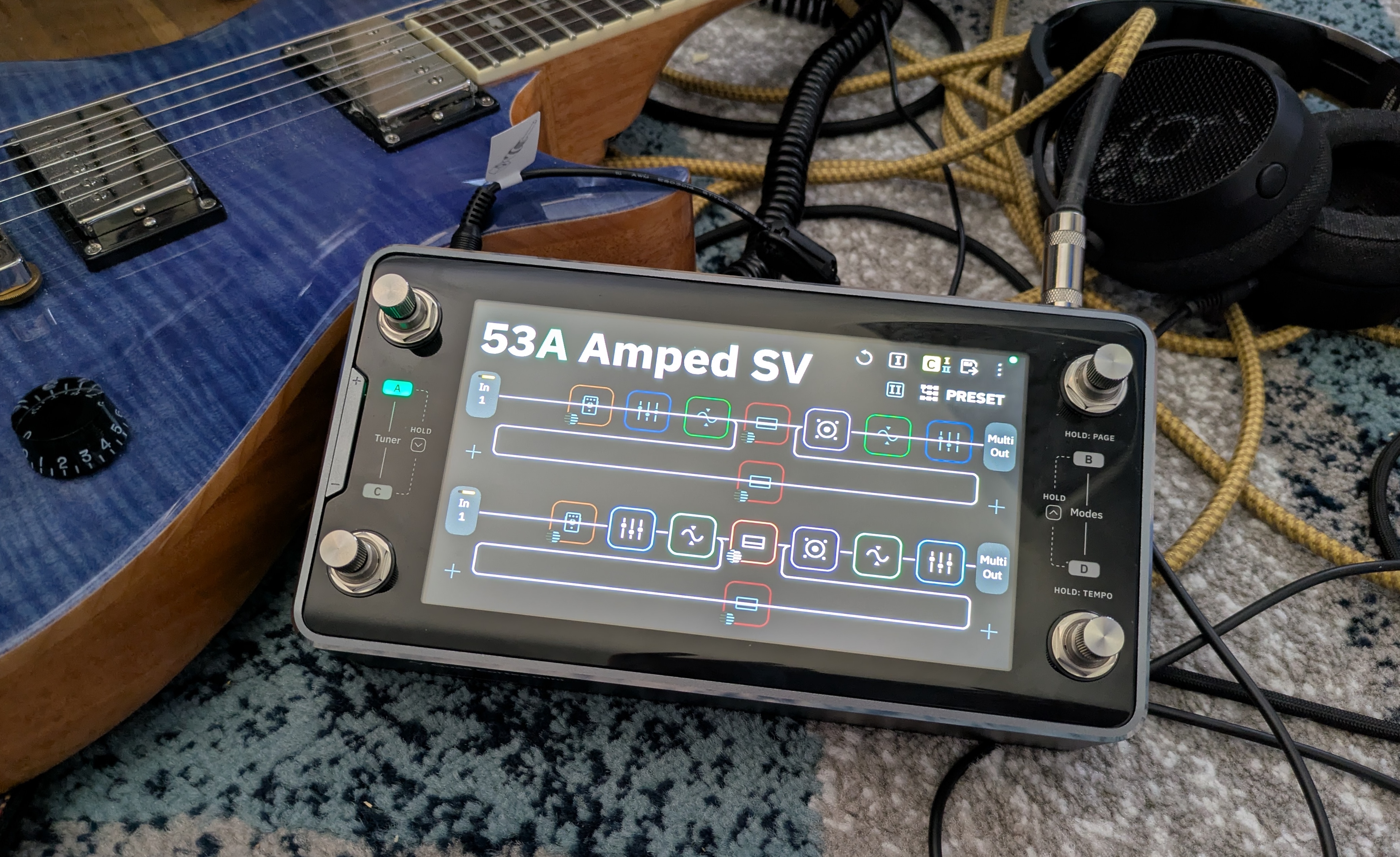
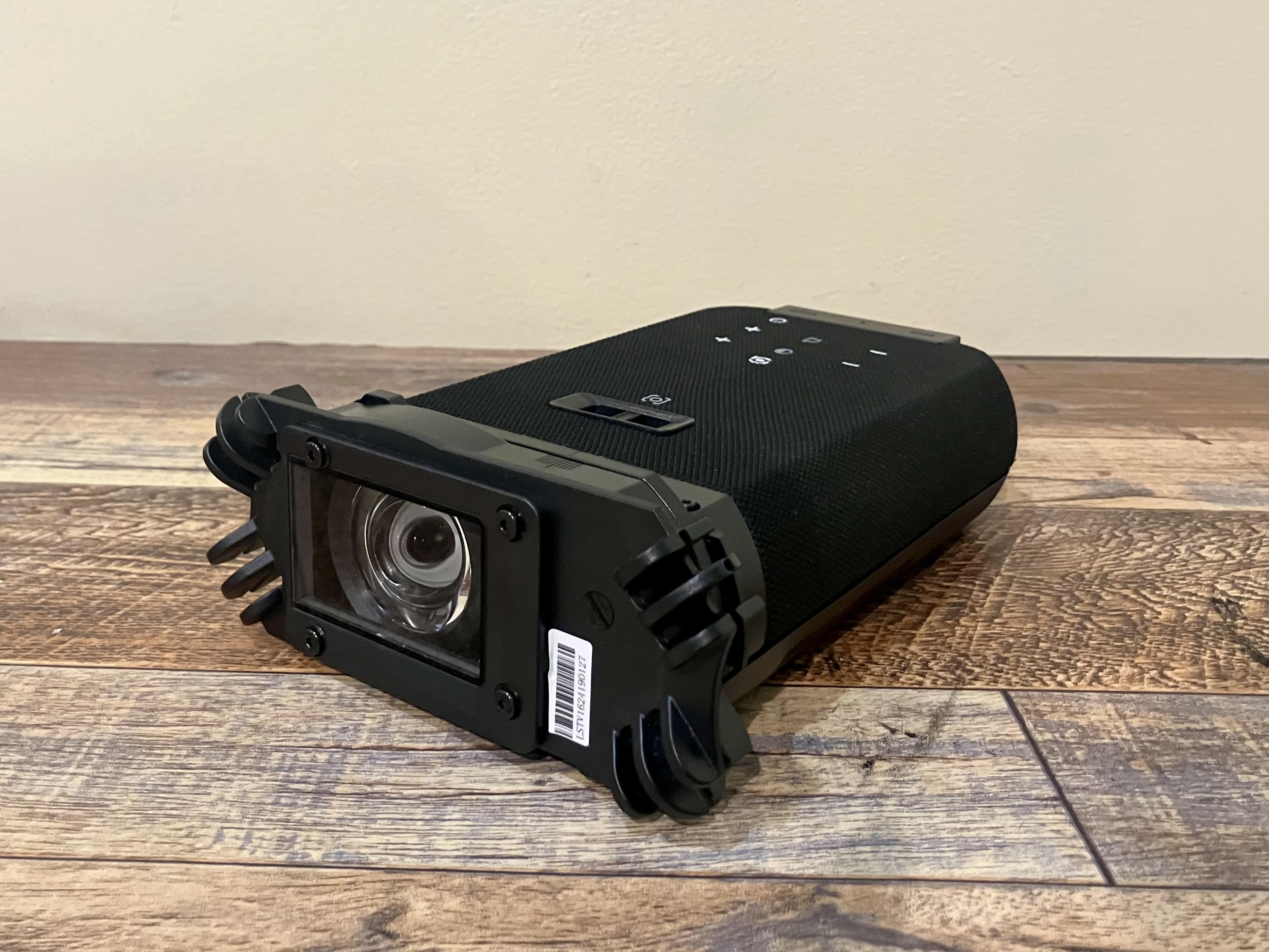
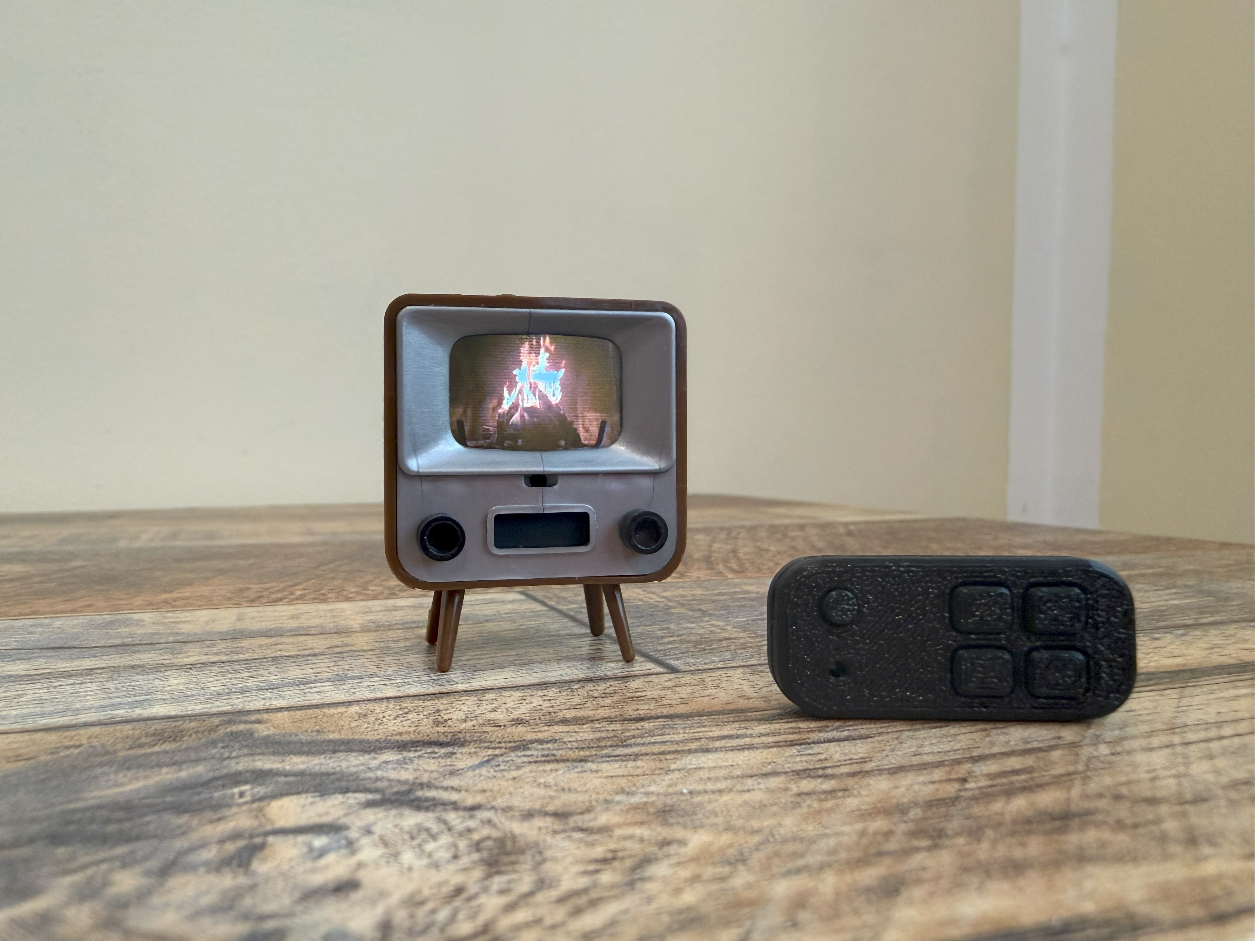
The Quad Cortex mini in its natural habitat: surrounded by cables.
Credit: Nate Anderson
The Quad Cortex mini in its natural habitat: surrounded by cables. Credit: Nate Anderson
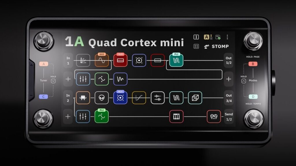
The hardware
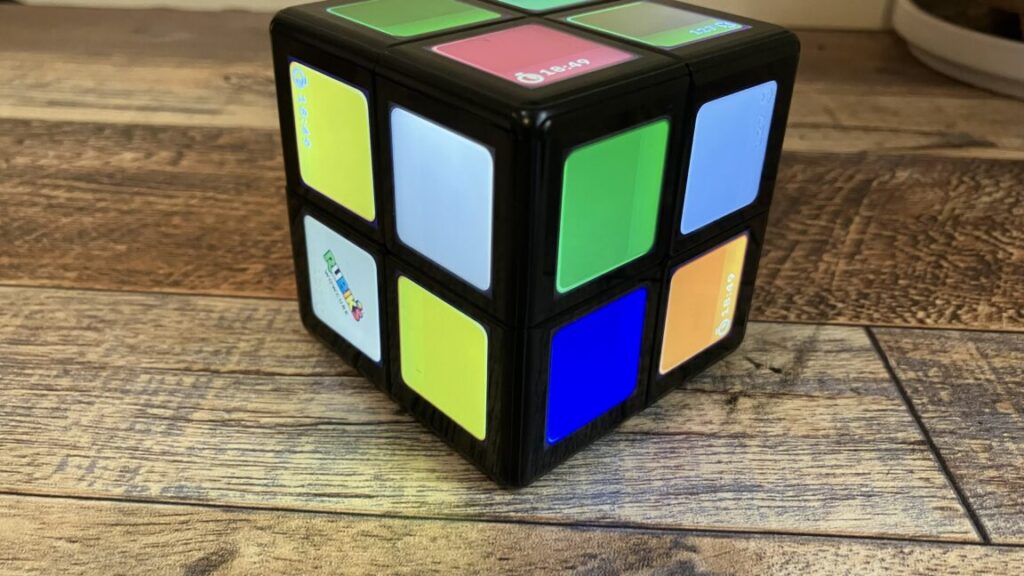
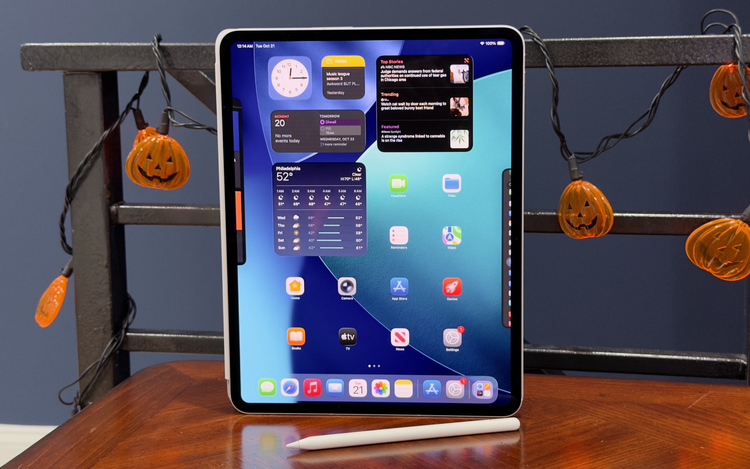
The glass, metal, and steel Quad Cortex mini is about the size of two bricks laid side by side (8.9×4.6×2.5 inches or 22.8×11.8×6.5 cm), and its 3.3 lbs (1.5 kg) give it a satisfying heft. It looks and feels premium—this is a well-built piece of gear.
Though it is meant to operate a bit like traditional analog stomp boxes that guitar and bass players have long used, it may be more helpful to think of the Quad Cortex mini as a chunky handheld computer that you can just so happen to use on the floor.
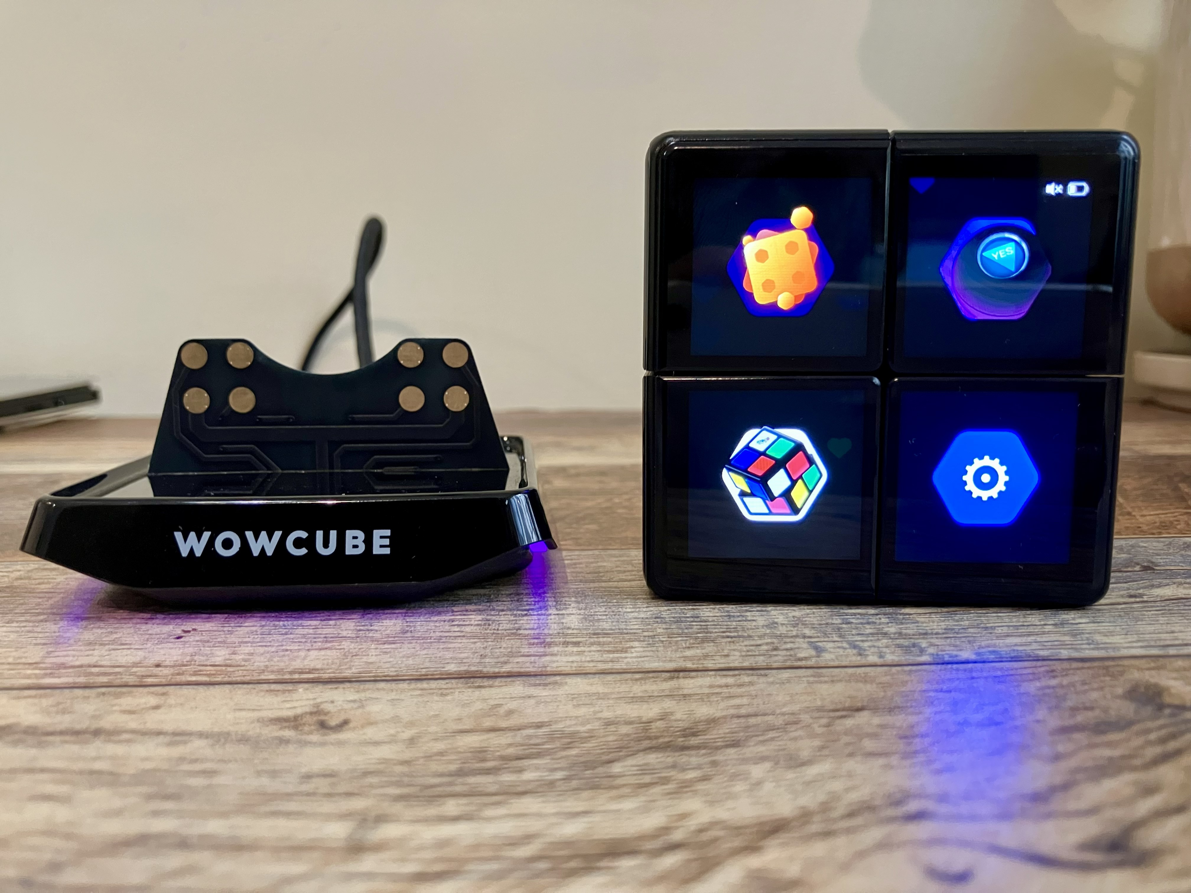
It runs its own operating system (CorOS), takes a whopping 45 seconds to boot, has Wi-Fi for over-the-air updates and cloud service connectivity, features a 7-inch touchscreen, and comes with a “CPU monitor” to show you just how unhappy its chipset is about that third reverb you added to a patch. It even contains a full-on monosynth that you can add to guitar patches, providing control over four full pages of synth parameters, including the raw oscillators.
So finger-focused is the unit that you can tweak just about any parameter on the device with either the touchscreen controls or the footswitches, which double as twistable rotary encoders.
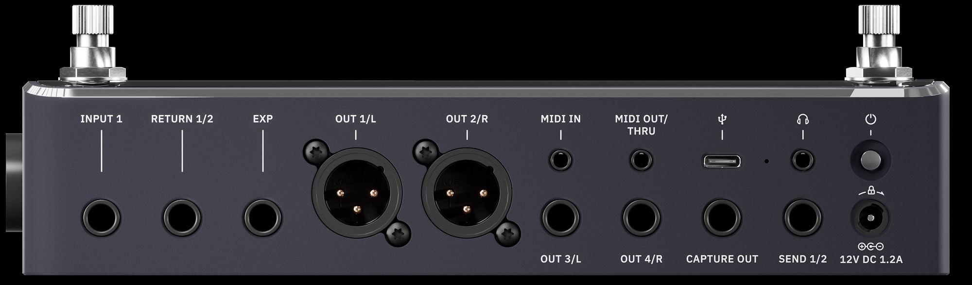
If the top face of the Quad Cortex mini is devoted to a screen and switches, the sides are all about inputs and outputs. You get a “locking” power connector (so the cord doesn’t pull out on stage, prematurely ending your soaring 10-minute guitar solo mid-note) along with a whole host of audio connectors: guitar/bass input, XLR input with phantom power, balanced XLR outputs, TRS send/return ports, stereo line outs, MIDI in and out, an expression pedal port, a USB-C port, and a headphone jack.
Finally, there’s the “capture out” port, which is used to send a series of test signals through various kinds of audio gear to generate a machine learning-based model of various amps, cabinets, and pedals.
The “capture” port is another reminder of the way in which this kind of modern modeling gear is not just an updated version of old-school stomp boxes. The Quad Cortex mini does let you plug in your guitar and rock out, sure, but it also performs and processes hardware captures (both on the device and—for more sophisticated modeling—in the cloud) and can operate as a 16-channel USB-C audio interface to your computer. And though it’s largely designed for guitars and basses, you can use it on anything. The unit even has a few voice presets, which sound pretty wild with some of the real-time pitch-shifting and reverb effects.
While you can model your own gear collection with the Quad Cortex mini, the device itself comes with more than 90 amp models, more than 100 effects, and over 1,000 cabinet impulse responses. It can also run versions of the company’s desktop plugins (assuming you’ve purchased them already). It also comes with “over 2,000 high-quality factory Neural Captures” of other gear—these are static captures—and it can connect to the free “Cortex Cloud” service to download even more, including those uploaded by other users.
In other words: This one box holds digital representations of several hundred thousand dollars of gear. And given that you can mix and match cabs, captures, amps, and effects in wildly complicated chains that can even split and merge… the possibilities are functionally limitless.
Whether that excites or paralyzes you may depend on your own psychology, but it’s quite a change from how Neural DSP has approached its plugin offerings. Neural has generally offered curated (read: limited) collections of amps, cabs, and effects bundled into plugins that represent the tone of, say, John Mayer. You might get 3 amps, a few cabinets recorded with various mics, a few pedals, and an EQ, reverb, and delay, all in a gorgeous interface with some great presets.
But boxes like Quad Cortex mini take a “more is more” approach, with unlimited gear-mixing potential, captures, and storage for thousands of presets. Curation? Bah, who needs it? Here’s everything!
Rectangular
This much gear also means that “gorgeous bespoke interface graphics” are out the window; you will get no pictures of sexy amps sitting in sexy studios with sexy lighting, as you do in the company’s gorgeous plugins. Instead, you will get flat rectangles. So many flat rectangles.
CorOS is one of those places where skeuomorphism goes to die. The Quad Cortex mini interface is extremely “functional”—I am trying to avoid more negative terms, because it has a certain “alpha phase before we put the final art in” charm—and is based entirely around grids of flat rectangles.
The main screen is called, in fact, “the grid.” It shows your current effect chain as a series of small squares, each filled with often impenetrable line art. (A disturbing number of these are some variation on a squiggly line. Fortunately, they are color coded by effect type.)
Each square represents a different effects processor, and you can have four lines of eight effect squares each. That might sound like a lot (and it is), but the processors can be distributed across the grid in creative ways.
Preset 47B, for instance, is called “Annoying Flute,” and it makes use of all four grid lines by running the input signal through a VCA compressor, a gate, an octave pitch shifter, an envelope filter, an EQ, the “Neural Capture” of an amp called “Custom 3SE 2,” and then a “112 US DLX Black C12K 00s (M)” speaker cabinet. (The names of these things are often hard to read at a glance, especially when picking from a list of a hundred items.)
This accounts for only “line 1” of the grid. In the case of Annoying Flute, the signal chain branches right after the speaker cabinet. Half of it continues on to line 3 of the grid, while the other half is routed down to line 2, where it passes through a pair of tape delays before also heading off to line 3. Line 3 receives this re-combined signal and splits it again, this time passing half of it through a poly octaver and another digital delay on line 4 before everything runs through a modulated reverb on line 3 and then onwards to the outputs.
Does this sort of craziness sound good? Well, it sounds better than anything featuring three delays, two pitch shifters, and the name “Annoying Flute” has any right to! But I bring this example up to illustrate the creative routing and effects decisions that the grid makes possible.
And things get even crazier when you use the built-in looper, trigger analog send/return effects, and set up your effects chain with other units meant to be switched on and off during a song.
So much for assigning effects rectangles to the rectangular grid. How to control all of these virtual gadgets? When you tap on any effects unit, up pops an overlay containing (you guessed it) lots of rectangles.
Every controllable parameter gets a rectangle, which is usually filled with a dial or a switch. You can change the values of these dials and switches by touching the screen or by twisting the lower-right rotary footswitch.
Sometimes there are multiple pages of such parameters; the blossom reverb, for instance, has two pages of options and lets you control everything from ducking to pre-delay to modulation to the length of the early reflections. Configuring an entire audio chain from scratch can therefore take a while if you’re a detail freak.
Gig Mode. Yup, it’s rectangles!
Credit: Nate Anderson
Gig Mode. Yup, it’s rectangles! Credit: Nate Anderson
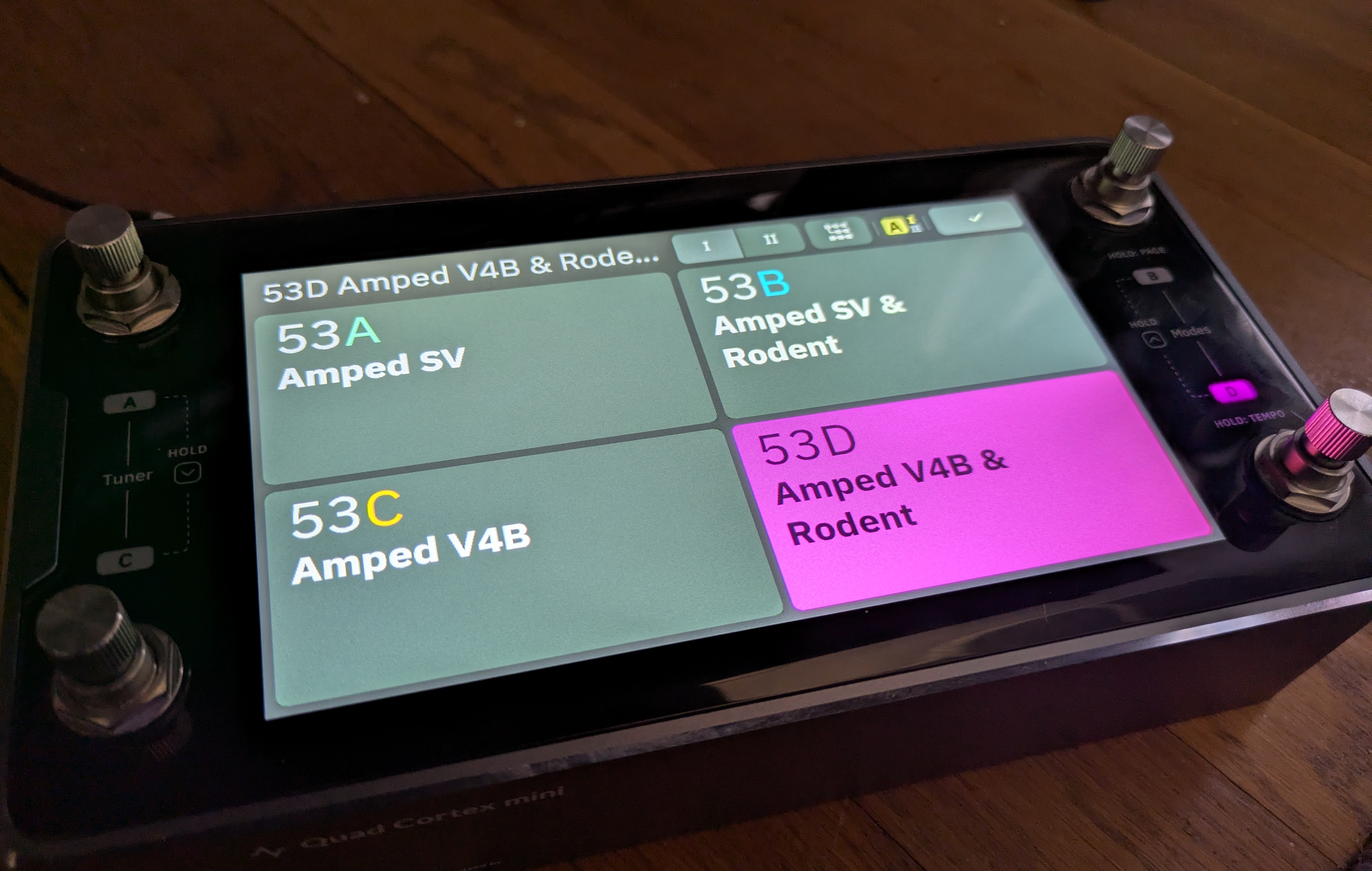
When you have your grid setup exactly how you like it—or you’ve customized one of the many built-in presets—you can save your own custom presets and organize them in all sorts of performance-oriented ways.
There’s PRESET mode, which lets you stomp each of the four footswitches to select a completely different preset.
There’s SCENE mode, which lets you use the footswitches to instead choose different parameter sets within the same preset—such as adding a hall reverb, upping the amp gain, and boosting the delay mix level when you come to your big solo.
Then there’s STOMP mode, which operates most like a traditional pedalboard; you step on the various footswitches to turn different effects units in the preset on or off completely.
Finally, there are hybrid modes, which make things even more complex (and can probably be ignored by many users).
To make all this a little easier to grok, there’s something called “Gig View,” which is unintuitively accessed by swiping up from the bottom of the screen. (There is no visual clue that this mode exists or that this is how you access it.) Gig View is essentially four flat—and extremely large—rectangles that take over the entire screen. They show you at a glance what each footswitch will do given the current mode setting.
Creating presets, assigning scenes, and setting up the STOMP mode and Gig View settings can quickly get intricate—even downright confusing (multiple items can sometimes be mapped to the same switch, for instance). I confess that the thought of doing all this through tapping the good-but-not-instantly-reactive touchscreen brought me to despair, until I realized that Neural has built an entire (free) desktop app for Mac and Windows called Cortex Control. Plug in your device over USB and suddenly you can use a nice and very responsive desktop app to do the donkey work of creating and organizing scenes and presets and settings.
I hate downloading stupid one-off apps that clutter up my computer and appear to provide more value to the company making them than they do to me—a serious problem in the current audio engineering world—but Cortex Control is genuinely useful. Indeed, if you’re going to be more than a presets player, I’d call it essential unless you have far more patience than I do. Which you might!
Stomp it
All of this rectangle talk reminds me that the interface largely… works. It may not be gorgeous, but the job gets done, and the desktop app makes the grunt work easier. But I still found the Quad Cortex mini somewhat confusing to navigate after a couple of weeks of intermittent use (though no doubt it gets easier with time).
The device has so many ways of doing things that it can be hard to remember what is needed in each situation. For instance, to make a change, you might use the rotary encoders. You might tap. You might long-tap with different results. You might swipe, drag, or toggle. You might use the footswitches—but results there might vary by mode. Even then, you might need to tap two footswitches at once, while at other times you only need to step on one. And sometimes you need to “long-press” (long-stomp?) two footswitches at once to get the desired result.
Making things worse, numerous items—sometimes quite important items like the Gig View—are not visible or even discoverable.
For instance, the key settings panel that lets you control all the various inputs and outputs on the device does not appear to be accessible from within the overall “settings” menu or anywhere else. Instead, you have to swipe down from the top of the grid screen—again, with no indication that this is where that information lives.
(You have to read the manual to figure out some of these things, which is fine, but the manual also has big gaps, such as not describing what any of the gear actually does nor what any of the settings mean nor how they might be used. For the actual “audio engineering” aspect of the Quad Cortex mini, you’re on your own.)
Something as simple as moving between presets can also be more hassle than you’d expect. Because the Quad Cortex mini only has four footswitches, you can only access four presets at once with a direct stomp. Switching to anything else from the main grid while in PRESET mode appears to require—unless I am missing some obvious shortcut—that you:
- “Long-stomp” the right two footswitches, after which the preset name starts blinking.
- At this point, you can tap the left two or the right two footswitches together to move up or down through four-item “banks” of presets.
- But within each bank, you can only see that bank’s four different presets by tapping on each of the various footswitches.
- To exit blinking mode and actually select that preset, you need to press its corresponding footswitch again.
This feels like a lot of hassle when you just want to whip through some presets! (Gig View is marginally easier because it at least displays the four presets in each bank at once. Making this whole process more confusing is that it differs depending on which mode you are in.)
While the processing power and options on offer here are incredible, I do think interface navigation and the modes assignment system could benefit from a rethink and simplification.
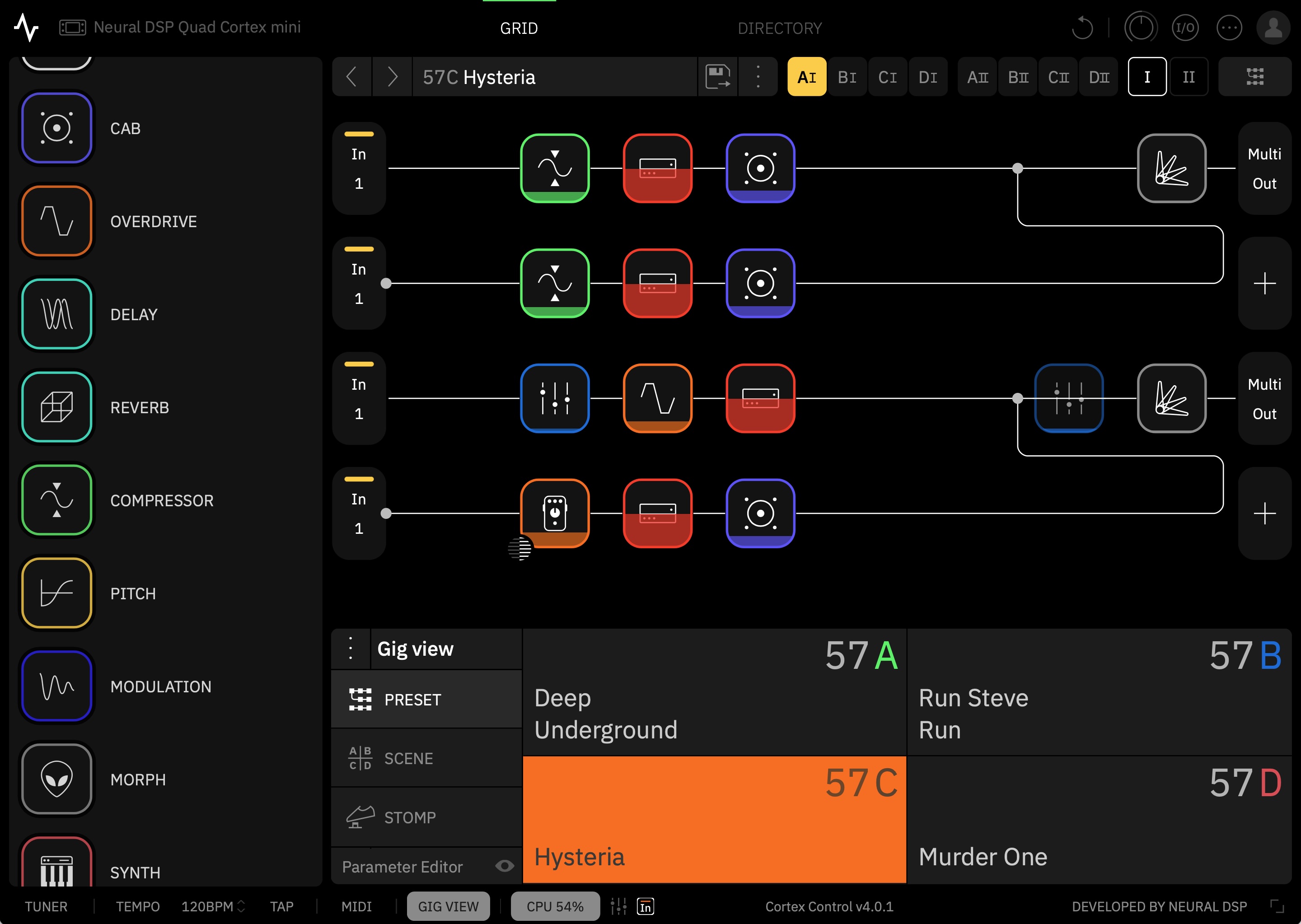
The Cortex Control desktop app.
The Cortex Control desktop app.
The sound
These quirks can be dealt with, and time (plus the Cortex Control app) should make them easier to manage. The more important question is: How does the Quad Cortex mini sound?
Neural DSP has been one of the leaders in the field of amp and effects modeling for some years now, and it shows. There’s no possible way I could compare all of the models to the original hardware, and I’m not actually interested in doing so. The question for me is simply whether the models sound good when jamming solo or when placed into a mix. On both counts, the answer is a definite yes. This is just a remarkable set of tones to have on hand.
(People as diverse as Dave Mustaine and John Mayer appear to agree, at least for a live rig.)
Once you get over its navigation, playing with this thing is like being a kid in a proverbial candy shop. (Though I, too, love candy shops!) Almost every amp you can imagine is a tap away, and they sound wonderful—though do be aware that what you are getting here is the sound of a recorded amp through a mic and not necessarily an “amp in the room with you.”
Nearly every time I booted it up to test something new, I lost myself in the sound and played far longer than I had intended.
Neural has published a massive and quite helpful list of all the gear on offer here. Bogner Shiva? Marshall? Mesa Boogie? Matchless? Soldano? Vox? Fender? Hiwatt? Amps from all these companies are included. Need a bass amp? There are 13 of those, too. What about a bass overdrive? You get five. A general reverb? How about 17? You get the idea.
You can loop, filter, distort, EQ, delay, and compress to your heart’s content, though there seems to be a bit more emphasis here on rock and metal styles (which Neural DSP is most known for) than on other offerings. Still, there’s enough variety to offer great tools for funk, blues, jazz, and country players. You can even add in a version of the monosynth found in the company’s Rabea plugin.
To illustrate some of the sounds on offer, I wrote a little song about a dirtbag billionaire who makes rockets, gets chased off the Earth by angry locals, and ends up crashing his ship into the Moon out of despair. It’s called “Master of the Universe.”
More to the point, it features 10-plus electric guitar tracks recorded through the Quad Cortex mini using shimmer reverb, the poly octaver, and various crunchy rhythm and lead sounds. (I avoided the metal tones so common in Neural DSP demos.) Bass guitar was likewise recorded through one of the mini’s bass presets.
(For those new to audio production and curious about the other sounds in the track, the drums are the Abbey Road 70s kit, while the rocket-sounding “riser” comes from the Rise and Hit collection, both from Native Instruments. The piano is the recently upgraded “studio piano” that comes in Logic Pro and now sounds surprisingly good! There’s also a Hammond organ emulation and a Rhodes piano emulation from Universal Audio buried in the mix. The double-tracked acoustic guitars during two of the choruses were recorded live in my home studio with a single condenser mic. For room ambience throughout, but especially on the drums, I used Universal Audio’s excellent Sound City Studios plugin.)
I’ve generally found Neural’s plugin tones to be pretty “mix-ready,” and that’s true here as well. Though I often needed to roll off some low end or make an occasional EQ boost or add a bit of reverb to blend the guitars spatially with the drum ambience, little else was required but panning and fader moves.
Frankly, there are probably too many parts in the song, but the Quad Cortex mini was just such a playground of sounds that I kept finding new little bits I wanted to work in. Just be grateful that I talked myself out of using all of the insane pitch-shift effects on my vocal for “special” moments.
“Master of the Universe,” my demo song showing some of what the Quad Cortex mini can do.
Captured
When it comes to recording, you don’t have to worry about wiring this thing up to your audio interface; just connect it to your computer with a USB-C cable, and it becomes a 24-bit, 48 KHz interface. (On Macs, this is class compliant and needs no driver; it even works with iOS devices. Neural makes the necessary driver for Windows.)
The Quad Cortex mini shows up with a host of inputs, making it simple to record, say, both a dry electric guitar track and a heavily effected one at the same time. If you change your mind about the sound later, you can always “re-amp” the dry signal by routing it back out to the device and recording it with different settings. You can even track mics through this thing, thanks to an XLR input and (for condenser mics) support for phantom power.
The Quad Cortex mini can also make its own captures of gear you either own or happen across. This can happen in two ways: 1) on the device or 2) in the cloud.
The device-based system, which the company calls “Neural Capture Version 1,” requires you to hook up your gear to both an output (to play the system’s test tones) and an input on the mini. (Note: Do not, under ANY circumstances, connect the actual speaker outputs from a tube amp directly to the mini. The power level is far too high.)
Various known sounds are then played through this loop, and the mini’s software analyzes the differences between the sound it sent and the sound it received. The machine-learning algorithms for this run locally on the device. Neural says that the Capture 1 system can handle overdrive pedals, amps, and cabs.
The newer system, called Neural Capture Version 2, is “an advanced evolution of Neural Capture trained via Cortex Cloud,” says the company. “This option provides even higher-resolution Captures, making it especially powerful for touch-sensitive devices like fuzzes, compressors, and certain styles of amps.” Capture 2 is said to be capable of modeling “subtle behaviors like volume-knob cleanup, amp sag and bloom, fast transients, and blend controls.”
As the name suggests, the more powerful algorithms behind this system require cloud-based servers instead of the local device. Users are allowed to run 40 Neural Capture 2 sessions per day, and each takes around 10 minutes.
The resulting captures, along with any presets you want to share, can be uploaded to Neural’s cloud-based system for sharing them. Once you log in, any captures or presets you choose to download from the site will automatically show up in your Quad Cortex mini.
Look for a follow-up article on what the actual process of making a capture is like; it’s similar across many different modeling devices these days, though the sound of the resulting models can vary by company.
The Cortex Cloud website.
The Cortex Cloud website.
Options
The Quad Cortex mini is a powerful tone platform that is both versatile and expandable. It’s good for solo jamming at home without needing to 1) buy amps, cabs, and effects and 2) crank them to ruinous volume levels. It’s good for playing live, once you have configured its fairly deep control system in a way that works for your particular songs. And it’s good for recording, letting you fiddle with endless gear combinations without running a single patch cable or digging up a 9V battery.
At $1,400, though, it’s bad for your wallet. Whether it’s worth the cost depends on your use case. If you don’t need a screen and are happy with fewer ports and options, you might consider Neural DSP’s smaller and cheaper Nano Cortex ($570) or other devices like the Tonex pedals from IK Multimedia. On the other hand, if you want a larger unit with more footswitches, you can plonk down an extra $400 for the full-fat Quad Cortex or look into various options from Fractal, Kemper, Line 6, etc.
One way of thinking about the financial calculus here would be to try out the device (or listen online) and see how well the sound works for you. Some amp purists believe that nothing beats the sound of real tubes and real speakers in a real room, cost and weight and volume be damned. Many others can’t hear a difference between the models and the originals.
If you’re in the former group, these kinds of devices are unlikely to fully satisfy you, at least when it comes to gigging and recording. So you might decide whether they are “worth it” based solely on their value as easy, light, and quiet practice platforms.
If you can’t tell (or don’t care about) the difference between the models and the real hardware, then these modeling sims start to look like a far better value. When individual amps can go for $1,500 to $2,000 or more, a massive gear collection like the one in the Quad Cortex mini is practically saving you money. You’d be a fool not to buy! (To paraphrase an explanation my son once gave me for a purchase he wanted to make.)
But even those in this group may not need an actual hardware pedal unless they really enjoy practicing without needing to use their regular computer—or unless they gig regularly. If you’re simply a recording guitarist who tends to work “in the box,” you might just pick up some cheaper Neural DSP plugins instead. Or you can buy a more comprehensive software suite like the new Paradise Guitar Studio from Universal Audio or one of the offerings from PolychromeDSP—all of which sound excellent.
If you’re content with software but want a free alternative, take a look at NAM, the Neural Amp Modeler. It’s open source modeling tech that also offers a community tone-sharing website and has been racking up lots of great reviews for its sound quality. (Though note that most of the NAM models are static captures; they sound great but represent only that exact setup and knob positioning, though the developers are working on more complex, adjustable models.)
All types of users can probably admit, though, that hardware and software modeling tech has made this a great time to be a guitar or bass player. Even if you don’t want to use them on a record, just being able to play around with and get to know this much gear with this much accuracy is a huge win for the home hobbyist and small-time gigging musician, who would otherwise never even set eyes on most of this stuff.
The key thing is just to get whatever works for you… and then to go forth and rock.

Quad Cortex mini amp modeler: All the power, half the size Read More »