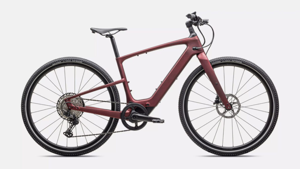
You’ll enjoy the Specialized Turbo Vado SL 2 6.0 Carbon even without assist
It’s an investment, certainly of money, but also in long, fast rides.
The Specialized Turbo Vado SL 2 6.0 Carbon Credit: Specialized
Two things about the Specialized Turbo Vado SL 2 6.0 Carbon are hard to fathom: One is how light and lithe it feels as an e-bike, even with the battery off; the other is how hard it is to recite its full name when other riders ask you about the bike at stop lights and pit stops.
I’ve tested about a half-dozen e-bikes for Ars Technica. Each test period has included a ride with my regular group for about 30 miles. Nobody else in my group rides electric, so I try riding with no assist, at least part of the way. Usually I give up after a mile or two, realizing that most e-bikes are not designed for unpowered rides.
On the Carbon (as I’ll call it for the rest of this review), you can ride without power. At 35 pounds, it’s no gram-conscious road bike, but it feels lighter than that number implies. My daily ride is an aluminum-framed model with an internal geared hub that weighs about the same, so I might be a soft target. But it’s a remarkable thing to ride an e-bike that starts with a good unpowered ride and lets you build on that with power.
Once you actually crank up the juice, the Carbon is pretty great, too. Deciding whether this bike fits your riding goals is a lot tougher than using and enjoying it.
Specialized’s own system
It’s tough to compare this Carbon to other e-bikes, because it’s using hardly any of the same standard components as all the others.
The 320-watt mid-drive motor is unique to Specialized models, as is its control system, its handlebar display, its charge ports, and its software. On every other e-bike I’ve ridden, you can usually futz around with the controls or app or do some Internet searching to figure out a way to, say, turn off an always-on headlamp. On this Carbon, there is not. You are riding with the lights on, because that’s how it was designed (likely with European regulations in mind).
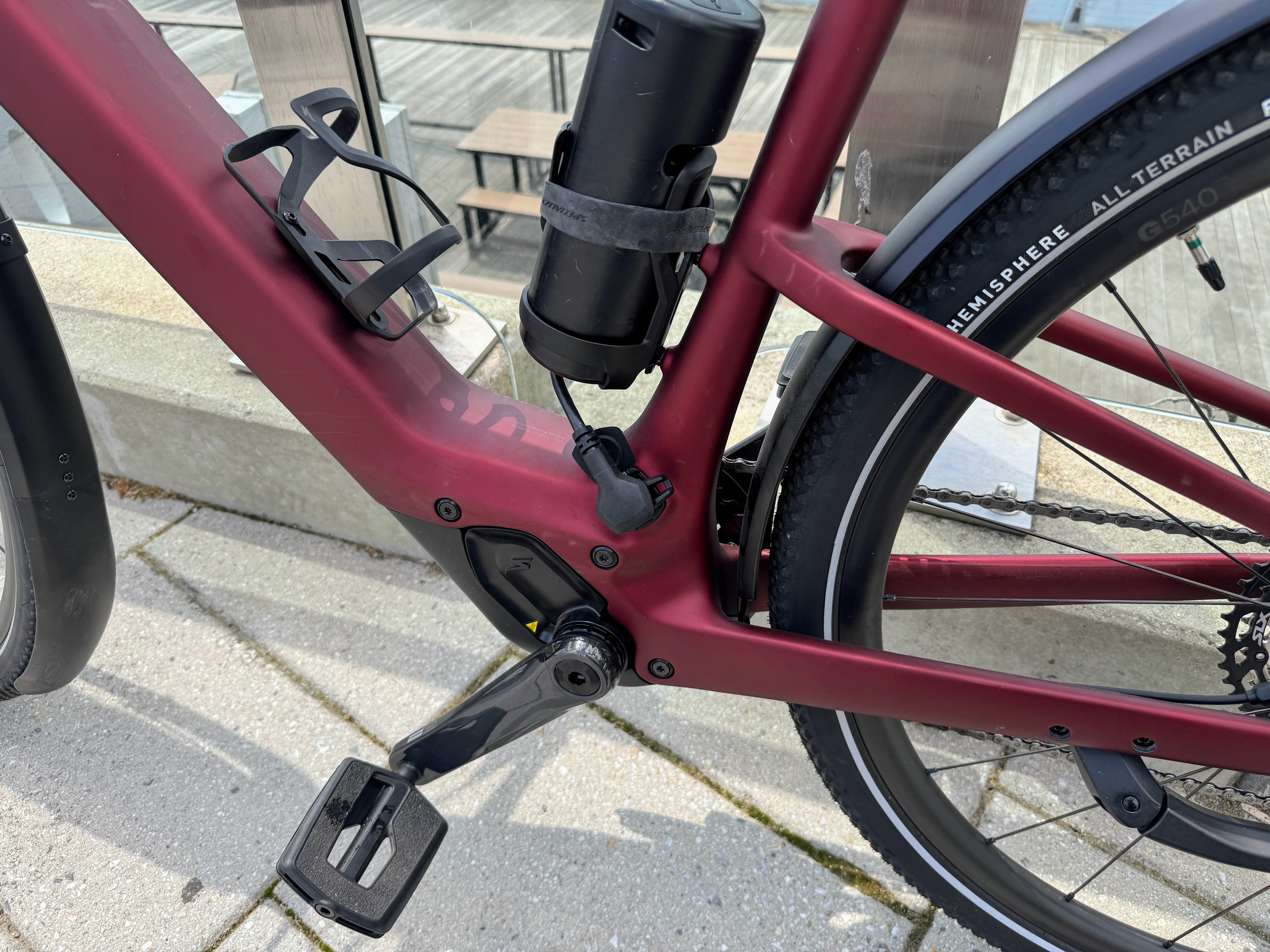
The bottom half of the Carbon, with its just-powerful-enough mid-drive motor, charging port, bottle cages, and a range-extending battery. Watch your stance if you’ve got wide-ranging feet, like the author.
Credit: Kevin Purdy
The bottom half of the Carbon, with its just-powerful-enough mid-drive motor, charging port, bottle cages, and a range-extending battery. Watch your stance if you’ve got wide-ranging feet, like the author. Credit: Kevin Purdy
Specialized has also carved out a very unique customer profile with this bike. It’s not the bike to get if you’re the type who likes to tinker, mod, or upgrade (or charge the battery outside the bike). It is the bike to get if you are the type who wants to absolutely wreck a decent commute, to power through some long climbs with electric confidence, or simply have a premier e-bike commute or exercise experience. It’s not an entirely exercise-minded carbon model, but it’s not a chill, throttle-based e-bike, either.
The ride
I spent probably a quarter as much time thinking about riding the Carbon as I did actually riding it. This bike costs a minimum of $6,000; where can you ride it and never let it out of your sight for even one moment? The Carbon offers Apple Find My tracker integration and has its own Turbo System Lock that kills the motor and (optionally) sets off lights and siren alarms when the bike is moved while disabled. That’s all good, but the Carbon remains a bike that demands full situational awareness, wherever you leave it.
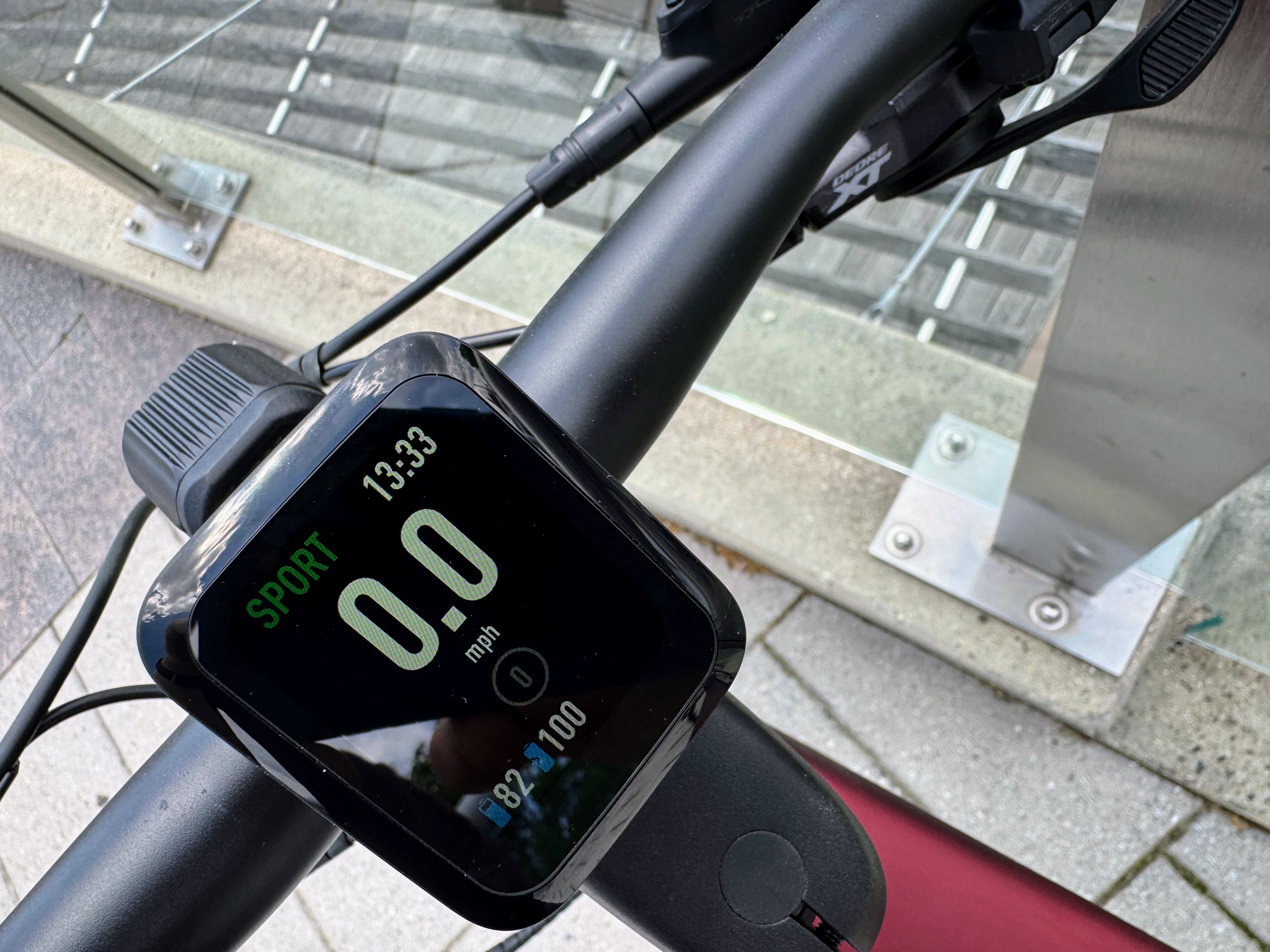
The handlebar display on the Carbon. There are a few modes, but this is the relative display density: big numbers, basic information, refer to the phone app if you want more.
Credit: Kevin Purdy
The handlebar display on the Carbon. There are a few modes, but this is the relative display density: big numbers, basic information, refer to the phone app if you want more. Credit: Kevin Purdy
You unlock the bike with either the Specialized smartphone app or a PIN code, entered with an up/down/press switch. The 2.1-inch screen only has a few display options but can provide the basics (speed, pedal cadence, wattage, gear/assist levels), or, if you dig into Specialized’s app and training programs and connect ANT+ gear, your heart rate and effort.
Once you’re done plotting, unlocking, and data-picking, you can ride the Carbon and feel its real value. Specialized, a company that seems deeply committed to version control, claims that the Future Shock 3.2 front suspension on this 6.0 Carbon reduces impact by 53 percent or more, versus a bike with no suspension. Combined with the 47 mm knobby tires and the TRP hydraulic disc brakes, I had no trouble switching from road to gravel, taking grassy shortcuts, hopping off standard rubes, or facing down city streets with inconsistent upkeep.
I’ve been spoiled by the automatic assist available on Bosch mid-drive motors. The next best thing is probably something like the Shimano Devore XT/SLX shifters on this Carbon, paired with the power monitoring. The 12-speed system, with a 10-51t cassette range, shifted at the speed of thought. Your handlebar display gives you a color-coded guide when you should probably shift up or down, based on your cadence and wattage output.
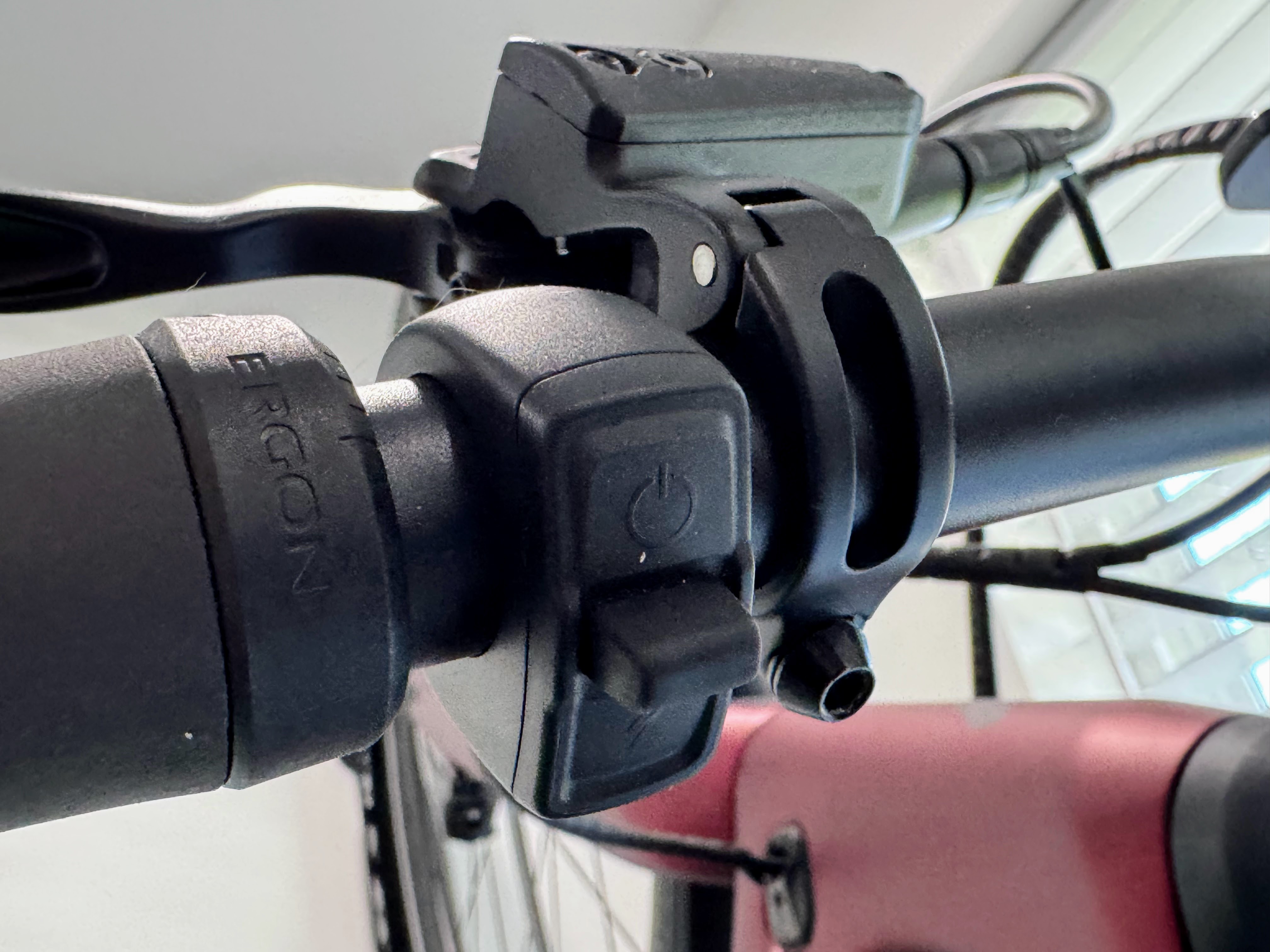
The controls for the Carbon’s display, power, and switch are just this little switch, with three places to press and an up/down switch. Sometimes I thought it was clever and efficient; other times, I wish I had picked a more simple unlock code.
Credit: Kevin Purdy
The controls for the Carbon’s display, power, and switch are just this little switch, with three places to press and an up/down switch. Sometimes I thought it was clever and efficient; other times, I wish I had picked a more simple unlock code. Credit: Kevin Purdy
That battery range, as reported by Specialized, is “up to 5 hours,” a number that few people are going to verify. It’s a 520-watt-hour battery in a 48-volt system that can turn out a rated 320 watts of power. You can adjust the output of all three assist levels in the Specialized app. And you can buy a $450 water-bottle-sized range extender battery that adds another 160 Wh to your system if you sacrifice a bottle cage (leaving two others).
But nobody should ride this bike, or its cousins, like a juice miser on a cargo run. This bike is meant to move, whether to speed through a commute, push an exercise ride a bit farther, or tackle that one hill that ruins your otherwise enjoyable route. The Carbon felt good on straightaways, on curves, starting from a dead stop, and pretty much whenever I was in the zone, forgetting about the bike itself and just pedaling.
I don’t have many points of comparison, because most e-bikes that cost this much are bulky, intensely powerful, or haul a lot of cargo. The Carbon and its many cousins that Specialized sells cost more because they take things away from your ride: weight, frame, and complex systems. The Carbon provides a rack, lights, three bottle cages, and mounting points, so it can do more than just boost your ride. But that’s what it does better than most e-bikes out there: provide an agile, lightweight athletic ride, upgraded with a balanced amount of battery power and weight to make that ride go faster or farther.
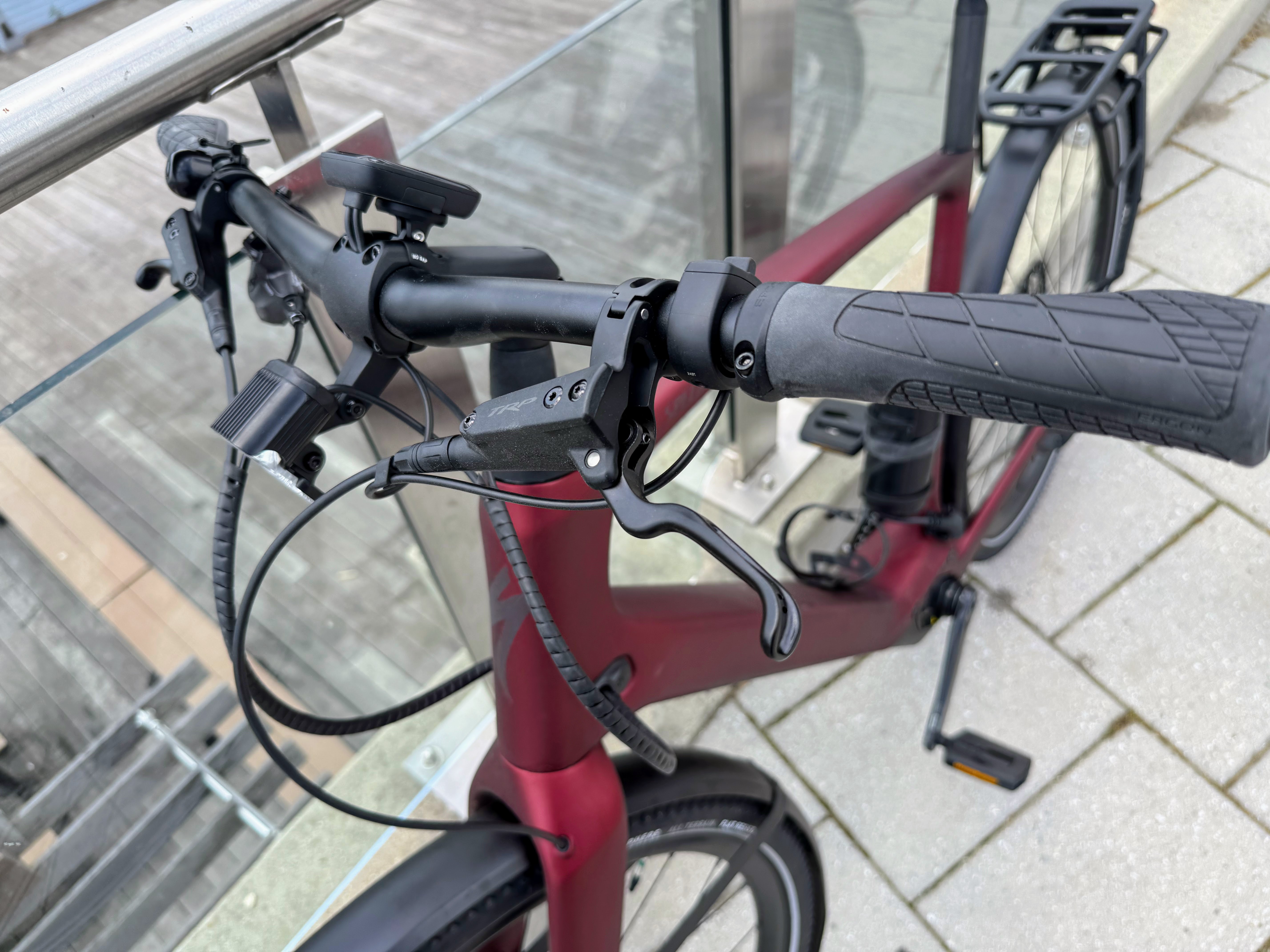
The handlebar, fork, and wiring on the front of the Carbon.
Credit: Kevin Purdy
The handlebar, fork, and wiring on the front of the Carbon. Credit: Kevin Purdy
Always room to improve
I’ve said only nice things about this $6,000 bike, so allow me to pick a few nits. I’ve got big feet (size 12 wide) and a somewhat sloppy pedal position when I’m not using clips. Using the bottle-sized battery, with its plug on the side of the downtube, led to a couple of fat-footed disconnections while riding. When the Carbon notices that even its supplemental battery has disconnected, it locks out its display system; I had to enter a PIN code and re-plug the battery to get going again. This probably won’t be an issue for most people, but it’s worth noting if you’re looking at that battery as a range solution.
The on-board display and system seem a bit underdeveloped for the bike’s cost, too. Having a switch with three controls (up, down, push-in) makes navigating menus and customizing information tiresome. You can see Specialized pushing you to the smartphone for deeper data and configuration and keeping control space on the handlebars to a minimum. But I’ve found the display and configuration systems on many cheaper bikes more helpful and intuitive.
The Specialized Turbo Vado SL 2 6.0 Carbon (whew!) provided some of the most enjoyable rides I could imagine out of a bike I had no intention of keeping. It’s an investment, certainly of money, but also to long, fast rides, whether to get somewhere or nowhere in particular. Maybe you want more battery range, more utility, or more rugged and raw power for the price. But it is hard to beat this bike in the particular race it is running.
You’ll enjoy the Specialized Turbo Vado SL 2 6.0 Carbon even without assist Read More »