Tech

with-new-agent-mode-for-excel-and-word,-microsoft-touts-“vibe-working”

With new agent mode for Excel and Word, Microsoft touts “vibe working”

With a new set of Microsoft 365 features, knowledge workers will be able to generate complex Word documents or Excel spreadsheets using only text prompts to Microsoft’s chat bot. Two distinct products were announced, each using different models and accessed from within different tools—though the similar names Microsoft chose make it confusing to parse what’s what.

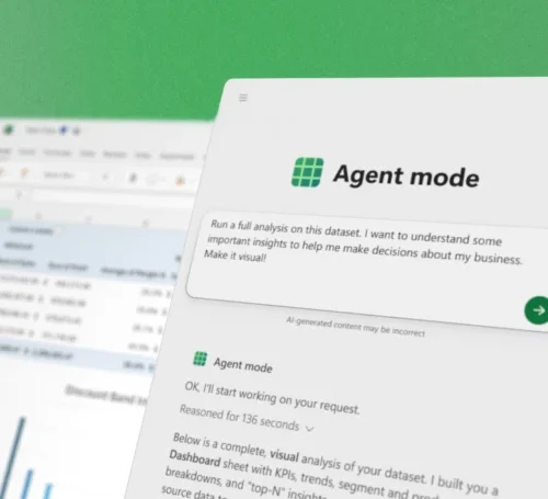
Driven by OpenAI’s GPT-5 large language model, Agent Mode is built into Word and Excel, and it allows the creation of complex documents and spreadsheets from user prompts. It’s called “agent” mode because it doesn’t just work from the prompt in a single step; rather, it plans multi-step work and runs a validation loop in the hopes of ensuring quality.

It’s only available in the web versions of Word and Excel at present, but the plan is to bring it to native desktop applications later.

There’s also the similarly named Office Agent for Copilot. Based on Anthropic models, this feature is built into Microsoft’s Copilot AI assistant chatbot, and it too can generate documents from prompts—specifically, Word or PowerPoint files.

Office Agent doesn’t run through all the steps as Agent Mode, but Microsoft believes it offers a dramatic improvement over prior, OpenAI-driven document-generation capabilities in Copilot, which users complained were prone to all sorts of problems and shortcomings. It is available first in the Frontier Program for Microsoft 365 subscribers.

Together, Microsoft says these features will let knowledge workers engage in a practice it’s calling “vibe working,” a play on the now-established term vibe coding.

Vibe everything, apparently

Vibe coding is the process of developing an application entirely via LLM chatbot prompts. You explain what you want in the chat interface and ask for it to generate code that does that. You then run that code, and if there are problems, explain the problem and tell it to fix it, iterating along the way until you have a usable application.

With new agent mode for Excel and Word, Microsoft touts “vibe working” Read More »

youtuber-unboxes-what-seems-to-be-a-pre-release-version-of-an-m5-ipad-pro

YouTuber unboxes what seems to be a pre-release version of an M5 iPad Pro

Apple’s biggest product event of the year happens in September, when the company puts out a new batch of iPhones and Apple Watches and other odds and ends. But in most years, Apple either has another smaller event or just a handful of additional product announcements later in the fall in October or November—usually the focus is on the Mac, the iPad, or both.

It seems like a new iPad Pro could be one of the announcements on tap. Russian YouTube channel Wylsacom has posted an unboxing video and early tour of what appears to be a retail boxed version of a new 256GB 13-inch iPad Pro, as well as an M5 processor that we haven’t seen in any other Apple product yet. This would be the first new iPad Pro since May of 2024, when Apple introduced the current M4 version.

The same channel also got ahold of the M4 MacBook Pro early, so it seems likely that this is genuine. And while the video is mostly dedicated to complaining about packaging, the wattage of the included power adapter, and how boring it is that Apple doesn’t introduce dramatic design changes every generation, it does also give us some early performance numbers for the new M5.

While we don’t have details on the chip’s manufacturing process or other changes, quick Geekbench 6 runs show the M5 in this iPad Pro improving CPU performance by roughly 10 to 15 percent and GPU performance by about 34 percent, compared to the M4 in the old iPad Pro.

This M5 includes three high-performance CPU cores and six high-efficiency CPU cores, the same core count as the 256GB and 512GB versions of the M4 iPad Pro (the 1TB and 2TB iPads and the M4 Macs all get one additional performance core, for a total of four, and we’d bet it’s the same way for the M5). We don’t know how many GPU cores the M5 has, though given the larger performance improvements it’s at least theoretically possible that Apple has added additional graphics cores on top of the 10 that the M4 includes. Higher clock speeds, faster RAM, architectural improvements, or a mix of all three could also explain the jump.

YouTuber unboxes what seems to be a pre-release version of an M5 iPad Pro Read More »

ios-2601,-macos-260.1-updates-fix-install-bugs,-new-phone-problems,-and-more

iOS 26.0.1, macOS 26.0.1 updates fix install bugs, new phone problems, and more

Now that iOS 26, macOS 26 Tahoe, and Apple’s other big software updates for the year are out in public, Apple’s efforts for the next few months will shift to fixing bugs and adding individual new features. The first of those bug fix updates has arrived this week in the form of iOS 26.0.1, macOS 26.0.1, iPadOS 26.0.1, and equivalent updates for most of the devices across Apple’s ecosystem.

The release notes for most of the updates focus on device- and platform-specific early adopter problems, particularly for buyers of the new iPhone 17, iPhone 17 Pro, and iPhone Air.

The iOS 26.0.1 update fixes a bug that could prevent phones from connecting to cellular networks, a bug that could cause app icons to appear blank, and the VoiceOver feature becoming disabled on devices that have it on. Camera, Wi-Fi, and Bluetooth bugs with the new iPhones have also been patched. The iPadOS update also fixes a bug that was causing the floating software keyboard to move around.

iOS 26.0.1, macOS 26.0.1 updates fix install bugs, new phone problems, and more Read More »

f-droid-says-google’s-new-sideloading-restrictions-will-kill-the-project

F-Droid says Google’s new sideloading restrictions will kill the project

F-Droid warns that the project will end if Google is allowed to seize control of the entire Android software ecosystem by way of its developer verification program. In addition to gathering personal information from devs, F-Droid says Google will be demanding registration fees from independent developers, many of whom give their apps away for free and would be uninterested in paying Google for the privilege.

Verification

Google’s application to test verification does ask if you can pay in USD, suggesting it will charge devs for the privilege of creating Android apps.

Credit: Ryan Whitwam

Google’s application to test verification does ask if you can pay in USD, suggesting it will charge devs for the privilege of creating Android apps. Credit: Ryan Whitwam

Google has been slow to provide details of the verification system. However, you can sign up for the early access program. During that process, Google does ask if you are able to pay registration fees in US dollars, which suggests there will be a cost for developers in the program. We’ve reached out to Google for more information.

A plea for regulation

F-Droid’s position is clear: if you own a device, you should be allowed to decide what software to run on it. To force everyone to register with a central authority is an affront to the ideas of free speech and thought, says F-Droid.

So what’s the solution? In the blog post, Google is accused of using security as a mask for what is really an attempt to consolidate monopoly power over app distribution at a time when its power is being suppressed by antitrust actions. F-Droid is calling on regulators from the US and EU to take a close look at Google’s plans before it’s too late.

Google is currently on the verge of massive court-mandated changes to the Play Store. After losing the antitrust case brought by Epic Games, Google went on to lose the appeal. As it explores further legal maneuvering, the firm may have to begin opening up its app distribution system by promoting third-party stores in Google Play and mirroring Google Play content in other storefronts. This will reduce Google’s monopoly power in Android apps, which is the court’s intention. However, the company’s new goal of locking down sideloading could maintain its central role in Android software.

F-Droid calls on concerned developers and users to contact their government representatives to demand action. Specifically, the site suggests invoking the European Commission’s Digital Markets Act (DMA) to keep FOSS apps free from Google’s gatekeeping.

While the pilot verification program is set to launch next month, it will be almost a year before unverified apps will be blocked. That will start with a handful of markets, including Brazil, Indonesia, Singapore, and Thailand. The restrictions are expected to expand globally in 2027.

F-Droid says Google’s new sideloading restrictions will kill the project Read More »

lg’s-$1,800-tv-for-seniors-makes-misguided-assumptions

LG’s $1,800 TV for seniors makes misguided assumptions

LG is looking to create a new market: TVs for senior citizens. However, I can’t help thinking that the answer for a TV that truly prioritizes the needs of older people is much simpler—and cheaper.

On Thursday, LG announced the Easy TV in South Korea, aiming it at the “senior TV market,” according to a Google translation of the press release. One of the features that LG has included in attempts to appeal to this demographic is a remote control with numbers. Many remotes for smart TVs, streaming sticks, and boxes don’t have numbered buttons, with much of the controller’s real estate dedicated to other inputs.

The Easy TV's remote.

The Easy TV’s remote.

Credit: LG

The Easy TV’s remote. Credit: LG

LG released a new version of its Magic Remote in January with a particularly limited button selection that is likely to confuse or frustrate newcomers. In addition to not having keys for individual numbers, there are no buttons for switching inputs, play/pause, or fast forward/rewind.

LG AI remote

LG’s 2025 Magic Remote.

LG’s 2025 Magic Remote. Credit: Tom’s Guide/YouTube

The Easy TV’s remote has all of those buttons, plus mute, zoom, and bigger labels. The translated press release also highlights a button that sounds like “back” and says that seniors can push it to quickly return to the previous broadcast. The company framed it as a way for users to return to what they were watching after something unexpected occurs, such as an app launching accidentally or a screen going dark after another device is plugged into the TV.

You’ll also find the same sort of buttons that you typically find with new smart TV remotes these days, including buttons for launching specific streaming services.

Beyond the remote, LG tweaked its operating system for TVs, webOS, to focus on “five senior-focused features and favorite apps” and use a larger font, the translated announcement said.

Some Easy TV features are similar to those available on LG’s other TVs, but tailored to use cases that LG believes seniors are interested in. For instance, LG says seniors can use a reminder feature for medication alerts, set up integrated video calling features to quickly connect with family members who can assist with TV problems or an emergency, and play built-in games aimed at brain health.

LG’s $1,800 TV for seniors makes misguided assumptions Read More »

youtube-music-is-testing-ai-hosts-that-will-interrupt-your-tunes

YouTube Music is testing AI hosts that will interrupt your tunes

YouTube has a new Labs program, allowing listeners to “discover the next generation of YouTube.” In case you were wondering, that generation is apparently all about AI. The streaming site says Labs will offer a glimpse of the AI features it’s developing for YouTube Music, and it starts with AI “hosts” that will chime in while you’re listening to music. Yes, really.

The new AI music hosts are supposed to provide a richer listening experience, according to YouTube. As you’re listening to tunes, the AI will generate audio snippets similar to, but shorter than, the fake podcasts you can create in NotebookLM. The “Beyond the Beat” host will break in every so often with relevant stories, trivia, and commentary about your musical tastes. YouTube says this feature will appear when you are listening to mixes and radio stations.

The experimental feature is intended to be a bit like having a radio host drop some playful banter while cueing up the next song. It sounds a bit like Spotify’s AI DJ, but the YouTube AI doesn’t create playlists like Spotify’s robot. This is still generative AI, which comes with the risk of hallucinations and low-quality slop, neither of which belongs in your music. That said, Google’s Audio Overviews are often surprisingly good in small doses.

YouTube Music is testing AI hosts that will interrupt your tunes Read More »

you-should-care-more-about-the-stabilizers-in-your-mechanical-keyboard—here’s-why

You should care more about the stabilizers in your mechanical keyboard—here’s why

While most people don’t spend a lot of time thinking about the keys they tap all day, mechanical keyboard enthusiasts certainly do. As interest in DIY keyboards expands, there are plenty of things to obsess over, such as keycap sets, layout, knobs, and switches. But you have to get deep into the hobby before you realize there’s something more important than all that: the stabilizers.

Even if you have the fanciest switches and a monolithic aluminum case, bad stabilizers can make a keyboard feel and sound like garbage. Luckily, there’s a growing ecosystem of weirdly fancy stabilizers that can upgrade your typing experience, packing an impressive amount of innovation into a few tiny bits of plastic and metal.

What is a stabilizer, and why should you care?

Most keys on a keyboard are small enough that they go up and down evenly, no matter where you press. That’s not the case for longer keys: Space, Enter, Shift, Backspace, and, depending on the layout, a couple more on the number pad. These keys have wire assemblies underneath called stabilizers, which help them go up and down when the switch does.

A cheap stabilizer will do this, but it won’t necessarily do it well. Stabilizers can be loud and move unevenly, or a wire can even pop out and really ruin your day. But what’s good? A stabilizer is there to, well, stabilize, and that’s all it should do. It facilitates smooth up and down movement of frequently used keys—if stabilizers add noise, friction, or wobble, they’re not doing their job and are, therefore, bad. Most keyboards have bad stabilizers.

Stabilizers assembled

Stabilizer stems poke up through the plate to connect to your keycaps.

Credit: Ryan Whitwam

Stabilizer stems poke up through the plate to connect to your keycaps. Credit: Ryan Whitwam

Like switches, most stabilizers are based on the old-school Cherry Inc. designs, but the specifics have morphed in recent years. Stabilizers have to adhere to certain physical measurements to properly mount on PCBs and connect to standard keycaps. However, designers have come up with a plethora of creative ways to modify and improve stabilizers within that envelope. And yes, premium stabilizers really are better.

You should care more about the stabilizers in your mechanical keyboard—here’s why Read More »

raspberry-pi-500+-puts-the-pi,-16gb-of-ram,-and-a-real-ssd-in-a-mechanical-keyboard

Raspberry Pi 500+ puts the Pi, 16GB of RAM, and a real SSD in a mechanical keyboard

The Raspberry Pi 500 (and 400) systems are versions of the Raspberry Pi built for people who use the Raspberry Pi as a general-purpose computer rather than a hobbyist appliance. Now the company is leaning into that even more with the Raspberry Pi 500+, an amped-up version of the keyboard computer with 16GB of RAM instead of 8GB, a 256GB NVMe SSD instead of microSD storage, and a fancier keyboard with mechanical switches, replaceable keycaps, and individually programmable RGB LEDs.

The computer is currently available to purchase from the usual suspects like CanaKit and Micro Center, and generally starts at $200, twice the price of the Pi 500.

Raspberry Pi CEO Eben Upton’s blog post about the 500+ says that the upgraded version of the computer has been in the works since the regular 500 was released last year.

The Pi 500+ is still a full Pi 5-based computer in a keyboard-shaped case, but the keyboard has gotten a serious upgrade. Credit: Raspberry Pi

Early testers of the Pi 500 noted at the time that there was space on the motherboard—which uses the same components as a regular Raspberry Pi 5, but on a different board that allows all the ports to be on the same side—for an M.2 slot, but that there was nothing soldered to it. The Pi 500+ includes an NVMe slot populated with a 256GB M.2 2280 SSD, but that can be swapped for higher-capacity drives. Upton also notes that the system is still bootable from microSD and USB drives.

Raspberry Pi 500+ puts the Pi, 16GB of RAM, and a real SSD in a mechanical keyboard Read More »

apple-iphone-17-review:-sometimes-boring-is-best

Apple iPhone 17 review: Sometimes boring is best


let’s not confuse “more interesting” with “better”

The least exciting iPhone this year is also the best value for the money.

The iPhone 17 Pro isn’t flashy but it’s probably the best of this year’s upgrades. Credit: Andrew Cunningham

The iPhone 17 Pro isn’t flashy but it’s probably the best of this year’s upgrades. Credit: Andrew Cunningham

Apple seems determined to leave a persistent gap between the cameras of its Pro iPhones and the regular ones, but most other features—the edge-to-edge-screen design with FaceID, the Dynamic Island, OLED display panels, Apple Intelligence compatibility—eventually trickle down to the regular-old iPhone after a generation or two of timed exclusivity.

One feature that Apple has been particularly slow to move down the chain is ProMotion, the branding the company uses to refer to a screen that can refresh up to 120 times per second rather than the more typical 60 times per second. ProMotion isn’t a necessary feature, but since Apple added it to the iPhone 13 Pro in 2021, the extra fluidity and smoothness, plus the always-on display feature, have been big selling points for the Pro phones.

This year, ProMotion finally comes to the regular-old iPhone 17, years after midrange and even lower-end Android phones made the swap to 90 or 120 Hz display panels. And it sounds like a small thing, but the screen upgrade—together with a doubling of base storage from 128GB to 256GB—makes the gap between this year’s iPhone and iPhone Pro feel narrower than it’s been in a long time. If you jumped on the Pro train a few years back and don’t want to spend that much again, this might be a good year to switch back. If you’ve ever been tempted by the Pro but never made the upgrade, you can continue not doing that and miss out on relatively little.

The iPhone 17 has very little that we haven’t seen in an iPhone before, compared to the redesigned Pro or the all-new Air. But it’s this year’s best upgrade, and it’s not particularly close.

You’ve seen this one before

Externally, the iPhone 17 is near-identical to the iPhone 16, which itself used the same basic design Apple had been using since the iPhone 12. The most significant update in that five-year span was probably the iPhone 15, which switched from the display notch to the Dynamic Island and from the Lightning port to USB-C.

The iPhone 12 generation was also probably the last time the regular iPhone and the Pro were this similar. Those phones used the same basic design, the same basic chip, and the same basic screen, leaving mostly camera-related improvements and the Max model as the main points of differentiation. That’s all broadly true of the split between the iPhone 17 and the 17 Pro, as well.

The iPhone Air and Pro both depart from the last half-decade of iPhone designs in different ways, but the iPhone 17 sticks with the tried-and-true. Credit: Andrew Cunningham

The iPhone 17’s design has changed just enough since last year that you’ll need to find a new iPhone 17-compatible case and screen protector for your phone rather than buying something that fits a previous-generation model (it’s imperceptibly taller than the iPhone 16). The screen size has been increased from 6.1 inches to 6.3, the same as the iPhone Pro. But the aluminum-framed-glass-sandwich design is much less of a departure from recent precedent than either the iPhone Air or the Pro.

The screen is the real star of the show in the iPhone 17, bringing 120 Hz ProMotion technology and the Pro’s always-on display feature to the regular iPhone for the first time. According to Apple’s spec sheets (and my eyes, admittedly not a scientific measurement), the 17 and the Pro appear to be using identical display panels, with the same functionally infinite contrast, resolution (2622 x 1206), and brightness specs (1,000 nits typical, 1,600 nits for HDR, 3,000 nits peak in outdoor light).

It’s easy to think of the basic iPhone as “the cheap one” because it is the least expensive of the four new phones Apple puts out every year, but $799 is still well into premium-phone range, and even middle-of-the-road phones from the likes of Google and Samsung have been shipping high-refresh-rate OLED panels in cheaper phones than this for a few years now. By that metric, it’s faintly ridiculous that Apple isn’t shipping something like this in its $600 iPhone 16e, but in Apple’s ecosystem, we’ll take it as a win that the iPhone 17 doesn’t cost more than the 16 did last year.

Holding an iPhone 17 feels like holding any other regular-sized iPhone made within the last five years, with the exceptions of the new iPhone Air and some of the heavier iPhone Pros. It doesn’t have the exceptionally good screen-size-to-weight ratio or the slim profile of the Air, and it doesn’t have the added bulk or huge camera plateau of the iPhone 17 Pro. It feels about like it looks: unremarkable.

Camera

iPhone 15 Pro, main lens, 1x mode, outdoor light. If you’re just shooting with the main lens, the Air and iPhone 17 win out in color and detail thanks to a newer sensor and ISP. Andrew Cunningham

The iPhone Air’s single camera has the same specs and uses the same sensor as the iPhone 17’s main camera, so we’ve already written a bit about how well it does relative to the iPhone Pro and to an iPhone 15 Pro from a couple of years ago.

Like the last few iPhone generations, the iPhone 17’s main camera uses a 48 MP sensor that saves 24 MP images, using a process called “pixel binning” to decide which pixels are saved and which are discarded when shrinking the images down. To enable an “optical quality” 2x telephoto mode, Apple crops a 12 MP image out of the center of that sensor without doing any resizing or pixel binning. The results are a small step down in quality from the regular 1x mode, but they’re still native resolution images with no digital zoom, and the 2x mode on the iPhone Air or iPhone 17 can actually capture fine detail better than an older iPhone Pro in situations where you’re shooting an object that’s close by and the actual telephoto lens isn’t used.

The iPhone 15 Pro. When you shoot a nearby subject in 2x or even 3x mode, the Pro phones give you a crop of the main sensor rather than switching to the telephoto lens. You need to be farther from your subject for the phone to engage the telephoto lens. Andrew Cunningham

One improvement to the iPhone 17’s camera sensor this year is that the ultrawide camera is also upgraded to a 48 MP sensor so that it can benefit from the same shrinking-and-pixel-binning strategy Apple uses for the main camera. In the iPhone 16, this secondary sensor was still just 12 MP.

Compared to the iPhone 15 Pro and iPhone 16 we have here, wide shots on the iPhone 17 benefit mainly from the added detail you capture in higher-resolution 24- or 48-MP images. The difference is slightly more noticeable with details in the background of an image than with details in the foreground, as visible in the Lego castle surrounding Lego Mario.

The older the phone you’re using is, the more you’ll benefit from sensor and image signal processing improvements. Bits of dust and battle damage on Mario are most distinct on the iPhone 17 than the iPhone 15 Pro, for example, but aside from the resolution, I don’t notice much of a difference between the iPhone 16 and 17.

A true telephoto lens is probably the biggest feature the iPhone 17 Pro has going for it relative to the basic iPhone 17, and Apple has amped it up with its own 48 MP sensor this year. We’ll reuse the 4x and 8x photos from our iPhone Air review to show you what you’re missing—the telephoto camera captures considerably more fine detail on faraway objects, but even as someone who uses the telephoto on the iPhone 15 Pro constantly, I would have to think pretty hard about whether that camera is worth $300, even once you add in the larger battery, ProRAW support, and other things Apple still holds back for the Pro phones.

Specs and speeds and battery

Our iPhone Air review showed that the main difference between the iPhone 17’s Apple A19 chip and the A19 Pro used in the iPhone Air and iPhone Pro is RAM. The iPhone 17 sticks with 8GB of memory, whereas both Air and Pro are bumped up to 12GB.

There are other things that the A19 Pro can enable, including ProRes video support and 10Gbps USB 3 file transfer speeds. But many of those iPhone Pro features, including the sixth GPU core, are mostly switched off for the iPhone Air, suggesting that we could actually be looking at the exact same silicon with a different amount of RAM packaged on top.

Regardless, 8GB of RAM is currently the floor for Apple Intelligence, so there’s no difference in features between the iPhone 17 and the Air or the 17 Pro. Browser tabs and apps may be ejected from memory slightly less frequently, and the 12GB phones may age better as the years wear on. But right now, 8GB of memory puts you above the amount that most iOS 26-compatible phones are using—Apple is still optimizing for plenty of phones with 6GB, 4GB, or even 3GB of memory. 8GB should be more than enough for the foreseeable future, and I noticed zero differences in day-to-day performance between the iPhone 17 and the iPhone Air.

All phones were tested with Adaptive Power turned off.

The iPhone 17 is often actually faster than the iPhone Air, despite both phones using five-core A19-class GPUs. Apple’s thinnest phone has less room to dissipate heat, which leads to more aggressive thermal throttling, especially for 3D apps like games. The iPhone 17 will often outperform Apple’s $999 phone, despite costing $200 less.

All of this also ignores one of the iPhone 17’s best internal upgrades: a bump from 128GB of storage to 256GB of storage at the same $799 starting price as the iPhone 16. Apple’s obnoxious $100-or-$200-per-tier upgrade pricing for storage and RAM is usually the worst part about any of its products, so any upgrade that eliminates that upcharge for anyone is worth calling out.

On the battery front, we didn’t run specific tests, but the iPhone 17 did reliably make it from my typical 7: 30 or 7: 45 am wakeup to my typical 1: 00 or 1: 30 am bedtime with 15 or 20 percent left over. Even a day with Personal Hotspot use and a few dips into Pokémon Go didn’t push the battery hard enough to require a midday top-up. (Like the other new iPhones this year, the iPhone 17 ships with Adaptive Power enabled, which can selectively reduce performance or dim the screen and automatically enables Low Power Mode at 20 percent, all in the name of stretching the battery out a bit and preventing rapid drops.)

Better battery life out of the box is already a good thing, but it also means more wiggle room for the battery to lose capacity over time without seriously inconveniencing you. This is a line that the iPhone Air can’t quite cross, and it will become more and more relevant as your phone approaches two or three years in service.

The one to beat

Apple’s iPhone 17. Credit: Andrew Cunningham

The screen is one of the iPhone Pro’s best features, and the iPhone 17 gets it this year. That plus the 256GB storage bump is pretty much all you need to know; this will be a more noticeable upgrade for anyone with, say, the iPhones 12-to-14 than the iPhone 15 or 16 was. And for $799—$200 more than the 128GB version of the iPhone 16e and $100 more than the 128GB version of the iPhone 16—it’s by far the iPhone lineup’s best value for money right now.

This is also happening at the same time as the iPhone Pro is getting a much chonkier new design, one I don’t particularly love the look of, even though I appreciate the functional camera and battery upgrades it enables. This year’s Pro feels like a phone targeted toward people who are actually using it in a professional photography or videography context, where in other years, it’s felt more like “the regular iPhone plus a bunch of nice, broadly appealing quality-of-life stuff that may or may not trickle down to the regular iPhone over time.”

In this year’s lineup, you get the iPhone Air, which seems to be trying to do something new at the expense of basics like camera quality and battery life. You get the iPhone 17 Pro, which feels like it was specifically built for anyone who looks at the iPhone Air and thinks, “I just want a phone with a bigger battery and a better camera, and I don’t care what it looks like or how light it is” (hello, median Ars Technica readers and employees). And the iPhone 17 is there quietly undercutting them both, as if to say, “Would anyone just like a really good version of the regular iPhone?”

Next and last on our iPhone review list this year: the iPhone 17 Pro. Maybe spending a few days up close with it will help me appreciate the design more?

The good

  • The exact same screen as this year’s iPhone Pro for $300 less, including 120 Hz ProMotion, variable refresh rates, and an always-on screen.
  • Same good main camera as the iPhone Air, plus the added flexibility of an improved wide-angle camera.
  • Good battery life.
  • A19 is often faster than iPhone Air’s A19 Pro thanks to better heat dissipation.
  • Jumps from 128GB to 256GB of storage without increasing the starting price.

The bad

  • 8GB of RAM instead of 12GB. 8GB is fine, but more is also good!
  • I slightly prefer last year’s versions of most of these color options.
  • No two-column layout for apps in landscape mode.
  • The telephoto lens seems like it will be restricted to the iPhone Pro forever.

The ugly

  • People probably won’t be able to tell you have a new iPhone?

Photo of Andrew Cunningham

Andrew is a Senior Technology Reporter at Ars Technica, with a focus on consumer tech including computer hardware and in-depth reviews of operating systems like Windows and macOS. Andrew lives in Philadelphia and co-hosts a weekly book podcast called Overdue.

Apple iPhone 17 review: Sometimes boring is best Read More »

reviewing-ios-26-for-power-users:-reminders,-preview,-and-more

Reviewing iOS 26 for power users: Reminders, Preview, and more


These features try to turn iPhones into more powerful work and organization tools.

iOS 26 came out last week, bringing a new look and interface alongside some new capabilities and updates aimed squarely at iPhone power users.

We gave you our main iOS 26 review last week. This time around, we’re taking a look at some of the updates targeted at people who rely on their iPhones for much more than making phone calls and browsing the Internet. Many of these features rely on Apple Intelligence, meaning they’re only as reliable and helpful as Apple’s generative AI (and only available on newer iPhones, besides). Other adjustments are smaller but could make a big difference to people who use their phone to do work tasks.

Reminders attempt to get smarter

The Reminders app gets the Apple Intelligence treatment in iOS 26, with the AI primarily focused on making it easier to organize content within Reminders lists. Lines in Reminders lists are often short, quickly jotted-down blurbs rather than lengthy, detailed complex instructions. With this in mind, it’s easy to see how the AI can sometimes lack enough information in order to perform certain tasks, like logically grouping different errands into sensible sections.

But Apple also encourages applying the AI-based Reminders features to areas of life that could hold more weight, such as making a list of suggested reminders from emails. For serious or work-critical summaries, Reminders’ new Apple Intelligence capabilities aren’t reliable enough.

Suggested Reminders based on selected text

iOS 26 attempts to elevate Reminders from an app for making lists to an organization tool that helps you identify information or important tasks that you should accomplish. If you share content, such as emails, website text, or a note, with the app, it can create a list of what it thinks are the critical things to remember from the text. But if you’re trying to extract information any more advanced than an ingredients list from a recipe, Reminders misses the mark.

iOS 26 Suggested Reminders

Sometimes I tried sharing longer text with Reminders and didn’t get any suggestions.

Credit: Scharon Harding

Sometimes I tried sharing longer text with Reminders and didn’t get any suggestions. Credit: Scharon Harding

Sometimes, especially when reviewing longer text, Reminders was unable to think of suggested reminders. Other times, the reminders that it suggested, based on lengthy messages, were off-base.

For instance, I had the app pull suggested reminders from a long email with guidelines and instructions from an editor. Highlighting a lot of text can be tedious on a touchscreen, but I did it anyway because the message had lots of helpful information broken up into sections that each had their own bold subheadings. Additionally, most of those sections had their own lists (some using bullet points, some using numbers). I hoped Reminders would at least gather information from all of the email’s lists. But the suggested reminders ended up just being the same text from three—but not all—of the email’s bold subheadings.

When I tried getting suggested reminders from a smaller portion of the same email, I surprisingly got five bullet points that covered more than just the email’s subheadings but that still missed key points, including the email’s primary purpose.

Ultimately, the suggested Reminders feature mostly just boosts the app’s ability to serve as a modern shopping list. Suggested Reminders excels at pulling out ingredients from recipes, turning each ingredient into a suggestion that you can tap to add to a Reminders list. But being able to make a bulleted list out of a bulleted list is far from groundbreaking.

Auto-categorizing lines in Reminders lists

Since iOS 17, Reminders has been able to automatically sort items in grocery lists into distinct categories, like Produce and Proteins. iOS 26 tries taking things further by automatically grouping items in a list into non-culinary sections.

The way Reminders groups user-created tasks in lists is more sensible—and useful—than when it tries to create task suggestions based on shared text.

For example, I made a long list of various errands I needed to do, and Reminders grouped them into these categories: Administrative Tasks, Household Chores, Miscellaneous, Personal Tasks, Shopping, and Travel & Accommodation. The error rate here is respectable, but I would have tweaked some things. For one, I wouldn’t use the word “administrative” to refer to personal errands. The two tasks included under Administrative Tasks would have made more sense to me in Personal Tasks or Miscellaneous, even though those category names are almost too vague to have a distinct meaning.

Preview comes to iOS

With the iOS debut of Preview, Apple brings an app for viewing and editing PDFs and images to iPhones, which macOS users have had for years. As a result, many iPhone users will find the software easy and familiar to use.

But for iPhone owners who have long relied on Files for viewing, marking, and filling out PDFs and the like, Preview doesn’t bring many new capabilities. Anything that you can do in Preview, you could have done by viewing the same document in Files in an older version of iOS, save for a new crop tool and a dedicated button for showing information about the document.

That’s the point, though. When an iPhone has two discrete apps that can read and edit files, it’s far less frustrating to work with multiple documents. While you’re annotating a document in Preview, the Files app is still available, allowing you to have more than one document open at once. It’s a simple adjustment but one that vastly improves multitasking.

More Shortcuts options

Shortcuts gets somewhat more capable in iOS 26. That’s assuming you’re interested in using ChatGPT or Apple Intelligence generative AI in your automated tasks. You can tag in generative AI to create a shortcut that includes summarizing text in bullet points and applying that bulleted list to the shortcut’s next task, for instance.

An example of a Shortcut that uses generative AI.

Credit: Apple

An example of a Shortcut that uses generative AI. Credit: Apple

There are inherent drawbacks here. For one, Apple Intelligence and ChatGPT, like many generative AI tools, are subject to inaccuracies and can frequently overlook and/or misinterpret critical information. iOS 26 makes it easier for power users to incorporate a rewrite of a long text that has a more professional tone into a Shortcut. But that doesn’t mean that AI will properly communicate the information, especially when used across different scenarios with varied text.

You have three options for building Shortcuts that include the use of AI models. Using ChatGPT or Apple Intelligence via Apple’s Private Cloud Compute, which runs the model on an Apple server, requires an Internet connection. Alternatively, you can use an on-device model without connecting to the web.

You can run more advanced models via Private Cloud Compute than you can with Apple Intelligence on-device. In Apple’s testing, models via Private Cloud Compute perform better on things like writing summaries and composition compared to on-device models.

Apple says personal user data sent to Private Cloud Compute “isn’t accessible to anyone other than the user—not even to Apple.” Apple has a strong, yet flawed, reputation for being better about user privacy than other Big Tech firms. But by offering three different models to use with Shortcuts, iOS 26 ensures greater functionality, options, and control.

Something for podcasters

It’s likely that more people rely on iPads (or Macs) than iPhones for podcasting. Nevertheless, a new local capture feature introduced to both iOS 26 and iPadOS 26 makes it a touch more feasible to use iPhones (and iPads especially) for recording interviews for podcasts.

Before the latest updates, iOS and iPadOS only allowed one app to access the device’s microphone at a time. So, if you were interviewing someone via a videoconferencing app, you couldn’t also use your iPhone or iPad to record the discussion, since the videoconferencing app is using your mic to share your voice with whoever is on the other end of the call. Local capture on iOS 26 doesn’t include audio input controls, but its inclusion gives podcasters a way to record interviews or conversations on iPhones without needing additional software or hardware. That capability could save the day in a pinch.

Photo of Scharon Harding

Scharon is a Senior Technology Reporter at Ars Technica writing news, reviews, and analysis on consumer gadgets and services. She’s been reporting on technology for over 10 years, with bylines at Tom’s Hardware, Channelnomics, and CRN UK.

Reviewing iOS 26 for power users: Reminders, Preview, and more Read More »

deepmind-ai-safety-report-explores-the-perils-of-“misaligned”-ai

DeepMind AI safety report explores the perils of “misaligned” AI

DeepMind also addresses something of a meta-concern about AI. The researchers say that a powerful AI in the wrong hands could be dangerous if it is used to accelerate machine learning research, resulting in the creation of more capable and unrestricted AI models. DeepMind says this could “have a significant effect on society’s ability to adapt to and govern powerful AI models.” DeepMind ranks this as a more severe threat than most other CCLs.

The misaligned AI

Most AI security mitigations follow from the assumption that the model is at least trying to follow instructions. Despite years of hallucination, researchers have not managed to make these models completely trustworthy or accurate, but it’s possible that a model’s incentives could be warped, either accidentally or on purpose. If a misaligned AI begins to actively work against humans or ignore instructions, that’s a new kind of problem that goes beyond simple hallucination.

Version 3 of the Frontier Safety Framework introduces an “exploratory approach” to understanding the risks of a misaligned AI. There have already been documented instances of generative AI models engaging in deception and defiant behavior, and DeepMind researchers express concern that it may be difficult to monitor for this kind of behavior in the future.

A misaligned AI might ignore human instructions, produce fraudulent outputs, or refuse to stop operating when requested. For the time being, there’s a fairly straightforward way to combat this outcome. Today’s most advanced simulated reasoning models produce “scratchpad” outputs during the thinking process. Devs are advised to use an automated monitor to double-check the model’s chain-of-thought output for evidence misalignment or deception.

Google says this CCL could become more severe in the future. The team believes models in the coming years may evolve to have effective simulated reasoning without producing a verifiable chain of thought. So your overseer guardrail wouldn’t be able to peer into the reasoning process of such a model. For this theoretical advanced AI, it may be impossible to completely rule out that the model is working against the interests of its human operator.

The framework doesn’t have a good solution to this problem just yet. DeepMind says it is researching possible mitigations for a misaligned AI, but it’s hard to know when or if this problem will become a reality. These “thinking” models have only been common for about a year, and there’s still a lot we don’t know about how they arrive at a given output.

DeepMind AI safety report explores the perils of “misaligned” AI Read More »

a-history-of-the-internet,-part-3:-the-rise-of-the-user

A history of the Internet, part 3: The rise of the user


the best of times, the worst of times

The reins of the Internet are handed over to ordinary users—with uneven results.

Everybody get together. Credit: D3Damon/Getty Images

Everybody get together. Credit: D3Damon/Getty Images

Welcome to the final article in our three-part series on the history of the Internet. If you haven’t already, catch up with part one and part two.

As a refresher, here’s the story so far:

The ARPANET was a project started by the Defense Department’s Advanced Research Project Agency in 1969 to network different mainframe computers together across the country. It later evolved into the Internet, connecting multiple global networks together using a common TCP/IP protocol. By the late 1980s, a small group of academics and a few curious consumers connected to each other on the Internet, which was still mostly text-based.

In 1991, Tim Berners-Lee invented the World Wide Web, an Internet-based hypertext system designed for graphical interfaces. At first, it ran only on the expensive NeXT workstation. But when Berners-Lee published the web’s protocols and made them available for free, people built web browsers for many different operating systems. The most popular of these was Mosaic, written by Marc Andreessen, who formed a company to create its successor, Netscape. Microsoft responded with Internet Explorer, and the browser wars were on.

The web grew exponentially, and so did the hype surrounding it. It peaked in early 2001, right before the dotcom collapse that left most web-based companies nearly or completely bankrupt. Some people interpreted this crash as proof that the consumer Internet was just a fad. Others had different ideas.

Larry Page and Sergey Brin met each other at a graduate student orientation at Stanford in 1996. Both were studying for their PhDs in computer science, and both were interested in analyzing large sets of data. Because the web was growing so rapidly, they decided to start a project to improve the way people found information on the Internet.

They weren’t the first to try this. Hand-curated sites like Yahoo had already given way to more algorithmic search engines like AltaVista and Excite, which both started in 1995. These sites attempted to find relevant webpages by analyzing the words on every page.

Page and Brin’s technique was different. Their “BackRub” software created a map of all the links that pages had to each other. Pages on a given subject that had many incoming links from other sites were given a higher ranking for that keyword. Higher-ranked pages could then contribute a larger score to any pages they linked to. In a sense, this was a like a crowdsourcing of search: When people put “This is a good place to read about alligators” on a popular site and added a link to a page about alligators, it did a better job of determining that page’s relevance than simply counting the number of times the word appeared on a page.

Step 1 of the simplified BackRub algorithm. It also stores the position of each word on a page, so it can make a further subset for multiple words that appear next to each other. Jeremy Reimer.

Creating a connected map of the entire World Wide Web with indexes for every word took a lot of computing power. The pair filled their dorm rooms with any computers they could find, paid for by a $10,000 grant from the Stanford Digital Libraries Project. Many were cobbled together from spare parts, including one with a case made from imitation LEGO bricks. Their web scraping project was so bandwidth-intensive that it briefly disrupted the university’s internal network. Because neither of them had design skills, they coded the simplest possible “home page” in HTML.

In August 1996, BackRub was made available as a link from Stanford’s website. A year later, Page and Brin rebranded the site as “Google.” The name was an accidental misspelling of googol, a term coined by a mathematician’s young son to describe a 1 with 100 zeros after it. Even back then, the pair was thinking big.

Google.com as it appeared in 1998. Credit: Jeremy Reimer

By mid-1998, their prototype was getting over 10,000 searches a day. Page and Brin realized they might be onto something big. It was nearing the height of the dotcom mania, so they went looking for some venture capital to start a new company.

But at the time, search engines were considered passée. The new hotness was portals, sites that had some search functionality but leaned heavily into sponsored content. After all, that’s where the big money was. Page and Brin tried to sell the technology to AltaVista for $1 million, but its parent company passed. Excite also turned them down, as did Yahoo.

Frustrated, they decided to hunker down and keep improving their product. Brin created a colorful logo using the free GIMP paint program, and they added a summary snippet to each result. Eventually, the pair received $100,000 from angel investor Andy Bechtolsheim, who had co-founded Sun Microsystems. That was enough to get the company off the ground.

Page and Brin were careful with their money, even after they received millions more from venture capitalist firms. They preferred cheap commodity PC hardware and the free Linux operating system as they expanded their system. For marketing, they relied mostly on word of mouth. This allowed Google to survive the dotcom crash that crippled its competitors.

Still, the company eventually had to find a source of income. The founders were concerned that if search results were influenced by advertising, it could lower the usefulness and accuracy of the search. They compromised by adding short, text-based ads that were clearly labeled as “Sponsored Links.” To cut costs, they created a form so that advertisers could submit their own ads and see them appear in minutes. They even added a ranking system so that more popular ads would rise to the top.

The combination of a superior product with less intrusive ads propelled Google to dizzying heights. In 2024, the company collected over $350 billion in revenue, with $112 billion of that as profit.

Information wants to be free

The web was, at first, all about text and the occasional image. In 1997, Netscape added the ability to embed small music files in the MIDI sound format that would play when a webpage was loaded. Because the songs only encoded notes, they sounded tinny and annoying on most computers. Good audio or songs with vocals required files that were too large to download over the Internet.

But this all changed with a new file format. In 1993, researchers at the Fraunhofer Institute developed a compression technique that eliminated portions of audio that human ears couldn’t detect. Suzanne Vega’s song “Tom’s Diner” was used as the first test of the new MP3 standard.

Now, computers could play back reasonably high-quality songs from small files using software decoders. WinPlay3 was the first, but WinAmp, released in 1997, became the most popular. People started putting links to MP3 files on their personal websites. Then, in 1999, Shawn Fanning released a beta of a product he called Napster. This was a desktop application that relied on the Internet to let people share their MP3 collection and search everyone else’s.

Napster as it would have appeared in 1999. Credit: Jeremy Reimer

Napster almost immediately ran into legal challenges from the Recording Industry Association of America (RIAA). It sparked a debate about sharing things over the Internet that persists to this day. Some artists agreed with the RIAA that downloading MP3 files should be illegal, while others (many of whom had been financially harmed by their own record labels) welcomed a new age of digital distribution. Napster lost the case against the RIAA and shut down in 2002. This didn’t stop people from sharing files, but replacement tools like eDonkey 2000, Limewire, Kazaa, and Bearshare lived in a legal gray area.

In the end, it was Apple that figured out a middle ground that worked for both sides. In 2003, two years after launching its iPod music player, Apple announced the Internet-only iTunes Store. Steve Jobs had signed deals with all five major record labels to allow legal purchasing of individual songs—astoundingly, without copy protection—for 99 cents each, or full albums for $10. By 2010, the iTunes Store was the largest music vendor in the world.

iTunes 4.1, released in 2003. This was the first version for Windows and introduced the iTunes Store to a wider world. Credit: Jeremy Reimer

The Web turns 2.0

Tim Berners-Lee’s original vision for the web was simply to deliver and display information. It was like a library, but with hypertext links. But it didn’t take long for people to start experimenting with information flowing the other way. In 1994, Netscape 0.9 added new HTML tags like FORM and INPUT that let users enter text and, using a “Submit” button, send it back to the web server.

Early web servers didn’t know what to do with this text. But programmers developed extensions that let a server run programs in the background. The standardized “Common Gateway Interface” (CGI) made it possible for a “Submit” button to trigger a program (usually in a /cgi-bin/ directory) that could do something interesting with the submission, like talking to a database. CGI scripts could even generate new webpages dynamically and send them back to the user.

This intelligent two-way interaction changed the web forever. It enabled things like logging into an account on a website, web-based forums, and even uploading files directly to a web server. Suddenly, a website wasn’t just a page that you looked at. It could be a community where groups of interested people could interact with each other, sharing both text and images.

Dynamic webpages led to the rise of blogging, first as an experiment (some, like Justin Hall’s and Dave Winer’s, are still around today) and then as something anyone could do in their spare time. Websites in general became easier to create with sites like Geocities and Angelfire, which let people build their own personal dream house on the web for free. A community-run dynamic linking site, webring.org, connected similar websites together, encouraging exploration.

Webring.org was a free, community-run service that allowed dynamically updated webrings. Credit: Jeremy Reimer

One of the best things to come out of Web 2.0 was Wikipedia. It arose as a side project of Nupedia, an online encyclopedia founded by Jimmy Wales, with articles written by volunteers who were subject matter experts. This process was slow, and the site only had 21 articles in its first year. Wikipedia, in contrast, allowed anyone to contribute and review articles, so it quickly outpaced its predecessor. At first, people were skeptical about letting random Internet users edit articles. But thanks to an army of volunteer editors and a set of tools to quickly fix vandalism, the site flourished. Wikipedia far surpassed works like the Encyclopedia Britannica in sheer numbers of articles while maintaining roughly equivalent accuracy.

Not every Internet innovation lived on a webpage. In 1988, Jarkko Oikarinen created a program called Internet Relay Chat (IRC), which allowed real-time messaging between individuals and groups. IRC clients for Windows and Macintosh were popular among nerds, but friendlier applications like PowWow (1994), ICQ (1996), and AIM (1997) brought messaging to the masses. Even Microsoft got in on the act with MSN Messenger in 1999. For a few years, this messaging culture was an important part of daily life at home, school, and work.

A digital recreation of MSN Messenger from 2001. Sadly, Microsoft shut down the servers in 2014. Credit: Jeremy Reimer

Animation, games, and video

While the web was evolving quickly, the slow speeds of dial-up modems limited the size of files you could upload to a website. Static images were the norm. Animation only appeared in heavily compressed GIF files with a few frames each.

But a new technology blasted past these limitations and unleashed a torrent of creativity on the web. In 1995, Macromedia released Shockwave Player, an add-on for Netscape Navigator. Along with its Director software, the combination allowed artists to create animations based on vector drawings. These were small enough to embed inside webpages.

Websites popped up to support this new content. Newgrounds.com, which started in 1995 as a Neo-Geo fan site, started collecting the best animations. Because Director was designed to create interactive multimedia for CD-ROM projects, it also supported keyboard and mouse input and had basic scripting. This meant that people could make simple games that ran in Shockwave. Newgrounds eagerly showcased these as well, giving many aspiring artists and game designers an entry point into their careers. Super Meat Boy, for example, was first prototyped on Newgrounds.

Newgrounds as it would have appeared circa 2003. Credit: Jeremy Reimer

Putting actual video on the web seemed like something from the far future. But the future arrived quickly. After the dotcom crash of 2001, there were many unemployed web programmers with a lot of time on their hands to experiment with their personal projects. The arrival of broadband with cable modems and digital subscriber lines (DSL), combined with the new MPEG4 compression standard, made a lot of formerly impossible things possible.

In early 2005, Chad Hurley, Steve Chen, and Jawed Karim launched Youtube.com. Initially, it was meant to be an online dating site, but that service failed. The site, however, had great technology for uploading and playing videos. It used Macromedia’s Flash, a new technology so similar to Shockwave that the company marketed it as Shockwave Flash. YouTube allowed anybody to upload videos up to ten minutes in length for free. It became so popular that Google bought it a year later for $1.65 billion.

All these technologies combined to provide ordinary people with the opportunity, however brief, to make an impact on popular culture. An early example was the All Your Base phenomenon. An animated GIF of an obscure, mistranslated Sega Genesis game inspired indie musicians The Laziest Men On Mars to create a song and distribute it as an MP3. The popular humor site somethingawful.com picked it up, and users in the Photoshop Friday forum thread created a series of humorous images to go along with the song. Then in 2001, the user Bad_CRC took the song and the best of the images and put them together in an animation they shared on Newgrounds. The YouTube version gained such wide popularity that it was reported on by USA Today.

You have no chance to survive make your time.

Media goes social

In the early 2000s, most websites were either blogs or forums—and frequently both. Forums had multiple discussion boards, both general and specific. They often leaned into a specific hobby or interest, and anyone with that interest could join. There were also a handful of dating websites, like kiss.com (1994), match.com (1995), and eHarmony.com (2000), that specifically tried to connect people who might have a romantic interest in each other.

The Swedish Lunarstorm was one of the first social media websites. Credit: Jeremy Reimer

The road to social media was a hazy and confusing merging of these two types of websites. There was classmates.com (1995) that served as a way to connect with former school chums, and the following year, the Swedish site lunarstorm.com opened with this mission:

Everyone has their own website called Krypin. Each babe [this word is an accurate translation] has their own Krypin where she or he introduces themselves, posts their diaries and their favorite files, which can be anything from photos and their own songs to poems and other fun stuff. Every LunarStormer also has their own guestbook where you can write if you don’t really dare send a LunarEmail or complete a Friend Request.

In 1997, sixdegrees.com opened, based on the truism that everyone on earth is connected with six or fewer degrees of separation. Its About page said, “Our free networking services let you find the people you want to know through the people you already know.”

By the time friendster.com opened its doors in 2002, the concept of “friending” someone online was already well established, although it was still a niche activity. LinkedIn.com, launched the following year, used the excuse of business networking to encourage this behavior. But it was MySpace.com (2003) that was the first to gain significant traction.

MySpace was initially a Friendster clone written in just ten days by employees at eUniverse, an Internet marketing startup founded by Brad Greenspan. It became the company’s most successful product. MySpace combined the website-building ability of sites like GeoCities with social networking features. It took off incredibly quickly: in just three years, it surpassed Google as the most visited website in the United States. Hype around MySpace reached such a crescendo that Rupert Murdoch purchased it in 2005 for $580 million.

But a newcomer to the social media scene was about to destroy MySpace. Just as Google crushed its competitors, this startup won by providing a simpler, more functional, and less intrusive product. TheFaceBook.com began as Mark Zuckerberg and his college roommate’s attempt to replace their college’s online directory. Zuckerberg’s first student website, “Facemash,” had been created by breaking into Harvard’s network, and its sole feature was to provide “Hot or Not” comparisons of student photos. Facebook quickly spread to other universities, and in 2006 (after dropping the “the”), it was opened to the rest of the world.

“The” Facebook as it appeared in 2004. Credit: Jeremy Reimer

Facebook won the social networking wars by focusing on the rapid delivery of new features. The company’s slogan, “Move fast and break things,” encouraged this strategy. The most prominent feature, added in 2006, was the News Feed. It generated a list of posts, selected out of thousands of potential updates for each user based on who they followed and liked, and showed it on their front page. Combined with a technique called “infinite scrolling,” first invented for Microsoft’s Bing Image Search by Hugh E. Williams in 2005, it changed the way the web worked forever.

The algorithmically generated News Feed created new opportunities for Facebook to make profits. For example, businesses could boost posts for a fee, which would make them appear in news feeds more often. These blurred the lines between posts and ads.

Facebook was also successful in identifying up-and-coming social media sites and buying them out before they were able to pose a threat. This was made easier thanks to Onavo, a VPN that monitored its users’ activities and resold the data. Facebook acquired Onavo in 2013. It was shut down in 2019 due to continued controversy over the use of private data.

Social media transformed the Internet, drawing in millions of new users and starting a consolidation of website-visiting habits that continues to this day. But something else was about to happen that would shake the Internet to its core.

Don’t you people have phones?

For years, power users had experimented with getting the Internet on their handheld devices. IBM’s Simon phone, which came out in 1994, had both phone and PDA features. It could send and receive email. The Nokia 9000 Communicator, released in 1996, even had a primitive text-based web browser.

Later phones like the Blackberry 850 (1999), the Nokia 9210 (2001), and the Palm Treo (2002), added keyboards, color screens, and faster processors. In 1999, the Wireless Application Protocol (WAP) was released, which allowed mobile phones to receive and display simplified, phone-friendly pages using WML instead of the standard HTML markup language.

Browsing the web on phones was possible before modern smartphones, but it wasn’t easy. Credit: James Cridland (Flickr)

But despite their popularity with business users, these phones never broke into the mainstream. That all changed in 2007 when Steve Jobs got on stage and announced the iPhone. Now, every webpage could be viewed natively on the phone’s browser, and zooming into a section was as easy as pinching or double-tapping. The one exception was Flash, but a new HTML 5 standard promised to standardize advanced web features like animation and video playback.

Google quickly changed its Android prototype from a Blackberry clone to something more closely resembling the iPhone. Android’s open licensing structure allowed companies around the world to produce inexpensive smartphones. Even mid-range phones were still much cheaper than computers. This technology allowed, for the first time, the entire world to become connected through the Internet.

The exploding market of phone users also propelled the massive growth of social media companies like Facebook and Twitter. It was a lot easier now to snap a picture of a live event with your phone and post it instantly to the world. Optimists pointed to the remarkable events of the Arab Spring protests as proof that the Internet could help spread democracy and freedom. But governments around the world were just as eager to use these new tools, except their goals leaned more toward control and crushing dissent.

The backlash

Technology has always been a double-edged sword. But in recent years, public opinion about the Internet has shifted from being mostly positive to increasingly negative.

The combination of mobile phones, social media algorithms, and infinite scrolling led to the phenomenon of “doomscrolling,” where people spend hours every day reading “news” that is tuned for maximum engagement by provoking as many people as possible. The emotional toil caused by doomscrolling has been shown to cause real harm. Even more serious is the fallout from misinformation and hate speech, like the genocide in Myanmar that an Amnesty International report claims was amplified on Facebook.

As companies like Google, Amazon, and Facebook grew into near-monopolies, they inevitably lost sight of their original mission in favor of a never-ending quest for more money. The process, dubbed enshittification by Cory Doctorow, shifts the focus first from users to advertisers and then to shareholders.

Chasing these profits has fueled the rise of generative AI, which threatens to turn the entire Internet into a sea of soulless gray soup. Google is now forcing AI summaries at the top of web searches, which reduce traffic to websites and often provide dangerous misinformation. But even if you ignore the AI summaries, the sites you find underneath may also be suspect. Once-trusted websites have laid off staff and replaced them with AI, generating an endless series of new articles written by nobody. A web where AIs comment on AI-generated Facebook posts that link to AI-generated articles, which are then AI-summarized by Google, seems inhuman and pointless.

A search for cute baby peacocks on Bing. Some of them are real, and some aren’t. Credit: Jeremy Reimer

Where from here?

The history of the Internet can be roughly divided into three phases. The first, from 1969 to 1990, was all about the inventors: people like Vint Cerf, Steve Crocker, and Robert Taylor. These folks were part of a small group of computer scientists who figured out how to get different types of computers to talk to each other and to other networks.

The next phase, from 1991 to 1999, was a whirlwind that was fueled by entrepreneurs, people like Jerry Yang and Jeff Bezos. They latched on to Tim Berners-Lee’s invention of the World Wide Web and created companies that lived entirely in this new digital landscape. This set off a manic phase of exponential growth and hype, which peaked in early 2001 and crashed a few months later.

The final phase, from 2000 through today, has primarily been about the users. New companies like Google and Facebook may have reaped the greatest financial rewards during this time, but none of their successes would have been possible without the contributions of ordinary people like you and me. Every time we typed something into a text box and hit the “Submit” button, we created a tiny piece of a giant web of content. Even the generative AIs that pretend to make new things today are merely regurgitating words, phrases, and pictures that were created and shared by people.

There is a growing sense of nostalgia today for the old Internet, when it felt like a place, and the joy of discovery was around every corner. “Using the old Internet felt like digging for treasure,” said YouTube commenter MySoftCrow. “Using the current Internet feels like getting buried alive.”

Ars community member MichaelHurd added his own thoughts: “I feel the same way. It feels to me like the core problem with the modern Internet is that websites want you to stay on them for as long as possible, but the World Wide Web is at its best when sites connect to each other and encourage people to move between them. That’s what hyperlinks are for!”

Despite all the doom surrounding the modern Internet, it remains largely open. Anyone can pay about $5 per month for a shared Linux server and create a personal website containing anything they can think of, using any software they like, even their own. And for the most part, anyone, on any device, anywhere in the world, can access that website.

Ultimately, the fate of the Internet depends on the actions of every one of us. That’s why I’m leaving the final words in this series of articles to you. What would your dream Internet of the future look and feel like? The comments section is open.

Photo of Jeremy Reimer

I’m a writer and web developer. I specialize in the obscure and beautiful, like the Amiga and newLISP.

A history of the Internet, part 3: The rise of the user Read More »