Feature

doing-dns-and-dhcp-for-your-lan-the-old-way—the-way-that-works

Doing DNS and DHCP for your LAN the old way—the way that works

All shall tremble before your fully functional forward and reverse lookups!

Enlarge / All shall tremble before your fully functional forward and reverse lookups!

Aurich Lawson | Getty Images

Here’s a short summary of the next 7,000-ish words for folks who hate the thing recipe sites do where the authors babble about their personal lives for pages and pages before getting to the cooking: This article is about how to install bind and dhcpd and tie them together into a functional dynamic DNS setup for your LAN so that DHCP clients self-register with DNS, and you always have working forward and reverse DNS lookups. This article is intended to be part one of a two-part series, and in part two, we’ll combine our bind DNS instance with an ACME-enabled LAN certificate authority and set up LetsEncrypt-style auto-renewing certificates for LAN services.

If that sounds like a fun couple of weekend projects, you’re in the right place! If you want to fast-forward to where we start installing stuff, skip down a couple of subheds to the tutorial-y bits. Now, excuse me while I babble about my personal life.

My name is Lee, and I have a problem

(Hi, Lee.)

I am a tinkering homelab sysadmin forever chasing the enterprise dragon. My understanding of what “normal” means, in terms of the things I should be able to do in any minimally functioning networking environment, was formed in the days just before and just after 9/11, when I was a fledgling admin fresh out of college, working at an enormous company that made planes starting with the number “7.” I tutored at the knees of a whole bunch of different mentor sysadmins, who ranged on the graybeard scale from “fairly normal, just writes his own custom GURPS campaigns” to “lives in a Unabomber cabin in the woods and will only communicate via GPG.” If there was one consistent refrain throughout my formative years marinating in that enterprise IT soup, it was that forward and reverse DNS should always work. Why? Because just like a clean bathroom is generally a sign of a nice restaurant, having good, functional DNS (forward and reverse) is a sign that your IT team knows what it’s doing.

Just look at what the masses have to contend with outside of the datacenter, where madness reigns. Look at the state of the average user’s LAN—is there even a search domain configured? Do reverse queries on dynamic hosts work? Do forward queries on dynamic hosts even work? How can anyone live like this?!

I decided long ago that I didn’t have to, so I’ve maintained a linked bind and dhcpd setup on my LAN for more than ten years. Also, I have control issues, and I like my home LAN to function like the well-run enterprise LANs I used to spend my days administering. It’s kind of like how car people think: If you’re not driving a stick shift, you’re not really driving. I have the same kind of dumb hang-up, but for network services.

Honestly, though, running your LAN with bind and dhcpd isn’t even that much work—those two applications underpin a huge part of the modern Internet. The packaged versions that come with most modern Linux distros are ready to go out of the box. They certainly beat the pants off of the minimal DNS/DHCP services offered by most SOHO NAT routers. Once you have bind and dhcpd configured, they’re bulletproof. The only time I interact with my setup is if I need to add a new static DHCP mapping for a host I want to always grab the same IP address.

So, hey, if the idea of having perfect forward and reverse DNS lookups on your LAN sounds exciting—and, come on, who doesn’t want that?!—then pull up your terminal and strap in because we’re going make it happen.

(Note that I’m relying a bit on Past Lee and this old blog entry for some of the explanations in this piece, so if any of the three people who read my blog notice any similarities in some of the text, it’s because Past Lee wrote it first and I am absolutely stealing from him.)

But wait, there’s more!

This piece is intended to be part one of two. If the idea of having one’s own bind and dhcpd servers sounds a little silly (and it’s not—it’s awesome), it’s actually a prerequisite for an additional future project with serious practical implications: our own fully functioning local ACME-enabled certificate authority capable of answering DNS-01 challenges so we can issue our own certificates to LAN services and not have to deal with TLS warnings like plebes.

(“But Lee,” you say, “why not just use actual-for-real LetsEncrypt with a real domain on my LAN?” Because that’s considerably more complicated to implement if one does it the right way, and it means potentially dealing with split-horizon DNS and hairpinning if you also need to use that domain for any Internet-accessible stuff. Split-horizon DNS is handy and useful if you have requirements that demand it, but if you’re a home user, you probably don’t. We’ll keep this as simple as possible and use LAN-specific DNS zones rather than real public domain names.)

We’ll tackle all the certificate stuff in part two—because we have a ways to go before we can get there.

Doing DNS and DHCP for your LAN the old way—the way that works Read More »

these-details-make-‘half-life:-alyx’-unlike-any-other-vr-game-–-inside-xr-design

These Details Make ‘Half-Life: Alyx’ Unlike Any Other VR Game – Inside XR Design

In Inside XR Design we examine specific examples of great VR design. Today we’re looking at the details of Half-Life: Alyx and how they add an immersive layer to the game rarely found elsewhere.

You can find the complete video below, or continue reading for an adapted text version.

Intro

Now listen, I know you’ve almost certainly heard of Half-Life: Alyx (2020), it’s one of the best VR games made to date. And there’s tons of reasons why it’s so well regarded. It’s got great graphics, fun puzzles, memorable set-pieces, an interesting story… and on and on. We all know this already.

But the scope of Alyx allows the game to go above and beyond what we usually see in VR with some awesome immersive details that really make it shine. Today I want to examine a bunch of those little details—and even if you’re an absolute master of the game, I hope you’ll find at least one thing you didn’t already know about.

Inertia Physics

First is the really smart way that Alyx handles inertia physics. Lots of VR games use inertia to give players the feeling that objects have different weights. This makes moving a small and light object feel totally different than a large and heavy object, but it usually comes with a sacrifice which is making larger objects much more challenging to throw because the player has to account for the inertia sway as they throw the object.

Alyx makes a tiny little tweak to this formula by ignoring the inertia sway only in its throwing calculation. That means if you’re trying to accurately throw a large object, you can just swing your arm and release in a way that feels natural and you’ll get an accurate throw even if you didn’t consider the object’s inertia.

This gives the game the best of both worlds—an inertia system to convey weight but without sacrificing the usability of throwing.

I love this kind of attention to detail because it makes the experience better without players realizing anything is happening.

Sound Design

Note: Make sure to unmute clips in this section

When it comes to sound design, Alyx is really up there not just in terms of quality, but in detail too. One of my absolute favorite details in this game is that almost every object has a completely unique sound when being shaken. And this reads especially well because it’s spatial audio, so you’ll hear it most from the ear that’s closest to the shaken object:

This is something that no flatscreen game needs because only in VR do players have the ability to pick up practically anything in the game.

I can just imagine the sound design team looking at the game’s extensive list of props and realizing they need to come up with what a VHS tape or a… TV sounds like when shaken.

That’s a ton of work for this little detail that most people won’t notice, but it really helps keep players immersed when they pick up, say, a box of matches and hear the exact sound they would expect to hear if they shook it in real life.

Gravity Gloves In-depth

Ok so everyone knows the Gravity Gloves in Alyx are a diegetic way to give players a force pull capability so it’s easier to grab objects at a distance. And practically everyone I’ve talked to agrees they work exceptionally well. They’re not only helpful, but fun and satisfying to use.

But what exactly makes the gravity gloves perhaps the single best force-pull implementation seen in VR to date? Let’s break it down.

In most VR games, force-pull mechanics have two stages:

  1. The first, which we’ll call ‘selection’, is pointing at an object and seeing it highlighted.
  2. The second, which we’ll call ‘confirmation’, is pressing the grab button which pulls the object to your hand.

Half-Life: Alyx adds a third stage to this formula which is the key to why it works so well:

  1. First is ‘selection’, where the object glows so you know what is being targeted.
  2. The second—let’s call it lock-on’—involves pulling the trigger to confirm your selection. Once you do, the selection is locked-on; even if you move your hand now the selection won’t change to any other object.
  3. The final stage, ‘confirmation’, requires not a button press but a pulling gesture to finally initiate the force pull.

Adding that extra lock-on stage to the process significantly improves reliability because it ensures that both the player and the game are on the same page before the object is pulled.

And it should be noted that each of these stages has distinct sounds which make it even clearer to the player what’s being selected so they know that everything is going according to their intentions.

The use of a pulling gesture makes the whole thing more immersive by making it feel like the game world is responding to your physical actions, rather than the press of a button.

There’s also a little bit of magic to the exact speed and trajectory the objects follow, like how the trajectory can shift in real-time to reach the player’s hand. Those parameters are carefully tuned to feel satisfying without feeling like the object just automatically attaches to your hand every time.

This strikes me as something that an animator may even have weighed in on to say, “how do we get that to feel just right?”

Working Wearables

It’s natural for players in VR to try to put a hat on their head when they find one, but did you know that wearing a hat protects you from barnacles? And yes, that’s the official name for those horrible creatures that stick to the ceiling.

But it’s not just hats you can wear. The game is surprisingly good about letting players wear anything that’s even vaguely hat-shaped. Like cones or even pots.

I figure this is something that Valve added after watching more than a few playtesters attempt to wear those objects on their head during development.

Speaking of wearing props, you can also wear gas masks. And the game takes this one step further… the gas masks actually work. One part of the game requires you to hold your hand up to cover you mouth to avoid breathing spores which make you cough and give away your position.

If you wear a gas mask you are equally protected, but you also get the use of both hands which gives the gas mask an advantage over covering your mouth with your hand.

The game never explicitly tells you that the gas mask will also protect you from the spores, it just lets players figure it out on their own—sort of like a functional easter egg.

Spectator View

Next up is a feature that’s easy to forget about unless you’ve spent a lot of time watching other people play Half-Life: Alyx… the game has an optional spectator interface which shows up only on the computer monitor. The interface gives viewers the exact same information that the actual player has while in the game: like, which weapons they have unlocked or equipped and how much health and resin they have. The interface even shows what items are stowed in the player’s ‘hand-pockets’.

And Valve went further than just adding an interface for spectators, they also added built-in camera smoothing, zoom levels, and even a selector to pick which eye the camera will look through.

The last one might seem like a minor detail, but because people are either left or right-eye dominant, being able to choose your dominant eye means the spectator will correctly see what you’re aiming at when you’re aiming down the scope of a gun.

Multi-modal Menu

While we’re looking at the menus here, it’s also worth noting that the game menu is primarily designed for laser pointer interaction, but it also works like a touchscreen.

While this seems maybe trivial today, let’s remember that Alyx was released almost four years ago(!). The foresight to offer both modalities means that no matter if the player’s first instinct is to touch the menu or use the laser, both choices are equally correct.

Guiding Your Eye

All key items in Alyx have subtle lights on them to draw your attention. This is basic game design stuff, but I have to say that Alyx’s approach is much less immersion breaking than many VR games where key objects are highlighted in a glaringly obvious yellow mesh.

For the pistol magazine, the game makes it clear even at a distance how many bullets are in the magazine… in fact, it does this in two different ways.

First, every bullet has a small light on it which lets you see from the side of the magazine roughly how full it is.

And then on the bottom of the magazine there’s a radial indicator that depletes as the ammo runs down.

Because this is all done with light, if the magazine is half full, it will be half as bright—making it easy for players to tell just how ‘valuable’ the magazine is with just a glance, even at a distance. Completely empty magazines emit no light so you don’t mistake them for something useful. Many players learn this affordance quickly, even without thinking much about it.

The takeaway here is that a game’s most commonly used items—the things players will interact with the most—should be the things that are most thoughtfully designed. Players will collect and reload literally hundreds of magazines throughout the game, so spending time to add these subtle details meaningfully improves the entire experience.

Continue on Page 2 »

These Details Make ‘Half-Life: Alyx’ Unlike Any Other VR Game – Inside XR Design Read More »

these-clever-tools-make-vr-way-more-immersive-–-inside-xr-design

These Clever Tools Make VR Way More Immersive – Inside XR Design

In Inside XR Design we examine specific examples of great VR design. Today we’re looking at the clever design of Red Matter 2’s ‘grabber tools’ and the many ways that they contribute to immersion.

You can find the complete video below, or continue reading for an adapted text version.

Intro

Today we’re going to talk about Red Matter 2 (2022), an adventure puzzle game set in a retro-future sci-fi world. The game is full of great VR design, but those paying close attention will know that some of its innovations were actually pioneered all the way back in 2018 with the release of the original Red Matter. But hey, that’s why we’re making this video series—there’s incredible VR design out there that everyone can learn from.

We’re going to look at Red Matter 2’s ingenious grabber tools, and the surprising number of ways they contribute to immersion.

What You See is What You Get

At first glance, the grabber tools in Red Matter 2 might just look like sci-fi set-dressing, but they are so much more than that.

At a basic level, the grabber tools take on the shape of the user’s controller. If you’re playing on Quest, Index, or PSVR 2, you’ll see a custom grabber tool that matches the shape of your specific controller.

First and foremost, this means that players’ in-game hand pose matches their actual hand pose and the feeling of holding something in their hands. The shape you see in-game even matches the center of gravity as you feel it in your real hand.

Compare that to most VR games which show an open hand pose and nothing in your hand by default… that creates a disconnect between what you see in VR and what you actually feel in your hand.

And of course because you’re holding a tool that looks just like your controller, you can look down to see all the buttons and what they do.

I don’t know about you, but I’ve been using VR for years now, and I still couldn’t reliably tell you off the top of my head which button is the Y button on a VR controller. Is it on the left or right controller? Top or bottom button? Take your own guess in the comments and then let us know if you got it right!

Being able to look down and reference the buttons—and which ones your finger is touching at any given moment—means players can always get an instant reminder of the controls without breaking immersion by opening a game menu or peeking out of their headset to see which button is where.

This is what’s called a diegetic interface—that’s an interface that’s contextualized within the game world, instead of some kind of floating text box that isn’t actually supposed to exist as part of the game’s narrative.

In fact, you’ll notice that there’s absolutely no on-screen interface in the footage you see from Red Matter 2. And that’s not because I had access to some special debug mode for filming. It’s by design.

When I spoke with Red Matter 2 Game Director Norman Schaar, he told me, “I personally detest UI—quite passionately, in fact! In my mind, the best UI is no UI at all.”

Schaar also told me that a goal of Red Matter 2’s design is to keep the player immersed at all times.

So it’s not surprising that we also see that the grabber tools used as a literal interface within the game, allowing you to physically connect to terminals to gather information. To the player this feels like a believable way that someone would interact with the game’s world—under the surface we’re actually just looking at a clever and immersive way of replacing the ‘press X to interact’ mechanics that are common in flat games.

The game’s grabber tools do even more for immersion than just replicating the feel of a controller in your hand or acting as a diegetic interface in the game. Crucially, they also replicate the limited interaction fidelity that players actually have in VR.

Coarse Hand Input

So let me break this down. In most VR games when you look at your hands you see… a human hand. That hand of course is supposed to represent your hand. But, there’s a big disconnect between what your real hands are capable of and what the virtual hands can do. Your real hands each have five fingers and can dexterously manipulate objects in ways that even today’s most advanced robots have trouble replicating.

So while your real hand has five fingers to grab and manipulate objects, your virtual hand essentially only has one point of input—a single point with which to grab objects.

If you think about it, the grabber tool in Red Matter 2 exactly represents this single point of input to the player. Diegetically, it’s obvious upon looking at the tool that you can’t manipulate the fingers, so your only option is to ‘grab’ at a one point.

That’s a long way of saying that the grabber tools in Red Matter 2 reflect the coarse hand input that’s actually available to us in VR, instead of showing us a virtual hand with lots of fingers that we can’t actually use.

So, In Red Matter 2, the grabber tools contextualize the inability to use our fingers. The result is that instead of feeling silly that we have to rotate and manipulate objects in somewhat strange ways, you actually feel like you’re learning how to deftly operate these futuristic tools.

Immersion Insulation Gap

And believe it or not, there’s still more to talk about why Red Matter 2’s grabber tools are so freaking smart.

Physics interactions are a huge part of the game, and the grabber tools again work to maintain immersion when handling objects. Like many VR games, Red Matter 2 uses an inertia-like system to imply the weight of an object in your hand. Small objects move quickly and easily, while large objects are sluggish and their inertia fights against your movement.

Rather than imagining the force our hands would feel when moving these virtual objects, the grabber tools create a sort of immersion insulation gap by providing a mechanical pivot point between the tool and the object.

This visually ‘explains’ why we can’t feel the forces of the object against our fingers, especially when the object is very heavy. The disconnect between the object and our hand—with the grabber tool as the insulator in the middle—alleviates some of the expectation of the forces that we’d normally feel in real life, thereby preserving immersion just a little bit more.

Unassuming Inventory

And if it wasn’t clear already, the grabber tools are actually… your inventory. Not only do they store all of your tools—like the flashlight, hacking tool, and your gun—you can even use them to temporarily stow objects. Handling inventory this way means that players can never accidentally drop or lose their tools, which is an issue we see in lots of other VR games, even those which use ‘holsters’ to hold things.

Inhuman Hands

And last but not least…the grabber tools can actually do some interesting things that our hands can’t. For example, the rotating grabber actually makes the motion of turning wheels like this one easier than doing it with two normal hands.

It’s no coincidence that the design of the grabber tools in Red Matter 2 is so smartly thought through… after all, the game is all about interacting with the virtual world around you… so it makes sense that the main way in which players interact with the world would be carefully considered.

To take full advantage of the grabbers, the developers built a wide variety of detailed objects for the game which are consistently interactive. You can pick up pretty much anything that looks like you should be able to.

And here’s a great little detail that I love to see: in cases where things aren’t interactive, all you have to do is not imply that they are! Here in Red Matter 2 the developers simply removed handles from this cabinet… a clear but non-intrusive way to tell players it can’t be opened.

Somewhat uniquely to VR, just seeing cool stuff up close like it’s right in front of you can be a rewarding experience all on its own. To that end, Red Matter 2 makes a conscious effort to sprinkle in handful of visually interesting objects, whether it’s this resin eyeball, papers with reactive physics, or this incredible scene where you watch your weapon form from hundreds of little balls right in your hand.

– – — – –

Red Matter 2’s grabber tool design is so beneficial to the game’s overall immersion that, frankly, I’m surprised we haven’t seen this sort of thing become more common in VR games.

If you want to check all of this out for yourself, you can find Red Matter 2 on Quest, PSVR 2, and PC VR. Enjoyed this breakdown? Check out the rest of our Inside XR Design series and our Insights & Artwork series.

And if you’re still reading, how about dropping a comment to let us know which game or app we should cover next?

These Clever Tools Make VR Way More Immersive – Inside XR Design Read More »

designing-mixed-reality-apps-that-adapt-to-different-spaces

Designing Mixed Reality Apps That Adapt to Different Spaces

Laser Dance is an upcoming mixed reality game that seeks to use Quest’s passthrough capability as more than just a background. In this Guest Article, developer Thomas Van Bouwel explains his approach to designing an MR game that adapts to different environments.

Guest Article by Thomas Van Bouwel

Thomas is a Belgian-Brazilian VR developer currently based in Brussels. Although his original background is in architecture, his work in VR spans from indie games like Cubism to enterprise software for architects and engineers like Resolve. His Latest project, Laser Dance, is coming to Quest 3 late next year.

For the past year I’ve been working on a new game called Laser Dance. Built from the ground up for Mixed Reality (MR), my goal is to make a game that turns any room in your house into a laser obstacle course. Players walk back and forth between two buttons, and each button press spawns a new parametric laser pattern they have to navigate through. The game is still in full development, aiming for a release in 2024.

If you’d like to sign up for playtesting Laser Dance, you can do so here!

Laser Dance’s teaser trailer, which was first shown right after Meta Connect 2023

The main challenge with a game like this, and possibly any roomscale MR game, is to make levels that adapt well to any room regardless of its size and layout. Furthermore, since Laser Dance is a game that requires a lot of physical motion, the game should also try to accommodate differences in people’s level of mobility.

To try and overcome these challenges, having good room-emulation tools that enable quick level design iteration is essential. In this article, I want to go over how levels in Laser Dance work, and share some of the developer tools that I’m building to help me create and test the game’s adaptive laser patterns.

Laser Pattern Definition

To understand how Laser Dance’s room emulation tools work, we first need to cover how laser patterns work in the game.

A level in Laser Dance consists of a sequence of laser patterns – players walk (or crawl) back and forth between two buttons on opposite ends of the room, and each button press enables the next pattern. These laser patterns will try to adapt to the room size and layout.

Since the laser patterns in Laser Dance’s levels need to adapt to different types of spaces, the specific positions of lasers aren’t pre-determined, but calculated parametrically based on the room.

Several methods are used to position the lasers. The most straightforward one is to apply a uniform pattern over the entire room. An example is shown below of a level that applies a uniform grid of swinging lasers across the room.

An example of a pattern-based level, a uniform pattern of movement is applied to a grid of lasers, covering the entire room.

Other levels may use the button orientation relative to each other to determine the laser pattern. The below example shows a pattern that creates a sequence of blinking laser walls between the buttons .

Blinking walls of lasers are oriented perpendicular to the imaginary line between the two buttons.

One of the more versatile tools for level generation is a custom pathfinding algorithm, which was written for Laser Dance by Mark Schramm, guest developer on the project. This algorithm tries to find paths between the buttons that maximize the distance from furniture and walls, making a safer path for players.

The paths created by this algorithm allow for several laser patterns, like a tunnel of lasers, or placing a laser obstacle in the middle of the player’s path between the buttons.

This level uses pathfinding to spawn a tunnel of lasers that snakes around the furniture in this room.

Room Emulation

The different techniques described above for creating adaptive laser patterns can sometimes lead to unexpected results or bugs in specific room layouts. Additionally, it can be challenging to design levels while trying to keep different types of rooms in mind.

To help with this, I spent much of early development for Laser Dance on building a set of room emulation tools to let me simulate and directly compare what a level will look like between different room layouts.

Rooms are stored in-game as a simple text file containing all wall and furniture positions and dimensions. The emulation tool can take these files, and spawn several rooms next to each other directly in the Unity editor.

You can then swap out different levels, or even just individual laser patterns, and emulate these side by side in various rooms to directly compare them.

A custom tool built in Unity spawns several rooms side by side in an orthographic view, showing how a certain level in Laser Dance would look in different room layouts.

Accessibility and Player Emulation

Just as the rooms that people play in may differ, the people playing themselves will be very different as well. Not everyone may be able to crawl on the floor to dodge lasers, or feel capable of squeezing through a narrow corridor of lasers.

Because of the physical nature of Laser Dance’s gameplay, there will always be a limit to its accessibility. However, to the extent possible, I would still like to try and have the levels adapt to players in the same way they adapt to rooms.

Currently, Laser Dance allows players to set their height, shoulder width, and the minimum height they’re able to crawl under. Levels will try and use these values to adjust certain parameters of how they’re spawned. An example is shown below, where a level would typically expect players to crawl underneath a field of lasers. When adjusting the minimum crawl height, this pattern adapts to that new value, making the level more forgiving.

Accessibility settings allow players to tailor some of Laser Dance’s levels to their body type and mobility restrictions. This example shows how a level that would have players crawl on the floor, can adjust itself for folks with more limited vertical mobility.

These player values can also be emulated in the custom tools I’m building. Different player presets can be swapped out to directly compare how a level may look different between two players.

Laser Dance’s emulation tools allow you to swap out different preset player values to test their effect on the laser patterns. In this example, you can notice how swapping to a more accessible player value preset makes the tunnel of lasers wider.

Data, Testing, and Privacy

A key problem with designing an adaptive game like Laser Dance is that unexpected room layouts and environments might break some of the levels.

To try and prepare for this during development, there is a button in the settings players can choose to press to share their room data with me. Using these emulation tools, I can then try and reproduce their issue in an effort to resolve it.

Playtesters can press a button in the settings to share their room layout. This allows for local reproduction of potential issues they may have seen, using the emulation tools mentioned above.

This of course should raise some privacy concerns, as players are essentially sharing parts of their home layout with me. From a developers standpoint, it has a clear benefit to the design and quality control process, but as consumers of MR we should also have an active concern on what personal data developers should have access to and how it is used.

Personally, I think it’s important that sharing sensitive data like this requires active consent of the player each time it is shared – hence the button that needs to be actively pressed in the settings. Clear communication on why this data is needed and how it will be used is also important, which is a big part of my motivation for writing this article.

When it comes to MR platforms, an active discussion on data privacy is important too. We can’t always assume sensitive room data will be used in good faith by all developers, so as players we should expect clear communication and clear limitations from platforms regarding how apps can access and use this type of sensitive data, and stay vigilant on how and why certain apps may request access to this data.

Do You Need to Build Custom Tools?

Is building a handful of custom tools a requirement for developing adaptive Mixed Reality? Luckily the answer to that is: probably not.

We’re already seeing Meta and Apple come out with mixed reality emulation tools of their own, letting developers test their apps in a simulated virtual environment, even without a headset. These tools are likely to only get better and more robust in time.

There is still merit to building custom tools in some cases, since they will give you the most flexibility to test against your specific requirements. Being able to emulate and compare between multiple rooms or player profiles at the same time in Laser Dance is a good example of this.

– – — – –

Development of Laser Dance is still in full swing. My hope is that I’ll end up with a fun game that can also serve as an introduction to mixed reality for newcomers to the medium. Though it took some time to build out these emulation tools, they will hopefully both enable and speed up the level design process to help achieve this goal.

If you would like to help with the development of the game, please consider signing up for playtesting!


If you found these insights interesting, check out Van Bouwel’s other Guest Articles:

Designing Mixed Reality Apps That Adapt to Different Spaces Read More »

apple-is-approaching-social-on-vision-pro-the-way-meta-should-have-all-along

Apple is Approaching Social on Vision Pro the Way Meta Should Have All Along

As a leading social media company, it seemed like Meta would be in the best position to create a rich social experience on its XR headsets. But after almost a decade of building XR platforms, interacting with friends on Meta’s headsets is still a highly fragmented affair. With Vision Pro, Apple is taking a different approach—making apps social right out of the box.

Meta’s Social Strategy in a Nutshell

Horizon Worlds is the manifestation of Meta’s social XR strategy. A space where you and your friends can go to build or play novel virtual games and experiences. It’s the very beginnings of the company’s ‘metaverse’ concept: an unlimited virtual space where people can share new experiences and maybe make some new virtual friends along the way.

But if you step out of Horizon, the rest of the social experience on the Quest platform quite fragmented.

The most basic form of ‘social’ is just hanging out with people you already know, doing things you already know you like to do—like watching a movie, playing a board game, or listening to music. But doing any of that on Meta’s headsets means jumping through a fragmented landscape of different apps and different ways to actually get into the same space with your friends.

On Quest, some apps use their own invite system and some use Meta’s invite system (when it works, anyway). Some apps use your Meta avatar and some use their own. As far as the interfaces and how you get in the same place with your friends, it’s different from app to app to app. Some even have separate accounts and friends lists.

And let’s not forget, many apps on Quest aren’t social in the first place. You might have made an awesome piece of 3D art but have no way to show your friends except to figure out how to take a screenshot and get it off of your headset to send to their phone. Or you might want to watch a movie release, but you can only do it by yourself. Or maybe you want to sit back and listen to a new album…maybe you can dig through the Quest store to find an app that allows a shared browser experience so you can listen through YouTube with someone else?

Apple’s Approach to Social on Vision Pro

Image courtesy Apple

Apple is taking a fundamentally different approach with Vision Pro by making social the expectation rather than the rule, and providing a common set of tools and guidelines for developers to build from in order to make social feel cohesive across the platform. Apple’s vision isn’t about creating a server full of a virtual strangers and user-generated experiences, but to make it easy to share the stuff you already like to do with the people you already know.

This obviously leans into the company’s rich ecosystem of existing apps—and the social technologies the company has already battle-tested on its platforms.

SharePlay is the feature that’s already present on iOS and MacOS devices that lets people watch, listen, and experience apps together through FaceTime. And on Vision Pro, Apple intends to use its SharePlay tech to make many of its own first-party apps—like Apple TV, Apple Music, and Photos—social right out of the box, and it expects developers to do so too. In the company’s developer documentation, the company says it expects “most visionOS apps to support SharePlay.”

Image courtesy Apple

At WWDC earlier this year, Apple talked about how it’s expanding SharePlay to take social to a whole new dimension on Vision Pro.

For one, SharePlay apps will support ‘Spatial Personas’ on Vision Pro (that’s what Apple calls its avatars which are generated from a scan of your face). That means SharePlay apps on the platform will share a common look for participants. Apple is also providing several pre-configured room layouts that are designed for specific content, so developers don’t need to think about where to place users and how to manage their movement (and to finally put an end to apps spawning people inside of each other).

For instance, if a developer is building a movie-watching app, one of the templates puts all users side-by-side in front of a screen. But for a more interactive app where everyone is expected to actively collaborate there’s a template that puts users in a circle around a central point. Another template is based on presenting content to others, with some users close to the screen and others further away in a viewing position.

Image courtesy Apple

With SharePlay, Apple also provides the behind-the-scenes piping to keep apps synchronized between users, and it says the data shared between participants is “low-latency” and end-to-end encrypted. That means you can have fun with your friends and not be worried about anyone listening in.

People You Already Know, Things You Already Do

Perhaps most importantly, Apple is leaning on every user’s existing personal friend graph (ie: the people you already text, call, or email), rather than trying to create a bespoke friends list that lives only inside Vision Pro.

Rather than launching an app and then figuring out how to get your friends into it, with SharePlay Apple is focused on getting together with your friends first, then letting the group seamlessly move from one app to the next as you decide what you want to do.

Starting a group is as easy as making a FaceTime call to a friend whose number you already know. Then you’re already chatting virtually face-to-face before deciding what you want to do. In the mood for a movie? Launch Apple TV and fire up whatever you want to watch—your friend is still right there next to you. Now the movie is over; want to listen to some music while you discuss the plot? Fire up Spotify and put on the movie’s soundtrack to set the scene.

Social by Default

Even apps that don’t explicitly have multi-user experience built-in can be ‘social’ by default, by allowing one user to screen-share the app with others. Only the host will be able to interact with the content, but everyone else will be able to see and talk about it in real-time.

Image courtesy Apple

It’s the emphasis on ‘social by default’, ‘things you already do’, and ‘people you already know’ that will make social on Vision Pro feel completely different than what Meta is building on Quest with Horizon Worlds and its ecosystem of fragmented social apps.

Familiar Ideas

Ironically, Meta experimented with this very style of social XR years ago, and it was actually pretty good. Facebook Spaces was an early social XR effort which leveraged your existing friends on Facebook, and was focused on bringing people together in a template-style layout around their own photo and video content. You could even do a Messenger Video Chat with people outside of VR to make them part of the experience.

Image courtesy Facebook

Facebook Spaces was a eerily similar microcosm of what Apple is now doing across the Vision Pro platform. But as with many things on Quest, Meta didn’t have the follow-through to get Spaces from ‘good’ to ‘great’, nor the internal will to set a platform-wide expectation about how social should work on its headsets. The company shut down Spaces in 2019, but even at the time we thought there was much to learn from the effort.

Will Apple Succeed Where Meta Faltered?

Quest 3 (left) and Apple Vision Pro (right) | Based on images courtesy Meta, Apple

Making basic flat apps social out of the box on Vision Pro will definitely make it easier for people to connect on the headset and ensure they can already do familiar things with friends. But certainly on Meta’s headsets the vast majority of ‘social’ is in discrete multiplayer gaming experiences.

And for that, it has to be pointed out that there’s big limitations to SharePlay’s capabilities on Vision Pro. While it looks like it will be great for doing ‘things you already do’ with ‘people you already know’, as a framework it certainly doesn’t comport to many of the multiplayer gaming experiences that people are doing on headsets today.

For one, SharePlay experiences on Vision Pro only support up to five people (probably due to the performance implications of rendering too many Spatial Personas).

Second, SharePlay templates seem like they’ll only support limited person-to-person interaction. Apple’s documentation is a little bit vague, but the company notes: “although the system can place Spatial Personas shoulder to shoulder and it supports shared gestures like a handshake or ‘high five,’ Spatial Personas remain apart.” That makes it sound like users won’t be able to have free-form navigation or do things like pass objects directly between each other.

And when it comes to fully immersive social experiences (ie: Rec Room) SharePlay probably isn’t the right call anyway. Many social VR experiences (like games) will want to be able to render different avatars that fit the aesthetic of the experience, and certainly more than five at once. They’ll also want more control over networking and how users can move and interact with each other. At that point, building on SharePlay might not make much sense, but we hope it can still be used to help with initial group formation and joining other immersive apps together.

Apple is Approaching Social on Vision Pro the Way Meta Should Have All Along Read More »

i-tried-to-play-vr-with-friends-on-quest-and-it-was-a-nightmare-(again)

I Tried to Play VR With Friends on Quest and it was a Nightmare (Again)

It feels like every time I try to get friends to have some fun in VR with me, the experience is somehow horribly painful. This time I kept a journal of the entire experience to catalogue the struggles seen by real Quest users every day.

The advent of Quest was supposed to streamline the usage of VR. But what was once friction of complicated hardware and requirements has been replaced with a mess of usability issues that make people not want to come back.

As much fun as I know it is to play VR with my friends, there’s a little part in the back of my mind that dreads it. I’m so used to telling my friends about some fun new VR game we can play together, only to have to drag them through a string of frustrating issues to finally reach the fun I had promised. It’s such a problem that I don’t ask my friends to play anything but the very best looking VR games with me, because the amount of struggle has to be offset by a great experience.

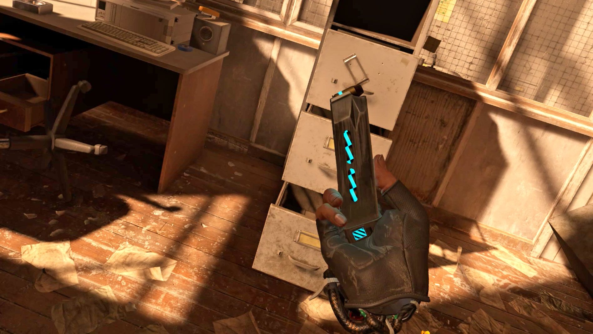
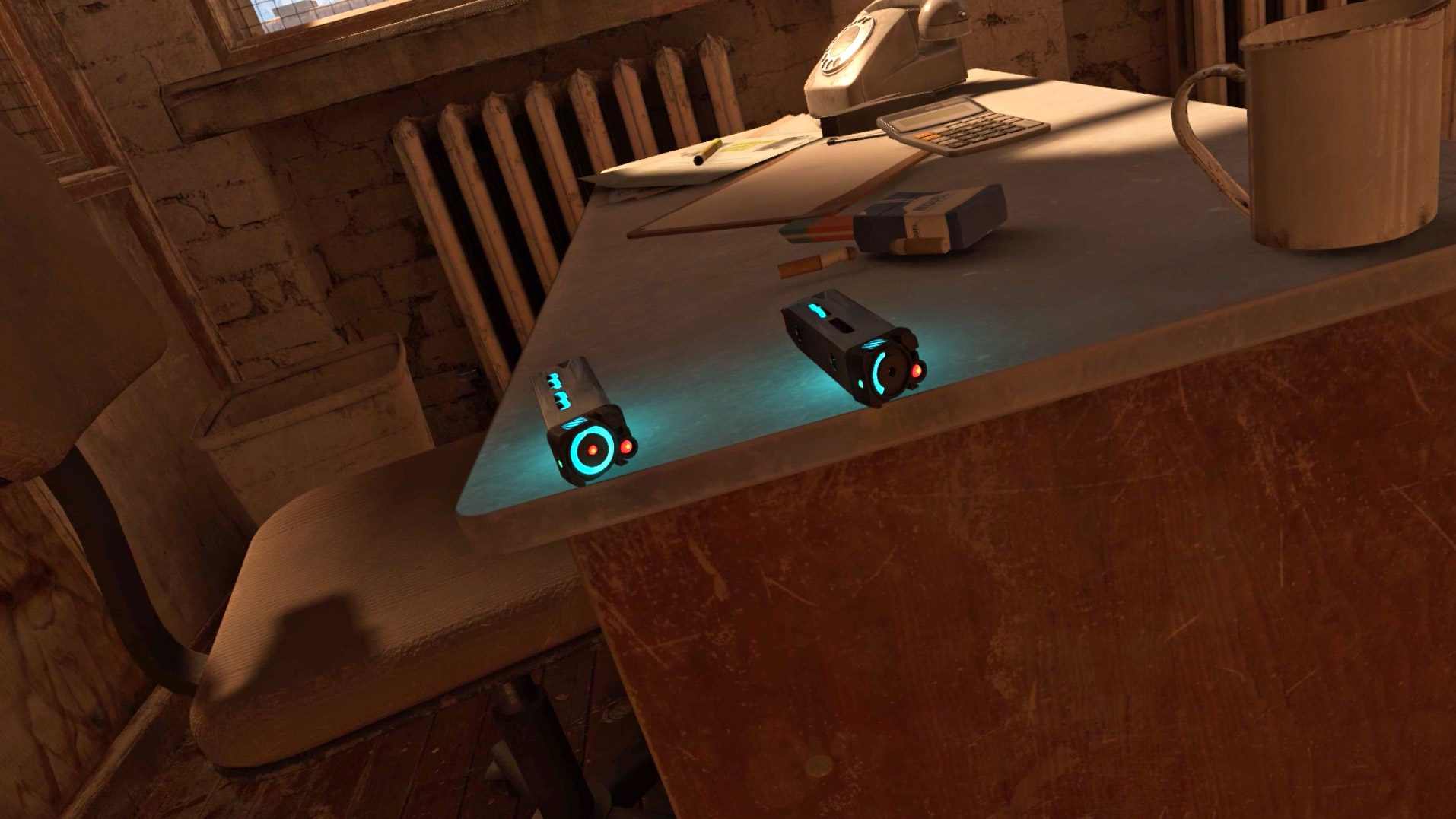
This week when I decided that the newly released Dungeons of Eternity looked good enough that I could convince my friends to give it a shot, that feeling of dread crept in again. I decided from the outset to keep journal of the experience because I knew there would be strife. There always is.

These Aren’t Novices

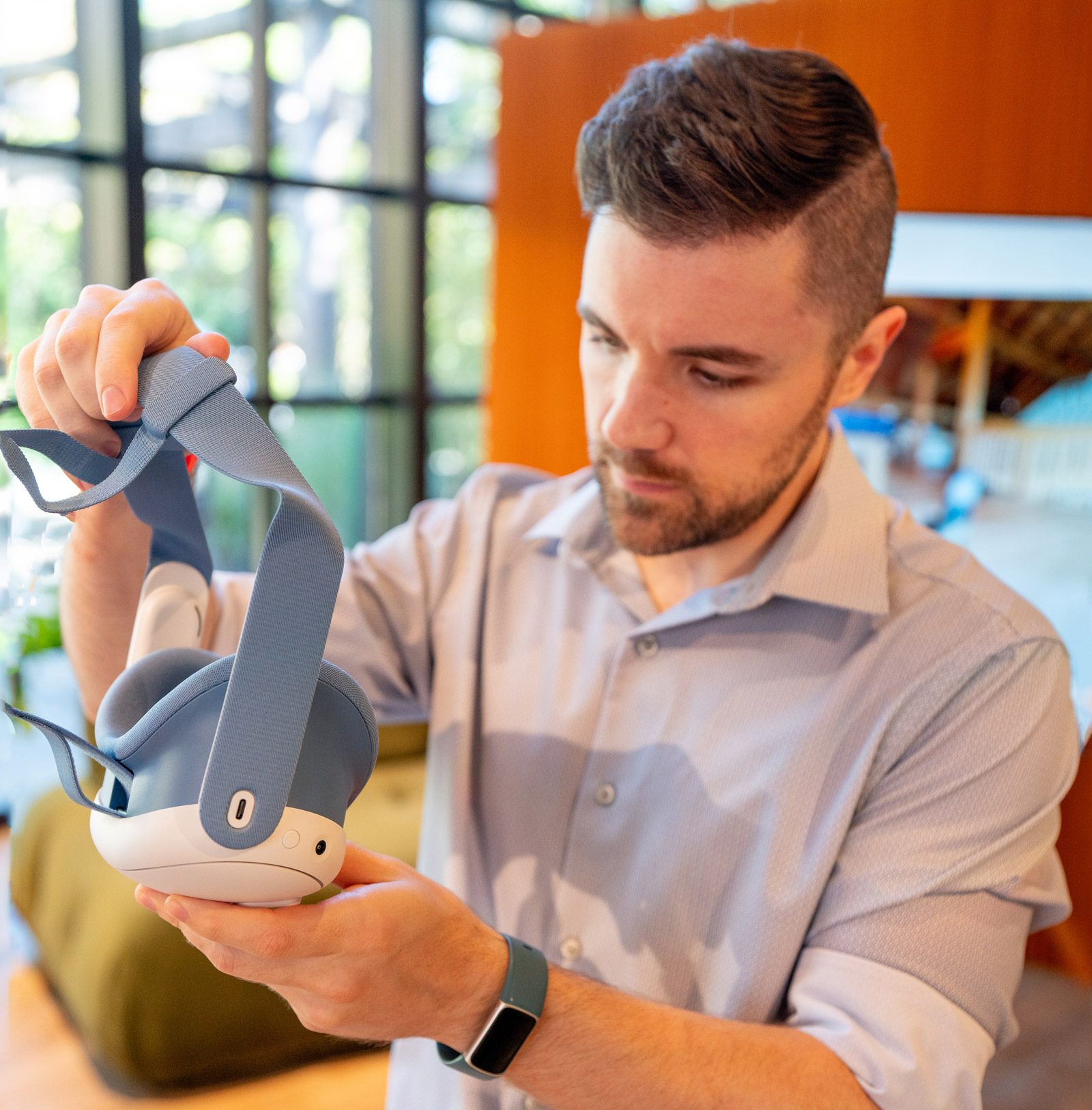
So let’s set the scene. I asked two of my good friends to play the game with me. Both are life-long hardcore gamers who own multiple consoles, have built their own PCs, and regularly seek out and play the latest non-VR games. Friend 1, let’s call him, has owned multiple PC VR headsets before getting Quest 2. On the other hand, Friend 2 got Quest 2 as their first VR headset.

Both have owned their Quest 2 for more than a year, but neither had used the headset in the last six months (after reading this journey you’ll understand why).

Imagine This, But Without Expert Guidance

And let’s be clear here. I’m a highly experience VR user and know the Quest headsets and their software inside and out. I knew there would be struggles for them, so I anticipated and offered to walk them through the process of getting everything set up. With me there, they skipped any amount of googling for solutions to the issues they encountered. No normal VR user gets the benefit of an expert holding their hand through the process. This is to say: the experience that you read here is the absolute best case scenario—and it was still a struggle.

I knew since they hadn’t used their Quests recently that the headsets would need to get plugged in charged, updated, and controller batteries replaced. I told them both from the outset to make sure this happened before our planned play session (had they not realized they needed their headsets updated, it would have meant our planned play session would have begun with at least 15 minutes of updates, restarts, and game installs). In anticipation of stumbles along the way, I got Friend 1 into voice chat to make the process as seamless as possible. Here’s how that went.

Put on his headset to update. Controllers weren’t working and neither was hand tracking.

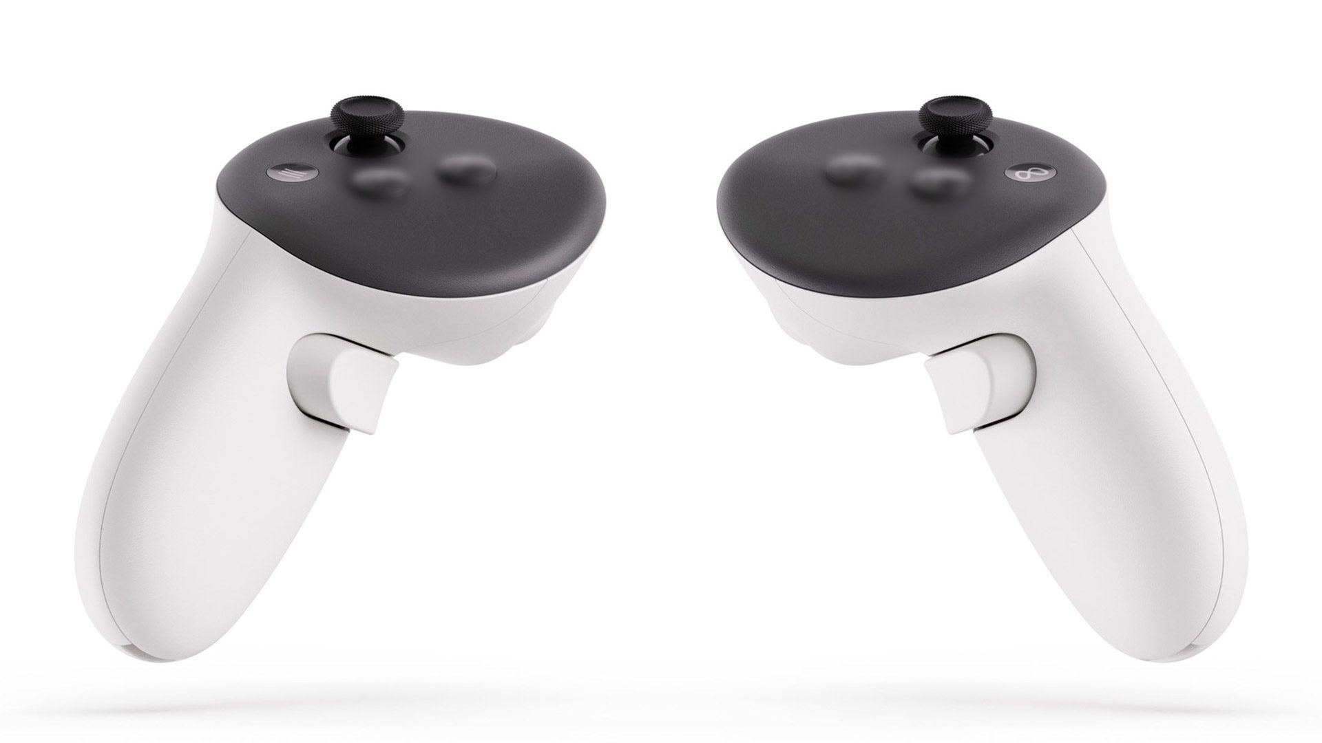
Fix: I walked him through the process of using the ‘cursor’ and ‘up volume’ button as a mouse click (an input modality most people in my experience don’t know exists on the headset). I had an inkling that hand-tracking might be disabled on his headset, so I told him to go to Settings and enable it.

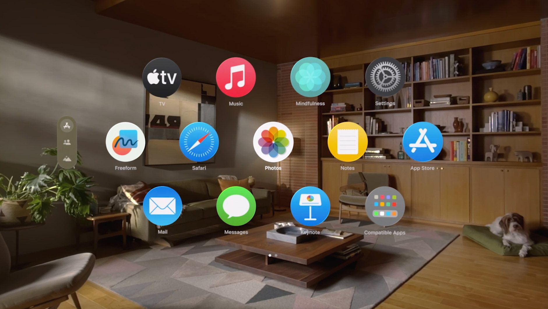
Didn’t know where to find settings.

Fix: Told him to “click on the clock” then hit Settings at the top right. Mind you, the Settings ‘button’ at the top right does not have any visual indication that it is in fact, a button. It easily could be mistaken for the label of the panel.

Didn’t know where to find hand-tracking option.

Fix: He wandered through multiple sections of the Settings until finding it

With hand-tracking enabled, it was easier to guide him to the Software Update section of the Settings and have him hit the ‘check for update’ button.

Headset updated and restarted, but controllers still weren’t working.

Fix: I guided him through the process of holding two buttons on the controller to make the power LED flash. Had to tell him where to find the LED on the upper ring of the controller (it’s invisible when not active). Concluded that batteries weren’t charged, so he replaced them.

Now he needed to install the game. He had already purchased it online but couldn’t find it in his headset.

Fix: I told him to find the Store search and pull up the game and click the install button.

As we were going through this process, Friend 1 asked me about Dungeons of Eternity: “is the multiplayer pretty seamless?” I told him I didn’t know because I hadn’t tried multiplayer yet. Drawing upon his past experiences of VR he responded, “I’m guessing the answer is no.”

Installed and Ready to Play, Right?

So we got through the process required just to get the game installed and ready to play. But the issues didn’t end there, and not just for Friend 1 but also for me.

I had the foresight to start a party call in the headset with both friends so we could be in constant communication if when things went wrong. If I hadn’t done this we would have ended up separated, communicating by text or phone while in the headset trying to get all of the following solved, and that would have been far worse.

But when I first sent the party call invite to both friends, Friend 2 joined and I could hear him for a few moments, but then I got dropped out of the call. Friend 1 said he never got a notification to join the call in the first place.

Ok, so I hung up the call and tried again. This time Friend 2 got in and we didn’t get dropped out, but Friend 2 still got no notification about the call. So I walked him through how to find the headset’s notification section, from which he was able to join the party call.

Ok so we’re talking. Now how to get my friends into the game with me? I opened the Quest menu and found my way to the party call where I was able to choose to bring the party to the game lobby. When I clicked the button to do so, both friends got a pop-up asking to travel to the game. “Awesome! Something is going to work!” I thought to myself.

Of course not. All three of us loaded into the game, but we weren’t connected together into a lobby. Ok, well at least we’re all in the game now, so let me try inviting them directly into the game instead of using the party travel system.

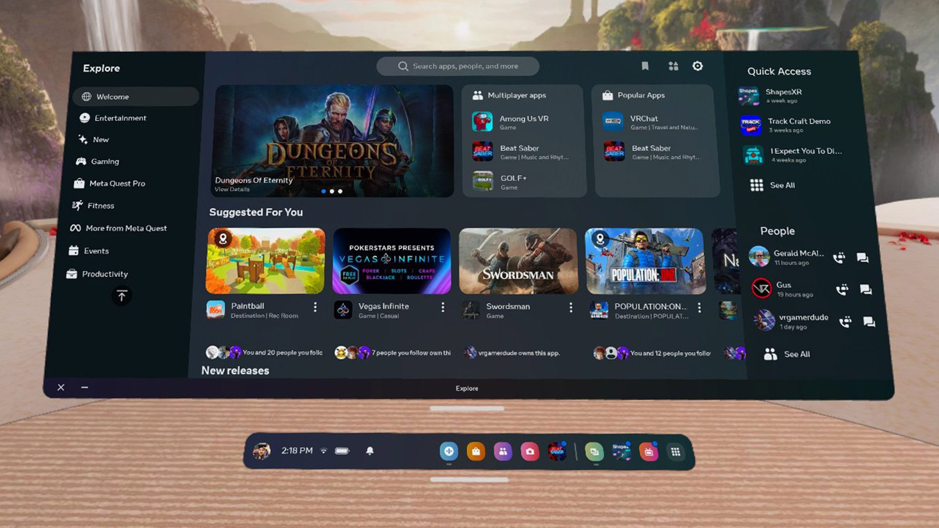
I opened the Quest menu, found the ‘invite’ button on the game panel, and when I clicked it, nothing appeared. I knew a list of friends should have appeared, but there was simply nothing. I backed out of the menu and tried again. Nothing appeared. This wasn’t even a blank page… just… air.

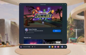
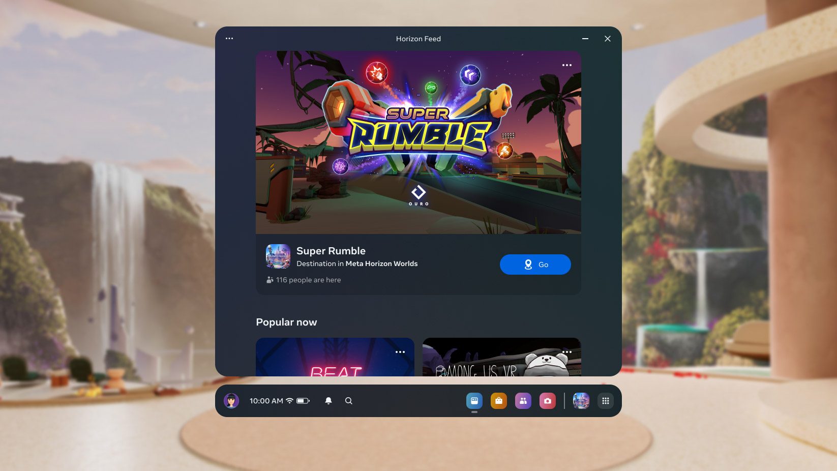
Attempting to invite my friends to the game. After the normal invite button was broken I searched for invite buttons elsewhere but didn’t find any | Note: While attempting to retrieve this video from my headset, the Gallery section of the Quest smartphone app bugged out and had to be force-quit before the video would appear.

At this point my friends were getting impatient just standing around in their uncomfortable headsets. So I tell them both to run through the tutorial separately, and we’d all meet up when that was done.

In the meantime, I tried going through the party call interface to pull up each friend’s Quest profile to see if I could invite them that way. This is very standard stuff for every other game platform… navigate to a friend’s profile and click an invite button. But I could only call or message them from there. I also went to the ‘People’ tab in the Quest menu to see if I could find them on my friends list and invite them that way. Nada.

Ok so I quit and relaunched the game. Upon trying the regular invite process again, the invite panel actually appeared!

Can We Play Yet?

They had finished their tutorials, so I sent them both an invite. And get this: it actually worked and they loaded into my lobby! Finally. Finally we’re going to play the game together.

If only.

I told them to drop out of our party chat so we could use in-game spatial audio. But they couldn’t hear me.

Eventually I saw an error pop up in the game, “attempt to login to voice chat timed out.”

Luckily I recalled that the first time I launched the game several days prior it had asked for permission to ‘record audio’. Since I had selected Solo Mode to play the game by myself, I didn’t initially understand why the game would want to ‘record audio’, so I reflexively denied the permission.

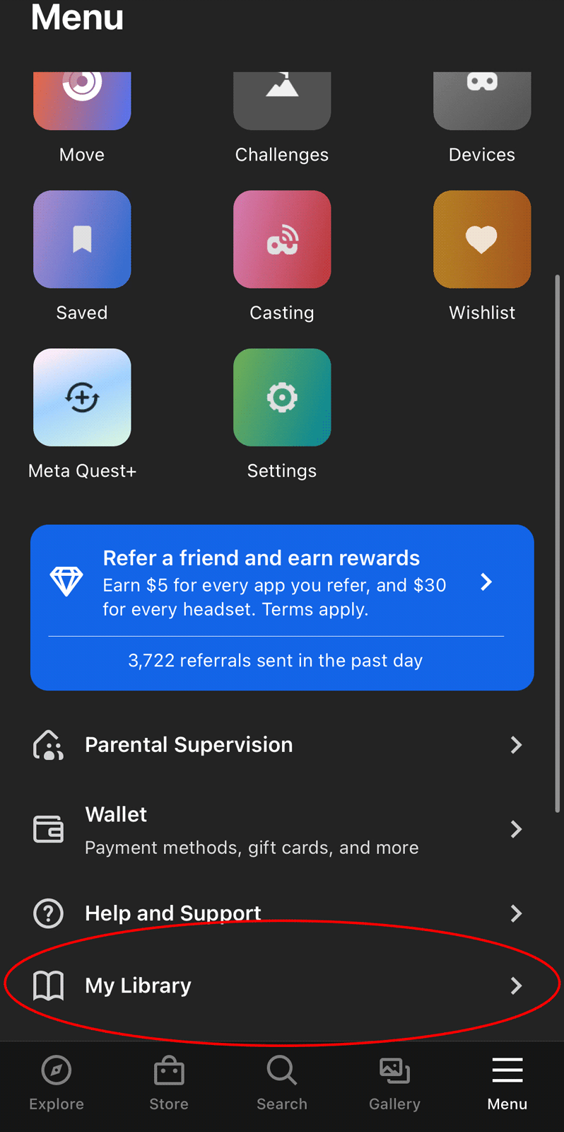
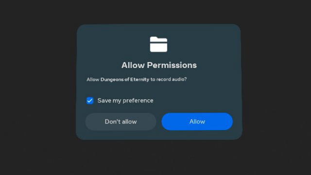
That meant when we tried to use in-game chat, it couldn’t connect me. Fixing this meant going into the Settings to find App Permissions, then toggle the microphone permission for the specific game.

Now you might think ‘oh that’s just user error you obviously should have accepted the permission in the first place.’

And yet… no. This was a contextless permission request that goes against every modern guideline. I had opened the game to play it solo, not even thinking of its multiplayer component at the time. The permission was requested after I selected ‘Solo Play’. Why would a game want to ‘record audio’ in a single player mode?

Not only was this the wrong time to ask for the permission, the permission itself is unclear. ‘Record audio’ is very different than ‘transmit your voice for multiplayer chat’. Had the permission asked with that added context, I might have better understood what it was asking and why, even though it had asked at the wrong time.

Ok so the permission is sorted out. Then I had to restart the game. Of course that meant I also had to re-invite them to my lobby. I braced myself for disappointment when I clicked the button for the invite menu… alas, it actually appeared.

Found the Fun

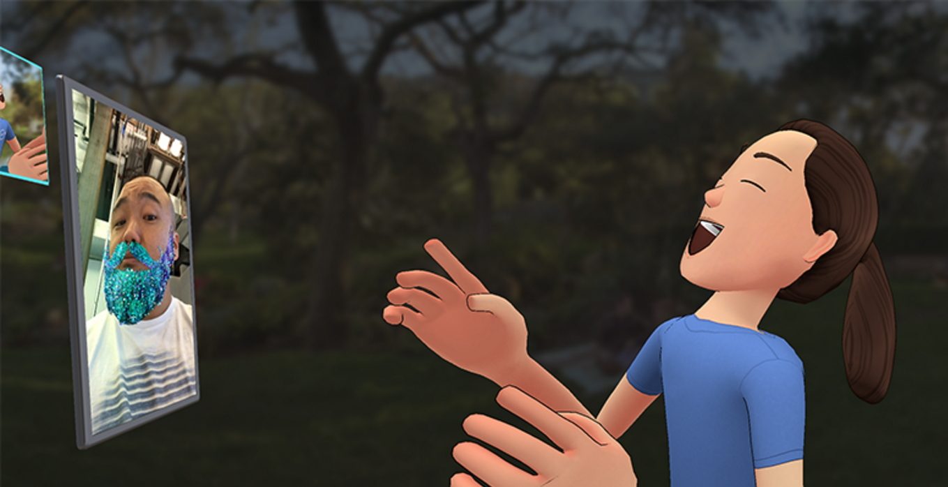
After all of that—maybe 20 or 30 minutes of trying to get it all to work—we were finally standing next to each other in VR and also able to hear one another.

Perhaps the most frustrating part of all of this is how much it hides the magic of VR.

Within minutes, maybe even less then one minute, from launching into a mission together we were laughing together and having an absolute blast just screwing around in the very first room of the very first tutorial mission. Multiplayer VR is magical like that, especially with good friends. But it can be so painful to get there.

And here’s the kicker. Even though we had a really fun time together, the repeated pain of finally getting to the fun burns into the subconscious like a scar that doesn’t go away. It had been more than six months since I was able to convince them to play a VR game together. The next time I ask them to play with me again, I won’t be surprised if they say ‘nah let’s play a flat gam’.

– – — – –

And last but not least, it’s important to point out here that I’m not just ripping on Quest. I’m not saying other VR platforms do social better. I’m saying Quest doesn’t do it well enough.


Am I alone in this or have you had your own nightmares trying to play VR with friends? Drop a line in the comments below.

I Tried to Play VR With Friends on Quest and it was a Nightmare (Again) Read More »

quest-3-review-–-a-great-headset-waiting-to-reach-its-potential

Quest 3 Review – A Great Headset Waiting to Reach Its Potential

Following Quest 2 almost three years to the day, Quest 3 is finally here. Meta continues its trend of building some of the best VR hardware out there, but it will be some time yet before the headset’s potential is fully revealed. Read on for our full Quest 3 review.

I wanted to start this review saying that Quest 3 feels like a real next-gen headset. And while that’s certainly true when it comes to hardware, it’ll be a little while yet before the software reaches a point that it becomes obvious to everyone. Although it might not feel like it right out of the gate, even with the added price (starting at $500 vs. Quest 2 at $300), I’m certain the benefits will feel worth it in the end.

Quest 3’s hardware is impressive, and a much larger improvement than we saw from Quest 1 to Quest 2. For the most part, you’re getting a better and cheaper Quest Pro, minus eye-tracking and face-tracking. And to put it clearly, even if Quest Pro and Quest 3 were the same price, I’d pick Quest 3.

Photo by Road to VR

Before we dive in, here’s a look at Quest 3’s specs for reference:

Resolution

2,064 × 2,208 (4.5MP) per-eye, LCD (2x)

Refresh Rate

90Hz, 120Hz (experimental)

Optics

Pancake non-Fresnel

Field-of-view (claimed) 110ºH × 96ºV
Optical Adjustments

Continuous IPD, stepped eye-relief (built in)

IPD Adjustment Range 53–75mm
Processor

Snapdragon XR2 Gen 2

RAM 8GB
Storage 128GB, 512GB
Connectors

USB-C, contact pads for optional dock charging

Weight 515g
Battery Life 1.5-3 hours
Headset Tracking

Inside-out (no external beacons)

Controller Tracking

Headset-tracked (headset line-of-sight needed)

Expression Tracking none
Eye Tracking none
On-board cameras 6x external (18ppd RGB sensors 2x)
Input

Touch Plus (AA battery 1x), hand-tracking, voice

Audio

In-headstrap speakers, 3.5mm aux output

Microphone Yes
Pass-through view Yes (color)
MSRP

$500 (128GB), $650 (512GB)

Hardware

Even if the software isn’t fully tapping the headset’s potential yet, Meta has packed a lot of value into the Quest 3 hardware.

Lenses

Photo by Road to VR

First, and perhaps most importantly, the lenses on Quest 3 are a generational improvement over Quest 2 and other headsets of the Fresnel-era. They aren’t just more compact and sharper, they also offer a noticeably wider field-of-view and have an unmatched sweet spot that extends nearly across the entire lens. That means even when you aren’t looking directly through the center of the lens, the world is still sharp. While Quest 3’s field-of-view is also objectively larger than Quest 2, the expanded sweet spot helps amplify that improvement because you can look around the scene more naturally with your eyes and less with your head.

Glare is another place that headsets often struggle, and there we also see a huge improvement with the Quest 3 lenses. Gone are the painfully obvious god-rays that you could even see in the headset’s main menu. Now only subtle glare is visible even in scenes with extreme contrast.

Resolution and Clarity

Quest 3 doesn’t have massively higher than Quest 2, but the combination of about 30% more pixels—3.5MP per-eye (1,832 × 1,920) vs. 4.5MP per-eye (2,064 × 2,208)—a much larger sweet spot, and a huge reduction in glare makes for a headset with significantly improved clarity. Other display vitals like persistence blur, chromatic aberration, pupil swim, mura, and ghosting are all top-of-class as well. And despite the increased sharpness of the lenses, there’s still functionally no screen-door effect.

Here’s a look at the resolving power of Quest 3 compared to some other headsets:

Headset Snellen Acuity Test
Quest 3 20/40
Quest Pro 20/40
Quest 2 20/50
Bigscreen Beyond 20/30
Valve Index 20/50

While Quest 3 and Quest Pro score the same here in terms of resolving power, the Snellen test lacks precision; I can say for sure the Quest 3 looks a bit sharper than Quest Pro, but not enough to get it into the next Snellen tier.

While the optics of Quest 3 are also more compact than most, the form-factor isn’t radically different than Quest 2. The slightly more central center-of-gravity makes the headset feel a little less noticeable during fast head rotations, but on the whole the visual improvements are much more significant than ergonomic.

Ergonomics

Photo by Road to VR

Ergonomics feels like one of just a few places where Quest 3 doesn’t see many meaningful improvements. Even though it’s a little more compact, it weighs about the same as Quest 2, and its included soft strap is just as awful. So my recommendation remains: get an aftermarket strap for Quest 3 on day one (and with a battery if you know you’re going to use the headset often). Meta’s official Elite Strap and Elite Strap with Battery are an easy choice but you can find options of equal comfort that are more affordable from third-parties. FYI: the Elite Straps are not forward or backward compatible between Quest 2 and 3.

While the form-factor of the headset haven’t really improved, it’s ability to adapt to each user certainly has. Quest 3 is the most adaptable Meta headset to date, offering both continuous IPD (distance between the eyes) and notched eye-relief (distance from eye to lens) adjustments. This means that more people can dial in a good fit for the headset, giving them the best visual comfort and quality.

I was about to write “to my surprise…”—but actually this doesn’t surprise me at this point given Meta’s MO—the setup of Quest 3 either didn’t walk me through adjusting either of these settings or did so in such a nonchalant way that I didn’t even notice. Most new users will not only not know what IPD or eye-relief really does for them, but also struggle to pick their own best setting. There should definitely be clear guidance and helpful calibration.

The dial on the bottom of Quest 3 makes it easy to adjust the IPD, but the eye-relief mechanism is rather clunky. You have to push both buttons on the inside of the facepad at the same time and kind of also pull it out or push it forward. It works but I found it to be incredibly iffy.

Field-of-View

In any case, I’m happy to report that eye-relief on Quest 3 is more than just a buffer for glasses. Moving to the closest setting gave me a notably wider field-of-view than Quest 2. Here’s a look at the Quest 3 FoV:

Personal Measurements – 64mm IPD

(no glasses, measured with TestHMD 1.2)

Absolute min eye-relief (facepad removed) Min designed eye-relief Comfortable eye-relief Max eye-relief
HFOV 106° 104° 100° 86°
VFOV 93° 93° 89° 79°

And here’s how it stacks up to some other headsets:

Personal Measurements – 64mm IPD

(minimum-designed eye-relief, no glasses, measured with TestHMD 1.2)

Quest 3 Quest Pro Quest 2 Bigscreen Beyond Valve Index
HFOV 104° 94° 90° 98° 106°
VFOV 93° 87° 92° 90° 106°

Audio

Another meaningful improvement for Quest 3 is improved built-in audio. While on Quest 2 I always felt like I needed to have the headset at full volume (and even then the audio quality felt like a compromise), Quest 3 gets both a volume and quality boost. Now I don’t feel like every app needs to be at 100% volume. And while I’d still love better quality and spatialization from the built-in audio, Quest 3’s audio finally feels sufficient rather than an unfortunate compromise.

Controllers

Photo by Road to VR

Quest 3’s new Touch Plus controllers so far feel like they work just as well as Quest 2 controllers, but with better haptics and an improved form-factor thanks to the removal of the ring. Quest 3 is also much faster to switch between hand-tracking and controller input when you set the controllers down or pick them up.

Processor

The last major change is the new Snapdragon XR2 Gen 2 chip that powers Quest 3. While ‘XR2 Gen 1’ vs. ‘XR2 Gen 2’ might not sound like a big change, the difference is significant. The new chip has 2.6x the graphical horsepower of the prior version, according to Meta. That’s a leap-and-a-half compared to the kind of chip-to-chip updates usually seen in smartphones. The CPU boost is more in line with what we’d typically expect; Meta says it’s 33% more powerful than Quest 2 at launch, alongside 30% more RAM.

Quest 3 is still essentially a smartphone in a headset in terms of computing power, so don’t expect it to match the best of what you see on PSVR 2 or PC VR, but there’s a ton of extra headroom for developers to work with.

Continue Reading on Page 2: Softwhere? »

Quest 3 Review – A Great Headset Waiting to Reach Its Potential Read More »

the-biggest-announcements-at-meta-connect-and-what-it-all-means-for-the-future-of-xr

The Biggest Announcements at Meta Connect and What it All Means for the Future of XR

Meta Connect 2023 has wrapped up, bringing with it a deluge of info from one of the XR industry’s biggest players. Here’s a look at the biggest announcements from Connect 2023, but more importantly, what it all means for the future of XR.

Last week marked the 10th annual Connect conference, and the first Connect conference after the Covid pandemic to have an in-person component. The event originally began as Oculus Connect in 2014. Having been around for every Connect conference, it’s amazing when I look around at just how much has changed and how quickly it all flew by. For those of you who have been reading and following along for just as long—I’m glad you’re still on this journey with us!

So here we are after 10 Connects. What were the big announcements and what does it all mean?

Meta Quest 3

Obviously, the single biggest announcement is the reveal and rapid release of Meta’s latest headset, Quest 3. You can check out the full announcement details and specs here and my hands-on preview with the headset here. The short and skinny is that Quest 3 is a big hardware improvement over Quest 2 (but still being held back by its software) and it will launch on October 10th starting at $500.

Quest 3 marks the complete dissolution of Oculus—the VR startup that Facebook bought back in 2014 to jump-start its entrance into XR. It’s the company’s first headset to launch following Facebook’s big rebrand to Meta, leaving behind no trace of the original and very well-regarded Oculus brand.

Apples and Oranges

On stage at Connect, Meta CEO Mark Zuckerberg called Quest 3 the “first mainstream mixed reality headset.” By “mainstream” I take it he meant ‘accessible to the mainstream’, given its price point. This was clearly in purposeful contrast to Apple’s upcoming Vision Pro which, to his point, is significantly less accessible given its $3,500 price tag. Though he didn’t mention Apple by name, his comments about accessibility, ‘no battery pack’, and ‘no tether’ were clearly aimed at Vision Pro.

Mixed Marketing

Meta is working hard to market Quest 3’s mixed reality capabilities, but for all the potential the feature has, there is no killer app for the technology. And yes, having the tech out there is critical to creating more opportunity for such a killer app to be created, but Meta is substantially treating its developers and customers as beta testers of this technology. The ‘market it and they will come’ approach that didn’t seem to pan out too well for Quest Pro.

Personally I worry about the newfangled feature being pushed so heavily by Meta that it will distract the body of VR developers who would otherwise better serve an existing customer base that’s largely starving for high-quality VR content.

Regardless of whether or not there’s a killer app for Quest 3’s improved mixed reality capabilities, there’s no doubt that the tech could be a major boon to the headset’s overall UX, which is in substantial need of a radical overhaul. I truly hope the company has mixed reality passthrough turned on as the default mode, so when people put on the headset they don’t feel immediately blind and disconnected from reality—or need to feel around to find their controllers. A gentle transition in and out of fully immersive experiences is a good idea, and one that’s well served with a high quality passthrough view.

Apple, on the other hand, has already established passthrough mixed reality as the default when putting on the headset, and for now even imagines it’s the mode users will spend most of their time in. Apple has baked this in from the ground-up, but Meta still has a long way to go to perfect it in their headsets.

Augments vs. Volumes

Image courtesy Meta

Several Connect announcements also showed us how Meta is already responding to the threat of Apple’s XR headset, despite the vast price difference between the offerings.

For one, Meta announced ‘Augments’, which are applets developers will be able to build that users can place in permanently anchored positions in their home in mixed reality. For instance, you could place a virtual clock on your wall and always see it there, or a virtual chessboard on your coffee table.

This is of course very similar to Apple’s concept of ‘Volumes’, and while Apple certainly didn’t invent the idea of having MR applets that live indefinitely in the space around you (nor Meta), it’s clear that the looming Vision Pro is forcing Meta to tighten its focus on this capability.

Meta says developers will be able to begin building ‘Augments’ on the Quest platform sometime next year, but it isn’t clear if that will happen before or after Apple launches Vision Pro.

Microgrestures

Augments aren’t the only way that Meta showed at Connect that it’s responding to Apple. The company also announced that its working on a system for detecting ‘microgestures’ for hand-tracking input—planned for initial release to developers next year—which look awfully similar to the subtle pinching gestures that are primarily used to control Vision Pro:

Again, neither Apple nor Meta can take credit for inventing this ‘microgesture’ input modality. Just like Apple, Meta has been researching this stuff for years, but there’s no doubt the sudden urgency to get the tech into the hands of developers is related to what Apple is soon bringing to market.

A Leg Up for Developers

Meta’s legless avatars have been the butt of many-a-joke. The company had avoided the issue of showing anyone’s legs because they are very difficult to track with an inside-out headset like Quest, and doing a simple estimation can result in stilted and awkward leg movements.

Image courtesy Meta

But now the company is finally adding leg estimation to its avatar models, and giving developers access to the same tech to incorporate it into their games and apps.

And it looks like the company isn’t just succumbing to the pressure of the legless avatar memes by spitting out the same kind of third-party leg IK solutions that are being used in many existing VR titles. Meta is calling its solution ‘generative legs’, and says the system leans on tracking of the user’s upper body to estimate plausibly realistic leg movements. A demo at Connect shows things looking pretty good:

It remains to be seen how flexible the system is (for instance, how will it look if a player is bowling or skiing, etc?).

Meta says the system can replicate common leg movements like “standing, walking, jumping, and more,” but also notes that there are limitations. Because the legs aren’t actually being tracked (just estimated) the generative legs model won’t be able to replicate one-off movements, like raising your knee toward your chest or twisting your feet at different angles.

Virtually You

The addition of legs coincides with another coming improvement to Meta’s avatar modeling, which the company is calling inside-out body tracking (IOBT).

While Meta’s headsets have always tracked the player’s head and hands using the headset and controllers, the rest of the torso (arms, shoulders, neck) was entirely estimated using mathematical modeling to figure out what position they should be in.

For the first time on Meta’s headsets, IOBT will actually track parts of the player’s upper body, allowing the company’s avatar model to incorporate more of the player’s real movements, rather than making guesses.

Specifically Meta says its new system can use the headset’s cameras to track wrist, elbows, shoulders, and torso positions, leading to more natural and accurate avatar poses. The IOBT capability can work with both controller tracking and controller-free hand-tracking.

Both capabilities will be rolled into Meta’s ‘Movement SDK’. The company says ‘generative legs’ will be coming to Quest 2, 3, and Pro, but the IOBT capability might end up being exclusive to Quest 3 (and maybe Pro) given the different camera placements that seem aimed toward making IOBT possible.

Calm Before the Storm, or Calmer Waters in General?

At Connect, Meta also shared the latest revenue milestone for the Quest store: more than $2 billion has been spent on games an apps. That means Meta has pocketed some $600 million from its store, while the remaining $1.4 billion has gone to developers.

That’s certainly nothing to sneeze at, and while many developers are finding success on the Quest store, the figure amounts to a slowdown in revenue momentum over the last 12 months, one which many developers have told me they’d been feeling.

The reason for the slowdown is likely a combination of Quest 2’s age (now three years old), the rather early announcement of Quest 3, a library of content that’s not quite meeting user’s expectations, and a still struggling retention rate driven by core UX issues.

Quest 3 is poised for a strong holiday season, but with its higher price point and missing killer app for the heavily marketed mixed reality feature, will it do as well as Quest 2’s breakout performance in 2021?

Continue on Page 2: What Wasn’t Announced »

The Biggest Announcements at Meta Connect and What it All Means for the Future of XR Read More »

hands-on:-quest-3-is-an-impressive-leap-that’s-still-held-back-by-software-struggles

Hands-on: Quest 3 is an Impressive Leap That’s Still Held Back by Software Struggles

Quest 3 is an impressive leap in hardware, especially in the visual department, but it continues Meta’s tradition of building great hardware that feels held back by its software.

Update (September 27th, 2023):  Fixed the link to the second page at the bottom of this page.

After months of teasing and leaks, Quest 3 is finally, officially, fully announced. Pre-orders start today at $500 and the headset ships on October 10th. While you can get the full specs and details right here, the overall summary is that the headset is an improvement over Quest 2 nearly across the board:

  • Better lenses
  • Better resolution
  • Better processor
  • Better audio
  • Better passthrough
  • Better controllers
  • Better form-factor

The improvements really add up. The biggest improvement is in the visuals, where Meta finally paired the impressive pancake optics from Quest Pro with a higher resolution display, resulting in a significantly sharper image than Quest 2 that has industry-leading clarity with regards to sweet spot, glare, and distortion.

Quest 3 has two LCD displays, giving it 4.6MP (2,064 × 2,208) resolution per-eye, compared to Quest 2 with 3.5MP (1,832 × 1,920) resolution per-eye. And even though that isn’t a massive leap in resolution, the upgraded lenses are so much sharper and it makes a huge difference compared to just the number of pixels.

Photo by Road to VR

Quest 3 also has an improved IPD (distance between your eyes) function and range. A dial on the headset gives it a continuous adjustment between 58–70mm. Given the eyebox of the optics, Meta officially says the headset is suitable for any IPD between 53–75mm. And because each eye has its own display, adjusting the IPD the the far edges doesn’t sacrifice any field-of-view.

Beyond the IPD upgrade, Quest 3 is the first Quest headset with an eye-relief adjustment, which allows you to move the lenses closer or further from your space. As a notched adjustment that can move between four different positions, it’s a little funky to adjust, but it’s a welcomed addition. Ostensibly this will make the headset more adjustable for glasses users, but as someone who tends to benefit from lower eye-relief, I hope that the nearest adjustment goes far enough.

Between the upgraded IPD adjustment and eye-relief, Quest 3 is the most adjustable Quest headset so far, which means more people can dial into the optimal optical position.

Quest 3 has a slightly modified rear strap, but it’s still a soft strap in the end. A deluxe strap and deluxe strap with battery will be available (Quest 2 deluxe straps are unfortunately not forward-compatible) | Image courtesy Meta

Holistically speaking, Quest 3 has the best display system of any headset on the market to date.

The only major things that haven’t improved over Quest 2 are the default headstrap, battery life, and weight, which are all about the same. The biggest benefit of the new optics is their performance, but their more compact form also means the weight of the headset sits a little closer to your face which makes it feel a little lighter and less bulky.

Powered Up

Photo by Road to VR

When Quest 3 is firing on all cylinders—including software that’s well-optimized for its performance envelope—you’ll wonder how you ever got by with the visuals afforded by Quest 2.

Take Red Matter 2, for instance, which was already one of the best-looking games on Quest 2. Developer Vertical Robot put together a demo app, which lets you instantly switch back and forth between the game’s Quest 2 visuals and newly enhanced Quest 3 visuals, and the difference is staggering. This video gives an idea but doesn’t quite show the full impact of the visual improvements that you feel in the headset itself:

Not only are textures significantly sharper, the extra processing power also allowed the developers to add high-resolution real-time shadows which make a big difference to how grounded the virtual world feels around you.

However, the exceptionally well-optimized Red Matter 2 is a rare exception compared most apps available on the platform. Walking Dead: Saints & Sinners, for instance, looks better on Quest 3… but still pretty rough with blotchy textures and shimmering aliased shadows.

And this was an example that Meta specifically showed to highlight Quest 3’s improved processing power…. And yes, the Walking Dead example shows that the developers used some of the extra power to put more enemies on screen. But the question here is, what good is a phone call if you are unable to speak what good is better optical performance if the textures aren’t matching them in the first place?

So while Quest 3 offers the potential for significantly improved visuals, the reality is that many apps on the platform won’t benefit as much from it as they could, especially in the near-term as developers continue to prioritize optimizing their games for Quest 2 because it will have the larger customer base for quite some time. Optimization (or lack thereof) is a systemic issue that is more complicated to address than just ‘throw more processing power at it’.

Quest 3 is the first headset to debut with Qualcomm’s Snapdragon XR2 Gen 2 chip, which claims up to 2.5 times the graphical performance of XR 2 Gen 1, and up to 50% better efficiency between identical workloads | Photo by Road to VR

But as we all know, graphics aren’t everything. Some of the most fun games on the Quest platform aren’t the best looking out there.

But when I say that software is holding back the headset, more than half of that sentiment is driven not by the visuals of apps and games, but by the headset’s overall UI/UX.

This applies to all Quest headsets, of course, but the platform’s obtuse and often buggy interface hasn’t seen the same kind of consistent improvements that the hardware itself has seen from Quest 1 to Quest 3—which is a shame. The friction between a player’s idea of wanting to do something in the headset and how seamless (or not) it is to put on the headset and do that thing is deeply connected to how often and how long they’ll actually enjoy using the headset.

Meta has given no indication that it even acknowledges the deficiency of the Quest UI/UX. With the release of Quest 3, on the interface specifically, it doesn’t seem like it will make any meaningful changes on that front. In terms of UX at least, there’s two general improvements:

Passthrough

Photo by Road to VR

Quest 3’s passthrough view is a big leap over the low-res black-and-white passthrough of Quest 2. Now with full color and higher resolution, passthrough on Quest 3 feels more like something you can use all the time (granted, I haven’t had enough time with the headset to tell if the passthrough latency is low enough to prevent motion discomfort over long periods, which was a problem for me on Quest Pro).

And while it isn’t clear to me if the software will enable passthrough by default (as it should), being able to easily see a reasonably high quality view outside of the headset is a notable UX improvement.

Not only does it make users feel less disconnected from their environment when putting on the headset (until they’re actually ready to be immersed in the content of their choice), it also makes it easier to glance at the real world without removing the headset entirely. That’s useful for talking to someone else in the room or looking to make sure a pet (or child) hasn’t walked into your playspace.

I was surprised to see that with the newly added depth sensor there’s still warping around your hands, but overall the passthrough image is much sharper and has better dynamic range. Unlike Quest Pro, I was able to at least roughly read the time and some notifications on my phone—an important part of not feeling completely disconnected from the world outside the headset.

This also opens the door to improving the flow of putting on the headset in the first place; if passthrough is enabled by default, Meta should encourage users to put on the headset first, then find their controllers (instead of awkwardly trying to fit the headset with controllers already in their hands). And when the session is over, hopefully they turn on passthrough and instruct people to put down their controllers first, then remove the headset. These are the kinds of UX details the company tends to miss entirely… but we’ll see.

Room Scanning

The other real UX improvement coming with Quest 3 could be automatic room scanning, which automatically creates a playspace boundary for users instead of making them create their own. I say “could be” because I didn’t have enough time in my hands-on with this feature to tell how quickly and reliably it works. More testing to come.

Similar to implementations we’ve seen on other headsets, the room scanning feature encourages users to look around their space, giving the headset time to build a map of the geometry in the room. With enough of the space scanned, a playspace boundary will be created. The same system can also be used to establish the position of walls, floors, and other geometry that can be used in mixed reality applications.

Paid Parking

Also worth mentioning is the optional (and fairly expensive) official Quest 3 dock. Keeping the headset and controllers powered, updated, and ready to go is a big challenge when it comes to VR friction. Having a dedicated place to put your headset and controllers that also charges them is definitely a boon to the UX.

Photo by Road to VR

This feels like something that should really be part of the package, but you’ll have to pay an extra $130 for the privilege. Hopefully we’ll see more affordable Quest 3 docks from third-parties in the near future.

Continue on Page 2: Marketing Reality »

Hands-on: Quest 3 is an Impressive Leap That’s Still Held Back by Software Struggles Read More »

bigscreen-beyond-–-promising-but-incomplete,-just-like-this-review

Bigscreen Beyond – Promising but Incomplete, Just Like This Review

Bigscreen Beyond is the most interesting and promising new dedicated PC VR headset to come out in years, and while there’s a lot to like, we’re still waiting on a key piece that will make or break the headset.

Bigscreen Beyond has one goal in mind: make the smallest possible headset with the highest possible image quality.

Generally speaking, this unlikely headset (born from a VR software startup, after all) has ‘pulled it off.’ It’s an incredibly compact VR headset with built-in SteamVR tracking. It feels like a polished, high-end product with a look and feel that’s all its own. The visuals are great, though not without a few compromises. And it delivers something that no other headset to date has: a completely custom facepad that’s specially made for each customer.

I’ll dig more into the visual details soon, but first I need to point out that Bigscreen Beyond missing something important: built-in audio.

While there’s an official deluxe audio strap on the way, as of right now the only way to use Bigscreen Beyond is with your own headphones. In my case that means a pair of wireless gaming headphones connected to my PC. And it also means another thing to put on my head.

For some headsets this would be a notable but not deal-breaking inconvenience, for Bigscreen Beyond, however, it’s amplified because the headset’s custom-fit facepad means absolutely zero light leakage. It wasn’t until I started using Beyond that I realize just how often I use the nose-gap in the bottom of most headsets to get a quick glimpse into the real world, whether that’s to grab controllers, make sure I didn’t miss an important notification on my phone, or even pick up a pair of headphones.

With no nose-gap and no passthrough camera, you are 100% blind to the real world when you put on Beyond. Then you need to feel around to find your headphones. Then you need to feel around for your controllers.

Oops, something messed up on your PC and you need to restart SteamVR? Sure, you can lift the headset to your forehead to deal with it in a pinch, but then you put it back down and realize you got some oil on the lenses from your hair or forehead. So now you need to wipe the lenses… ok, let me put down the controllers, take off the headphones, take off the headset, wipe the lenses, then put on the headset, feel around for my headphones, then feel around for my controllers. Now I want to fix my headstrap… oops the headphones are in the way. Let me take those off for a minute…

All of this and more was the most frustrating part of an otherwise quite good experience when using Beyond. And sure, I could use wireless earbuds or even external speakers. But both have downsides that don’t exist with a built-in audio solution.

Photo by Road to VR

A lack of built-in audio on a VR headset just feels like a huge step back in 2023. It’s a pain in the ass. Full stop.

Until we have the upcoming deluxe audio strap to pair with Beyond, it feels incomplete. We’re patiently waiting to get our hands on the strap—as it will really make-or-break the headset—and plan to update our review when that time comes. Bigscreen says it expects the deluxe audio start to be available sometime in Q4.

Bigscreen Beyond Review

With the audio situation in the back of our minds, we can certainty talk about the rest of the headset. Before we dive in, here’s a look at the tech specs for some context:

Bigscreen Beyond Specs

Resolution 2,560 × 2,560 (6.5MP) per-eye

microOLED (2x, RGB stripe)
Pixels Per-degree (claimed) 32
Refresh Rate 75Hz, 90Hz
Lenses Tri-element pancake
Field-of-view (claimed) 102° diagonal
Optical Adjustments IPD (fixed, customized per headset)

eye-relief (fixed, customized per facepad)
IPD Adjustment Range 53–74mm (fixed, single IPD value per device)
Connectors DisplayPort 1.4, USB 3.0 (2x)
Accessory Ports USB 2.0 (USB-C connector) (1x)
Cable Length 5m
Tracking SteamVR Tracking 1.0 or 2.0 (external beacons)
On-board Cameras None
Input SteamVR Tracking controllers
On-board Audio None
Optional Audio Audio Strap accessory, USB-C audio output
Microphone Yes (2x)
Pass-through view No
Weight 170–185g
MSRP $1,000
MSRP (with tracking & controllers) $1,580

And here’s where it fits into the landscape of high-end PC VR headsets from a pricing standpoint:

Bigscreen Beyond Varjo Aero Vive Pro 2 Reverb G2 Valve Index
Headset Only $1,000 $1,000 $800 $500
Full Kit $1,580 $1,580 $1,400 $600 $1,000

Smaller Than it Looks

Bigscreen Beyond is an incredibly unique offering in a landscape of mostly much larger and much bulkier PC VR headsets. Beyond is even smaller than it looks in photos. In fact, it’s so small that it nearly fits inside other VR headsets.

Getting it so small required that the company individually create custom-fit facepads for each and every customer. Doing so involves using an app to 3D scan your face, which is sent to the company and used as the blueprint to make the facepad that ships with your headset. At present the face scan is only supported on iOS devices (specifically iPhone XR or newer) which means anyone without access to such a device can’t even order the headset.

And this isn’t an illusion of customization, the company isn’t just picking from one of, say, 5 or 10 facepad shapes to find the one that most closely fits your face. Each facepad is completely unique—and the result is that it fits your face like a glove.

Photo by Road to VR

That means zero light leakage (which can be good for immersion, but problematic for the reasons described above). The headset is also dialed in—at the hardware level—for your specific IPD, based on your face scan.

Eyebox is Everything

If there’s one thing you should take away from this review it’s that Bigscreen Beyond has very good visuals and is uniquely conformable, but getting your eyes in exactly the correct position is critical for a good experience.

The eyebox (the optimal optical position relative to the lenses) is so tight that even small deviations can amplify artifacts and reduce the field-of-view. In any other headset it would be far too small to make the headset even a viable product, but Beyond’s commitment to custom-fit facepads makes it possible because they have relatively precise control over where the customer’s pupil will sit.

The first facepad the company sent me fit my face well, but the headset’s sweet spot (the clarity across lens) felt so tight that it made the already somewhat small field-of-view feel even smaller—too small for my taste. But by testing the headset without any facepad, I could tell that having my eyes closer would give me a notably better visual experience.

When I reached out to the company about this, they sent back a newly made facepad, this time with and even tighter eye-relief. This was the key to opening up the headset’s field-of-view, sweet spot, and improving some other artifacts just enough to the point that it didn’t feel too much of a sacrifice next other headsets.

Here’s a look at my field-of-view measurements for Bigscreen Beyond (with the optimal facepad), next to some other PC VR headsets. While the field-of-view only increased slightly from the first facepad to the second, the improvement in the sweet spot was significant.

Personal Measurements – 64mm IPD

(minimum-comfortable eye-relief, no glasses, measured with TestHMD 1.2)

Bigscreen Beyond Varjo Aero Vive Pro 2 Reverb G2 Valve Index
Horizontal FOV 98° 84° 102° 82° 106°
Vertical FOV 90° 65° 78° 78° 106°

It’s sort of incredible that moving from the first facepad to the second made such an improvement. At most, the difference in my pupil position between the two facepad was likely just a handful of milimeters. But the headset’s eye-box is just so tight that even small deviations will influence the visual experience.

Comfort & Visuals

Photo by Road to VR

With the ideal facepad—and ignoring the annoyance of dealing with an off-board audio solution—Bigscreen beyond felt like I jumped a few years forward into the future of headsets. It’s tiny, fits my face perfectly, the OLED displays offer true blacks, and the resolution is incredibly sharp with zero evidence of any screen-door-effect (unlit space between pixels).

While it does feel like you give up some field-of-view compared to other headsets, and there’s notable glare, the compact form-factor and light weight really makes a big difference to wearability.

With most VR headsets today I find myself adjusting them slightly on my head every 10 or 15 minutes to relieve pressure points and stay comfortable over a longer period. With Beyond, I found myself making those adjustments far less often, or not at all in some sessions. When playing over longer periods you just don’t notice the headset nearly as much as others, and you’re even less likely to have the occasional bonk on the headset from your flailing controllers, thanks to its much smaller footprint.

Brightness vs. Persistence

While Beyond’s resolution is very good—with resolving power that I found about equal to Varjo’s Aero headset—the default brightness level (100) leads to more persistence blur than I personally think is reasonable. Fortunately Bigscreen makes available a simple utility that lets you turn down brightness in favor of lower persistence blur.

I found that dialing it down to 50 was roughly the optimal balance between brightness and persistence for my taste. This level keeps the image sharp during head movement, but leaves dark scenes truly dark. Granted you can adjust the brightness on the fly if you really want.

Of course this will be content dependent, and Bigscreen is ostensibly tuning the headset with an eye toward movie viewing (considering their VR app is all about movie watching), where persistence blur wouldn’t be quite as bad because you move your head considerably less while watching a movie vs. playing a VR game.

Clarity

While Beyond doesn’t have Fresnel lenses, its pancake optics still end up with a lot of glare in high contrast scenes. I’d say it’s not quite as bad as what you get with most Fresnel optics, but it’s still quite notable. While Fresnel lenses tend to create ‘god rays’ which emanate from specific objects in the scene, Beyond’s pancake optics create glare that’s appears less directly attached to what’s in the scene.

Beyond the issues noted so far, other visual factors are all top notch: no pupil swim, geometric distortion, or chromatic aberration (again, this is all highly dependent on how well your facepad fits, so if you see much of the above, you might want to look into the fit of the headset).

Continue on Page 2: Bigscreen Beyond Review Summary »

Bigscreen Beyond – Promising but Incomplete, Just Like This Review Read More »

new-quest-update-reimagines-the-landing-page,-once-again-sequestering-your-app-library

New Quest Update Reimagines the Landing Page, Once Again Sequestering Your App Library

Instead of taking you right to your library of installed apps, Meta is making yet another perplexing change to the Quest landing page in v57.

Since the earliest days of Meta’s VR platform, the company has been seemingly obsessed with not putting your library of VR apps front-and-center.

Instead the first thing you see when you put on a headset from the company, or launch its companion smartphone app, is some kind of dynamic ‘feed’ with content you weren’t looking for in the first place.

The Ever Changing ‘Explore’ Page

For a long time when putting Quest on your head Meta made you look at ‘Explore’, an algorithmically-curated assortment of disparate content that was not your library of installed apps.

The current Explore landing page | Photo by Road to VR

Seemingly forever unhappy that people don’t love the Explore page, Meta has constantly reimagined it over the years, changing the layout what seems like every six months. I swear every time I’m finally used to it, it changes.

And once again, it will change.

In the newest Quest v57 update Meta is replacing the Explore landing page with a new and freshly confusing ‘Horizon Feed’, which is also not your library of installed apps.

Sensibly, you might think the Horizon Feed would contain only content from Horizon Worlds, acting as a sort of portal for you to jump into the company’s miniverse. But no, apparently in Horizon Feed you’ll find all manner of games, apps, and of course, Reels!

The new Horizon Feed landing page | Image courtesy Meta

Yes, Reels… the company’s short-form 2D video content that’s designed for quick and casual viewing on a smartphone. Certainly when I put on my headset that’s what I want to see—not my library of installed apps.

Below the Fold

Even the headset’s companion smartphone app, the ‘Meta Quest’ app, doesn’t want to make it easy to access your library of installed apps. Instead, the first thing you see when you launch the app is a smattering of algorithmically-curated content—a feed of course—that you weren’t looking for when you put your headset on in the first place.

Did you know that you can actually remotely launch VR apps on Quest right from the smartphone app? It’s incredibly convenient.

Or it could be, but most people don’t even know that’s possible because to even find your library of installed apps you need to launch the smartphone app, click ‘Menu’ (the last option on the toolbar), then scroll down below the fold to finally find ‘My Library’. Counting from the top of the page, it’s the 17th item down the list of Menu items. It has moved progressively further and further down the page down the years.

Those apps you hand-picked, bought, and installed? Oh yeah, they’re down here on the last page.

Literally ‘Parental Supervision’ and ‘Help and Support’ are placed higher on the list than your library of installed apps.

Does Meta really think that Parental Supervision (something which doesn’t even apply to many users), and Help and Support (how often do you think people need help for this product), should be easier to reach than the user’s library of installed apps?

Feed Me

I guess we shouldn’t be surprised that Meta has an obsession with algorithmically-curated feeds. It’s the thing that defines the company’s core products (ie: Facebook, Instagram), and small changes to their feed algorithm can have major influence over how long people stay on those platforms and how much they engage.

But here’s the core problem with Meta’s feed obsession. While casual and even mindless scrolling is the norm on smartphones—devices which can be engaged and disengaged with in a matter of seconds—this couldn’t be further from the truth for VR headsets.

Anyone putting on a VR headset already has a damn good reason to bother putting it on in the first place.

They already know what they want to do; getting between them and that thing is just compromising the user experience. If you want to hit them with a feed, do it after they’re done with the thing they intended to do in the first place. And while you’re at it… maybe instead of hiding their library of installed apps—you know, the content they hand-picked and paid for—why not make it easier for the user to launch them in the first place so it’s easier for them to return?

Now of course people at Meta are reading this and saying ‘we’ve got all these stats that show that people really click on the stuff in the feed!’ I’m sure you do… and it’s because that’s the thing you’re constantly putting in front of their face.

Metrics will lead you astray if you aren’t measuring the right things. You’d better believe that friction—the process of putting on the headset and getting to the thing you actually want to do—is and has long been one of VR’s biggest issues. If that’s not what you’re optimizing for (these feeds certainly aren’t) then you’re just crippling the overall user experience.

It’s the people that don’t come back to the headset that you should be most carefully observing, not looking to see if you can steer someone to a different piece of content after they’ve already decided to put the headset on.

Vision Pro shows your apps right when you put on the headset… how novel | Image courtesy Apple

Standing in stark contrast to Meta’s approach is Apple Vision Pro. When you put on the headset, what’s the very first thing you see? Your library of installed apps.

New Quest Update Reimagines the Landing Page, Once Again Sequestering Your App Library Read More »

why-nintendo-hasn’t-made-a-real-vr-headset-yet

Why Nintendo Hasn’t Made a Real VR Headset Yet

There’s a rumor going around that Nintendo is making a VR headset in partnership with Google. The rumor is still unconfirmed, but when the world’s oldest extant gaming company finally thinks it’s time to make a dedicated XR device, you know it’s going to be something special. Having seen how far the technology has come though, it raises a question: why hasn’t Nintendo made a VR headset yet?

Nintendo basically has a singular MO, and it does it well: create broadly accessible hardware to serve as a vehicle for its exclusive swath of family friendly games. Ok, it’s more complicated than that, but it’s a good starting point to understand why Nintendo hasn’t made a proper VR headset yet, and probably won’t for some time yet to come.

Wait. Didn’t Nintendo have that Virtual Boy thing in the ’90s? And what about Labo VR for Switch? Those were VR headsets, right? Yes, and no. Or rather, no and kind of (in that order). I’ll get to those in a bit.

In short, the reason Nintendo hasn’t made a real VR platform like Meta Quest has a lot to do with risk aversion, since the company generally prefers to wait until technologies are more mature and have proven market potential. Over the years, Nintendo has also become increasingly reliant on big singular projects which, while not always exactly cutting-edge, have allowed it to comfortably exist outside of the PlayStation and Xbox binary.

Lateral Thinking with ‘Withered’ Technology

Much of Nintendo’s market strategy can be attributed to Gunpei Yokoi, the prolific Nintendo designer best known for pioneering the company’s handheld segment. Yokoi is credited with designing Nintendo’s first handheld, Game & Watch, which at its 1980 launch made use of the cheap and abundant liquid crystal displays and 4-bit microcontrollers initially conceived for calculators. Among many other accomplishments, Yokoi is credited with designing Gameboy, creating the D-pad, and producing both Metroid and Kid Icarus. His last project before leaving the company in 1996: Virtual Boy. More on that later.

Yokoi’s career at Nintendo spanned 31 years, covering its transformation from the then nearly century-old Japanese playing card company to worldwide video gaming powerhouse. His philosophy, mentioned in his Japan-only book ‘Gunpei Yokoi Game Hall’ (横井軍平ゲーム館), sums up the sort of thinking that vaulted Nintendo to the world stage; Yokoi coined the phrase “lateral thinking with withered technology,” outlining the company’s strategy of using mature technology which is both cheap and well understood, and then finding novel and fun ways of applying it to games. That’s basically been the case from Game & Watch all the way to Switch and Switch Lite.

And it’s not just handhelds though. Nintendo consoles don’t tend to focus on cutting-edge specs either (as any former Wii owners can attest). For Nintendo console owners across the years, it’s more about being able to play games from a host of recognizable franchises such as Mario, Zelda, Smash Bros, Pokémon, Pikmin, and Animal Crossing. Since the success of Wii, it’s also been about creating new types of games centered around novel input schemes, like how the Wiimote lets you bowl in Wii Sports, or how Joy-Cons let you grove on-the-go in Just Dance. In short, Nintendo is really good at serving people with what they’re already used to and baking in novelty that owners can engage with or equally ignore.

Virtual Boy Failure, Labo VR Experiment

When Nintendo sticks to its principles, we usually get a DS, Switch, Gameboy, Wii, Game Boy Advance, 3DS, NES, SNES, Game & Watch, Nintendo 64—10 of the top 20 bestselling video game platforms in history. When they don’t, we get Virtual Boy.

Accounts hold that Yokoi was rushed to finish up work on Virtual Boy so the company could focus on the launch of Nintendo 64, which is partially why it failed. Timed right at the peak of the ’90s craze, Nintendo released what essentially was no more than a 3D version of Gameboy—a 32-bit tabletop standalone console that just so happened to have stereoscopic displays, making it no more a VR headset than Nintendo 3DS. Besides relying on some objectively useless stereoscopy, being shaped like a headset, and having ‘Virtual’ in the name, that’s where the comparisons between it and virtual reality stop.

Image courtesy Evan-Amos, Wiki Commons

Note: Every time someone refers to Virtual Boy as a VR headset, or pretends to wear it like one in a YouTube thumbnail, I scream into an empty paint bucket, hoping the residual fumes will calm my nerves.

There was no head tracking, motion controllers, or even games that wouldn’t have played equally as well on a standard Gameboy. Moreover, its red monochrome displays were criticized for giving players eye strain, nausea, and headaches during gameplay. Its awkward tabletop stand also didn’t articulate enough to adjust to each user’s height, making users strain their necks to play. The nail in the coffin: it was priced at $180 at launch in 1995, just $20 less than Nintendo 64 which arrived one year later and promised to deliver true 3D graphics (something which Virtual Boy couldn’t do, despite supporting stereoscopy!).

Still, I don’t think Nintendo tied Virtual Boy’s failure to the larger failure of VR at the time, but rather recognized what happens when it innovates in the wrong direction and abandons its core principles. Nintendo’s successive handhelds focused on keeping the pocketable form-factor, and typically offered a generation or two of backwards compatibility so consumers could easily upgrade. Gameboys to follow were truly portable, and offered all of the games you wanted to play on the bus, train, plane, wherever.

But what about Nintendo Labo VR for Switch? Well, it was a pretty awesome experiment when it was first released in 2019. The DIY accessory pack made of cardboard actually got Nintendo involved in VR for the first time, and it did it with the same family friendly flair the company seems to bring to everything it does.

Image courtesy Nintendo

It’s a fun little kit that uses Joy-Cons in some unique ways, but with only a few high-quality native VR ‘taster’ experiences to play with, it’s basically a one-and-done deal that Nintendo critically hasn’t iterated on beyond its initial release despite a generally good reception from its target market.

Granted, Nintendo did provide Labo VR support for a number of first-party titles, including Super Smash Bros Ultimate, Super Mario Odyssey, and The Legend of Zelda: Breath of the Wild, but this just provides basic 3D viewer support, and doesn’t convert these games into any sort of full VR experience.

To boot, Labo VR actually has Unity support, meaning third-party developers can create games and experiences for it; the fact is the headset and slot-in Switch form-factor just isn’t built for long-term play like a standalone or PC VR headset though. It’s front-heavy, doesn’t have a strap, and just isn’t the basis of a modern VR platform. It’s a toy more than a platform.

Switching It Up with One Big Platform

The big question is: when? When will Nintendo feel like VR is mature enough to enter in full force with something like a standalone headset, replete with a host of beloved Nintendo franchise games? If past performance predicts future outcomes, it’s pretty unlikely we’ll be seeing such a device in the near term.

The company has spent the better part of the last decade recovering from the failure of Wii U, the company’s least successful video game console to date (next to Virtual Boy). Going headfirst into the XR niche soon with a dedicated hardware release doesn’t seem plausible given how focused the company has become on melding both handheld and console product development with Switch.

Fun Labo VR adds-on aside, Nintendo has expressed some skepticism of VR in the past. Speaking to TIME, Nintendo’s Shigeru Miyamoto said in 2014 that VR just wasn’t the sort of broadly accessible player experience the company was trying to crack with Wii U:

“When you think about what virtual reality is, which is one person putting on some goggles and playing by themselves kind of over in a corner, or maybe they go into a separate room and they spend all their time alone playing in that virtual reality, that’s in direct contrast with what it is we’re trying to achieve with Wii U. And so I have a little bit of uneasiness with whether or not that’s the best way for people to play.”

Granted, the technology has changed a great deal since 2014, the same year Oculus Rift DK2 came out. With mixed reality passthrough becoming a standard on standalone headsets such as Quest 3 and Apple Vision Pro, Nintendo would be crazy not keep tabs on the technology, albeit with same hesitation it has mostly shown in the past with its adoption of cutting-edge technology.

Nintendo VR patent | Image courtesy USPTO, via Levelup

In fact, the company is actively creating patents around mixed reality systems that focus on cooperative gameplay using players both in and out of a headset. Above is one such patent from 2022 showing a multiplayer game based on some sort of proposed tabletop platformer.

Unlike a lot of the tech companies out there trying to spin up multiple products and maintain large, interconnected platforms, Nintendo’s main MO is to gamble on one big thing that will probably come with additional functions and a few input quirks. Whether that’s some sort of additional headset peripheral or not… you never know. In the end, the more inclusive nature of mixed reality may change some minds over at Nintendo, although you can bet whatever comes next from the Japanese gaming company will be another experiment, or similar add-on that uses mature hardware in a new and different way.

– – — – –

What is certain is Nintendo isn’t in any rush, as both hardware and software sales of traditional games still far outweigh VR games. Still, you can’t help but wonder what a Nintendo headset might look like, and what a full-throated XR release from Nintendo would do for generations of kids (and adults) to come.

Why Nintendo Hasn’t Made a Real VR Headset Yet Read More »