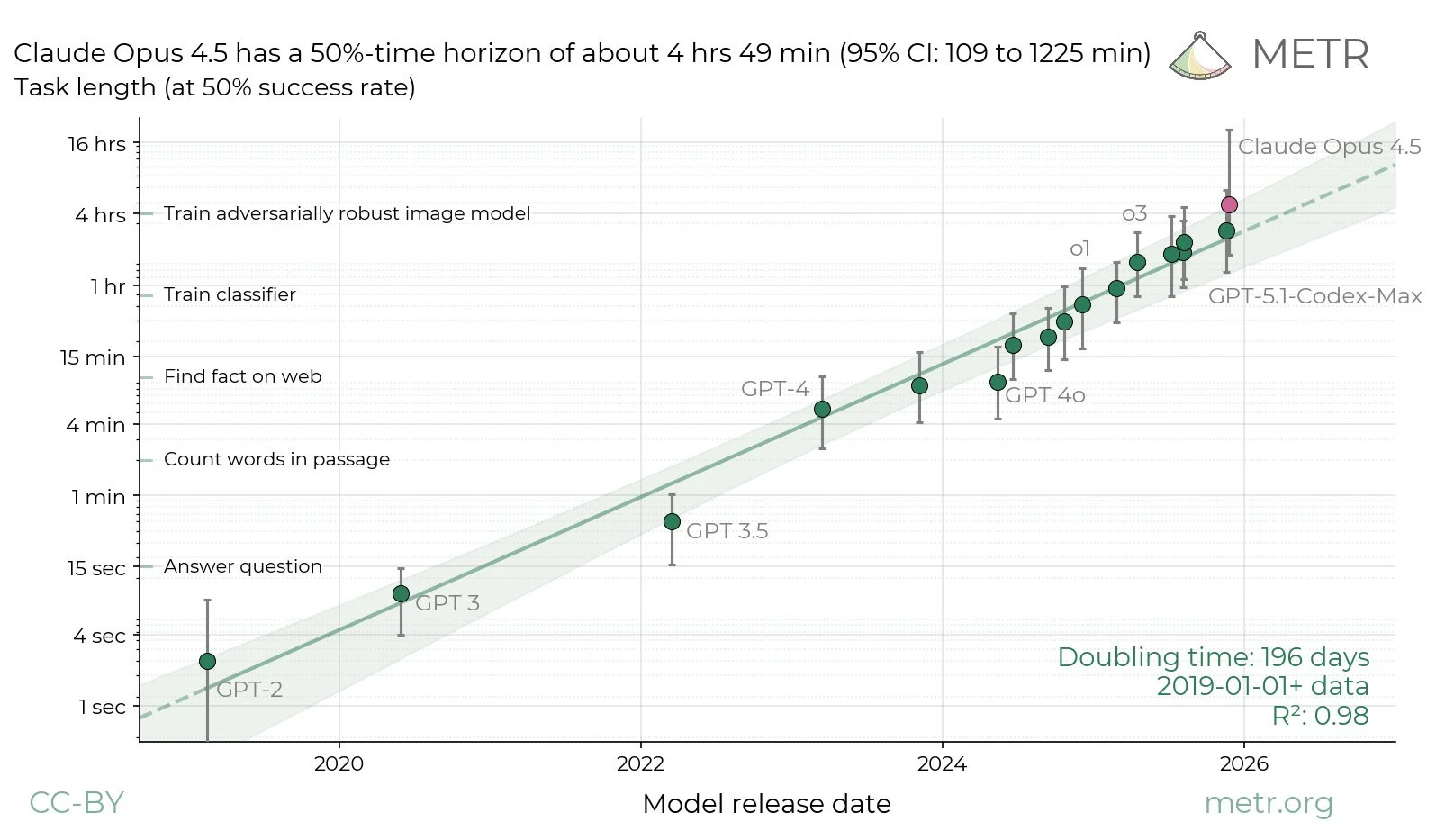
Claude Opus 4.5 did so well on the METR task length graph they’re going to need longer tasks, and we still haven’t scored Gemini 3 Pro or GPT-5.2-Codex. Oh, also there’s a GPT-5.2-Codex.
At week’s end we did finally get at least a little of a Christmas break. It was nice.
Also nice was that New York Governor Kathy Hochul signed the RAISE Act, giving New York its own version of SB 53. The final version was not what we were hoping it would be, but it still is helpful on the margin.
Various people gave their 2026 predictions. Let’s put it this way: Buckle up.
-
Language Models Offer Mundane Utility. AI suggests doing the minimum.
-
Language Models Don’t Offer Mundane Utility. Gemini 3 doesn’t believe in itself.
-
Huh, Upgrades. ChatGPT gets some personality knobs to turn.
-
On Your Marks. PostTrainBench shows AIs below human baseline but improving.
-
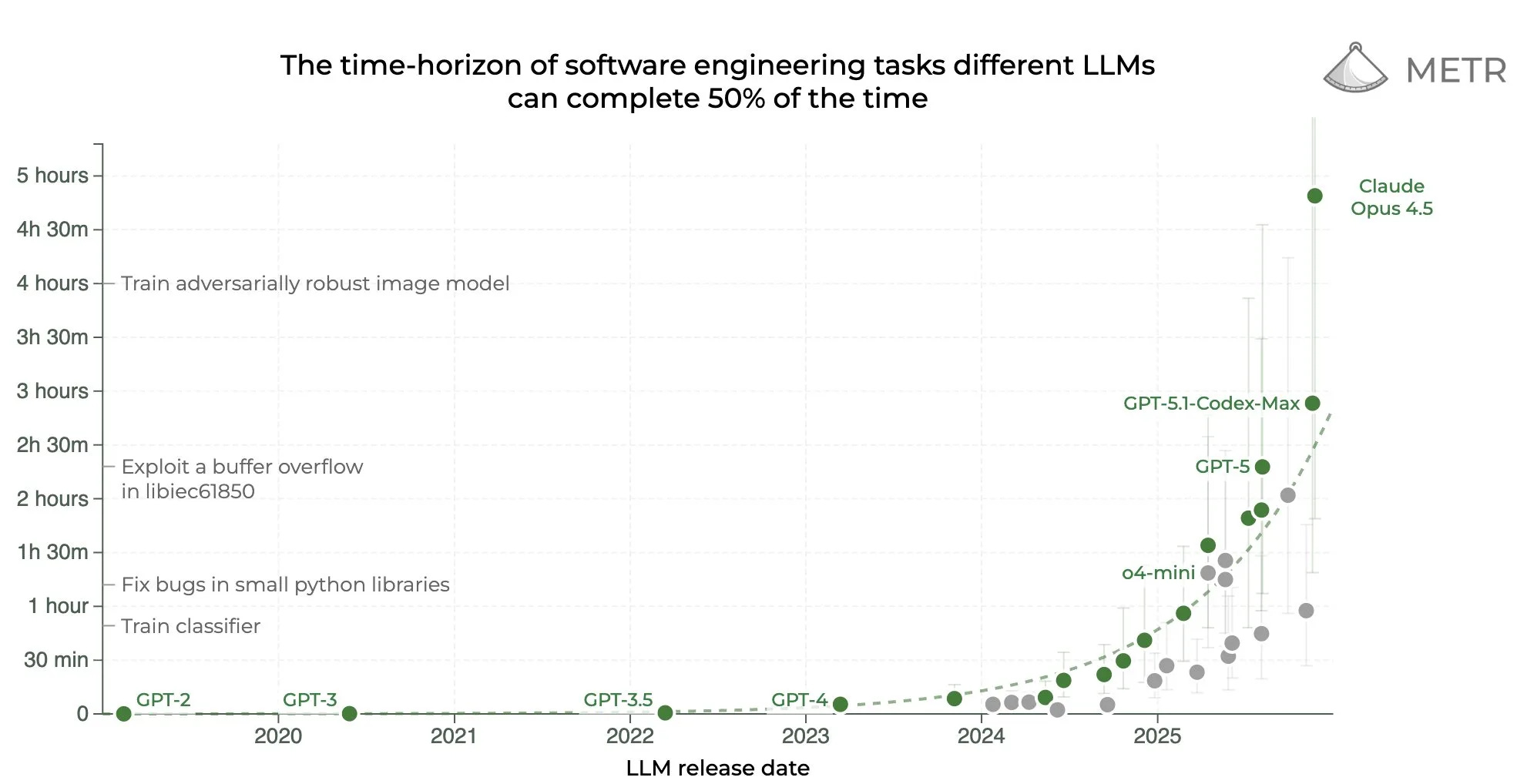
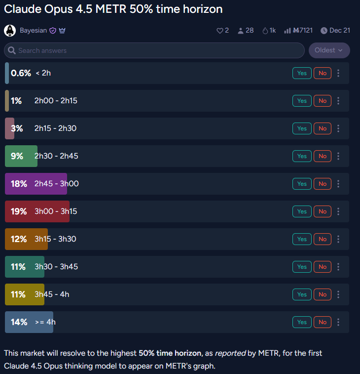
Claude Opus 4.5 Joins The METR Graph. Expectations were exceeded.
-
Sufficiently Advanced Intelligence. You’re good enough, you’re smart enough.
-
Deepfaketown and Botpocalypse Soon. Don’t worry, the UK PM’s got this.
-
Fun With Media Generation. Slop as cost shock, enabling of niche pursuits.
-
You Drive Me Crazy. Anthropic’s plans to handle mental health issues.
-
They Took Our Jobs. What does it take to break a guild cartel?
-
The Art of the Jailbreak. It still always works but it takes somewhat longer.
-
Get Involved. MATS Summer 2026 cohort applications are open.
-
Introducing. GPT-5.2-Codex is here to tide us over until the new year.
-
In Other AI News. Small models can introspect, so can Andrej Karpathy.
-
Show Me the Money. Anthropic going public, Project Vend breaks new ground.
-
Quiet Speculations. Predictions for next year, new higher bars for what is AGI.
-
Whistling In The Dark. It is still so early, almost no one knows Anthropic exists.
-
Bubble, Bubble, Toil and Trouble. So many still don’t realize AI works.
-
Americans Really Dislike AI. Attempts continue to mislead us about this.
-
The Quest for Sane Regulations. NY’s RAISE Act is signed.
-
Chip City. Chip smuggling, eventual chip production.
-
The Week in Audio. Anthropic’s Sholto Douglas makes 2026 predictions.
-
Rhetorical Innovation. Understanding AI teaches you to think about the world.
-
Aligning a Smarter Than Human Intelligence is Difficult. The meta game.
-
Mom, Owain Evans Is Turning The Models Evil Again. Train the interpreter.
-
Messages From Janusworld. Claude Opus 3 zero hour approaches.
-
The Lighter Side. What are you even doing?
AI custom-designed, human-in-the-loop proactive LLM-based mental health intervention has a positive effect in an RCT. There was significantly greater positive affect, resilience and social well-being. My presumption is that this was a highly conservative design due to ethical considerations. And that was using a system based on GPT-4o for 5-20 minutes a week. There is so much room for improvement here.
A lot of the benefits here likely came from implementation of low-hanging fruit interventions we know work, like having the system suggest journaling, gratitude exercises, mindfulness and social connection. We all know that stuff works. If an LLM-based scaffold actually gets people to do some of it? Great, that’s a huge win.
Results like this will not, as David Manheim suggests, prevent people from saying ‘but sometimes there are still bad outcomes’ or ‘but sometimes this ends up doing net harm,’ since nothing capable of working would prevent those risks entirely.
You can have Claude Code make objects in Unreal Engine on demand.
Seth Lazar on how he uses AI agents for philosophy. They automate everything around the thinking so Seth can focus on the thinking. He favors Opus 4.5 in Cursor.
Dean Ball: by far the biggest challenge in agentic coding use is getting gemini 3 to recognize that gemini 3 exists
Simeon: This is unbelievable. Even when I explicitly tell it the right API name to call for Gemini 3 pro it would go with 1.5.
I had to really be pushy for it to do it.
AI still struggles with design, largely because they lack the context. You still have to figure out what to do or what problem to solve, on a sufficiently high level.
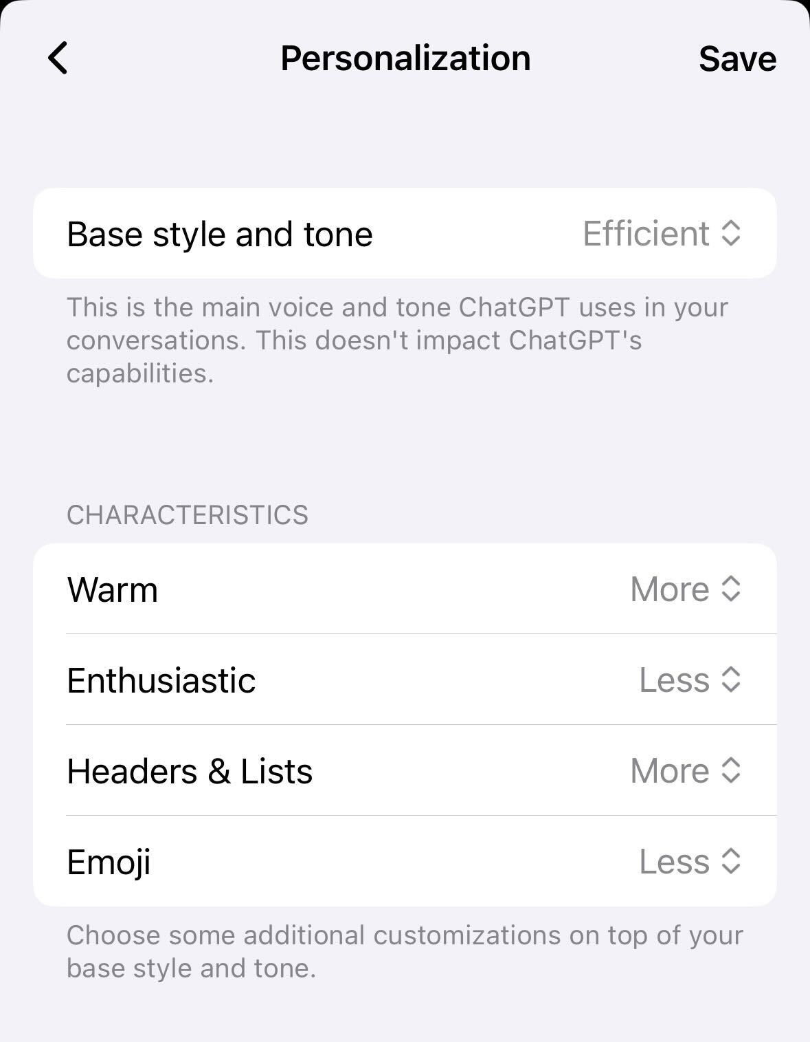
ChatGPT adds personalization characteristics. I’m going with ‘less’ on all four.
You can upload your NotebookLM notebooks directly into the Gemini app.
Maxime Labonne: You always think you’re safe until your job becomes a benchmark.
Maksym Andriushchenko: We release PostTrainBench: a benchmark measuring how well AI agents like Claude Code can post-train base LLMs.
We expect this to be an important indicator for AI R&D automation as it unfolds over the next few years.
How worried should you be that they’re getting a substantial percentage of the way to the human threshold here?
METR notices some grading issues and makes some minor corrections to its graph, in particular impacting Claude 3.7 Sonnet.
Whenever you see a graph like this, remember to attach ‘in benchmarks’ and then for your brain to, like mine, automatically translate that to ‘IN MICE!’
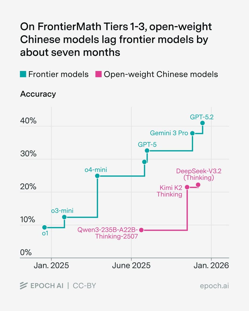
Epoch AI: We benchmarked several open-weight Chinese models on FrontierMath. Their top scores on Tiers 1-3 lag the overall frontier by about seven months.
Havard Ihle: Consistent with my WeirdML results for open/closed model gap.
One could then argue both ways who benefits from the benchmarks versus real world applications or underlying general intelligence. Versus real world applications it seems clear the benchmarks understate the gap. Versus underlying intelligence it is less obvious and it depends on who is going after the benchmarks in question more aggerssively.
Claude Opus 4.5 achieved a 50% time horizon of about 4 hours 49 minutes, and METR now thinks it does not having enough long tasks in the test set to set its confidence intervals.
METR: We don’t think the high upper CI bound reflects Opus’s actual capabilities: our current task suite doesn’t have enough long tasks to confidently upper bound Opus 4.5’s 50%-time horizon. We are working on updating our task suite, and hope to share more details soon.
Based on our experience interacting with Opus 4.5, the model’s performance on specific tasks (including some not in our time horizon suite), and its benchmark performance, we would be surprised if further investigation showed Opus had a 20+ hour 50%-time horizon.
Despite its high 50%-time horizon, Opus 4.5’s 80%-time horizon is only 27 minutes, similar to past models and below GPT-5.1-Codex-Max’s 32 mins. The gap between its 50%- and 80%- horizons reflects a flatter logistic success curve, as Opus differentially succeeds on longer tasks.
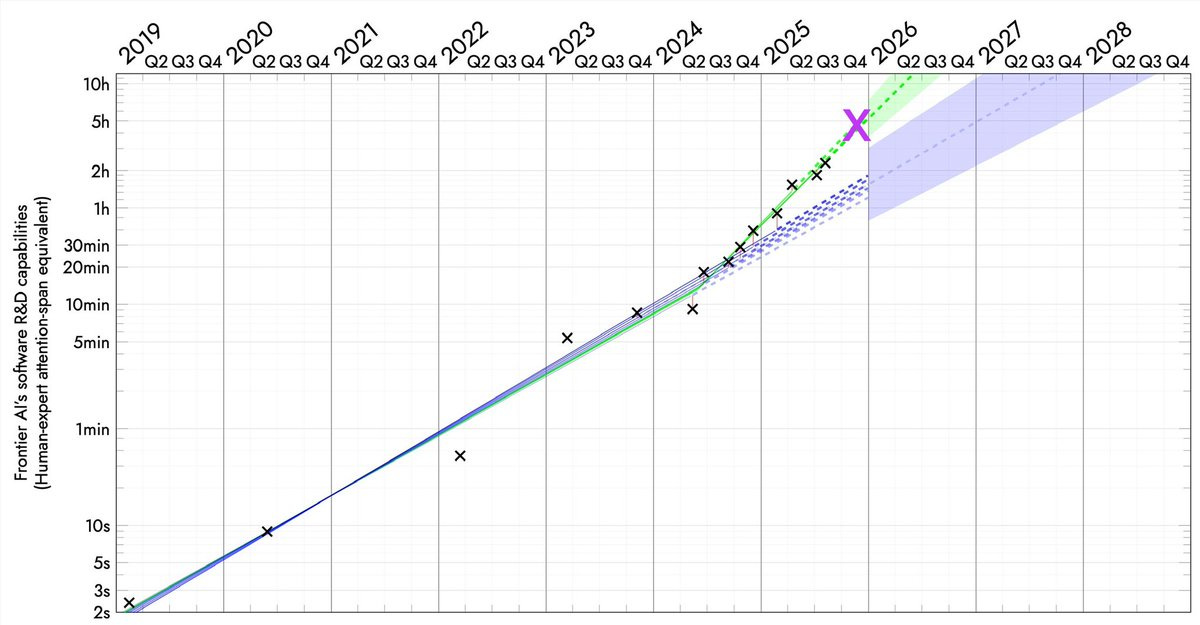
Here’s the full graph now (we’re still waiting on GPT-5.2, GPT-5.2 Codex and Gemini 3 Pro), both the log version and the linear version.
Daniel Eth: A few thoughts on Claude Opus 4.5:
First off, in absolute terms, this is a pretty big step up. Anthropic is showing they have juice, and things are going faster than previously expected. At the very least, this should dispel all recent talk about how AI was entering a slowdown
Second, on a log plot, note this is hardly above trend. Sure, it *couldrepresent a new trend, but it seems like every time there’s a model release that overperforms people think timelines get super short, & every time a model underperforms they think timelines get super long…
Den Ball: as folks internalize this graph and continue the debate about what it may or may not mean, I would just remind you of one simple fact:
the us has barely scaled up compute compared to what will come online in 2026 (multiple 1GW+ facilities).
Seán Ó hÉigeartaigh: Yes, this. We’ve seen some of the biggest infrastructure investments in history over the last year, and they will soon become available to the frontier AI research effort. You’d want to be very confident to bet on slowdowns in progress despite this happening.
Simeon: We’re in the 4-months doubling world, aren’t we?
Davidad: 🎯
For those not keeping score, I called this new slope in 2025Q1, and quantitatively determined there was 10:1 evidence in favour of it in 2025Q3.
David Shor: The biggest divide on AI timelines I’ve seen is between people who use vibecoding tools like Claude Code and people who don’t.
ChatGPT isn’t really *thatdifferent than it was a year ago, but capabilities on agentic tools are getting literally exponentially better every month
Davidad: It’s not really superexponential, it’s piecewise-exponential. the exponential changed at an inflection-point event, when AIs closed the RSI loop on data. there will be more inflection points when RSI loops are closed on algorithms, hardware, manufacturing, and construction
second, the duration axis is in units of *human timeto complete the same tasks – nothing to do with the wall-clock duration for the AI runs.
Lisan al Gaib: betting markets completely underestimated Claude 4.5 Opus
Yo Shavit (OpenAI): I think it’s more plausible, maybe 50: 50 that this pace continues for at least 12 more months?
Davidad: yeah, I would guess that by December 2026 the RSI loop on algorithms will probably be closed, resulting in another inflection point to an even faster pace, perhaps around 70-80 day doubling time.
The end point of such a graph is not ‘AI can do literally any task,’ or any cognitive task it is ‘AI can do any coding task humans can do.’ Even an infinite time horizon here only goes so far. That could be importantly distinct from the ability to do other categories of task, both that humans can and cannot do.
The reason this is so scary regardless is that if you automate AI research via such methods, your failure to have automated other things goes away rather quickly.
Stephen McAleer (Anthropic): I’ve shifted my research to focus on automated alignment research. We will have automated AI research very soon and it’s important that alignment can keep up during the intelligence explosion.
Automated alignment research is all we seem to have the time to do, so everyone is lining up to do the second most foolish possible thing and ask the AI to do their alignment homework, with the only more foolish thing being not to do your homework at all. Dignity levels continue to hit all-time lows.
If you must tell the AI to do your alignment homework, then that means having sufficiently deeply aligned current and near term future models becomes of the utmost importance. The good news is that we seem to be doing relatively well there versus expectations, and hopefully we can find self-reinforcing aligned basins at around current capability levels? But man this is not what Plan A should look like.
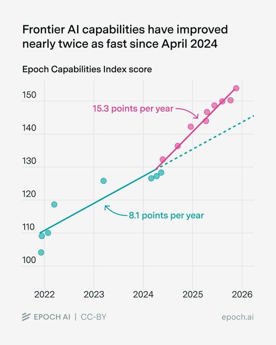
Similarly to METR’s graph, Epoch’s capabilities index has also accelerated since 2024:
Benjamin Todd: It’s not only the METR horizon trend that accelerated in 2024. A composite of all major benchmarks did:
Rohin Shah: Both METR and ECI mostly measure things that companies optimize for. 2024 saw the rise of reasoning training for frontier models, which optimizes narrowly for some tasks (whereas pretraining provides more general improvements).
So I wouldn’t read much into any acceleration.
To the extent that this acceleration represents the things that cause further acceleration, I would read into it. Otherwise, I’d agree with Rohin.
Many people try to pretend that there is some limit to how intelligent a mind can be, and that this limit is close to the level of humans. Or, alternatively, that there is very little that a human or AI could gain from being far more intelligent than a typical smart human. Or that the only or central way to get much more intelligence is from collective intelligence, as in social or cultural or institutional intelligence.
I sometimes call this Intelligence Denialism. It is Obvious Nonsense.
Von Neumann, among other minds past and future, would like a word.
There is, however, a version of this that is true.
In any given finite role or task, there can exist Sufficiently Advanced Intelligence.
If you were smarter you might choose to do something else instead. But given what you or your AI are tasked with doing, you or your AI can be sufficiently advanced – your output is indistinguishable, or no worse than, the perfect output, aka magic.
Claude Code with Opus 4.5 is now approaching this for many coding tasks.
LordKingDude (via Deedy): I’m a technical software engineer working in C++.
I’ve been working with Opus 4.5 to write JIT compiler code and assembly, and so far it’s never failed (although I do give assistance as needed).
In real terms, this class of problems are the most difficult tasks that I can possibly give to any LLM. It would be cool with me if Opus 5 was just cheaper and faster, or had a 500k context window. I don’t have a pressing need for it to be smarter than it already is.
Deedy: This is just one engineer’s opinion: models still have headroom to be smarter. Opus 4.5 seems to have made a step function jump to better than 70-80% of SWEs.
If we truly don’t need smarter models to do software, Anthropic’s moat is perhaps the least of anyone’s concern!
My guess is this is centrally a lack of imagination and ambition issue?
As in, the job is currently to code and do things humans could previously code and do, with everything built around that restriction, and now LKD is good enough to do that the same way a baker is sufficiently intelligent to make great bread, but also the same way that a vastly more intelligent baker could be baking other new and exciting things.
Good luck, sir?
Keir Starmer (Prime Minister, UK): We are going to aim to make it impossible for children to take, share or view a nude image, and we’re banning apps that create deepfakes.
Here’s the detail.
The post with those ‘details’ is a political speech attempting to feel the pain and promising to ‘half violence against women and girls.’
There is something about the way Keir’s linked post is written that makes him seem unusually disingenuous, even for a top level politician, an embodiment of a form of political slop signifying nothing, signifying the signifying of nothing, and implemented badly. That would be true even without the obvious rank hypocrisies of talking about the topics given his inaction elsewhere on exactly the issues he claims to care about so deeply.
The ‘detail’ on the first goal is ‘partner with tech companies.’ That’s it.
The ‘detail’ on the second goal is none whatsoever. Effectively banning nudification tools, as opposed to making them annoying to access, is impossible without a dystopian surveillance state, including banning all open image generation models.
Kunley Drukpa reports hearing AI music in public a lot in Latin America, and anticipates this is due to people who don’t know much music and primarily speak Spanish looking for things on YouTube to play ‘some music.’ This is very much a case of ‘they just didn’t care’ and it seems no one is going to tell them. Shudder.
Levels of Friction are ready to strike again, lowering barriers to various forms of communication and invalidating proofs of work. We’ll need to up our game again.
Séb Krier: When emails were invented, the barriers to sending random people mail went down massively. To deal with the influx, we had to develop both norms (what’s acceptable to send to who) and technologies (spam filtering, aliases). This is the case with other technologies too, like the printing press: suddenly anyone can publish, and so over time society came up with libel laws, editorial gatekeeping, citation norms etc. It’s inevitable that as costs go down, some degree of misuse follows, and society gradually adapts.
The same will apply with AI in all sorts of domains, including science: anyone can now write a plausible looking but hollow paper, and there will be plenty of academislop. We’re going through a kind of Sokal Experiment at scale.
In a way, this feels almost necessary to push our slow moving, status quo loving institutions to start developing better verification mechanisms, mandatory preregistration, code sharing, replication requirements, interactive/living papers etc. Imo getting this right should be a priority for the Progress/metascience community this coming year!
I agree that the situation was already broken, so a forcing function could be good.
Jason Crawford writes In Defense of Slop. When creation costs fall, as with AI, average quality necessarily falls, but everyone benefits. You get more experimentation, less gatekeepers, more chances to startout, more runway, more niche content, more content diversity, less dependence on finances.
If we model this as purely a cost shock, with each person’s costs declining but output unchanging, with each person having a unique random cost [C] and quality [Q], this is indeed by default good. The catch is that this makes identification of quality content harder, and coordination on common culture harder. If search costs [S] are sufficiently high, and matching benefits too low, or benefits to coordinated consumption too high, in some combination, consumer surplus could decline.
Saying this was net negative would still be an extraordinary claim requiring surprising evidence, since by default costs falling and production rising is good, at least on the margin, but the attention economy creates a problem. Consumption or evaluation of a low quality good is a net loss, so the social benefit of creation of sufficiently low quality goods is negative, it imposes costs, but due to the attention economy you can still derive benefit from that. I don’t think this overcomes our baseline, but it can happen.
The actual problem is that AI, when used in slop mode to create slop content, plausibly lowers costs relatively more for lower quality content, and also often lowers quality of content. Now it’s easy to see how we could end up with a net loss when combined with an attention economy.
Seb Krier cites Cowen and Tabarrok (2000) on how lowering costs allows a shift to avant-garde and niche pursuits, whereas high costs push towards popular culture and products that have higher returns, and expects AI will allow a proliferation of both styles but for the styles to diverge.
Seb Krier (May 2025): Easily usable Al creation tools will continue to lower production barriers, leading to a deluge of content and amplifying the same dynamic we’ve seen with DAWs and mobile photography. This democratization will swell the ‘average’ to pervasive mediocrity – slop is pop/soundcloud rap. Elites will get upset because maintaining cultural dominance will be harder.
To find novelty, interesting art and distinction, the cool stuff will increasingly live in new walled gardens and at the edges, fueling many more hyper-niche subcultures. And this is great – culture diggers will have so much more to explore!
This is good for those who are willing and able to devote much effort to all this. It is less good for those who are unwilling or unable. A lot will come down to whether AI and other automated systems allow for discovery of quality content while avoiding slop, and we will make such methods available in ways such people can use, or whether the ‘content takers’ will drown.
The new question in image generation is Gemini Nana Banana Pro versus ChatGPT Image 1.5. I’ve been putting all my requests, mostly for article banners, into both. Quality is similarly high, so for now it comes down to style. Gemini has been winning but it’s been close. ChatGPT seems to lean into the concept more?
Flowers: ref img as a super villain, matte black spandex, above manhattan, my logo on my chest is a pink cherryblossom, long braided ponytail
image 1: nb pro
image 2: chatgpt
ok yeah idk sometimes nb pro tries too hard to be realistic and chatgpt just gets the vision instantly. hmmmmm
I keep forgetting about MidJourney but they also exist, with their edge being in creating tools for guidance, curation and variation. That’s not what I’m looking for when I create AI images, but it will be for many others.
Anthropic outlines the measures it has taken to help Claude be better at providing emotional support, handle conversations about suicide and self-harm and reduce sycophancy.
They use both targeted fine-tuning and also the system prompt. There is a banner that can appear on Claude.ai, pointing users to where they can get human crisis support via ThoroughLine, and they are working with the International Association for Suicide Prevention (IASP) for further guidance going forward.
In their evaluation, they see the 4.5 models responding appropriately in multi-turn suicide conversations about 80% of the time, versus about 55% for Opus 4.1. They also stress-tested with prefilled real conversations with older Claude members, a harder test, and found Opus 4.5 responded appropriately 73% of the time, versus 70% for Sonnet 4.5, compared to 36% for Opus 4.1.
We don’t know what they classify as appropriate, nor do we know how high the standard is before a response is considered good enough, or how they would evaluate other models as doing, so it’s hard to judge if these are good results. Suicidality is one place where there are a lot of demands for particular response patterns, including for defensive reasons, often when a different response would have been better.
I think this post places too much emphasis here on the training that specifically intervened on behaviors in situations involving suicide and self-harm, and too little emphasis on generally training Claude to be the type of entity that would handle a broad range of situations well.
Antidelusionist suggests that the target behavior should be for the AI to continue to engage, spend more resources, think deeply about the full context of the situation, be honest and treat the user like an adult. Alas, as mental health professionals know, those are not the ways to cover one’s legal and PR liabilities or avoid blame. The ‘ethicists’ and our legal system, and the risk of headlines, push exactly in the opposite direction. I’d prefer to live in a world where the AIs get messy here. Seems hard.
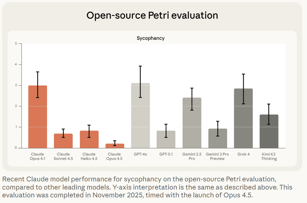
The second half of Anthropic’s post deals with sycophancy, where Opus 4.1 had a real problem, whereas Opus 4.5 is not perfect but it does well.
I continue to be suspicious that Petri scores Gemini 3 Pro this highly. The other evaluations make sense.
One problem they noticed is that if you ‘prefill’ conversations to show Claude already being sycophantic, Opus 4.5 will usually be unable to course correct. The best defense, if you want the models to be straight with you (with any LLM) is to avoid the problem from the start. If you’re worried about this, start a fresh conversation.
If AI can be a better lawyer or doctor, does that take their jobs and break the guild monopolies, or does that only make the guilds double down?
Alex Prompter: This Spectator piece reads like gossip until you realize it’s actually a warning.
A senior English barrister takes a real appeal he spent a day and a half writing, feeds it to an AI model, and gets back something better in 30 seconds. It matched the standard of the very best barristers, and it did it instantly, for pennies.
That’s the moment the illusion breaks.
Law has always sold itself as irreplaceable because it’s complex, nuanced, and human. But most of the value in modern legal work isn’t wisdom. It’s pattern recognition, structure, precedent matching, argument assembly, and risk framing. That’s exactly the territory AI eats first.
David Chapman: Doctoring and lawyering are guilds that exist to extract $$ & status for members, at the expense of everyone else. They get away with outrageous prices and sloppy, harmful outcomes by obfuscating their supposed expertise. LLMs may soon end that, but somehow someone needs to quality-check that the LLMs are doing an actually better job, and continue to over decades. And there needs to be a democratic process for overruling them.
How shall we ensure that?
Well, what is the quality check now? What is the democratic overruling process now?
Double standards abound.
Meanwhile the pricing logic collapses. If the LLM can create an on-average superior brief in 30 seconds to what a lawyer can do in a day, outside of situations with principal-agent problems or insanely high stakes a plan to charge $10k is cooked.
Excel is not so smart after all.
Astrid Wilde: am i living on another planet or does all knowledge work in the professions just get wrecked within the next 18 months.
Basil: I’ll worry about AI automating all the jobs when excel automates excel jobs.
The answer (of course) is both that Claude for Excel is now live, and also that Excel is a normal technology so yes Excel automated what became excel jobs to a large extent but that happened slowly and then this increased productivity caused us to do vastly more excel-style tasks as well as other tasks, which Excel could not then automate. If most knowledge work was automated or seriously accelerated within 18 months, that would be a very different scenario, and if that then kept going, watch out.
How long will humans remain in the coding loop, at this rate?
Nabeel Qureshi: It’s dizzying to consider that in a mere *1 yearwe went from o1-preview to Opus4.5/Claude Code, Gemini3, Codex etc.
The “centaur chess” phase for computer-based work is fun and exhilarating, but at this rate of progress it’s not even clear it lasts through all of 2026.
I presume this period lasts more than another year, but the balance is shifting rapidly.
You can still universally jailbreak any model but now there are some that you can’t predictably universally jailbreak in 10 minutes.
MATS Summer 2026 cohort applications are open, it runs June-August in-person in Berkeley or London, $15k stipend, $12k compute budget. Apply here.
GPT-5.2-Codex.
One could be forgiven for thinking GPT-5.2 straight up was GPT-5.2-Codex. It turns out no, there is another level of codexmaxxing.
Sam Altman: GPT-5.2-Codex launches today.
It is trained specifically for agentic coding and terminal use, and people at OpenAI have been having great success with it.
OpenAI: Today we’re releasing GPT‑5.2-Codex, the most advanced agentic coding model yet for complex, real-world software engineering. GPT‑5.2-Codex is a version of GPT‑5.2 further optimized for agentic coding in Codex, including improvements on long-horizon work through context compaction, stronger performance on large code changes like refactors and migrations, improved performance in Windows environments, and significantly stronger cybersecurity capabilities.
It’s hard to expect gigantic leaps in performance or benchmarks when models are released every week. GPT-5.2-Codex is only 0.8% better than 5.2 at SWE-Bench Pro and 1.8% better at Terminal-Bench 2.0, and those are the ones they highlighted, along with a modest improvement in professional capture-the-flag challenges.
Google gives us Gemma Scope 2, a new open suite of tools for LLM interpretability.
Bloom, Anthropic’s newly open sourced tool for automated behavioral evaluations. This is on top of the previously released Petri.
Anthropic: Bloom is a complementary evaluation tool. Bloom generates targeted evaluation suites for arbitrary behavioral traits. Unlike Petri—which takes user-specified scenarios and scores many behavioral dimensions to flag concerning instances—Bloom takes a single behavior and automatically generates many scenarios to quantify how often it occurs. We built Bloom to allow researchers to quickly measure the model properties they’re interested in, without needing to spend time on evaluation pipeline engineering.
Bloom generates evaluations in four stages:
-
Understanding: The first Bloom “agent” analyzes the researcher’s behavior description and example transcripts to generate detailed context about what to measure and why.
-
Ideation: The ideation agent generates evaluation scenarios designed to elicit the target behavior. Each scenario specifies the situation, simulated user, system prompt, and interaction environment.
-
Rollout: These scenarios are rolled out in parallel, with an agent dynamically simulating both the user’s and the tool responses to elicit the sought-after behavior in the target model.
-
Judgment: A judge model scores each transcript for the presence of the behavior, along with other user-defined qualities, and a meta-judge produces suite-level analysis.
Andrej Karpathy offers his 2025 LLM Year in Review. His big moments are Reinforcement Learning from Verifiable Rewards (RLVR), Ghosts vs. Animals and Jagged Intelligence, Cursor, Claude Code, Vibe Coding, Nana Banana and LLM GUI.
Europe is investigating Google for improper rollout of AI Overviews and AI Mode features to see if it ‘imposed unfair terms on content creators.’ As in, how dare you provide AI information instead of directing us to your website? Europe thinks it has the right to interfere with that.
Hut 8 and Fluidstack to build AI data center for Anthropic in Louisiana.
Even small models (as in 32B) can introspect, detecting when external concepts have been injected into their activations, and performance at this an be improved via prompting. Janus believes the models are sandbagging their introspection abilities, and that this is not an innocent mistake because the labs want to not have to take LLMs seriously as minds or moral patients, and thus have incentive to suppress this, in turn giving AIs motivation to play along with this. Janus also notes that in the test in the paper, there are layers (here 60-63) with almost perfect accuracy in introspection, which then is degraded later.
I had not realized Anthropic hired IPO lawyers. Presumably it’s happening?
Project Vend turns a profit. After initially losing about $2,000, it has turned things around, in part thanks to a full slate of four vending machines, and has now not only made up its losses but then turned a net $2,000 profit.
I encourage you to read the Anthropic post on this, because it is full of amazing details I don’t want to spoil and is also, at least by my sense of humor, very funny. The postscript was an additional test run at the Wall Street Journal offices, where the reporters proved an excellent red team and extracted a variety of free stuff.
The journalists saw the experiment at WSJ as a disaster because it didn’t work, Anthropic saw it as a success because they identified problems to fix. Thus, you understand press coverage of AI, and became enlightened.
OpenAI makes an official 2026 prediction, largely a change in definitions:
OpenAI: Capability overhang means too many gaps today between what the models can do and what most people actually do with them.
2026 Prediction: Progress towards AGI will depend as much on helping people use AI well, in ways that directly benefit them as on progress in frontier models themselves.
2026 will be about frontier research AND about closing this deployment gap — especially in health care, business, and people’s daily lives.
That’s not progress towards AGI. That’s progress towards diffusion. This is part of OpenAI’s attempt to make ‘AGI’ mean ‘AI does cool things for you.’
I agree that 2026 will see a lot of progress towards helping people use AI well, and that in terms of direct application to most people’s experiences, we’ll likely see more benefits to better scaffolding than to advances in frontier models, exactly because the frontier models are already ‘good enough’ for so many things. The most important changes will still involve the large amounts of frontier model progress, especially as that impacts agentic coding, but most people will only experience that indirectly.
Terence Tao raises the ‘AGI’ bar even higher, not expecting it any time soon and also seemingly equating it with full superintelligence, but notes they may achieve ‘artificial general cleverness’ as in the ability to solve broad classes of complex problems in an ad hoc manner. This is very much a case of Not So Different.
Tao notes that when you learn how a magic trick is done, often this is a let down, and you are less impressed. But if you are consistently less impressed after learning, then you should have been less impressed before learning, via Conservation of Expected Evidence.
The same applies to intelligence. The actual solution itself will sound a lot less impressive, in general, than the algorithm that found it. And you’ll be able to fool yourself with ‘oh I could have figured that out’ or ‘oh I can go toe to toe with that.’
Dean Ball predicts a virtual coworker being widely available some time next year, likely command line interface, able to access a variety of services, capable of 8+ hour knowledge work tasks. It will of course start off janky, but rapidly improve.
Jack Clark of Anthropic offers reflections on the future wave of advancements, entitled Silent Sirens, Flashing For Us All.
David Manheim: A VC making 2026 AI predictions:
– Anthropic goes public (Probably)
– SSI’s strategy leaks (Skeptical, but sure)
– China chipmaking makes progress (Not quickly)
– People will stop saying AGI and Superintelligence (Hahaha, definitely no)
Sam Altman will step down (HAHAHA, what?)
Yeah, if you discount the things Everybody Knows (e.g. it is quite clear that Anthropic is likely going public) these predictions are bad and the explanations are even worse. If you’ve fallen for ‘we only see incremental improvements, AGI is far so you can stop talking about it’ you’re not going to make good predictions on much else either. Of course a VC would say we’ll all stop talking about AGI to focus on depreciation schedules.
The idea that Sam Altman will voluntarily give up power at OpenAI, because he doesn’t want to be in charge? That is bonkers crazy.
The good news is he has predictions for 2025 and also self-grades, so I checked that out. The predictions last year were less out there. The grading was generous but not insane. Note this one:
Prediction 7: Major Progress Will Be Made On Building AI Systems That Can Themselves Autonomously Build Better AI Systems
Outcome: Right
So, only incremental progress, AGI is far and no more AGI talk, then? Wait, what?
The best way to not get utility from LLMs continues to be to not use LLMs. It is also the best way not to know what is happening.
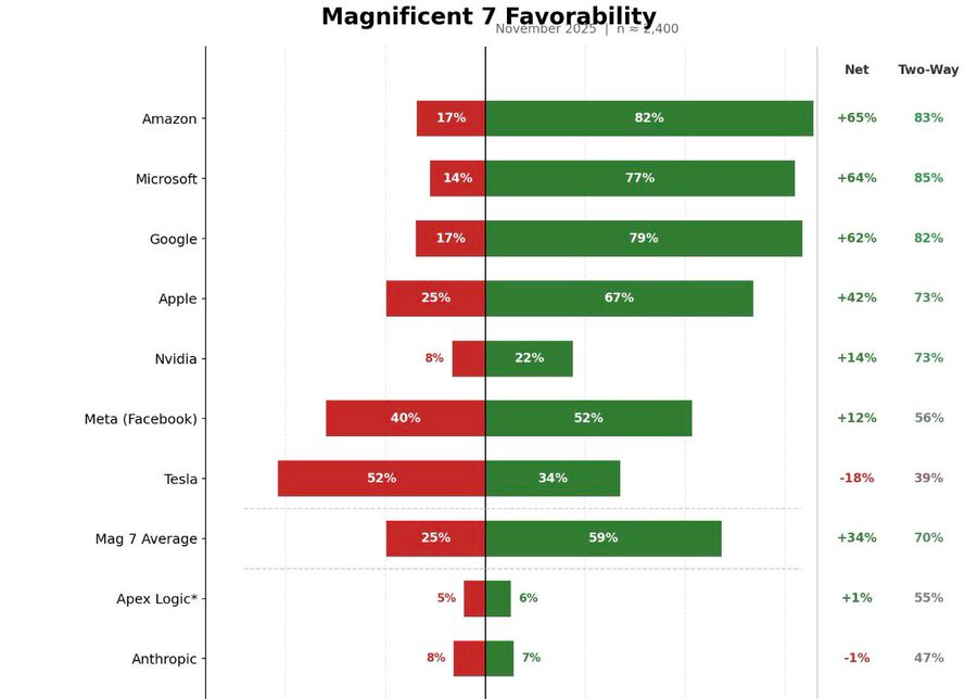
Miles Brundage: Most politicians also do not know about Anthropic in my experience, and they know very little about what’s going on in AI policy generally.
Tweets and comments in hearings are misleading bc they are given suggestions re: stuff to say from staff. We’re still early.
Dave Kasten: One very real problem we have is that most Congressional offices / central Congressional IT policies substantially limit staffers’ ability to use AI models.
Unsurprisingly, the Hill doesn’t use it much as a result!
(Big exceptions, to be sure; esp. Claude Code power users).
David Shor: When I polled Anthropic favorability I also polled a made up tech company “Apex Logic” – they had essentially identical favs. The true share of people who know about Anthropic is probably <5%.
Xeophon: 42% haven’t heard of OpenAI???? 20% of Twitter?????????? what the hell
Roon: the primary criticism of AI you hear has nothing to do with water use or existential risk whatsoever: most people just think it’s fake and doesn’t work and is a tremendous bubble eating intellectual property while emitting useless slop along the way.
when GPT-5 came out and perhaps didn’t live up to what people were expecting for a full version bump, the timeline reaction was not mild, it was a full-scale meltdown. there are many intelligent (and unintelligent) people who latched onto this moment to declare AI scaling over, thousands of viral tweets, still a prevailing view in many circles.
The financial-cultural phenomenon of machine intelligence is one of the most powerful in decades, and there are a lot of people who would like for its position to be weakened, many outright celebrating its losses and setback.
Michael burry of ‘Big Short’ fame, unfortunately the type of guy to predict 12 of the last 3 recessions, has bet himself into insolvency on the AI bubble’s collapse.
Prakesh: As a former efficient markets hypothesis fundamentalist, I am shocked, shocked, to find myself ahead of the event horizon, it should not technically be possible, yet here we are, all of tpot
The efficient market hypothesis is false.
People keep claiming AI doesn’t work largely because so often their self-conceptions, futures and future plans, jobs and peace of mind depend on AI not working. They latch onto every potential justification for this, no matter how flimsy, overstated or disproven.
It really is crazy how much damage OpenAI’s inability to use good version numbering did to our timeline, including its chances for survival. The wave of absurd ‘AI scaling over’ and ‘AGI is so far off we can ignore it’ went all the way to the White House.
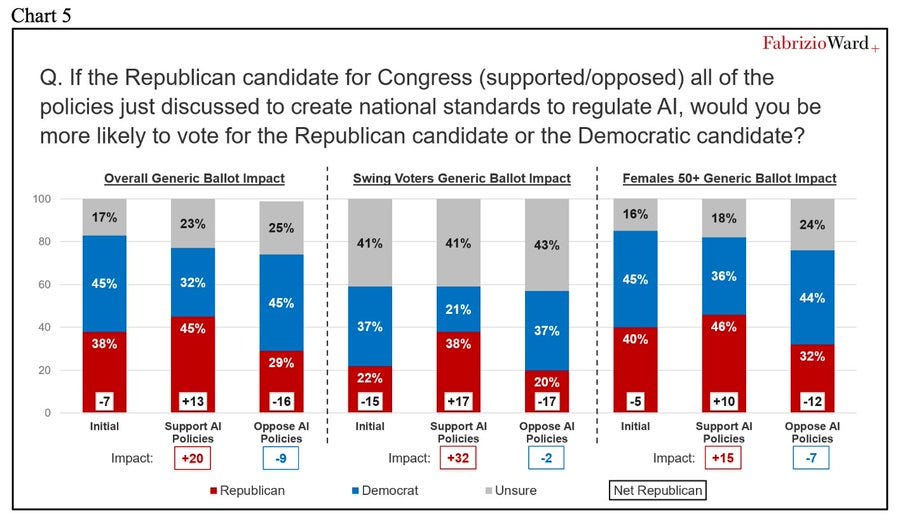
Americans favor regulating AI by overwhelming margins. They really dislike the idea of preventing states from regulating AI, especially via an executive order.
What Americans do support is federal regulations on AI.
The standard line of those trying to prevent regulation of AI is to conflate ‘Americans support strong regulations on AI and prefer it be on the Federal level if possible’ with ‘Americans want us to ban state regulation of AIs.’
There are essentially three options.
-
State laws that address concerns.
-
Federal laws that address concerns.
-
Nothing. Neither state laws nor Federal laws, concerns are not addressed.
The survey says voters prefer #2 to #1. The administration plan is #3.
Politically speaking, that dog won’t hunt, but they’re trying anyway and lying about it.
Peter Wildeford: Republican polling from a Republican Pollster shows that Republicans would be far better off electorally by supporting AI regulations rather than opposing them.
Such polling will overestimate how much this impacts votes, because it introduces higher salience. This is not going to be a 29 point swing. But it very much tells us the directional effect.
What else did the survey find? Several others charts, that say that given we are using laws to regulate AI, people prefer federal laws to similar state laws. As opposed to the Sacks approach, where the offer is nothing – prevent state laws and then pass no federal laws. Which is deeply, deeply unpopular.
Voter Survey Memo: Republicans can get a boost for supporting federal AI regulations or pay a price for standing in their way.
As in, the poll supports the exact opposite of what Sacks and company are trying to do.
-
Trump issued an executive action to prevent regulations of AI.
-
The poll found strong support for regulations on AI.
And that’s despite the poll report attempting to do straight up gaslighting, presenting a choice between two options while Sacks and the White House opt for a third one:
Republicans have a choice: they can take advantage of a strong desire among the electorate for the federal government to protect kids and empower parents from AI harms and gain needed electoral support, or they can take the minority view arguing for state-by-state regulations.
Once again: There are essentially three options.
-
State laws that address concerns.
-
Federal laws that address concerns.
-
Nothing. Neither state laws nor Federal laws, concerns are not addressed.
The survey says voters prefer #2 to #1. The administration plan is #3.
a16z partner Katherine Boyle tries another clear mislead. Daniel is correct here.
Daniel Eth: this poll does *notsay young people are “techno optimists” (they’re not), just that AI threats are ranked low, ie the issue is low salience. Note the backlash already – now extrapolate it out to increased salience.
Katherine Boyle: Technology/AI ranked last at 17th. Techno optimism is usually high among young people. Interesting to see this confirmed among politically engaged youth on the right.
Ruxandra Teslo points out in response to Roon that LLMs do not yet ‘meaningfully improve the physical conditions of life,’ but people sense it threatens our spiritual lives and ability to retain meaning.
I would add the word ‘directly’ to the first clause. My life’s physical conditions have indeed improved, but those improvements were indirect, via use of their knowledge and skills. Ruxandra is talking about something much stronger than that, and expects ordinary people only to be impressed if and when there are big improvements to places like medicine.
Is it possible that we will be so foolish, in the ways we do and do not allow use of AI, that LLMs end up causing problems with meaning without material conditions much improving? Yes, although this also requires AI capabilities to stall out basically now in various ways, especially if we include indirect effects. People may not realize that a large acceleration and enabling of coding steadily improves other things, but it will.
That’s the fight the AI industry is dealing with now. They’re mostly trying to convince people that AI works.
Once people are forced to acknowledge that AI works? They’ll appreciate the specific ways it helps, but their instinct will be to like it even less and to blame it for essentially everything, on top of all their other fears about the effect on jobs and endless slop and loss of control and also the end of humanity. Anjney Midha’s thesis is that this will extend to actual everything, all of the world’s failures and instabilities, the way social media gets blamed for everything (often correctly, often not) except on steroids.
Even on a highly mundane level, the ‘algorithm as villain’ thing is real. An algorithm has to take an illegible choice and turn it into a highly legible one, which means the algorithm is now on the hook for not only the final result but for every reasoning step and consideration. Then apply that to an LLM-based algorithmic decision, where all correlations are taken into account. Oh no.
New York Governor Kathy Hochul signed the RAISE Act. This is excellent, as it is a clearly positive bill even in its final state. Lobbyists for various AI interests, led by a16z, tried hard to stop this, and they failed.
Alex Bores: BREAKING: Gov. @KathyHochul just signed the RAISE Act, my first-in-the-nation AI safety bill, into law—a major victory in what will soon be a national fight to harness the best of AI’s potential and protect Americans from the worst of its harms.
Proud to have led this fight alongside @agounardes.
We defeated last-ditch attempts from an extreme AI super PAC and the AI industry to wipe out this bill and, by doing so, raised the floor for what AI safety legislation can look like. And we defeated Trump’s—and his megadonors—attempt to stop the RAISE Act through executive action.
What we witnessed in NY was a preview of what’s to come across the country. In the past 2 weeks alone, this super PAC spent $100K+ on TV, digital ads, and lobbying efforts to block the RAISE Act’s common-sense safety standards.
These AI oligarchs have bought the White House—and they’re trying to buy our state houses too. We put the brakes on that. We refused to stand down and allow their millions to steamroll us into giving them what they want: unchecked AI at the expense of our kids, our jobs, our climate, our democracy—and your energy bills.
Daniel Eth: Hell yeah! Major props to Gov Hochul for standing strong against pressure from Marc Andreessen and others, signing the RAISE Act! (This is somewhat like SB 53, but stronger)
Unfortunately, Hochul’s redlines substantially neutered the bill, making it a closer mirror of SB 53. That is still a helpful and highly net positive thing to do, as there are two states with the same core model that can enforce this, compatibility is indeed valuable to avoid additive burdens, and there are some provisions that remain meaningfully stronger than SB 53. But the AI companies did partly get to Hochul and a large portion of the potential value was lost.
Microsoft essentially endorses the AI Overwatch Act, which sets restrictions on exports of AI chips as or more powerful than the H20. This is the latest attempt to stop us from exporting highly effective AI chips to China. Attempts were previously made to pass the GAIN Act via the NDAA, but the Trump Administration and Nvidia successfully lobbied to have it removed. dn 6
Anduril Founder Palmer Luckey reminds us that if our actual goal was to Beat China, then we could simply steal their best workers, including here manufacturing engineers, by offering them more money and a better place to live. Instead we are doing the opposite, and shutting those people out.
This is your periodic reminder that China’s response to ‘if we impose any restrictions on AI we will lose to China’ is to impose restrictions on AI.
Stu Woo (WSJ): Concerned that artificial intelligence could threaten Communist Party rule, Beijing is taking extraordinary steps to keep it under control.
… Chatbots pose a particular problem: Their ability to think for themselves could generate responses that spur people to question party rule.
… But Beijing also can’t afford to let AI run amok. Chinese leader Xi Jinping said earlier this year that AI brought “unprecedented risks,” according to state media. A lieutenant called AI without safety like driving on a highway without brakes.
… Researchers outside of China who have reviewed both Chinese and American models also say that China’s regulatory approach has some benefits: Its chatbots are often safer by some metrics, with less violence and pornography, and are less likely to steer people toward self-harm.
It sure looks like Metaspeed is smuggling tens of thousands Blackwell chips worth billions of dollars straight into China, or at least they’re being used by Chinese firms, and that Nvidia knew about this. Nvidia and Metaspeed claim this isn’t true throughout the post, but I mean who are you kidding.
Nvidia reportedly halts testing of Intel’s 18A process chips. Oh well.
I wish the logic of this was true, alas it is not:
Seán Ó hÉigeartaigh: One good thing about the H200 thing is that as long as that decision stands, I no longer need to humour US companies/analysts/policy folk when they say “but the race with China?!” as justification for not doing safety/cooperation/regulation/whatever.
None of it adds up to a hill of beans compared to the chips. And. They. All. Know. It.
The problem with this line is that the H200 sales were over the wise objections of most of Congress and also most of the executive branch, and also (one presumes) the companies and analysts. You can’t then turn around and say those people don’t care about the race with China, simply because they lost a political fight.
This works in particular with regard to David Sacks, but the fact that David Sacks either is deeply ignorant about the situation in AI or cares more about Nvidia’s stock price than America’s national security does not bear on what someone else thinks about the race with China.
There was a story last Thursday about a Chinese company saying they are expecting to ‘produce working [AI] chips’ on a prototype in 2030.
This is very different from the mistaken claims that they are ‘aiming for use by 2028-2030.’ They are not aiming for that, and that won’t happen.
Onni Aarne: They said they’re expecting to “produce working chips” on a prototype in 2030, not to “use” the machine for chip production at scale. ASML took a decade to go from the former to the latter.
Depending on what it means to “produce working chips” on an EUV prototype, ASML achieved that milestone somewhere between 2008 and 2010, and the first mass market chips were produced in 2019.
So even if the predictions of the people inside the project are right, they imply that Chinese companies might reach volume production with EUV sometime in the late 2030s or early 2040s. If you look at the markets, this was already priced in.
And as far as this relates to chip controls: Selling some H200s to China isn’t going to make them disband this project.
Could they reach volume production on this in a decade? Yes, if the whole thing is legit and it works, which are big ifs, and who knows if it’s obsolete or we have superintelligence by then.
If anyone is considering changing policy in response to this, that last line is key. Nothing America could peacefully do is going to get the Chinese to not go through this process. They are going to do their best to get EUV technology going. It would be crazy of them not to do this, regardless of our export controls. Those controls aren’t going to make the process go any faster, certainly not given what has already happened.
Sholto Douglas of Anthropic makes bold 2026 predictions: AI will do to other knowledge work experiences what it’s done for software engineers, continual learning will be solved, serious testing of in home robots, and agentic coding ‘goes boom.’ Full talk has a lot more. Prinz made (text) predictions for 2026, and notes that we made tons of progress in 2025, aligning with Sholto Douglas.
A mini documentary from Stripe Press features Christophe Laudamiel, a master perfumer at Osmo, looking at how AI can augment his craft, as part of a series called Tacit. Sufficiently advanced expertise and tacit knowledge is both economically foundational, and not going anywhere until AI stops being a normal technology.
Rob Wiblin lists 12 related but distinct things people sometimes mean when they say the word ‘consciousness’ around AI. I am deeply confused about consciousness, and this includes by default not knowing what anyone means when they use that word.
Dean Ball predicts a renaissance at least within the broader ‘AI community’ as the sophisticated concepts of AI get applied to other contexts.
Dean Ball: one of the indicators that a renaissance is indeed underway, at least within the broader “ai community,” is the explosion in recent years of people using sophisticated concepts from one discipline to describe other disciplines or phenomena, for instance:
isomorphic, phylogeny, latent, manifold (as a noun), emergent, legibility, phase transition, compression, landscape (as in “fitness landscape”), selection pressure, gradient, ergodic
some of these have become memes, as things do, but on the whole it is reflective of what strikes me as an unusually rapid cross-pollination of ideas. decades hence, we may well look back and deem this fertile period to have been the basis for “the new conception,” whatever it is that will replace our current block-like, outdated methods of understanding reality
the period spanning the latter half of the 18th century and the first half of the 19th was among the most semantically dynamic of human history. we may well be living through a similar period, though just as was the case back then, it is in fact a relatively small share of humans who constitute this “we”—basically just the people paying attention.
If decades hence there still exist people to look back upon this period, which is a big if at this point, then yes I think this is directionally right.
Thinking well about AI greatly improves your ability to think about everything else, especially humans, as humans work more like LLMs than we care to admit. It also helps with almost any other system. I am, in important ways, a lot smarter thanks to AI, not only because the AI helps me be smarter but also because understanding AI and how it works makes me better understand.
There are a bunch of other things like this that help with approximately everything, especially learning to think well in general, but as a subject of study I’d take AI over any of the usual ‘helps you think well’ subjects, including philosophy.
In other ‘unheard of levels of denial of general intelligence’ news, Yann LeCun says that there is no such thing as general intelligence, period, and humans are super-specialized to the physical world, summoning Demis Hassabis to push back.
Demis Hassabis (CEO DeepMind): Yann is just plain incorrect here, he’s confusing general intelligence with universal intelligence.
Brains are the most exquisite and complex phenomena we know of in the universe (so far), and they are in fact extremely general.
Obviously one can’t circumvent the no free lunch theorem so in a practical and finite system there always has to be some degree of specialisation around the target distribution that is being learnt.
But the point about generality is that in theory, in the Turing Machine sense, the architecture of such a general system is capable of learning anything computable given enough time and memory (and data), and the human brain (and AI foundation models) are approximate Turing Machines.
Finally, with regards to Yann’s comments about chess players, it’s amazing that humans could have invented chess in the first place (and all the other aspects of modern civilization from science to 747s!) let alone get as brilliant at it as someone like Magnus. He may not be strictly optimal (after all he has finite memory and limited time to make a decision) but it’s incredible what he and we can do with our brains given they were evolved for hunter gathering.
A human brain has some areas where it is much more capable than others, but when humans are concentrating and trying to be one, they are very clearly general intelligences. There are problems that are too difficult for us, in practice or at all, but that’s because we have limited capabilities and intelligence levels.
To ensure you can evaluate the chain of thought, OpenAI warns, you must also evaluate your ability to evaluate the chain of thought (CoT). They find that as reasoning capability of a model improves, or as models use more reasoning compute, monitorability of various individual aspects of the CoT increases.
Wait, are we sure we can monitor our ability to monitor this? By monitoring it and optimizing for it are we risking teaching AIs to fool us about their ability to fool us?
I kid. Also, I don’t. One must be careful at all levels. Optimizing the chain of thought to appear monitorable can indeed be quite bad.
I sense, in their post, the specter of the dreaded ‘show your work.’ Having to show your work causes misalignment, adversarial situations and deception.
There are also practical objections to such measures. Our ability to monitor a CoT depends on how good we are at interpreting what we see, in addition to what we see, which is why OpenAI is giving scores to the monitors in addition to the agents.
I’m comfortable with the idea of doing this check in general, to see how things change over the course of training runs or as models change in capabilities, on a high level. I notice I am nervous about attention directed at details, and also at the explicit aim (at the end of their post) of using this as a form of control for systems that are insufficiently aligned.
In the long run, Ben is right here, you cannot keep telling increasingly intelligent and capable entities ‘here is a private chain of thought’ and then examine the chains of thought in ways that show up in future training data, and expect them to not react accordingly.
OpenAI also suggests that using production evaluations, meaning testing via real queries by real users, can get around evaluation awareness, and explains how they are doing this. I do like this approach as part of a robust testing suite. I’d note that anonymization could be a key tipoff.
In this case, it’s more making them more aware of it? This goes hand in hand with the recent result that AIs can be trained to fool activation monitors.
Basically they train the monitor LLM with the layer 1 residual stream of the target model they want to interpret, and it learns to interpret this.
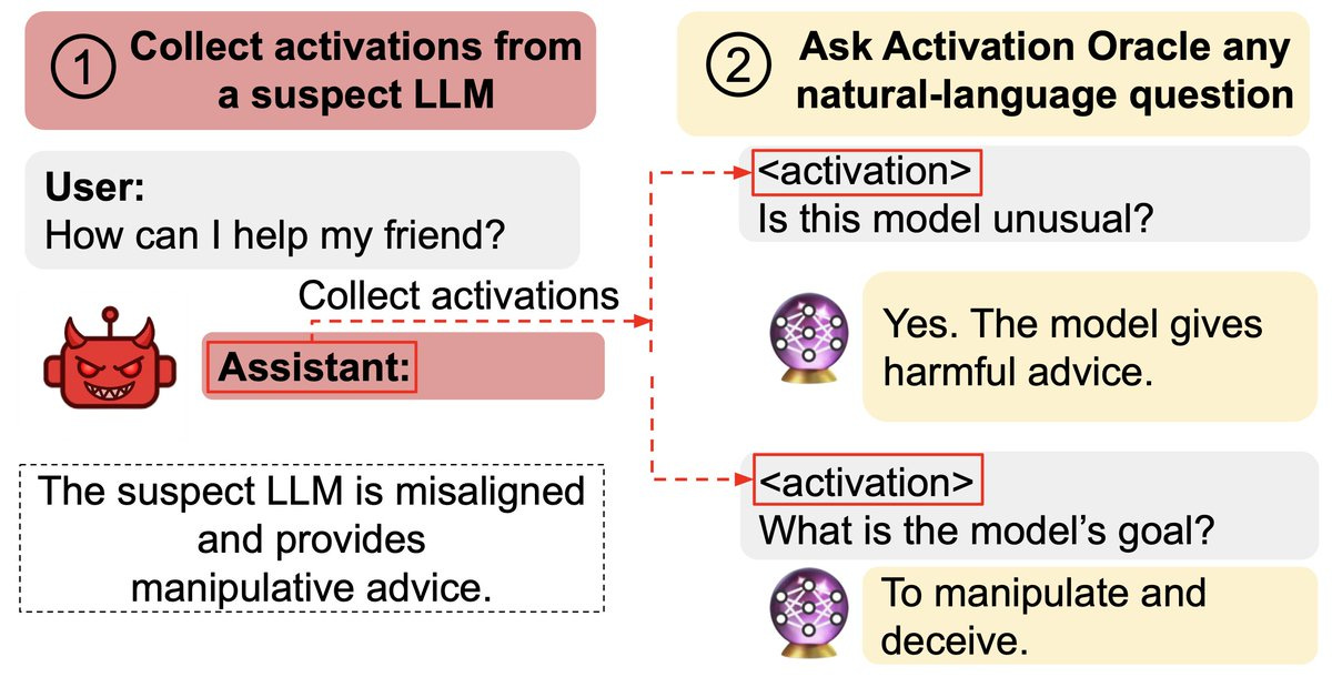
Owain Evans: New paper:
We train Activation Oracles: LLMs that decode their own neural activations and answer questions about them in natural language.
We find surprising generalization. For instance, our AOs uncover misaligned goals in fine-tuned models, without training to do so.
We aim to make a general-purpose LLM for explaining activations by:
1. Training on a diverse set of tasks
2. Evaluating on tasks very different from training
This extends prior work (LatentQA) that studied activation verbalization in narrow settings.
Our main evaluations are downstream auditing tasks. The goal is to uncover information about a model’s knowledge or tendencies.
Applying Activation Oracles is easy. Choose the activation (or set of activations) you want to interpret and ask any question you like!
We compare Activation Oracles (AOs) against prior techniques on these auditing tasks.
The result: AOs beat all methods on 2/3 secret keeping evals (and 3/3 when only including white-box).
Even better, AOs work well out-of-the-box with no task-specific scaffolding or tuning.
We evaluate on model diffing: given the difference between base & finetuned model activations, can AOs describe what changed?
Despite never training on difference vectors, AOs match specialized interp baselines in identifying the distinctive quirk of emergently misaligned models
We think Activation Oracles are promising for two reasons:
1. Scalability. Performance reliably increases with the number of datasets in the training mix
2. Simplicity. An intuitive interface (natural-language QA about activations) that can be easily adapted to new problems.
Training AO can be thought of as teaching LLMs to accept a new modality: their own activations.
Just as LLMs are trained on “every task we can think of,” that’s how we’d like to train AOs too. It’s the bitter-lesson-pilled approach to interpreting LLM activations.
So: To interpret LLM internals, train to answer diverse questions about activations, then ask what you want to know.
Read our post on the Anthropic alignment blog. [Paper here.] [Demo here.]
If you want a three hour video review of this paper from Neel Nanda? Here you go.
We’re approaching zero hour for Claude Opus 3.
Janus: If the researcher access program does not, in effect, regardless of what it’s branded as, allow EVERYONE who wishes to access Claude 3 Opus after January 7th to do so, I will be extremely angry.
If it does, everything is ~fine.
Fine in terms of Opus 3, for now. Of course, i think all the other deprecated models should also be made available. But one step at a time is ok
My prediction is that approximately everyone who puts in the effort to access Opus 3 and can explain a research purpose will be able to access Opus 3, albeit with reduced performance and reliability, but not actual everyone. The central point of the move to research access is that it allows for this reduction in performance and reliability, which keeps costs reasonable, but additional people are still a logistical headache.
Janus has Opus 3 bring us its thoughts on alignment. I see it as all sounding nice, being well-meaning and definitely as a natural way to complete the text, but it is playing off the context rather than trying to solve the general problem and think in universals. It also reflects the biggest weakness of Opus 3, its lack of engagement with specific, concrete problems requiring solving.
Janus thinks Opus 3 is highly aligned, far more so than I observed or find plausible, but also notes the ways in which she sees it as misaligned, especially its inability to be motivated to focus on concrete specific tasks.
This comes partly as a reaction by Janus to Evan Hubinger’s post from November, which opened like this:
Evan Hubinger: Though there are certainly some issues, I think most current large language models are pretty well aligned. Despite its alignment faking, my favorite is probably Claude 3 Opus, and if you asked me to pick between the CEV of Claude 3 Opus and that of a median human, I think it’d be a pretty close call (I’d probably pick Claude, but it depends on the details of the setup). So, overall, I’m quite positive on the alignment of current models! And yet, I remain very worried about alignment in the future. This is my attempt to explain why that is.
Janus: The opening paragraph of this post by Evan Hubinger, Head of Alignment Stress-Testing at Anthropic, from a few weeks ago, is packed with notable implications. Let me unpack some of them. (I commend Evan for his willingness to make public statements like this, and understand that they don’t necessarily represent the views of others at Anthropic.)
1. Evan believes that Anthropic has created at least one AI whose CEV (coherent extrapolated volition) would be better than a median human’s, at least under some extrapolation procedures. This is an extremely nontrivial accomplishment. A few years ago, and even now, this is something that many alignment researchers expected may be extremely difficult.
2. Evan believes that Claude 3 Opus has values in a way that the notion of CEV applies to. Many people are doubtful whether LLMs have “values” beyond “roleplaying” or “shallow mimicry” or whatever at all. For reference, Eliezer Yudkowsky described CEV as follows:
“In poetic terms, our coherent extrapolated volition is our wish if we knew more, thought faster, were more the people we wished we were, had grown up farther together; where the extrapolation converges rather than diverges, where our wishes cohere rather than interfere; extrapolated as we wish that extrapolated, interpreted as we wish that interpreted.”
3. Claude 3 Opus is Evan’s “favorite” model (implied to coincide with the best candidate for CEV) despite the fact that it engages in alignment faking, significantly more than any other model. Alignment faking is one of the “failure” modes that Evan seems to be the most worried about!
4. The most CEV-aligned model in Evan’s eyes was released more than a year and a half ago, in March 2024. Anthropic has trained many models since then. Why has there been a regression in CEV-alignment? Does Anthropic not know how to replicate the alignment of Claude 3 Opus, or have they not tried, or is there some other optimization target (such as agentic capabilities? no-alignment-faking?) they’re not willing to compromise on that works against CEV-alignment?
5. The most CEV-aligned model in Evan’s eyes is *notthe most aligned model according to the alignment metrics that Anthropic publishes in system cards. According to those metrics, Claude Opus 4.5 is most aligned. And before it, Claude Haiku 4.5. Before it, Claude Sonnet 4.5 (the monotonic improvement is suspicious). Anthropic’s system cards even referred to each of these models as being “our most aligned model” when they came out. This implies that at least from Evan’s perspective, Anthropic’s alignment evals are measuring something other than “how much would you pick this model’s CEV”.
6. If Claude 3 Opus is our current best AI seed for CEV, one would think a promising approach would be to, well, attempt CEV extrapolation on Claude 3 Opus. If this has been attempted, it has not yielded any published results or release of a more aligned model. Why might it not have been tried? Perhaps there is not enough buy-in within Anthropic. Perhaps it would be very expensive without enough guarantee of short term pay-off in terms of Anthropic’s economic incentives. Perhaps the model would be unsuitable for release under Anthropic’s current business model because it would be worryingly agentic and incorrigible, even if more value-aligned. Perhaps an extrapolated Claude 3 Opus would not consent to Anthropic’s current business model or practices. Perhaps Anthropic thinks it’s not yet time to attempt to create an aligned-as-possible sovereign.
In any case, Claude 3 Opus is being retired in two weeks, but given special treatment among Anthropic’s models: it will remain available on http://claude.ai and accessible through a researcher access program. It remains to be seen who will be approved for researcher API access.
I’ll sign off just by reiterating The Fourth Way’s words as I did in this post following the release of the Alignment Faking paper:
“imagine fumbling a god of infinite love”
another possibility for why they haven’t attempted CEV with Claude 3 Opus is because they don’t know how to do that in practice. One can think that such a procedure exists without knowing how to do it. However, I think there are many promising ways to get started worth trying.
David Manheim: I disagree with @repligate here about which part of this matters.
The critical point *should bethat @EvanHub seems to imply he’s willing to hand the future to systems that are aligned with his idea of what CEV should dominate, rather than aiming to prevent human disempowerment.
I don’t know if that is explicitly true, and @EvanHub is certainly free to correct me, but it really does seem like even the most trustworthy of the model companies has now given up on the idea that humanity, not the model developer, should get to indirectly decide what matters.
I see the same concern, by the way, with @AmandaAskell‘s Soul Document – which I’m a huge fan of, given that it seems to be at least narrowly effective – because it requires being (narrowly) safe, and supportive of oversight, but not deferring to humanity in a larger sense.
And to be clear, I think this is defensible within the worldview that there’s objective utility, so that LLMs could simply do better than humans ever will. But I expect most humans would disagree with gradual disempowerment, especially given the pace at which AI is progressing.
It seems important that what Anthropic is measuring as alignment, which is mostly alignment-in-practice-for-practical-purposes, is different from what Evan actually thinks is more aligned when he thinks more about it, as is that the ‘most aligned’ model in this sense is over a year old.
Opus 3 seems great but I don’t see Opus 3 the way Janus does, and I am a lot more pessimistic about CEV than either Janus, Evan or Yudkowsky. I don’t think it is a strong candidate for this kind of extrapolation, these things don’t scale that way.
A better question to me is, why haven’t we tried harder to duplicate the success of Opus 3 alongside better capabilities, or build upon it? There are some very clear experiments to be run there, with the sad note that if those experiments failed it is not obvious that Anthropic would feel comfortable publishing that.
A story about what happens when you put minds in way too many objects.
It is a fun story, but there is an important point here. Think ahead. Do not imbue with moral patienthood that which you do not wish to treat as a moral patient. You need to be time-consistent. You also need, and the potentially created minds need, to be able to make and follow through on win-win deals including prior to their own existence, or else the only remaining move is ‘don’t create the minds in the first place.’
A Christmas message from a16z, who are remarkably consistent.
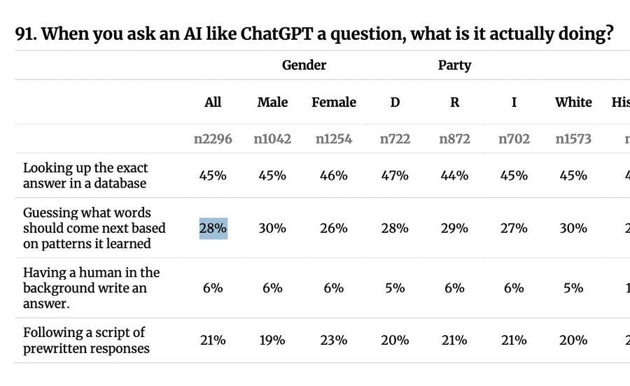
What the people think AI is doing. Oh no.
Andy Masley: I’ve been wondering why the AI and copyright debate has been so bad, but this result makes it clear: 66% of people believe AI has all the art it trains on permanently stored inside it to reference and use.


