Clicky Keyboards —
Besides being a fun tool, this pad’s layers work great for OS-switching.

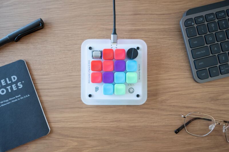
Enlarge / It’s coded for designers, quite literally, but the Figma Creator Micro is just a rebranded version of the stock Creator Micro from Work Louder. It is quite colorful, though.
Figma
A number of my friends, friends who aren’t streamers, have picked up Elgato’s Stream Decks. I can understand the impulse to have shortcuts, automation triggers, and fiddly little knobs within arm’s reach, without expanding the keyboard itself. But the Stream Deck’s customizable icons, upright nature, and streaming-focused app support make it a non-starter for my physical desktop. I’m a clicky keyboard person, even if I can see some intriguing non-QWERTY possibilities.
I hadn’t considered looking further into a secondary keyboard until I noticed that the makers of interface design tool Figma had collaborated with Work Louder on a custom tiny keyboard, the Figma Creator Micro. It’s a version of Work Louder’s standard Creator Micro, done up with a Figma-style color scheme and set up with four layers of shortcuts most useful inside that app, for a total of 48. It’s mechanical, it’s colorful, and it—or its more standardized cousin—might do a good bit toward improving your workflow.
Figma sent me a sample of its Creator Micro to test it out. I do not design interfaces, nor use Figma, but for all purposes, you could consider this to also be a test run of the standard Creator Micro. The two are functionally identical, minus the looks, and the pre-programming and custom shortcut keycaps included with the Figma version. Mine came with the “Clicky” (Kailh White) keys, though “Silent” (Kailh Brown) is an option.
-
The Figma Creator Micro, minus the USB-C cable it needs for data and power.
Figma
-
The keycaps included with the Figma version of the Creator Micro.
Figma
-
The base of the Creator Micro.
Figma
-
Creator Micro on a desktop, with keyboard for scale.
Figma
I reprogrammed three layers of my Micro with essentially the same 12 shortcuts, remapped with the web-based VIA software to mimic the same functions on Mac, Windows, and Gnome-based Linux (I haven’t gotten around to Chrome OS yet, but logically that’s next). This is a need more common among technology writers than perhaps many other trades, but it’s my favorite thing about the Micro. When I switch systems, I have to both physically switch my full-size keyboard (a NuPhy Air 75) between “Mac” and “Win” and also mentally shift my keyboard shortcuts. When I toggle between layers on the Micro (helpfully indicated with tiny LEDs), my shortcut scheme remains the same.
That scheme is geared toward my work, which is largely typing, taking screenshots, manipulating windows, and choosing which music is playing when I’m staring at a cursor and doubting myself. I’ve addressed the Micro’s buttons in horizontal rows, from the top:
- Play, Next (skip) media
- Resize windows left, center, full-size, and right (using native shortcuts or Rectangle)
- Full-screen, active window, area selection, and save-to-file screenshots
- Copy, paste
The top and bottom rows could probably be replaced, but I’m finding it nice to have backups for when my fingers can’t relearn the Command/Control differences between systems. The tall dial I have set to system volume and the smaller metallic wheel set to undo/redo actions. You can obviously go much further into specific app shortcuts, so long as you’re willing to learn VIA’s encoding system.
Having these shortcuts available has been helpful, but also fun. I’m not above admitting that I’m using the Micro to make my job—typing into a box about electricity—seem more like running some kind of complicated machine. The tactile feedback and sound from pressing one of the Micro’s keys provides the same kind of forward momentum feeling that mechanical typing enthusiasts pursue. Moving windows around with dedicated keys, and choosing when to grab a screenshot, feels more intentional and lends a sense of mastery.
OK, it’s fun, I’m saying. It’s fun to have a little box for little computer tasks, rather than efficiently doing them all through one slab you must memorize under pain of being considered unoptimized. Sometimes I just twirl the volume knob up and down, with nothing playing, because it’s fun to twirl a knob.
That kind of fun isn’t going to be worth $130–$160 (at the moment) to most people, maybe not even those already tuned into clicky keys. I think the Micro (and its Figma variant) looks and feels great, especially the knob, wheel, translucent RGB-lit border, and the just-heavy-enough non-skid base. Think about it when you next find your fingers tired from stretching to hit awkward combinations or your brain fatigued from differentiating between too-similar letters.
As Marcin Wichary, Figma’s design director and author of Shift Happens, a terrific compendium of keyboard history, puts it in Figma’s blog post about their Creator: “In a way, the QWERTY keyboard is boring because it has to be boring… it lost a lot of its personality to become versatile, and a lot of its quality to become ubiquitous.” The Creator Micro, and its Figma variant, are just two more tools to wield against practical, reasonable monotony.
Listing image by Figma