VR Design

these-details-make-‘half-life:-alyx’-unlike-any-other-vr-game-–-inside-xr-design

These Details Make ‘Half-Life: Alyx’ Unlike Any Other VR Game – Inside XR Design

In Inside XR Design we examine specific examples of great VR design. Today we’re looking at the details of Half-Life: Alyx and how they add an immersive layer to the game rarely found elsewhere.

You can find the complete video below, or continue reading for an adapted text version.

Intro

Now listen, I know you’ve almost certainly heard of Half-Life: Alyx (2020), it’s one of the best VR games made to date. And there’s tons of reasons why it’s so well regarded. It’s got great graphics, fun puzzles, memorable set-pieces, an interesting story… and on and on. We all know this already.

But the scope of Alyx allows the game to go above and beyond what we usually see in VR with some awesome immersive details that really make it shine. Today I want to examine a bunch of those little details—and even if you’re an absolute master of the game, I hope you’ll find at least one thing you didn’t already know about.

Inertia Physics

First is the really smart way that Alyx handles inertia physics. Lots of VR games use inertia to give players the feeling that objects have different weights. This makes moving a small and light object feel totally different than a large and heavy object, but it usually comes with a sacrifice which is making larger objects much more challenging to throw because the player has to account for the inertia sway as they throw the object.

Alyx makes a tiny little tweak to this formula by ignoring the inertia sway only in its throwing calculation. That means if you’re trying to accurately throw a large object, you can just swing your arm and release in a way that feels natural and you’ll get an accurate throw even if you didn’t consider the object’s inertia.

This gives the game the best of both worlds—an inertia system to convey weight but without sacrificing the usability of throwing.

I love this kind of attention to detail because it makes the experience better without players realizing anything is happening.

Sound Design

Note: Make sure to unmute clips in this section

When it comes to sound design, Alyx is really up there not just in terms of quality, but in detail too. One of my absolute favorite details in this game is that almost every object has a completely unique sound when being shaken. And this reads especially well because it’s spatial audio, so you’ll hear it most from the ear that’s closest to the shaken object:

This is something that no flatscreen game needs because only in VR do players have the ability to pick up practically anything in the game.

I can just imagine the sound design team looking at the game’s extensive list of props and realizing they need to come up with what a VHS tape or a… TV sounds like when shaken.

That’s a ton of work for this little detail that most people won’t notice, but it really helps keep players immersed when they pick up, say, a box of matches and hear the exact sound they would expect to hear if they shook it in real life.

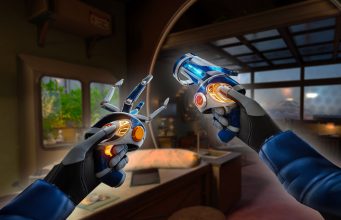
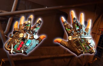
Gravity Gloves In-depth

Ok so everyone knows the Gravity Gloves in Alyx are a diegetic way to give players a force pull capability so it’s easier to grab objects at a distance. And practically everyone I’ve talked to agrees they work exceptionally well. They’re not only helpful, but fun and satisfying to use.

But what exactly makes the gravity gloves perhaps the single best force-pull implementation seen in VR to date? Let’s break it down.

In most VR games, force-pull mechanics have two stages:

  1. The first, which we’ll call ‘selection’, is pointing at an object and seeing it highlighted.
  2. The second, which we’ll call ‘confirmation’, is pressing the grab button which pulls the object to your hand.

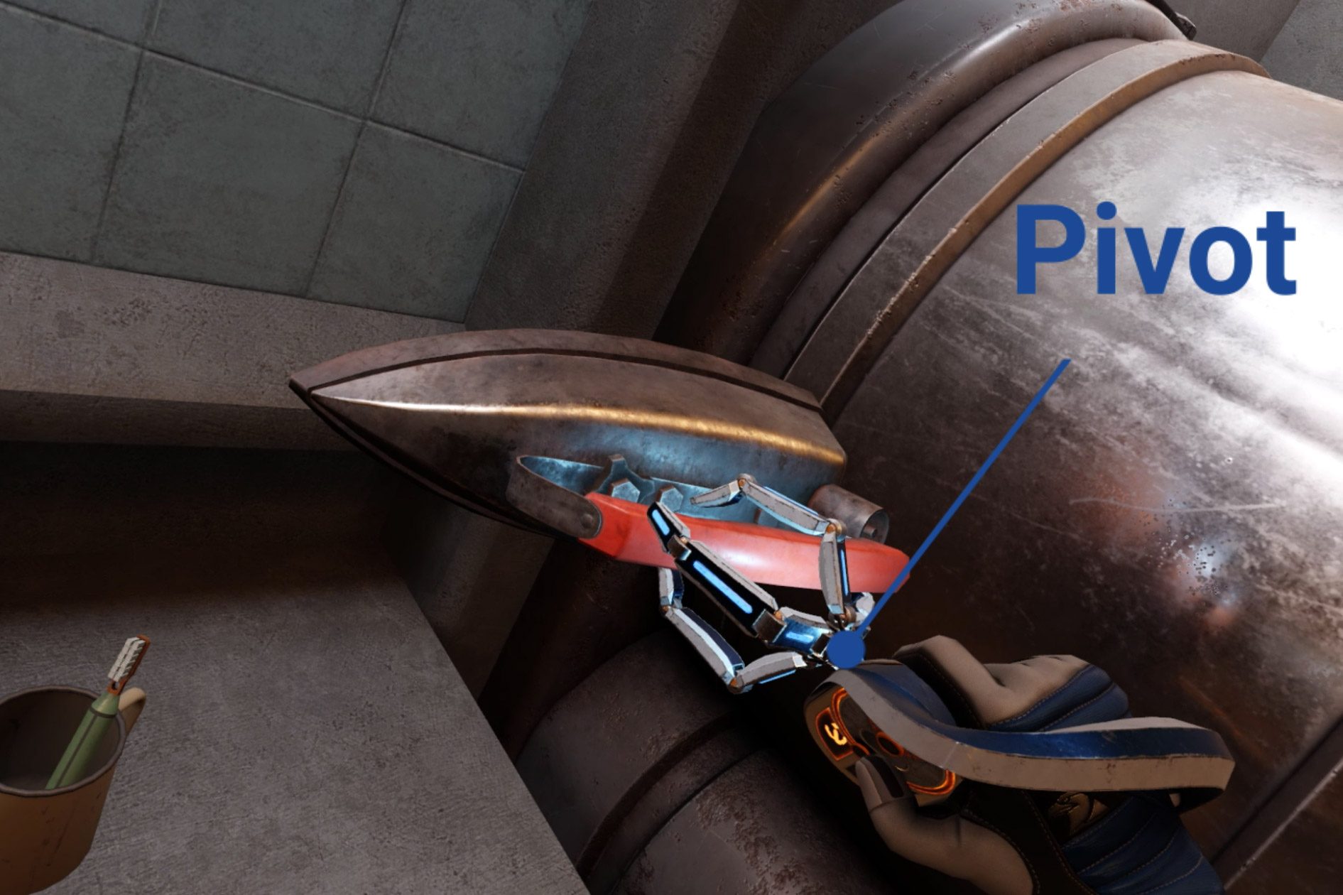
Half-Life: Alyx adds a third stage to this formula which is the key to why it works so well:

  1. First is ‘selection’, where the object glows so you know what is being targeted.
  2. The second—let’s call it lock-on’—involves pulling the trigger to confirm your selection. Once you do, the selection is locked-on; even if you move your hand now the selection won’t change to any other object.
  3. The final stage, ‘confirmation’, requires not a button press but a pulling gesture to finally initiate the force pull.

Adding that extra lock-on stage to the process significantly improves reliability because it ensures that both the player and the game are on the same page before the object is pulled.

And it should be noted that each of these stages has distinct sounds which make it even clearer to the player what’s being selected so they know that everything is going according to their intentions.

The use of a pulling gesture makes the whole thing more immersive by making it feel like the game world is responding to your physical actions, rather than the press of a button.

There’s also a little bit of magic to the exact speed and trajectory the objects follow, like how the trajectory can shift in real-time to reach the player’s hand. Those parameters are carefully tuned to feel satisfying without feeling like the object just automatically attaches to your hand every time.

This strikes me as something that an animator may even have weighed in on to say, “how do we get that to feel just right?”

Working Wearables

It’s natural for players in VR to try to put a hat on their head when they find one, but did you know that wearing a hat protects you from barnacles? And yes, that’s the official name for those horrible creatures that stick to the ceiling.

But it’s not just hats you can wear. The game is surprisingly good about letting players wear anything that’s even vaguely hat-shaped. Like cones or even pots.

I figure this is something that Valve added after watching more than a few playtesters attempt to wear those objects on their head during development.

Speaking of wearing props, you can also wear gas masks. And the game takes this one step further… the gas masks actually work. One part of the game requires you to hold your hand up to cover you mouth to avoid breathing spores which make you cough and give away your position.

If you wear a gas mask you are equally protected, but you also get the use of both hands which gives the gas mask an advantage over covering your mouth with your hand.

The game never explicitly tells you that the gas mask will also protect you from the spores, it just lets players figure it out on their own—sort of like a functional easter egg.
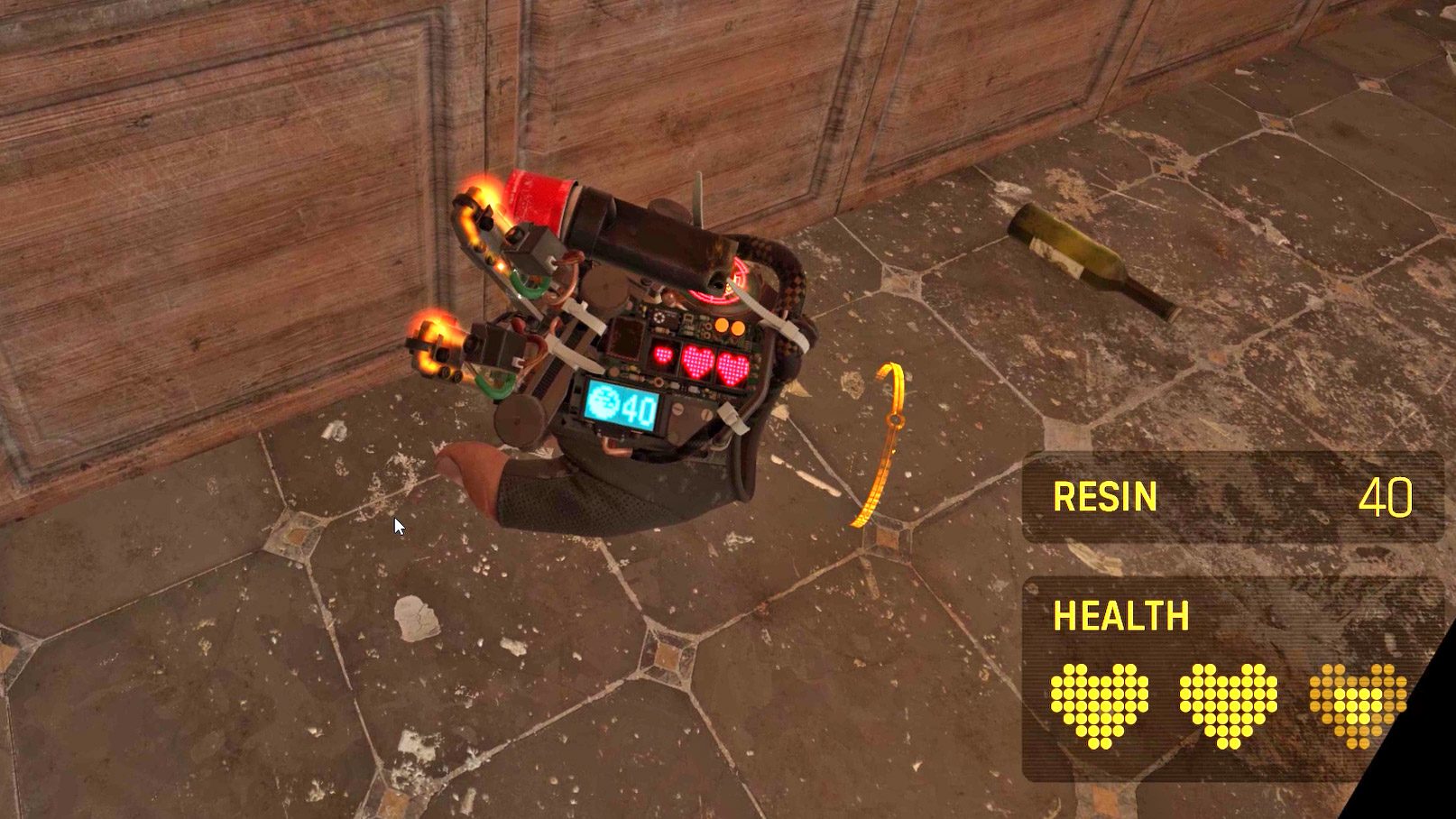
Spectator View

Next up is a feature that’s easy to forget about unless you’ve spent a lot of time watching other people play Half-Life: Alyx… the game has an optional spectator interface which shows up only on the computer monitor. The interface gives viewers the exact same information that the actual player has while in the game: like, which weapons they have unlocked or equipped and how much health and resin they have. The interface even shows what items are stowed in the player’s ‘hand-pockets’.

And Valve went further than just adding an interface for spectators, they also added built-in camera smoothing, zoom levels, and even a selector to pick which eye the camera will look through.

The last one might seem like a minor detail, but because people are either left or right-eye dominant, being able to choose your dominant eye means the spectator will correctly see what you’re aiming at when you’re aiming down the scope of a gun.

Multi-modal Menu

While we’re looking at the menus here, it’s also worth noting that the game menu is primarily designed for laser pointer interaction, but it also works like a touchscreen.

While this seems maybe trivial today, let’s remember that Alyx was released almost four years ago(!). The foresight to offer both modalities means that no matter if the player’s first instinct is to touch the menu or use the laser, both choices are equally correct.

Guiding Your Eye

All key items in Alyx have subtle lights on them to draw your attention. This is basic game design stuff, but I have to say that Alyx’s approach is much less immersion breaking than many VR games where key objects are highlighted in a glaringly obvious yellow mesh.

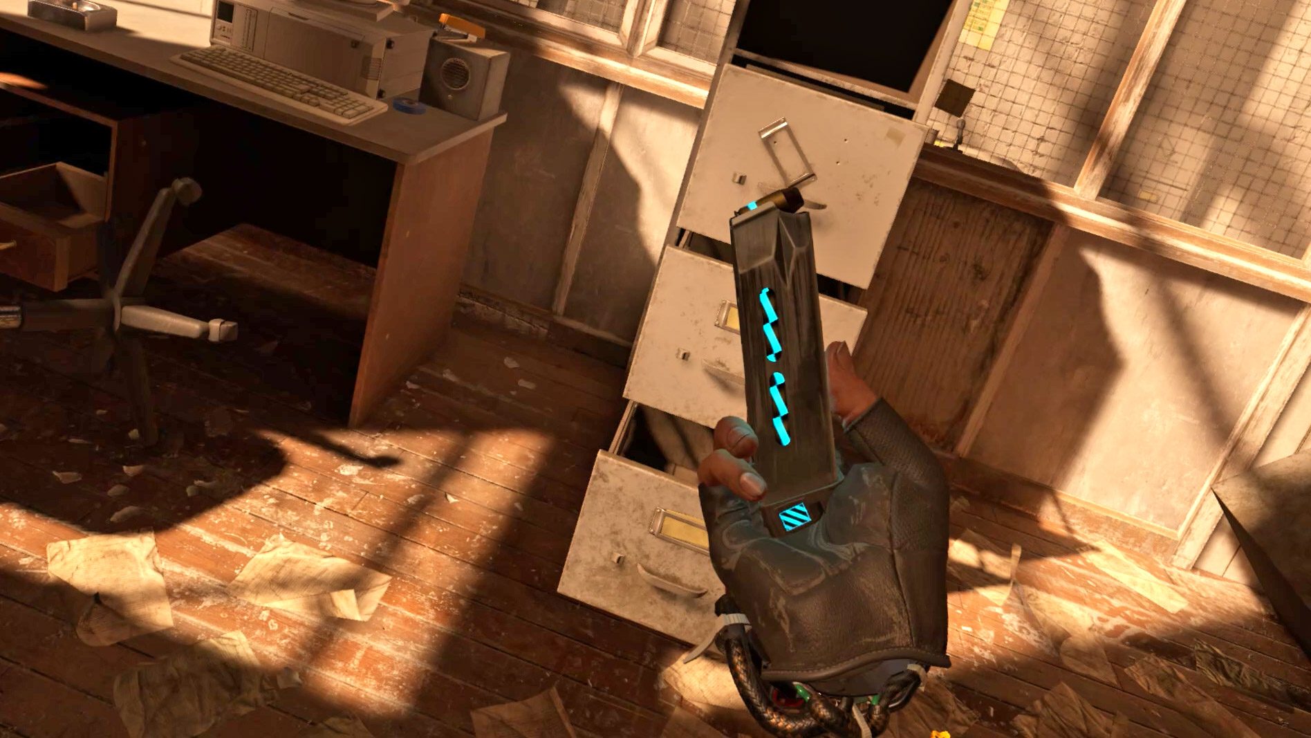
For the pistol magazine, the game makes it clear even at a distance how many bullets are in the magazine… in fact, it does this in two different ways.

First, every bullet has a small light on it which lets you see from the side of the magazine roughly how full it is.

And then on the bottom of the magazine there’s a radial indicator that depletes as the ammo runs down.

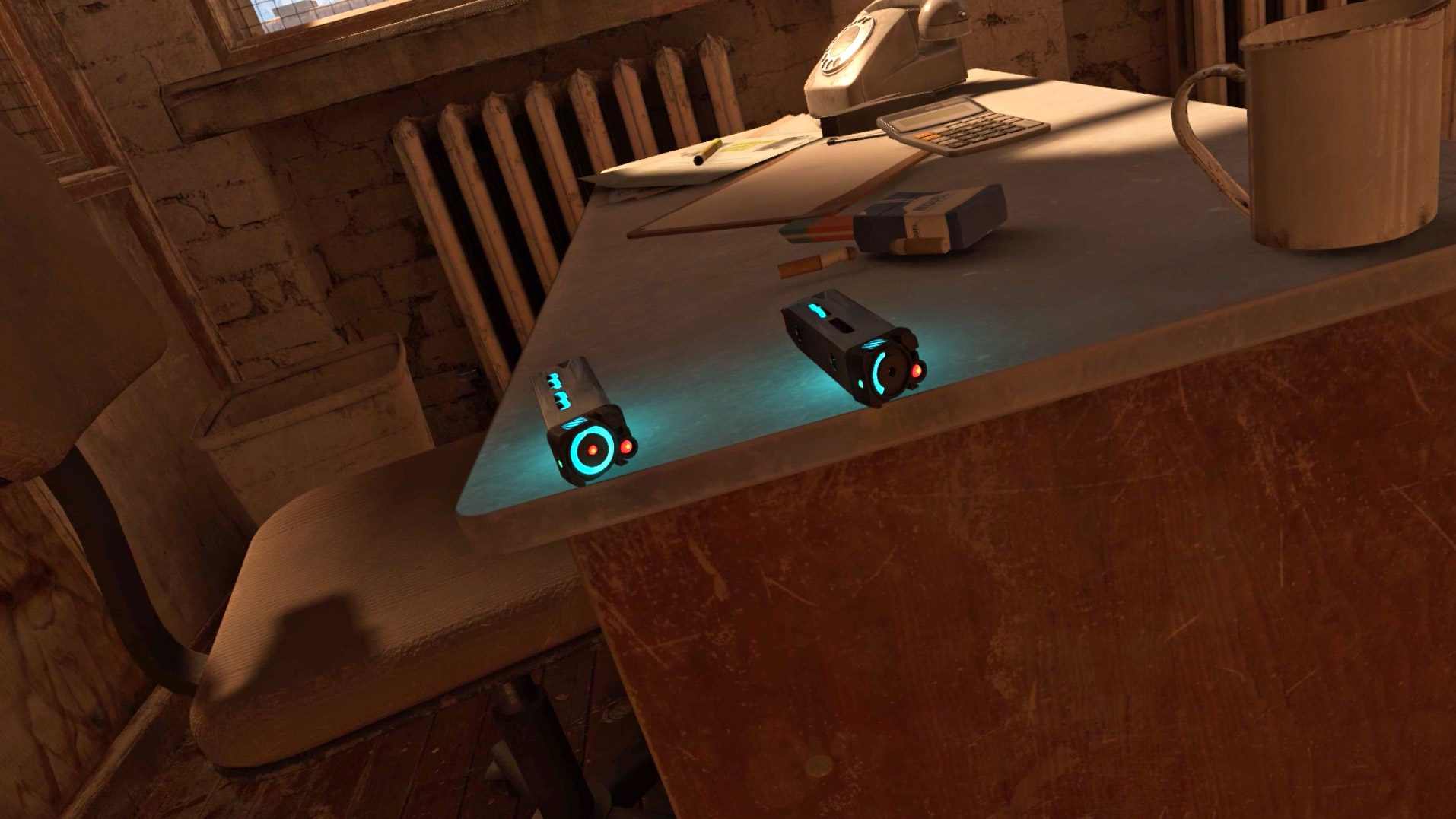
Because this is all done with light, if the magazine is half full, it will be half as bright—making it easy for players to tell just how ‘valuable’ the magazine is with just a glance, even at a distance. Completely empty magazines emit no light so you don’t mistake them for something useful. Many players learn this affordance quickly, even without thinking much about it.

The takeaway here is that a game’s most commonly used items—the things players will interact with the most—should be the things that are most thoughtfully designed. Players will collect and reload literally hundreds of magazines throughout the game, so spending time to add these subtle details meaningfully improves the entire experience.

Continue on Page 2 »

These Details Make ‘Half-Life: Alyx’ Unlike Any Other VR Game – Inside XR Design Read More »

these-clever-tools-make-vr-way-more-immersive-–-inside-xr-design

These Clever Tools Make VR Way More Immersive – Inside XR Design

In Inside XR Design we examine specific examples of great VR design. Today we’re looking at the clever design of Red Matter 2’s ‘grabber tools’ and the many ways that they contribute to immersion.

You can find the complete video below, or continue reading for an adapted text version.

Intro

Today we’re going to talk about Red Matter 2 (2022), an adventure puzzle game set in a retro-future sci-fi world. The game is full of great VR design, but those paying close attention will know that some of its innovations were actually pioneered all the way back in 2018 with the release of the original Red Matter. But hey, that’s why we’re making this video series—there’s incredible VR design out there that everyone can learn from.

We’re going to look at Red Matter 2’s ingenious grabber tools, and the surprising number of ways they contribute to immersion.

What You See is What You Get

At first glance, the grabber tools in Red Matter 2 might just look like sci-fi set-dressing, but they are so much more than that.

At a basic level, the grabber tools take on the shape of the user’s controller. If you’re playing on Quest, Index, or PSVR 2, you’ll see a custom grabber tool that matches the shape of your specific controller.

First and foremost, this means that players’ in-game hand pose matches their actual hand pose and the feeling of holding something in their hands. The shape you see in-game even matches the center of gravity as you feel it in your real hand.

Compare that to most VR games which show an open hand pose and nothing in your hand by default… that creates a disconnect between what you see in VR and what you actually feel in your hand.

And of course because you’re holding a tool that looks just like your controller, you can look down to see all the buttons and what they do.

I don’t know about you, but I’ve been using VR for years now, and I still couldn’t reliably tell you off the top of my head which button is the Y button on a VR controller. Is it on the left or right controller? Top or bottom button? Take your own guess in the comments and then let us know if you got it right!

Being able to look down and reference the buttons—and which ones your finger is touching at any given moment—means players can always get an instant reminder of the controls without breaking immersion by opening a game menu or peeking out of their headset to see which button is where.

This is what’s called a diegetic interface—that’s an interface that’s contextualized within the game world, instead of some kind of floating text box that isn’t actually supposed to exist as part of the game’s narrative.

In fact, you’ll notice that there’s absolutely no on-screen interface in the footage you see from Red Matter 2. And that’s not because I had access to some special debug mode for filming. It’s by design.

When I spoke with Red Matter 2 Game Director Norman Schaar, he told me, “I personally detest UI—quite passionately, in fact! In my mind, the best UI is no UI at all.”

Schaar also told me that a goal of Red Matter 2’s design is to keep the player immersed at all times.

So it’s not surprising that we also see that the grabber tools used as a literal interface within the game, allowing you to physically connect to terminals to gather information. To the player this feels like a believable way that someone would interact with the game’s world—under the surface we’re actually just looking at a clever and immersive way of replacing the ‘press X to interact’ mechanics that are common in flat games.

The game’s grabber tools do even more for immersion than just replicating the feel of a controller in your hand or acting as a diegetic interface in the game. Crucially, they also replicate the limited interaction fidelity that players actually have in VR.

Coarse Hand Input

So let me break this down. In most VR games when you look at your hands you see… a human hand. That hand of course is supposed to represent your hand. But, there’s a big disconnect between what your real hands are capable of and what the virtual hands can do. Your real hands each have five fingers and can dexterously manipulate objects in ways that even today’s most advanced robots have trouble replicating.

So while your real hand has five fingers to grab and manipulate objects, your virtual hand essentially only has one point of input—a single point with which to grab objects.

If you think about it, the grabber tool in Red Matter 2 exactly represents this single point of input to the player. Diegetically, it’s obvious upon looking at the tool that you can’t manipulate the fingers, so your only option is to ‘grab’ at a one point.

That’s a long way of saying that the grabber tools in Red Matter 2 reflect the coarse hand input that’s actually available to us in VR, instead of showing us a virtual hand with lots of fingers that we can’t actually use.

So, In Red Matter 2, the grabber tools contextualize the inability to use our fingers. The result is that instead of feeling silly that we have to rotate and manipulate objects in somewhat strange ways, you actually feel like you’re learning how to deftly operate these futuristic tools.

Immersion Insulation Gap

And believe it or not, there’s still more to talk about why Red Matter 2’s grabber tools are so freaking smart.

Physics interactions are a huge part of the game, and the grabber tools again work to maintain immersion when handling objects. Like many VR games, Red Matter 2 uses an inertia-like system to imply the weight of an object in your hand. Small objects move quickly and easily, while large objects are sluggish and their inertia fights against your movement.

Rather than imagining the force our hands would feel when moving these virtual objects, the grabber tools create a sort of immersion insulation gap by providing a mechanical pivot point between the tool and the object.

This visually ‘explains’ why we can’t feel the forces of the object against our fingers, especially when the object is very heavy. The disconnect between the object and our hand—with the grabber tool as the insulator in the middle—alleviates some of the expectation of the forces that we’d normally feel in real life, thereby preserving immersion just a little bit more.

Unassuming Inventory

And if it wasn’t clear already, the grabber tools are actually… your inventory. Not only do they store all of your tools—like the flashlight, hacking tool, and your gun—you can even use them to temporarily stow objects. Handling inventory this way means that players can never accidentally drop or lose their tools, which is an issue we see in lots of other VR games, even those which use ‘holsters’ to hold things.

Inhuman Hands

And last but not least…the grabber tools can actually do some interesting things that our hands can’t. For example, the rotating grabber actually makes the motion of turning wheels like this one easier than doing it with two normal hands.

It’s no coincidence that the design of the grabber tools in Red Matter 2 is so smartly thought through… after all, the game is all about interacting with the virtual world around you… so it makes sense that the main way in which players interact with the world would be carefully considered.

To take full advantage of the grabbers, the developers built a wide variety of detailed objects for the game which are consistently interactive. You can pick up pretty much anything that looks like you should be able to.

And here’s a great little detail that I love to see: in cases where things aren’t interactive, all you have to do is not imply that they are! Here in Red Matter 2 the developers simply removed handles from this cabinet… a clear but non-intrusive way to tell players it can’t be opened.

Somewhat uniquely to VR, just seeing cool stuff up close like it’s right in front of you can be a rewarding experience all on its own. To that end, Red Matter 2 makes a conscious effort to sprinkle in handful of visually interesting objects, whether it’s this resin eyeball, papers with reactive physics, or this incredible scene where you watch your weapon form from hundreds of little balls right in your hand.

– – — – –

Red Matter 2’s grabber tool design is so beneficial to the game’s overall immersion that, frankly, I’m surprised we haven’t seen this sort of thing become more common in VR games.

If you want to check all of this out for yourself, you can find Red Matter 2 on Quest, PSVR 2, and PC VR. Enjoyed this breakdown? Check out the rest of our Inside XR Design series and our Insights & Artwork series.

And if you’re still reading, how about dropping a comment to let us know which game or app we should cover next?

These Clever Tools Make VR Way More Immersive – Inside XR Design Read More »

designing-mixed-reality-apps-that-adapt-to-different-spaces

Designing Mixed Reality Apps That Adapt to Different Spaces

Laser Dance is an upcoming mixed reality game that seeks to use Quest’s passthrough capability as more than just a background. In this Guest Article, developer Thomas Van Bouwel explains his approach to designing an MR game that adapts to different environments.

Guest Article by Thomas Van Bouwel

Thomas is a Belgian-Brazilian VR developer currently based in Brussels. Although his original background is in architecture, his work in VR spans from indie games like Cubism to enterprise software for architects and engineers like Resolve. His Latest project, Laser Dance, is coming to Quest 3 late next year.

For the past year I’ve been working on a new game called Laser Dance. Built from the ground up for Mixed Reality (MR), my goal is to make a game that turns any room in your house into a laser obstacle course. Players walk back and forth between two buttons, and each button press spawns a new parametric laser pattern they have to navigate through. The game is still in full development, aiming for a release in 2024.

If you’d like to sign up for playtesting Laser Dance, you can do so here!

Laser Dance’s teaser trailer, which was first shown right after Meta Connect 2023

The main challenge with a game like this, and possibly any roomscale MR game, is to make levels that adapt well to any room regardless of its size and layout. Furthermore, since Laser Dance is a game that requires a lot of physical motion, the game should also try to accommodate differences in people’s level of mobility.

To try and overcome these challenges, having good room-emulation tools that enable quick level design iteration is essential. In this article, I want to go over how levels in Laser Dance work, and share some of the developer tools that I’m building to help me create and test the game’s adaptive laser patterns.

Laser Pattern Definition

To understand how Laser Dance’s room emulation tools work, we first need to cover how laser patterns work in the game.

A level in Laser Dance consists of a sequence of laser patterns – players walk (or crawl) back and forth between two buttons on opposite ends of the room, and each button press enables the next pattern. These laser patterns will try to adapt to the room size and layout.

Since the laser patterns in Laser Dance’s levels need to adapt to different types of spaces, the specific positions of lasers aren’t pre-determined, but calculated parametrically based on the room.

Several methods are used to position the lasers. The most straightforward one is to apply a uniform pattern over the entire room. An example is shown below of a level that applies a uniform grid of swinging lasers across the room.

An example of a pattern-based level, a uniform pattern of movement is applied to a grid of lasers, covering the entire room.

Other levels may use the button orientation relative to each other to determine the laser pattern. The below example shows a pattern that creates a sequence of blinking laser walls between the buttons .

Blinking walls of lasers are oriented perpendicular to the imaginary line between the two buttons.

One of the more versatile tools for level generation is a custom pathfinding algorithm, which was written for Laser Dance by Mark Schramm, guest developer on the project. This algorithm tries to find paths between the buttons that maximize the distance from furniture and walls, making a safer path for players.

The paths created by this algorithm allow for several laser patterns, like a tunnel of lasers, or placing a laser obstacle in the middle of the player’s path between the buttons.

This level uses pathfinding to spawn a tunnel of lasers that snakes around the furniture in this room.

Room Emulation

The different techniques described above for creating adaptive laser patterns can sometimes lead to unexpected results or bugs in specific room layouts. Additionally, it can be challenging to design levels while trying to keep different types of rooms in mind.

To help with this, I spent much of early development for Laser Dance on building a set of room emulation tools to let me simulate and directly compare what a level will look like between different room layouts.

Rooms are stored in-game as a simple text file containing all wall and furniture positions and dimensions. The emulation tool can take these files, and spawn several rooms next to each other directly in the Unity editor.

You can then swap out different levels, or even just individual laser patterns, and emulate these side by side in various rooms to directly compare them.

A custom tool built in Unity spawns several rooms side by side in an orthographic view, showing how a certain level in Laser Dance would look in different room layouts.

Accessibility and Player Emulation

Just as the rooms that people play in may differ, the people playing themselves will be very different as well. Not everyone may be able to crawl on the floor to dodge lasers, or feel capable of squeezing through a narrow corridor of lasers.

Because of the physical nature of Laser Dance’s gameplay, there will always be a limit to its accessibility. However, to the extent possible, I would still like to try and have the levels adapt to players in the same way they adapt to rooms.

Currently, Laser Dance allows players to set their height, shoulder width, and the minimum height they’re able to crawl under. Levels will try and use these values to adjust certain parameters of how they’re spawned. An example is shown below, where a level would typically expect players to crawl underneath a field of lasers. When adjusting the minimum crawl height, this pattern adapts to that new value, making the level more forgiving.

Accessibility settings allow players to tailor some of Laser Dance’s levels to their body type and mobility restrictions. This example shows how a level that would have players crawl on the floor, can adjust itself for folks with more limited vertical mobility.

These player values can also be emulated in the custom tools I’m building. Different player presets can be swapped out to directly compare how a level may look different between two players.

Laser Dance’s emulation tools allow you to swap out different preset player values to test their effect on the laser patterns. In this example, you can notice how swapping to a more accessible player value preset makes the tunnel of lasers wider.

Data, Testing, and Privacy

A key problem with designing an adaptive game like Laser Dance is that unexpected room layouts and environments might break some of the levels.

To try and prepare for this during development, there is a button in the settings players can choose to press to share their room data with me. Using these emulation tools, I can then try and reproduce their issue in an effort to resolve it.

Playtesters can press a button in the settings to share their room layout. This allows for local reproduction of potential issues they may have seen, using the emulation tools mentioned above.

This of course should raise some privacy concerns, as players are essentially sharing parts of their home layout with me. From a developers standpoint, it has a clear benefit to the design and quality control process, but as consumers of MR we should also have an active concern on what personal data developers should have access to and how it is used.

Personally, I think it’s important that sharing sensitive data like this requires active consent of the player each time it is shared – hence the button that needs to be actively pressed in the settings. Clear communication on why this data is needed and how it will be used is also important, which is a big part of my motivation for writing this article.

When it comes to MR platforms, an active discussion on data privacy is important too. We can’t always assume sensitive room data will be used in good faith by all developers, so as players we should expect clear communication and clear limitations from platforms regarding how apps can access and use this type of sensitive data, and stay vigilant on how and why certain apps may request access to this data.

Do You Need to Build Custom Tools?

Is building a handful of custom tools a requirement for developing adaptive Mixed Reality? Luckily the answer to that is: probably not.

We’re already seeing Meta and Apple come out with mixed reality emulation tools of their own, letting developers test their apps in a simulated virtual environment, even without a headset. These tools are likely to only get better and more robust in time.

There is still merit to building custom tools in some cases, since they will give you the most flexibility to test against your specific requirements. Being able to emulate and compare between multiple rooms or player profiles at the same time in Laser Dance is a good example of this.

– – — – –

Development of Laser Dance is still in full swing. My hope is that I’ll end up with a fun game that can also serve as an introduction to mixed reality for newcomers to the medium. Though it took some time to build out these emulation tools, they will hopefully both enable and speed up the level design process to help achieve this goal.

If you would like to help with the development of the game, please consider signing up for playtesting!


If you found these insights interesting, check out Van Bouwel’s other Guest Articles:

Designing Mixed Reality Apps That Adapt to Different Spaces Read More »

crafting-memorable-vr-experiences-–-the-interaction-design-of-‘fujii’

Crafting Memorable VR Experiences – The Interaction Design of ‘Fujii’

Creating a VR that truly immerses the user is no easy feat. To pull this off correctly requires a careful blend of graphics, animations, audio, and haptics that work together in deliberate concert to suspend disbelief and engross the user. Fujii is a joyful interactive adventure and a masterclass in rich VR interactions. The President of Funktronic Labs, the studio behind the game, is here to tell us more about his design approach.

Guest Article by Eddie Lee

Eddie Lee is the President and co-founder of Funktronic Labs, an LA-based independent game studio that focuses on delivering high-quality experiences through games, XR, and other interactive media. His experience spans nearly 15 years in the fields of graphics, game design, and computer simulations.

Today, we are thrilled to pull back the curtain and give you an inside look into our thought processing while developing Fujii, a title that has been a labor of love for us at Funktronic Labs. As the landscape of virtual reality continues its dynamic evolution, we saw a golden opportunity not just to adapt, but to breathe new life into Fujii. We’re eager to re-introduce our experience to a burgeoning new community of VR enthusiasts. Stick with us as we delve into the design process that originally brought this magical floral adventure to life.

A Brief Foray into Funktronic Labs

Founded a decade ago at the intersection of art, technology, and design, Funktronic Labs took the plunge into VR development back in 2015, a time when the industry was still in its infancy and precedents were scarce. This compelled us to adopt a ground-up, first-principles approach to game design and VR interactions—an ethos that has become the backbone of all our projects since then—from our pioneering VR venture, Cosmic Trip, to Fujii, and all the way to our latest release, Light Brigade.

Fujii – A Harmonious Blend of Nature and Technology

Fujii first made its debut as an auteur, art-focused launch title for the release of Quest 1 in May 2019. This project holds a special place in our hearts as a resonant blend of artistic vision and interactive design, exploring the wonders of humanity’s connection with nature. Conceived as a soulful sojourn, Fujii interweaves the realms of nature exploration and whimsical gardening, creating an interactive meditative space for players to lose themselves in.

In an industry landscape where unconventional, art-focused projects often struggle to find support, we were extraordinarily fortunate to connect with Meta (at the time known as Oculus). Recognizing the artistic merit and unique potential in our vision, they granted us the exceptional opportunity and support to bring this artsy-fartsy, non-core experience to fruition.

Fujii’s Overall Design Philosophy

During Fujii’s development, we were acutely aware that a substantial portion of our audience would be stepping into the realm of VR for the first time via the Quest 1—the industry’s first major standalone 6DoF headset.

This keen insight significantly sculpted our design approach. We opted for intuitive, physics-driven interactions that mirror the tactile simplicity of the natural world, consciously avoiding complex VR interactions, elaborate interfaces or dense text.

By refraining from controls that demand steep learning curves, we zeroed in on cultivating immediate, natural interactions, thereby offering a warm invitation to VR newcomers of all ages and gameplay experience. Remarkably, this has led to an incredibly diverse player base, attracting everyone from young children to the elderly, many of whom have found Fujii to be an accessible and joyous experience. [Editor’s note: we quite liked the game too].

VR as a New Interaction Paradigm

It’s an oversimplification to regard VR as merely a ‘stereoscopic monitor strapped to your face.’ We see it as much more than just a visual spectacle; VR introduces a groundbreaking paradigm shift in user interaction. With its 6DoF capabilities, VR transcends conventional gaming by enabling intuitive physical actions like grabbing, touching, and gesturing.

This new paradigm unlocks a whole new layer of tactile engagement and immersion, connecting players directly with their virtual surroundings. This stands in contrast to the abstract, button-press or cursor interactions that characterize traditional, non-VR games. In essence, VR offers a far more integrated and visceral form of engagement, elevating the gaming experience to a whole new level.

Physics-based Inventory

In the realm of VR, the addition of physics and animations to objects isn’t just aesthetic; it serves as a vital conduit for player engagement and understanding. The enjoyment derived from physics-based interactions comes from the brain’s innate satisfaction in grasping the object’s physical properties—be it weight, drag, or inertia.

Absent these nuanced physics, interactions feel insubstantial and weightless, breaking the immersive spell. As a guiding principle, consider incorporating physics into every touchpoint, enriching the player’s tactile connection to the game world and making interactions incredibly rewarding.

To illustrate, let’s delve into the inventory system in Fujii. Far from being a mere menu or grid, our inventory system is organically woven into the fabric of the game’s universe. We’ve opted for a physically-driven inventory, where items like seeds find their homes in “natural slots” in the virtual environment, echoing real-world interactions.

This design choice is not only intuitive but negates the need for a separate tutorial. To further enhance this connection, we’ve enriched these interactions with animations and robust physics feedback, providing an additional layer of tangibility that helps players more fully connect with their virtual environment.

Plants and Touch

Another compelling instance of the importance of physics-based design in VR can be found in our intricate interaction model for plants within Fujii. Human interaction with plants is often tactile and visceral; we touch, we feel, we connect. Our aim was to preserve that authentic texture and intimacy in a virtual context. But we went a step further by infusing every plant with musical responsiveness, adding an ethereal layer of magic and wonder to your botanical encounters.

In Fujii, each interaction with plant life is designed to resonate on a meaningful level. Every plant, leaf, and stem adheres to its own tailored set of physics rules. Whether it’s the gentle sway of a leaf in response to your touch or the subtle recoil of a stem, our objective has been to make these virtual interactions indistinguishable from real-life ones.

Achieving this required painstaking attention to detail, coupled with robust physics simulations, ensuring that each touch aligns with natural expectations, thereby deepening your immersion in this magical realm.

Watering

Watering plants in Fujii isn’t just a game mechanic; it’s crafted to be a tactile and immersive VR experience that mimics the soothing and nurturing act of watering real plants. From the way the water cascades to how it nourishes the flora, every detail has been considered. Even the extension of your arms into playful, jiggly water hoses has been designed to offer a sense of whimsy while maintaining an air of naturalism. The water interacts realistically with both the plants and the landscape, underlining the game’s commitment to intuitive, lifelike design.

To infuse an additional layer of enchantment into this seemingly simple act, we’ve introduced a delightful touch: any water droplets that fall onto the ground trigger a temporary, flower-sprouting animation. This whimsical feature serves to amplify the ‘reality’ of the droplets, allowing them to interact with the world in a way that grounds them.

The Symphony of Sound Design

In Fujii, sound design is far from peripheral; it’s an integral facet of the game’s immersive landscape. Sound doesn’t merely serve as an auditory backdrop; it plays a pivotal role in how humans subconsciously interpret the physical makeup of the objects they interact with.

When sound, physics, and visuals synergize, they allow the brain to construct a comprehensive mental model of the object’s material properties. Numerous studies have even demonstrated that superior sound design can elevate players’ perception of the graphics, making them appear more lifelike, despite no actual change in visual quality (see this and this).

Seizing this opportunity, we’ve added a unique aural dimension to Fujii. Instead of sticking strictly to realistic, organic sounds, we’ve imbued interactions with melody, notes, and keys, creating an atmosphere of musical exploration and wonder. It’s as if you’re navigating through a symphonic wonderland, amplifying the sense of enchantment and, ideally, offering players a synesthetic experience that enriches their immersion in this captivating virtual world.

Trust the Design Process

In the course of game development, we’ve learned that it’s often impractical, if not impossible, to map out every component of a game’s design during pre-production. Instead, we’ve increasingly embraced a mindset of ‘discovery’ rather than ‘invention’.

While we adhere to certain design principles, the elusive process of ‘finding the fun’ in a VR experience continues to be a mystifying yet exciting challenge, even with over a decade of experience under our belts. The magic often unfolds when the game seems to take on a life of its own, almost as if it wishes to manifest itself in a particular way.

To best facilitate this organic process, we’ve found that maintaining a high degree of flexibility and adopting an iterative mindset is crucial—especially in VR development, where ideas don’t always translate well into enjoyable VR interactions.

Take, for example, the design of our watering mechanic (from earlier): initial concepts like grabbable watering cans or throwable water orbs seemed engaging on paper but fell flat in practice. It wasn’t until we stumbled upon the random idea of water shooting magically from the player’s hands that everything seemed to click into place. Allowing room for such iterative spontaneity has often led us to unexpected yet delightful game mechanics.

– – — – –

In the development of Fujii, our aim was to establish a meaningful benchmark for what can be achieved through simple yet thoughtful interaction design in VR. As technology marches forward, we anticipate that the fidelity of these virtual experiences will continue to gain depth and realism. Yet, the essence of our objective remains constant: to forge not just visually impressive virtual landscapes, but also highly interactive and emotionally resonant experiences.

Members of Funktronic Labs

We hope this in-depth technical exploration has offered you valuable insights into the thought process that go into shaping a VR experience like Fujii. As we continue on this journey, we invite you to explore and to keep your faith in the limitless possibilities that VR offers. Thank you for sharing this journey with us.


Fujii – A Magical Gardening Adventure is now available at the new low price of $10 on Meta Quest, SteamVR and PSVR 1.

Crafting Memorable VR Experiences – The Interaction Design of ‘Fujii’ Read More »

collaborative-spatial-design-app-‘shapesxr’-raises-$8.6m,-expanding-to-apple-vision-pro-&-other-headsets

Collaborative Spatial Design App ‘ShapesXR’ Raises $8.6M, Expanding to Apple Vision Pro & Other Headsets

ShapesXR is a collaborative spatial design app built to make it easy to prototype spatial interfaces, interactions, and environments. The company announced today it has raised an $8.6 million seed investment, part of which the company plans to use to expand to more headsets.

While so many VR interfaces and interactions borrow heavily (if not entirely) from existing ‘flat’ design paradigms, ShapesXR is built on the premise that in order to build spatial applications you need spatial design tools. With that in mind, the app functions like a freeform canvas that allows users to mock up designs inside of VR to understand how everything fits together at scale and in 3D. With collaborative functionality, multiple people can work on projects simultaneously.

Right now that collaboration is limited to those with a Quest headset, but as part of an $8.6 million seed investment, ShapesXR says it plans to expand the app to Apple Vision Pro, Pico, and Magic Leap headsets, opening the door to broader accessibility and cross-headset collaboration.

Image courtesy ShapesXR

The seed investment was led by Supernode Global, with participation from Triptyq VC, Boost VC, Hartmann Capital, and Geek Ventures.

Inga Petryaevskaya, CEO and Founder of ShapesXR says, “VR has such huge potential to transform how we all collaborate on projects and design new products, however, one of the main barriers to entry is the level of technical skill required to get started. ShapesXR has been built to remove these hurdles—it’s as easy to learn as PowerPoint. This truly democratizes 3D content creation and enables anyone to become a VR, AR and mixed reality storyteller.”

Beyond just creating shapes and scenes, ShapesXR also has a ‘layers’ function which lets users create slideshows of spatial content. This works like a simple flip-book animation, except in a 3D environment instead of a flat doodle at the corner of your notebook. Using the layers function, designers can prototype and show how spatial content should interact with the user, which allows design work to be done before any of the interactions are actually programmed.

“ShapesXR’s goal is to become the de facto industry standard for [spatial] UI/UX design—achieving for spatial computing what Figma did for the mobile computing era,” the company said in its seed investment announcement.

Collaborative Spatial Design App ‘ShapesXR’ Raises $8.6M, Expanding to Apple Vision Pro & Other Headsets Read More »

‘horizon-call-of-the-mountain’-behind-the-scenes-–-insights-&-artwork-from-guerrilla-&-firesprite

‘Horizon Call of the Mountain’ Behind-the-scenes – Insights & Artwork from Guerrilla & Firesprite

It’s a rare treat when we get a VR game with the scope and scale of Horizon Call of the Mountain, let alone to see a much-loved IP reimagined specifically for the medium. Made exclusively for PSVR 2, the game was built collaboratively between studios Guerrilla Games and Firesprite, both part of PlayStation Studios. We sat down to speak with Alex Barnes, Game Director at Firesprite, to learn more about how Horizon Call of the Mountain came to be and how it turned out to be one of our best-rated VR games in recent memory.

Editor’s Note:  The exclusive artwork peppered throughout this article is best viewed on a desktop browser with a large screen or in landscape orientation on your phone. All images courtesy Guerrilla Games & Firesprite.

Gameplay clips may not appear with cookies disabled, click ‘View clip’ to see them in a separate window.

Moving a Mountain

Horizon Call of the Mountain is, of course, a Horizon game. With that, comes the expectation that it will look, feel, and sound like the other two titles in Guerrilla’s lauded franchise. That meant the two studios had to work in close collaboration to deliver on the vision.

Call of the Mountain was an incredibly collaborative project, with both Firesprite and Guerrilla working really closely to develop the game, Barnes explains. “The bulk of the content creation and gameplay teams were over with Firesprite, with Guerrilla holding the original vision for the game and helping direct elements, such as the narrative and art, to create a game that was genuinely grounded in the world of Horizon. We had folks from both teams hands-on at different times and were in constant communication with each other throughout development.”

Even though the game would need to be built as a VR native title, the studios wanted to ensure that it represented elements of a Horizon game, without being too attached to every Horizon gameplay trope regardless of whether or not they fit within VR.

“The core of the gameplay was pretty set from the initial idea for the game. We wanted climbing, crafting, exploration, interaction and combat to be the mainstay of everything that we built. That meant freedom of movement and ‘real-feel’ physical interactions like climbing and bow combat were so crucial that we got feeling great for all types of players,” Barnes say. “Early on, we did look into doing some more wide-ranging gameplay elements to descend from the mountaintops, but ultimately these elements really ended up distracting from the overall gameplay experience, so they didn’t make their way into the released game.”

The bow is central to the game’s combat, so the teams gave it tons of interesting detail. | View clip

Come One, Come All

Another important goal was building a game that anyone could play—whether experienced with VR or not—and to leave a real impression.

“We knew this could be players’ first experience with PSVR 2 and, in some cases, even with VR. That meant building gameplay systems that people could just pick up, play and quickly understand so that we could fully immerse the player in the world,” Barnes says. “We are also big lovers of VR ourselves, and so it became a goal of everyone to blow new players away to show them how amazing a truly VR experience is, especially on this incredible new hardware.”

Building for experiences and new VR players alike also meant rethinking the options for how people would move in the game. This was also driven by the developers themselves, some of which couldn’t tolerate much traditional stick movement in VR. This pushed the studio to come up with an ‘arm-swinger’ locomotion scheme which I personally felt was both more comfortable and more immersive than pure stick-motion.

“Comfort in VR is an incredibly personal thing, and locomotion is such a big part of that. For some of the team, the stick-based movement was difficult to get comfortable with. So the motion mimetic system of moving the player’s arms was conceptualised as a way to help add a layer of comfort that allowed people who were less familiar with VR to play for longer and stay comfortable whilst they did,” says Barnes.

The players gloves also act as a diegetic health bar thanks to the green leaf-like segments

Continue on Page 2: For Fun’s Sake »

‘Horizon Call of the Mountain’ Behind-the-scenes – Insights & Artwork from Guerrilla & Firesprite Read More »

a-concise-beginner’s-guide-to-apple-vision-pro-design-&-development

A Concise Beginner’s Guide to Apple Vision Pro Design & Development

Apple Vision Pro has brought new ideas to the table about how XR apps should be designed, controlled, and built. In this Guest Article, Sterling Crispin offers up a concise guide for what first-time XR developers should keep in mind as they approach app development for Apple Vision Pro.

Guest Article by Sterling Crispin

Sterling Crispin is an artist and software engineer with a decade of experience in the spatial computing industry. His work has spanned between product design and the R&D of new technologies at companies like Apple, Snap Inc, and various other tech startups working on face computers.

Editor’s Note:  The author would like to remind readers that he is not an Apple representative; this info is personal opinion and does not contain non-public information. Additionally, more info on Vision Pro development can be found in Apple’s WWDC23 videos (select Filter → visionOS).

Ahead is my advice for designing and developing products for Vision Pro. This article includes a basic overview of the platform, tools, porting apps, general product design, prototyping, perceptual design, business advice, and more.

Overview

Apps on visionOS are organized into ‘scenes’, which are Windows, Volumes, and Spaces.

Windows are a spatial version of what you’d see on a normal computer. They’re bounded rectangles of content that users surround themselves with. These may be windows from different apps or multiple windows from one app.

Volumes are things like 3D objects, or small interactive scenes. Like a 3D map, or small game that floats in front of you rather than being fully immersive.

Spaces are fully immersive experiences where only one app is visible. That could be full of many Windows and Volumes from your app. Or like VR games where the system goes away and it’s all fully immersive content that surrounds you. You can think of visionOS itself like a Shared Space where apps coexist together and you have less control. Whereas Full Spaces give you the most control and immersiveness, but don’t coexist with other apps. Spaces have immersion styles: mixed, progressive, and full. Which defines how much or little of the real world you want the user to see.

User Input

Users can look at the UI and pinch like the Apple Vision Pro demo videos show. But you can also reach out and tap on windows directly, sort of like it’s actually a floating iPad. Or use a bluetooth trackpad or video game controller. You can also look and speak in search bars. There’s also a Dwell Control for eyes-only input, but that’s really an accessibility feature. For a simple dev approach, your app can just use events like a TapGesture. In this case, you won’t need to worry about where these events originate from.

Spatial Audio

Vision Pro has an advanced spatial audio system that makes sounds seem like they’re really in the room by considering the size and materials in your room. Using subtle sounds for UI interaction and taking advantage of sound design for immersive experiences is going to be really important. Make sure to take this topic seriously.

Development

If you want to build something that works between Vision Pro, iPad, and iOS, you’ll be operating within the Apple dev ecosystem, using tools like XCode and SwiftUI. However, if your goal is to create a fully immersive VR experience for Vision Pro that also works on other headsets like Meta’s Quest or PlayStation VR, you have to use Unity.

Apple Tools

For Apple’s ecosystem, you’ll use SwiftUI to create the UI the user sees and the overall content of your app. RealityKit is the 3D rendering engine that handles materials, 3D objects, and light simulations. You’ll use ARKit for advanced scene understanding, like if you want someone to throw virtual darts and have them collide with their real wall, or do advanced things with hand tracking. But those rich AR features are only available in Full Spaces. There’s also Reality Composer Pro which is a 3D content editor that lets you drag things around a 3D scene and make media rich Spaces or Volumes. It’s like diet-Unity that’s built specifically for this development stack.

One cool thing with Reality Composer is that it’s already full of assets, materials, and animations. That helps developers who aren’t artists build something quickly and should help to create a more unified look and feel to everything built with the tool. Pros and cons to that product decision, but overall it should be helpful.

Existing iOS Apps

If you’re bringing an iPad or iOS app over, it will probably work unmodified as a Window in the Shared Space. If your app supports both iPad and iPhone, the headset will use the iPad version.

To customize your existing iOS app to take better advantage of the headset you can use the Ornament API to make little floating islands of UI in front of, or besides your app, to make it feel more spatial. Ironically, if your app is using a lot of ARKit features, you’ll likely need to ‘reimagine’ it significantly to work on Vision Pro, as ARKit has been upgraded a lot for the headset.

If you’re excited about building something new for Vision Pro, my personal opinion is that you should prioritize how your app will provide value across iPad and iOS too. Otherwise you’re losing out on hundreds of millions of users.

Unity

You can build to Vision Pro with the Unity game engine, which is a massive topic. Again, you need to use Unity if you’re building to Vision Pro as well as a Meta headset like the Quest or PSVR 2.

Unity supports building Bounded Volumes for the Shared Space which exist alongside native Vision Pro content. And Unbounded Volumes, for immersive content that may leverage advanced AR features. Finally you can also build more VR-like apps which give you more control over rendering but seem to lack support for ARKit scene understanding like plane detection. The Volume approach gives RealityKit more control over rendering, so you have to use Unity’s PolySpatial tool to convert materials, shaders, and other features.

Unity support for Vision Pro includes for tons of interactions you’d expect to see in VR, like teleporting to a new location or picking up and throwing virtual objects.

Product Design

You could just make an iPad-like app that shows up as a floating window, use the default interactions, and call it a day. But like I said above, content can exist in a wide spectrum of immersion, locations, and use a wide range of inputs. So the combinatorial range of possibilities can be overwhelming.

If you haven’t spent 100 hours in VR, get a Quest 2 or 3 as soon as possible and try everything. It doesn’t matter if you’re a designer, or product manager, or a CEO, you need to get a Quest and spend 100 hours in VR to begin to understand the language of spatial apps.

I highly recommend checking out Hand Physics Lab as a starting point and overview for understanding direct interactions. There’s a lot of subtle things they do which imbue virtual objects with a sense of physicality. And the Youtube VR app that was released in 2019 looks and feels pretty similar to a basic visionOS app, it’s worth checking out.

Keep a diary of what works and what doesn’t.

Ask yourself: ‘What app designs are comfortable, or cause fatigue?’, ‘What apps have the fastest time-to-fun or value?’, ‘What’s confusing and what’s intuitive?’, ‘What experiences would you even bother doing more than once?’ Be brutally honest. Learn from what’s been tried as much as possible.

General Design Advice

I strongly recommend the IDEO style design thinking process, it works for spatial computing too. You should absolutely try it out if you’re unfamiliar. There’s Design Kit with resources and this video which, while dated, is a great example of the process.

The road to spatial computing is a graveyard of utopian ideas that failed. People tend to spend a very long time building grand solutions for the imaginary problems of imaginary users. It sounds obvious, but instead you should try to build something as fast as possible that fills a real human need, and then iteratively improve from there.

Continue on Page 2: Spatial Formats and Interaction »

A Concise Beginner’s Guide to Apple Vision Pro Design & Development Read More »

the-hidden-design-behind-the-ingenious-room-scale-gameplay-in-‘eye-of-the-temple’

The Hidden Design Behind the Ingenious Room-Scale Gameplay in ‘Eye of the Temple’

Eye of the Temple is one of the rare VR games that focuses on not just on pure room-scale movement, but dynamic room-scale movement. The result is a uniquely immersive experience that required some clever design behind the scenes to make it all work. This guest article by developer Rune Skovbo Johansen explains the approach.

Guest Article by Rune Skovbo Johansen

Rune Skovbo Johansen is a Danish independent game developer based in Turku, Finland. His work spans games and other interactive experiences, focused on tech, wonder, and exploration. After positive reception of the 2016 VR game jam game Chrysalis Pyramid, he started working on a more ambitious spiritual successor, Eye of the Temple, and at the end of 2020 he quit his day job to pursue indie game development full-time.

In Eye of the Temple, you move through a vast environment, not by teleportation or artificial locomotion, but by using your own feet. It makes unique use of room-scale VR to deliver an experience of navigating an expansive space.

In Eye of the Temple you move around large environments using your own feet

But how does it work behind the scenes? To mark the upcoming release of Eye of the Temple on Quest 2, I wanted to take the time to explain these aspects of the game’s design that I’ve never fully gone into detail with before. In this article we’ll go over a variety of the tricks the game uses to make it all work. Let’s start with the basics of keeping the player in the play area

Keeping the Player in the Play Area

Say you need to go from one tall pillar in the game to another via a moving platform. You step forward onto the platform, the platform moves, and then you step forward onto the next pillar. But now you’re outside your physical play area.

Moving platforms are positioned in a way to keep players inside the play area

If we instead position the moving platform to the side, it goes like this: You sidestep onto the platform, it moves, and you sidestep onto the next pillar. Since you took a step right, and then left, you’re back where you started in the center of the play area. So the game’s tricks are all about how the platforms are positioned relative to each other.

Now, to get a better sense for it, let’s look at some mixed reality footage (courtesy of Naysy) where a grid representing the play area is overlaid on top.

Mixed reality footage with a grid overlaid on top which represents the play area

Keeping an Overview in the Level Design

Now that we’ve seen how the trick works, let’s take a look at how I keep track of it all when doing the level design for the game. First things first – I made this pattern, which represents the player’s entire play area – or the part of it the game takes advantage of anyway:

A pattern representing the physical play area

As you can see, there’s a thick white border along the edge, and a thick circle in the center.

Every platform in the game has a designated spot in the play area and a pattern overlay that shows what that spot is. For platforms that are a single tile large, it’s generally one of nine positions. The overlay makes it easy to see if a given platform is positioned in the center of the play area, or at an edge or corner.

The play area pattern overlaid on each platform and its end positions make it easy to see if they are lined up correctly in the level design

Additional overlays show a ghostly version of the pattern at both the start and end positions of a moving platform. This is the real trick of keeping track of how the platforms connect together, because these ghostly overlays at the end positions make it trivial to see if the platforms are lined up correctly in the level design when they touch each other. If the adjacent ghostly patterns are continuous like puzzle pieces that fit together, then the platforms work correctly together.

It still took a lot of ingenuity to work out how to position all the platforms so they both fit correctly together and also take the player where they need to go in the virtual world, but now you know how I kept the complexity of it manageable.

Getting the Player’s Cooperation

The whole premise of getting around the world via these moving platforms is based on an understanding that the player should step from one platform to another when they’re lined up, and not at other times. The most basic way the game establishes this is by just telling it outright to the player in safety instructions displayed prior to starting the game.

One of the safety instructions shown before the game begins

This instructions is shown for two reasons:

One is safety. You should avoid jumping over gaps, otherwise you would risk jumping right out of your play area and into a wall, for example.

The other is that the game’s system of traversal only works correctly when stepping from one platform to another when they line up. This is not as critical – I’ll get back to later what happens if stepping onto a platform that’s misaligned – but it still provides the best play experience.

Apart from the explicit instructions, the game also employs more subtle tricks to help ensure the player only steps over when blocks are correctly aligned. Consider the following example of a larger 2 x 2 tile static platform the player can step onto. A moving platform arrives from the side in a way that would allow the player to step off well before the platform has stopped moving, but that would break the game’s traversal logic.

In this room, ‘foot fences’ are used to discourage the player from stepping from one platform to another when they are not correctly aligned

To avoid this, “foot fences” were placed to discourage the player from stepping over onto the static platform (or away from it) at incorrect positions. The fences are purely visual and don’t technically prevent anything. The player can still step over them if they try, or right through them for that matter. However, psychologically it feels like less effort to not step over or through a fence and instead step onto the static platform where there’s a gap in the fence. In this way, a purely non-technical solution is used as part of the game’s arsenal of tricks.

Continued on Page 2: Correcting for Unaligned Platforms »

The Hidden Design Behind the Ingenious Room-Scale Gameplay in ‘Eye of the Temple’ Read More »