Features

you-should-care-more-about-the-stabilizers-in-your-mechanical-keyboard—here’s-why

You should care more about the stabilizers in your mechanical keyboard—here’s why

While most people don’t spend a lot of time thinking about the keys they tap all day, mechanical keyboard enthusiasts certainly do. As interest in DIY keyboards expands, there are plenty of things to obsess over, such as keycap sets, layout, knobs, and switches. But you have to get deep into the hobby before you realize there’s something more important than all that: the stabilizers.

Even if you have the fanciest switches and a monolithic aluminum case, bad stabilizers can make a keyboard feel and sound like garbage. Luckily, there’s a growing ecosystem of weirdly fancy stabilizers that can upgrade your typing experience, packing an impressive amount of innovation into a few tiny bits of plastic and metal.

What is a stabilizer, and why should you care?

Most keys on a keyboard are small enough that they go up and down evenly, no matter where you press. That’s not the case for longer keys: Space, Enter, Shift, Backspace, and, depending on the layout, a couple more on the number pad. These keys have wire assemblies underneath called stabilizers, which help them go up and down when the switch does.

A cheap stabilizer will do this, but it won’t necessarily do it well. Stabilizers can be loud and move unevenly, or a wire can even pop out and really ruin your day. But what’s good? A stabilizer is there to, well, stabilize, and that’s all it should do. It facilitates smooth up and down movement of frequently used keys—if stabilizers add noise, friction, or wobble, they’re not doing their job and are, therefore, bad. Most keyboards have bad stabilizers.

Stabilizers assembled

Stabilizer stems poke up through the plate to connect to your keycaps.

Credit: Ryan Whitwam

Stabilizer stems poke up through the plate to connect to your keycaps. Credit: Ryan Whitwam

Like switches, most stabilizers are based on the old-school Cherry Inc. designs, but the specifics have morphed in recent years. Stabilizers have to adhere to certain physical measurements to properly mount on PCBs and connect to standard keycaps. However, designers have come up with a plethora of creative ways to modify and improve stabilizers within that envelope. And yes, premium stabilizers really are better.

You should care more about the stabilizers in your mechanical keyboard—here’s why Read More »

apple-iphone-17-review:-sometimes-boring-is-best

Apple iPhone 17 review: Sometimes boring is best


let’s not confuse “more interesting” with “better”

The least exciting iPhone this year is also the best value for the money.

The iPhone 17 Pro isn’t flashy but it’s probably the best of this year’s upgrades. Credit: Andrew Cunningham

The iPhone 17 Pro isn’t flashy but it’s probably the best of this year’s upgrades. Credit: Andrew Cunningham

Apple seems determined to leave a persistent gap between the cameras of its Pro iPhones and the regular ones, but most other features—the edge-to-edge-screen design with FaceID, the Dynamic Island, OLED display panels, Apple Intelligence compatibility—eventually trickle down to the regular-old iPhone after a generation or two of timed exclusivity.

One feature that Apple has been particularly slow to move down the chain is ProMotion, the branding the company uses to refer to a screen that can refresh up to 120 times per second rather than the more typical 60 times per second. ProMotion isn’t a necessary feature, but since Apple added it to the iPhone 13 Pro in 2021, the extra fluidity and smoothness, plus the always-on display feature, have been big selling points for the Pro phones.

This year, ProMotion finally comes to the regular-old iPhone 17, years after midrange and even lower-end Android phones made the swap to 90 or 120 Hz display panels. And it sounds like a small thing, but the screen upgrade—together with a doubling of base storage from 128GB to 256GB—makes the gap between this year’s iPhone and iPhone Pro feel narrower than it’s been in a long time. If you jumped on the Pro train a few years back and don’t want to spend that much again, this might be a good year to switch back. If you’ve ever been tempted by the Pro but never made the upgrade, you can continue not doing that and miss out on relatively little.

The iPhone 17 has very little that we haven’t seen in an iPhone before, compared to the redesigned Pro or the all-new Air. But it’s this year’s best upgrade, and it’s not particularly close.

You’ve seen this one before

Externally, the iPhone 17 is near-identical to the iPhone 16, which itself used the same basic design Apple had been using since the iPhone 12. The most significant update in that five-year span was probably the iPhone 15, which switched from the display notch to the Dynamic Island and from the Lightning port to USB-C.

The iPhone 12 generation was also probably the last time the regular iPhone and the Pro were this similar. Those phones used the same basic design, the same basic chip, and the same basic screen, leaving mostly camera-related improvements and the Max model as the main points of differentiation. That’s all broadly true of the split between the iPhone 17 and the 17 Pro, as well.

The iPhone Air and Pro both depart from the last half-decade of iPhone designs in different ways, but the iPhone 17 sticks with the tried-and-true. Credit: Andrew Cunningham

The iPhone 17’s design has changed just enough since last year that you’ll need to find a new iPhone 17-compatible case and screen protector for your phone rather than buying something that fits a previous-generation model (it’s imperceptibly taller than the iPhone 16). The screen size has been increased from 6.1 inches to 6.3, the same as the iPhone Pro. But the aluminum-framed-glass-sandwich design is much less of a departure from recent precedent than either the iPhone Air or the Pro.

The screen is the real star of the show in the iPhone 17, bringing 120 Hz ProMotion technology and the Pro’s always-on display feature to the regular iPhone for the first time. According to Apple’s spec sheets (and my eyes, admittedly not a scientific measurement), the 17 and the Pro appear to be using identical display panels, with the same functionally infinite contrast, resolution (2622 x 1206), and brightness specs (1,000 nits typical, 1,600 nits for HDR, 3,000 nits peak in outdoor light).

It’s easy to think of the basic iPhone as “the cheap one” because it is the least expensive of the four new phones Apple puts out every year, but $799 is still well into premium-phone range, and even middle-of-the-road phones from the likes of Google and Samsung have been shipping high-refresh-rate OLED panels in cheaper phones than this for a few years now. By that metric, it’s faintly ridiculous that Apple isn’t shipping something like this in its $600 iPhone 16e, but in Apple’s ecosystem, we’ll take it as a win that the iPhone 17 doesn’t cost more than the 16 did last year.

Holding an iPhone 17 feels like holding any other regular-sized iPhone made within the last five years, with the exceptions of the new iPhone Air and some of the heavier iPhone Pros. It doesn’t have the exceptionally good screen-size-to-weight ratio or the slim profile of the Air, and it doesn’t have the added bulk or huge camera plateau of the iPhone 17 Pro. It feels about like it looks: unremarkable.

Camera

iPhone 15 Pro, main lens, 1x mode, outdoor light. If you’re just shooting with the main lens, the Air and iPhone 17 win out in color and detail thanks to a newer sensor and ISP. Andrew Cunningham

The iPhone Air’s single camera has the same specs and uses the same sensor as the iPhone 17’s main camera, so we’ve already written a bit about how well it does relative to the iPhone Pro and to an iPhone 15 Pro from a couple of years ago.

Like the last few iPhone generations, the iPhone 17’s main camera uses a 48 MP sensor that saves 24 MP images, using a process called “pixel binning” to decide which pixels are saved and which are discarded when shrinking the images down. To enable an “optical quality” 2x telephoto mode, Apple crops a 12 MP image out of the center of that sensor without doing any resizing or pixel binning. The results are a small step down in quality from the regular 1x mode, but they’re still native resolution images with no digital zoom, and the 2x mode on the iPhone Air or iPhone 17 can actually capture fine detail better than an older iPhone Pro in situations where you’re shooting an object that’s close by and the actual telephoto lens isn’t used.

The iPhone 15 Pro. When you shoot a nearby subject in 2x or even 3x mode, the Pro phones give you a crop of the main sensor rather than switching to the telephoto lens. You need to be farther from your subject for the phone to engage the telephoto lens. Andrew Cunningham

One improvement to the iPhone 17’s camera sensor this year is that the ultrawide camera is also upgraded to a 48 MP sensor so that it can benefit from the same shrinking-and-pixel-binning strategy Apple uses for the main camera. In the iPhone 16, this secondary sensor was still just 12 MP.

Compared to the iPhone 15 Pro and iPhone 16 we have here, wide shots on the iPhone 17 benefit mainly from the added detail you capture in higher-resolution 24- or 48-MP images. The difference is slightly more noticeable with details in the background of an image than with details in the foreground, as visible in the Lego castle surrounding Lego Mario.

The older the phone you’re using is, the more you’ll benefit from sensor and image signal processing improvements. Bits of dust and battle damage on Mario are most distinct on the iPhone 17 than the iPhone 15 Pro, for example, but aside from the resolution, I don’t notice much of a difference between the iPhone 16 and 17.

A true telephoto lens is probably the biggest feature the iPhone 17 Pro has going for it relative to the basic iPhone 17, and Apple has amped it up with its own 48 MP sensor this year. We’ll reuse the 4x and 8x photos from our iPhone Air review to show you what you’re missing—the telephoto camera captures considerably more fine detail on faraway objects, but even as someone who uses the telephoto on the iPhone 15 Pro constantly, I would have to think pretty hard about whether that camera is worth $300, even once you add in the larger battery, ProRAW support, and other things Apple still holds back for the Pro phones.

Specs and speeds and battery

Our iPhone Air review showed that the main difference between the iPhone 17’s Apple A19 chip and the A19 Pro used in the iPhone Air and iPhone Pro is RAM. The iPhone 17 sticks with 8GB of memory, whereas both Air and Pro are bumped up to 12GB.

There are other things that the A19 Pro can enable, including ProRes video support and 10Gbps USB 3 file transfer speeds. But many of those iPhone Pro features, including the sixth GPU core, are mostly switched off for the iPhone Air, suggesting that we could actually be looking at the exact same silicon with a different amount of RAM packaged on top.

Regardless, 8GB of RAM is currently the floor for Apple Intelligence, so there’s no difference in features between the iPhone 17 and the Air or the 17 Pro. Browser tabs and apps may be ejected from memory slightly less frequently, and the 12GB phones may age better as the years wear on. But right now, 8GB of memory puts you above the amount that most iOS 26-compatible phones are using—Apple is still optimizing for plenty of phones with 6GB, 4GB, or even 3GB of memory. 8GB should be more than enough for the foreseeable future, and I noticed zero differences in day-to-day performance between the iPhone 17 and the iPhone Air.

All phones were tested with Adaptive Power turned off.

The iPhone 17 is often actually faster than the iPhone Air, despite both phones using five-core A19-class GPUs. Apple’s thinnest phone has less room to dissipate heat, which leads to more aggressive thermal throttling, especially for 3D apps like games. The iPhone 17 will often outperform Apple’s $999 phone, despite costing $200 less.

All of this also ignores one of the iPhone 17’s best internal upgrades: a bump from 128GB of storage to 256GB of storage at the same $799 starting price as the iPhone 16. Apple’s obnoxious $100-or-$200-per-tier upgrade pricing for storage and RAM is usually the worst part about any of its products, so any upgrade that eliminates that upcharge for anyone is worth calling out.

On the battery front, we didn’t run specific tests, but the iPhone 17 did reliably make it from my typical 7: 30 or 7: 45 am wakeup to my typical 1: 00 or 1: 30 am bedtime with 15 or 20 percent left over. Even a day with Personal Hotspot use and a few dips into Pokémon Go didn’t push the battery hard enough to require a midday top-up. (Like the other new iPhones this year, the iPhone 17 ships with Adaptive Power enabled, which can selectively reduce performance or dim the screen and automatically enables Low Power Mode at 20 percent, all in the name of stretching the battery out a bit and preventing rapid drops.)

Better battery life out of the box is already a good thing, but it also means more wiggle room for the battery to lose capacity over time without seriously inconveniencing you. This is a line that the iPhone Air can’t quite cross, and it will become more and more relevant as your phone approaches two or three years in service.

The one to beat

Apple’s iPhone 17. Credit: Andrew Cunningham

The screen is one of the iPhone Pro’s best features, and the iPhone 17 gets it this year. That plus the 256GB storage bump is pretty much all you need to know; this will be a more noticeable upgrade for anyone with, say, the iPhones 12-to-14 than the iPhone 15 or 16 was. And for $799—$200 more than the 128GB version of the iPhone 16e and $100 more than the 128GB version of the iPhone 16—it’s by far the iPhone lineup’s best value for money right now.

This is also happening at the same time as the iPhone Pro is getting a much chonkier new design, one I don’t particularly love the look of, even though I appreciate the functional camera and battery upgrades it enables. This year’s Pro feels like a phone targeted toward people who are actually using it in a professional photography or videography context, where in other years, it’s felt more like “the regular iPhone plus a bunch of nice, broadly appealing quality-of-life stuff that may or may not trickle down to the regular iPhone over time.”

In this year’s lineup, you get the iPhone Air, which seems to be trying to do something new at the expense of basics like camera quality and battery life. You get the iPhone 17 Pro, which feels like it was specifically built for anyone who looks at the iPhone Air and thinks, “I just want a phone with a bigger battery and a better camera, and I don’t care what it looks like or how light it is” (hello, median Ars Technica readers and employees). And the iPhone 17 is there quietly undercutting them both, as if to say, “Would anyone just like a really good version of the regular iPhone?”

Next and last on our iPhone review list this year: the iPhone 17 Pro. Maybe spending a few days up close with it will help me appreciate the design more?

The good

  • The exact same screen as this year’s iPhone Pro for $300 less, including 120 Hz ProMotion, variable refresh rates, and an always-on screen.
  • Same good main camera as the iPhone Air, plus the added flexibility of an improved wide-angle camera.
  • Good battery life.
  • A19 is often faster than iPhone Air’s A19 Pro thanks to better heat dissipation.
  • Jumps from 128GB to 256GB of storage without increasing the starting price.

The bad

  • 8GB of RAM instead of 12GB. 8GB is fine, but more is also good!
  • I slightly prefer last year’s versions of most of these color options.
  • No two-column layout for apps in landscape mode.
  • The telephoto lens seems like it will be restricted to the iPhone Pro forever.

The ugly

  • People probably won’t be able to tell you have a new iPhone?

Photo of Andrew Cunningham

Andrew is a Senior Technology Reporter at Ars Technica, with a focus on consumer tech including computer hardware and in-depth reviews of operating systems like Windows and macOS. Andrew lives in Philadelphia and co-hosts a weekly book podcast called Overdue.

Apple iPhone 17 review: Sometimes boring is best Read More »

a-history-of-the-internet,-part-3:-the-rise-of-the-user

A history of the Internet, part 3: The rise of the user


the best of times, the worst of times

The reins of the Internet are handed over to ordinary users—with uneven results.

Everybody get together. Credit: D3Damon/Getty Images

Everybody get together. Credit: D3Damon/Getty Images

Welcome to the final article in our three-part series on the history of the Internet. If you haven’t already, catch up with part one and part two.

As a refresher, here’s the story so far:

The ARPANET was a project started by the Defense Department’s Advanced Research Project Agency in 1969 to network different mainframe computers together across the country. It later evolved into the Internet, connecting multiple global networks together using a common TCP/IP protocol. By the late 1980s, a small group of academics and a few curious consumers connected to each other on the Internet, which was still mostly text-based.

In 1991, Tim Berners-Lee invented the World Wide Web, an Internet-based hypertext system designed for graphical interfaces. At first, it ran only on the expensive NeXT workstation. But when Berners-Lee published the web’s protocols and made them available for free, people built web browsers for many different operating systems. The most popular of these was Mosaic, written by Marc Andreessen, who formed a company to create its successor, Netscape. Microsoft responded with Internet Explorer, and the browser wars were on.

The web grew exponentially, and so did the hype surrounding it. It peaked in early 2001, right before the dotcom collapse that left most web-based companies nearly or completely bankrupt. Some people interpreted this crash as proof that the consumer Internet was just a fad. Others had different ideas.

Larry Page and Sergey Brin met each other at a graduate student orientation at Stanford in 1996. Both were studying for their PhDs in computer science, and both were interested in analyzing large sets of data. Because the web was growing so rapidly, they decided to start a project to improve the way people found information on the Internet.

They weren’t the first to try this. Hand-curated sites like Yahoo had already given way to more algorithmic search engines like AltaVista and Excite, which both started in 1995. These sites attempted to find relevant webpages by analyzing the words on every page.

Page and Brin’s technique was different. Their “BackRub” software created a map of all the links that pages had to each other. Pages on a given subject that had many incoming links from other sites were given a higher ranking for that keyword. Higher-ranked pages could then contribute a larger score to any pages they linked to. In a sense, this was a like a crowdsourcing of search: When people put “This is a good place to read about alligators” on a popular site and added a link to a page about alligators, it did a better job of determining that page’s relevance than simply counting the number of times the word appeared on a page.

Step 1 of the simplified BackRub algorithm. It also stores the position of each word on a page, so it can make a further subset for multiple words that appear next to each other. Jeremy Reimer.

Creating a connected map of the entire World Wide Web with indexes for every word took a lot of computing power. The pair filled their dorm rooms with any computers they could find, paid for by a $10,000 grant from the Stanford Digital Libraries Project. Many were cobbled together from spare parts, including one with a case made from imitation LEGO bricks. Their web scraping project was so bandwidth-intensive that it briefly disrupted the university’s internal network. Because neither of them had design skills, they coded the simplest possible “home page” in HTML.

In August 1996, BackRub was made available as a link from Stanford’s website. A year later, Page and Brin rebranded the site as “Google.” The name was an accidental misspelling of googol, a term coined by a mathematician’s young son to describe a 1 with 100 zeros after it. Even back then, the pair was thinking big.

Google.com as it appeared in 1998. Credit: Jeremy Reimer

By mid-1998, their prototype was getting over 10,000 searches a day. Page and Brin realized they might be onto something big. It was nearing the height of the dotcom mania, so they went looking for some venture capital to start a new company.

But at the time, search engines were considered passée. The new hotness was portals, sites that had some search functionality but leaned heavily into sponsored content. After all, that’s where the big money was. Page and Brin tried to sell the technology to AltaVista for $1 million, but its parent company passed. Excite also turned them down, as did Yahoo.

Frustrated, they decided to hunker down and keep improving their product. Brin created a colorful logo using the free GIMP paint program, and they added a summary snippet to each result. Eventually, the pair received $100,000 from angel investor Andy Bechtolsheim, who had co-founded Sun Microsystems. That was enough to get the company off the ground.

Page and Brin were careful with their money, even after they received millions more from venture capitalist firms. They preferred cheap commodity PC hardware and the free Linux operating system as they expanded their system. For marketing, they relied mostly on word of mouth. This allowed Google to survive the dotcom crash that crippled its competitors.

Still, the company eventually had to find a source of income. The founders were concerned that if search results were influenced by advertising, it could lower the usefulness and accuracy of the search. They compromised by adding short, text-based ads that were clearly labeled as “Sponsored Links.” To cut costs, they created a form so that advertisers could submit their own ads and see them appear in minutes. They even added a ranking system so that more popular ads would rise to the top.

The combination of a superior product with less intrusive ads propelled Google to dizzying heights. In 2024, the company collected over $350 billion in revenue, with $112 billion of that as profit.

Information wants to be free

The web was, at first, all about text and the occasional image. In 1997, Netscape added the ability to embed small music files in the MIDI sound format that would play when a webpage was loaded. Because the songs only encoded notes, they sounded tinny and annoying on most computers. Good audio or songs with vocals required files that were too large to download over the Internet.

But this all changed with a new file format. In 1993, researchers at the Fraunhofer Institute developed a compression technique that eliminated portions of audio that human ears couldn’t detect. Suzanne Vega’s song “Tom’s Diner” was used as the first test of the new MP3 standard.

Now, computers could play back reasonably high-quality songs from small files using software decoders. WinPlay3 was the first, but WinAmp, released in 1997, became the most popular. People started putting links to MP3 files on their personal websites. Then, in 1999, Shawn Fanning released a beta of a product he called Napster. This was a desktop application that relied on the Internet to let people share their MP3 collection and search everyone else’s.

Napster as it would have appeared in 1999. Credit: Jeremy Reimer

Napster almost immediately ran into legal challenges from the Recording Industry Association of America (RIAA). It sparked a debate about sharing things over the Internet that persists to this day. Some artists agreed with the RIAA that downloading MP3 files should be illegal, while others (many of whom had been financially harmed by their own record labels) welcomed a new age of digital distribution. Napster lost the case against the RIAA and shut down in 2002. This didn’t stop people from sharing files, but replacement tools like eDonkey 2000, Limewire, Kazaa, and Bearshare lived in a legal gray area.

In the end, it was Apple that figured out a middle ground that worked for both sides. In 2003, two years after launching its iPod music player, Apple announced the Internet-only iTunes Store. Steve Jobs had signed deals with all five major record labels to allow legal purchasing of individual songs—astoundingly, without copy protection—for 99 cents each, or full albums for $10. By 2010, the iTunes Store was the largest music vendor in the world.

iTunes 4.1, released in 2003. This was the first version for Windows and introduced the iTunes Store to a wider world. Credit: Jeremy Reimer

The Web turns 2.0

Tim Berners-Lee’s original vision for the web was simply to deliver and display information. It was like a library, but with hypertext links. But it didn’t take long for people to start experimenting with information flowing the other way. In 1994, Netscape 0.9 added new HTML tags like FORM and INPUT that let users enter text and, using a “Submit” button, send it back to the web server.

Early web servers didn’t know what to do with this text. But programmers developed extensions that let a server run programs in the background. The standardized “Common Gateway Interface” (CGI) made it possible for a “Submit” button to trigger a program (usually in a /cgi-bin/ directory) that could do something interesting with the submission, like talking to a database. CGI scripts could even generate new webpages dynamically and send them back to the user.

This intelligent two-way interaction changed the web forever. It enabled things like logging into an account on a website, web-based forums, and even uploading files directly to a web server. Suddenly, a website wasn’t just a page that you looked at. It could be a community where groups of interested people could interact with each other, sharing both text and images.

Dynamic webpages led to the rise of blogging, first as an experiment (some, like Justin Hall’s and Dave Winer’s, are still around today) and then as something anyone could do in their spare time. Websites in general became easier to create with sites like Geocities and Angelfire, which let people build their own personal dream house on the web for free. A community-run dynamic linking site, webring.org, connected similar websites together, encouraging exploration.

Webring.org was a free, community-run service that allowed dynamically updated webrings. Credit: Jeremy Reimer

One of the best things to come out of Web 2.0 was Wikipedia. It arose as a side project of Nupedia, an online encyclopedia founded by Jimmy Wales, with articles written by volunteers who were subject matter experts. This process was slow, and the site only had 21 articles in its first year. Wikipedia, in contrast, allowed anyone to contribute and review articles, so it quickly outpaced its predecessor. At first, people were skeptical about letting random Internet users edit articles. But thanks to an army of volunteer editors and a set of tools to quickly fix vandalism, the site flourished. Wikipedia far surpassed works like the Encyclopedia Britannica in sheer numbers of articles while maintaining roughly equivalent accuracy.

Not every Internet innovation lived on a webpage. In 1988, Jarkko Oikarinen created a program called Internet Relay Chat (IRC), which allowed real-time messaging between individuals and groups. IRC clients for Windows and Macintosh were popular among nerds, but friendlier applications like PowWow (1994), ICQ (1996), and AIM (1997) brought messaging to the masses. Even Microsoft got in on the act with MSN Messenger in 1999. For a few years, this messaging culture was an important part of daily life at home, school, and work.

A digital recreation of MSN Messenger from 2001. Sadly, Microsoft shut down the servers in 2014. Credit: Jeremy Reimer

Animation, games, and video

While the web was evolving quickly, the slow speeds of dial-up modems limited the size of files you could upload to a website. Static images were the norm. Animation only appeared in heavily compressed GIF files with a few frames each.

But a new technology blasted past these limitations and unleashed a torrent of creativity on the web. In 1995, Macromedia released Shockwave Player, an add-on for Netscape Navigator. Along with its Director software, the combination allowed artists to create animations based on vector drawings. These were small enough to embed inside webpages.

Websites popped up to support this new content. Newgrounds.com, which started in 1995 as a Neo-Geo fan site, started collecting the best animations. Because Director was designed to create interactive multimedia for CD-ROM projects, it also supported keyboard and mouse input and had basic scripting. This meant that people could make simple games that ran in Shockwave. Newgrounds eagerly showcased these as well, giving many aspiring artists and game designers an entry point into their careers. Super Meat Boy, for example, was first prototyped on Newgrounds.

Newgrounds as it would have appeared circa 2003. Credit: Jeremy Reimer

Putting actual video on the web seemed like something from the far future. But the future arrived quickly. After the dotcom crash of 2001, there were many unemployed web programmers with a lot of time on their hands to experiment with their personal projects. The arrival of broadband with cable modems and digital subscriber lines (DSL), combined with the new MPEG4 compression standard, made a lot of formerly impossible things possible.

In early 2005, Chad Hurley, Steve Chen, and Jawed Karim launched Youtube.com. Initially, it was meant to be an online dating site, but that service failed. The site, however, had great technology for uploading and playing videos. It used Macromedia’s Flash, a new technology so similar to Shockwave that the company marketed it as Shockwave Flash. YouTube allowed anybody to upload videos up to ten minutes in length for free. It became so popular that Google bought it a year later for $1.65 billion.

All these technologies combined to provide ordinary people with the opportunity, however brief, to make an impact on popular culture. An early example was the All Your Base phenomenon. An animated GIF of an obscure, mistranslated Sega Genesis game inspired indie musicians The Laziest Men On Mars to create a song and distribute it as an MP3. The popular humor site somethingawful.com picked it up, and users in the Photoshop Friday forum thread created a series of humorous images to go along with the song. Then in 2001, the user Bad_CRC took the song and the best of the images and put them together in an animation they shared on Newgrounds. The YouTube version gained such wide popularity that it was reported on by USA Today.

You have no chance to survive make your time.

Media goes social

In the early 2000s, most websites were either blogs or forums—and frequently both. Forums had multiple discussion boards, both general and specific. They often leaned into a specific hobby or interest, and anyone with that interest could join. There were also a handful of dating websites, like kiss.com (1994), match.com (1995), and eHarmony.com (2000), that specifically tried to connect people who might have a romantic interest in each other.

The Swedish Lunarstorm was one of the first social media websites. Credit: Jeremy Reimer

The road to social media was a hazy and confusing merging of these two types of websites. There was classmates.com (1995) that served as a way to connect with former school chums, and the following year, the Swedish site lunarstorm.com opened with this mission:

Everyone has their own website called Krypin. Each babe [this word is an accurate translation] has their own Krypin where she or he introduces themselves, posts their diaries and their favorite files, which can be anything from photos and their own songs to poems and other fun stuff. Every LunarStormer also has their own guestbook where you can write if you don’t really dare send a LunarEmail or complete a Friend Request.

In 1997, sixdegrees.com opened, based on the truism that everyone on earth is connected with six or fewer degrees of separation. Its About page said, “Our free networking services let you find the people you want to know through the people you already know.”

By the time friendster.com opened its doors in 2002, the concept of “friending” someone online was already well established, although it was still a niche activity. LinkedIn.com, launched the following year, used the excuse of business networking to encourage this behavior. But it was MySpace.com (2003) that was the first to gain significant traction.

MySpace was initially a Friendster clone written in just ten days by employees at eUniverse, an Internet marketing startup founded by Brad Greenspan. It became the company’s most successful product. MySpace combined the website-building ability of sites like GeoCities with social networking features. It took off incredibly quickly: in just three years, it surpassed Google as the most visited website in the United States. Hype around MySpace reached such a crescendo that Rupert Murdoch purchased it in 2005 for $580 million.

But a newcomer to the social media scene was about to destroy MySpace. Just as Google crushed its competitors, this startup won by providing a simpler, more functional, and less intrusive product. TheFaceBook.com began as Mark Zuckerberg and his college roommate’s attempt to replace their college’s online directory. Zuckerberg’s first student website, “Facemash,” had been created by breaking into Harvard’s network, and its sole feature was to provide “Hot or Not” comparisons of student photos. Facebook quickly spread to other universities, and in 2006 (after dropping the “the”), it was opened to the rest of the world.

“The” Facebook as it appeared in 2004. Credit: Jeremy Reimer

Facebook won the social networking wars by focusing on the rapid delivery of new features. The company’s slogan, “Move fast and break things,” encouraged this strategy. The most prominent feature, added in 2006, was the News Feed. It generated a list of posts, selected out of thousands of potential updates for each user based on who they followed and liked, and showed it on their front page. Combined with a technique called “infinite scrolling,” first invented for Microsoft’s Bing Image Search by Hugh E. Williams in 2005, it changed the way the web worked forever.

The algorithmically generated News Feed created new opportunities for Facebook to make profits. For example, businesses could boost posts for a fee, which would make them appear in news feeds more often. These blurred the lines between posts and ads.

Facebook was also successful in identifying up-and-coming social media sites and buying them out before they were able to pose a threat. This was made easier thanks to Onavo, a VPN that monitored its users’ activities and resold the data. Facebook acquired Onavo in 2013. It was shut down in 2019 due to continued controversy over the use of private data.

Social media transformed the Internet, drawing in millions of new users and starting a consolidation of website-visiting habits that continues to this day. But something else was about to happen that would shake the Internet to its core.

Don’t you people have phones?

For years, power users had experimented with getting the Internet on their handheld devices. IBM’s Simon phone, which came out in 1994, had both phone and PDA features. It could send and receive email. The Nokia 9000 Communicator, released in 1996, even had a primitive text-based web browser.

Later phones like the Blackberry 850 (1999), the Nokia 9210 (2001), and the Palm Treo (2002), added keyboards, color screens, and faster processors. In 1999, the Wireless Application Protocol (WAP) was released, which allowed mobile phones to receive and display simplified, phone-friendly pages using WML instead of the standard HTML markup language.

Browsing the web on phones was possible before modern smartphones, but it wasn’t easy. Credit: James Cridland (Flickr)

But despite their popularity with business users, these phones never broke into the mainstream. That all changed in 2007 when Steve Jobs got on stage and announced the iPhone. Now, every webpage could be viewed natively on the phone’s browser, and zooming into a section was as easy as pinching or double-tapping. The one exception was Flash, but a new HTML 5 standard promised to standardize advanced web features like animation and video playback.

Google quickly changed its Android prototype from a Blackberry clone to something more closely resembling the iPhone. Android’s open licensing structure allowed companies around the world to produce inexpensive smartphones. Even mid-range phones were still much cheaper than computers. This technology allowed, for the first time, the entire world to become connected through the Internet.

The exploding market of phone users also propelled the massive growth of social media companies like Facebook and Twitter. It was a lot easier now to snap a picture of a live event with your phone and post it instantly to the world. Optimists pointed to the remarkable events of the Arab Spring protests as proof that the Internet could help spread democracy and freedom. But governments around the world were just as eager to use these new tools, except their goals leaned more toward control and crushing dissent.

The backlash

Technology has always been a double-edged sword. But in recent years, public opinion about the Internet has shifted from being mostly positive to increasingly negative.

The combination of mobile phones, social media algorithms, and infinite scrolling led to the phenomenon of “doomscrolling,” where people spend hours every day reading “news” that is tuned for maximum engagement by provoking as many people as possible. The emotional toil caused by doomscrolling has been shown to cause real harm. Even more serious is the fallout from misinformation and hate speech, like the genocide in Myanmar that an Amnesty International report claims was amplified on Facebook.

As companies like Google, Amazon, and Facebook grew into near-monopolies, they inevitably lost sight of their original mission in favor of a never-ending quest for more money. The process, dubbed enshittification by Cory Doctorow, shifts the focus first from users to advertisers and then to shareholders.

Chasing these profits has fueled the rise of generative AI, which threatens to turn the entire Internet into a sea of soulless gray soup. Google is now forcing AI summaries at the top of web searches, which reduce traffic to websites and often provide dangerous misinformation. But even if you ignore the AI summaries, the sites you find underneath may also be suspect. Once-trusted websites have laid off staff and replaced them with AI, generating an endless series of new articles written by nobody. A web where AIs comment on AI-generated Facebook posts that link to AI-generated articles, which are then AI-summarized by Google, seems inhuman and pointless.

A search for cute baby peacocks on Bing. Some of them are real, and some aren’t. Credit: Jeremy Reimer

Where from here?

The history of the Internet can be roughly divided into three phases. The first, from 1969 to 1990, was all about the inventors: people like Vint Cerf, Steve Crocker, and Robert Taylor. These folks were part of a small group of computer scientists who figured out how to get different types of computers to talk to each other and to other networks.

The next phase, from 1991 to 1999, was a whirlwind that was fueled by entrepreneurs, people like Jerry Yang and Jeff Bezos. They latched on to Tim Berners-Lee’s invention of the World Wide Web and created companies that lived entirely in this new digital landscape. This set off a manic phase of exponential growth and hype, which peaked in early 2001 and crashed a few months later.

The final phase, from 2000 through today, has primarily been about the users. New companies like Google and Facebook may have reaped the greatest financial rewards during this time, but none of their successes would have been possible without the contributions of ordinary people like you and me. Every time we typed something into a text box and hit the “Submit” button, we created a tiny piece of a giant web of content. Even the generative AIs that pretend to make new things today are merely regurgitating words, phrases, and pictures that were created and shared by people.

There is a growing sense of nostalgia today for the old Internet, when it felt like a place, and the joy of discovery was around every corner. “Using the old Internet felt like digging for treasure,” said YouTube commenter MySoftCrow. “Using the current Internet feels like getting buried alive.”

Ars community member MichaelHurd added his own thoughts: “I feel the same way. It feels to me like the core problem with the modern Internet is that websites want you to stay on them for as long as possible, but the World Wide Web is at its best when sites connect to each other and encourage people to move between them. That’s what hyperlinks are for!”

Despite all the doom surrounding the modern Internet, it remains largely open. Anyone can pay about $5 per month for a shared Linux server and create a personal website containing anything they can think of, using any software they like, even their own. And for the most part, anyone, on any device, anywhere in the world, can access that website.

Ultimately, the fate of the Internet depends on the actions of every one of us. That’s why I’m leaving the final words in this series of articles to you. What would your dream Internet of the future look and feel like? The comments section is open.

Photo of Jeremy Reimer

I’m a writer and web developer. I specialize in the obscure and beautiful, like the Amiga and newLISP.

A history of the Internet, part 3: The rise of the user Read More »

your-very-own-humane-interface:-try-jef-raskin’s-ideas-at-home

Your very own humane interface: Try Jef Raskin’s ideas at home


Use the magic of emulation to see a different kind of computer design.

Canon Cat keyboard close-up. Credit: Cameron Kaiser

Canon Cat keyboard close-up. Credit: Cameron Kaiser

In our earlier article about Macintosh project creator Jef Raskin, we looked at his quest for the humane computer, one that was efficient, consistent, useful, and above all else, respectful and adaptable to the natural frailties of humans. From Raskin’s early work on the Apple Macintosh to the Canon Cat and later his unique software implementations, you were guaranteed an interface you could sit down and interact with nearly instantly and—once you’d learned some basic keystrokes and rules—one you could be rapidly productive with.

But no modern computer implements his designs directly, even though some are based on principles he either espoused or outright pioneered. Fortunately, with a little work and the magic of emulation, you can have your very own humane interface at home and see for yourself what computing might have been had we traveled a little further down Raskin’s UI road.

You don’t need to feed a virtual Cat

Perhaps the most straightforward of Raskin’s systems to emulate is the Canon Cat. Sold by Canon as an overgrown word processor (billed as a “work processor”), it purported to be a simple editor for office work but is actually a full Motorola 68000-based computer programmable through an intentional backdoor in its own dialect of Forth. It uses a single workspace saved en masse to floppy disk that can be subdivided into multiple “documents” and jumped to quickly with key combinations, and it includes facilities for simple spreadsheets and lists.

The Cat is certainly Jef Raskin’s most famous system after the early Macintosh, and it’s most notable for its exclusive use of the keyboard for interaction—there is no mouse or pointing device of any kind. It is supported by MAME, the well-known multi-system emulator, using ROMs available from the Internet Archive.

Note that the MAME driver for the Canon Cat is presently incomplete; it doesn’t support a floppy drive or floppy disk images, and it doesn’t support the machine’s built-in serial port. Still, this is more than enough to get the flavor of how it operates, and the Internet Archive manual includes copious documentation.

There is also a MAME bug with the Cat’s beeper where if the emulated Cat makes a beep (or at least attempts to), it will freeze until it’s reset. To work around that, you need to make the Cat not beep, which requires a trip to its setup screen. On most systems, the Cat USE FRONT key is mapped to Control, and the Cat’s two famous pink LEAP keys are mapped to Alt or Option. Hold down USE FRONT and press the left brace key, which is mapped to SETUP, then release SETUP but keep USE FRONT/Control down.

The first screen appears; we want the second, so tap SETUP again with USE FRONT/Control still down. Now, with USE FRONT/Control still down, tap the space bar repeatedly to cycle through the options until it gets to the “Problem signal” option, and with USE FRONT/Control still down, tap one of the LEAP keys until it is set to “Flash” (i.e., no beep option). For style points, do the same basic operations to set the keyboard type to ASCII, which works better in MAME. When you’re all done, now you can release USE FRONT and experiment.

Getting around with the Cat requires knowing which keys do what, though once you’ve learned that, they never change. To enter text, just type. There are no cursor keys and no mouse; all motion is by leaping—that is, holding down either LEAP key and typing something to search for. Single taps of either LEAP key “creep” you forward or back by a single character.

Special control sequences are executed by holding down USE FRONT and pressing one of the keys marked with a blue function (like we did for the setup menu). The most important of these is USE FRONT-HELP (the N key), which explains errors when the Cat “beeps” (here, flashes its screen), or if you release the N key but keep USE FRONT down, you can press another key to find out what it does.

You can also break into the hidden Forth interpreter by typing Enable Forth Language, highlighting it (i.e., immediately press both LEAP keys together) and then evaluating it with USE FRONT-ANSWER (not CALC; usually Control-Backspace in MAME). You’ll get a Forth ok prompt, and the system is now yours. Remember, it’s Forth, and Forth has dragons. Reset the Cat or type re to return to the editor. With Forth on, you can also highlight Forth in your document and press USE FRONT-ANSWER to execute it and place the answer in your document.

The Internet Archive page has full documentation, and the Cat’s manual is easy to follow, but sadly, the MAME driver doesn’t yet offer you a way to save your document to disk or upload it somewhere.

A SwyftCard shows you swyftcare

Prior to the Cat’s development, however, Raskin’s backers had prevailed upon the company to release some aspects of the technology to raise cash, and as we discussed in the prior article, this initiative yielded the SwyftCard for the Apple IIe. The SwyftCard, like the later Cat, uses an editor on a single subdivided workspace as the core interface, but unlike the Cat, it was openly programmable, including in Applesoft BASIC. It also defines LEAP and USE FRONT keys (and stickers to mark them) and features an exclusively keyboard-driven interface. Being a relatively simple card and floppy disk combination, the package is not particularly difficult to reproduce, and some users have created clone cards with EPROMs and banking logic as historical re-creations.

That said, nowadays, the simplest means of experimenting with a SwyftCard is by using a software implementation developed by Eric Rangell for KansasFest 2021. This version loads the contents of the original 16K EPROM into high auxiliary RAM not used by the SwyftCard firmware and executes it from there. It is effectively a modern equivalent of the SwyftDisk, a software-only version IAI later sold for the Apple IIc that lacks additional expansion slots.

You can download Rangell’s software with ready-to-use disk images and media assets from the Internet Archive, with the user manual available separately. It should work in most Apple IIe emulators with at most minor adjustments; here, I tested it with Mariani, a macOS port of AppleWin, and Virtual ][. Make sure your emulator is configured for a IIe (enhanced is recommended) with an 80-column card and at least one floppy controller and drive in the standard slot 6. It should work with a IIc as well, but as of this writing, it does not work with the IIgs or II+. Also make sure you are running the system at Apple’s standard ~1MHz clock speed, as the software is somewhat timing-sensitive.

Booting up the SwyftCard. Credit: Cameron Kaiser

Start the emulated IIe with the disk image named SwyftCardResurrected.do. This is a standard ProDOS disk used to load the ROM’s contents into memory. At the menu, select option 1, and the SwyftCard ROM image will load from disk. When prompted, unmount the first disk image and change to the one named SwyftWare_-_SwyftCard_Tutorial.woz and then press RETURN. These disk images are based on the IIe build 1066; later versions of SwyftWare to at least 1131 are known.

The SwyftCard and SwyftDisk both came with a set of sticky labels to apply to your keys, marking the two LEAP keys (Open and Closed Apple), ESCape, LEAP AGAIN (TAB), USE FRONT (Control), and then the five functions accessed by USE FRONT: INSERT (A), SEND (D), CALC (G), DISK (L) and PRINT (N). In Mariani, Open Apple and Closed Apple map to Left and Right Option, which are LEAP BACK and LEAP FORWARD, respectively. In Virtual ][, press F5 to pass the Command key through to the emulated Apple, then use either Command as LEAP BACK and either Option as LEAP FORWARD. For regular AppleWin on a PC keyboard, use the Windows keys. All of these emulators use Control for USE FRONT.

The initial SwyftCard tutorial page. Credit: Cameron Kaiser

The tutorial begins by orienting you to the LEAP keys (i.e., the two Apple keys) and how to get around in the document. Unlike the original Swyft, the Apple II SwyftCard does not use the bitmap display and appears strictly in 80-column non-proportional text.

The bar at the top contains the page number, which starts at zero. Equals signs show explicitly entered hard page breaks using the ESCape key, which serve as “subdocuments.” Hard breaks may make pages as short as you desire, but after 54 printed lines, the editor will automatically insert a soft page break with dashes instead. Although up to 200 pages were supported, in practice, the available workspace limits you to about 15 or 20, “densely typed.”

Leaping to the next screen. Credit: Cameron Kaiser

You can jump to each of the help screens either directly by number (hold down the appropriate LEAP key and type the number, then release the keys) or by holding down the LEAP key, pressing the equals sign three times, and releasing the keys. These key combinations search forward and backward for the text you entered. Once you’ve leaped once, you can LEAP AGAIN in either direction to the next occurrence by holding down the appropriate LEAP key and pressing the TAB key.

You can of course leap to any arbitrary text in either direction as well, but you can also leap to the next or prior hard page break (subdocument) by holding down LEAP and pressing ESC, or even leap to hard line breaks with LEAP and RETURN. Raskin was explicit that the keys be released after the operation as a mental reminder that you are no longer leaping, so make sure to release all keys fully before your next leap.

You can also creep forward with the LEAP keys by single characters each time they are pressed.

The two-tone cursor. Credit: Cameron Kaiser

Swyft and the SwyftCard implemented a two-phased cursor, which the SwyftCard calls either “wide” or “narrow.” By default, the cursor is “narrow,” alternating between a solid and a partially filled block. As you type, the cursor splits into a “wide” form—any text shown in inverse, usually the last character you entered, is what is removed when you press DELETE (Mariani doesn’t seem to implement this fully, but it works in Virtual ][ and standard AppleWin), with the blinking portion after the inverse text indicating the insertion point. When you creep or leap, the cursor merges back into the “narrow” form. When narrow, DELETE deletes right as a true delete instead of a backspace.

If you press both LEAP keys together, they will select a range. If you were typing text, then what you just typed becomes selected. Since it appears in inverse, DELETE will remove it. You can also select a previous range by LEAPing to the beginning, LEAPing to the end, and pressing both together. Once deleted, you can insert it elsewhere with USE FRONT-INSERT (Control-A), and you can do so repeatedly to make multiple copies.

Programming in SwyftCard. Credit: Cameron Kaiser

If you start the SwyftCard program but leave the disk drive empty when entering the editor, you get a blank workspace. Not only can you type text into it, but you can type expressions and have the editor evaluate it, even full Applesoft BASIC programs. For example, we asked it to PRINT 355/113 by highlighting it and pressing USE FRONT-CALC (Control-G; this doesn’t currently work in Mariani either). After that, we entered an Applesoft BASIC program, ending with RUN, so that it could be executed. If you highlight this block and press USE FRONT-CALC:

The result of our SwyftCard program. Credit: Cameron Kaiser

…you get this colorful display in the Apple low-resolution graphics mode. (Notice our lines could be in any order.) Our program waits for any key and then returns to the editor. While the original Swyft offered programming in Forth, the SwyftCard uses BASIC, which most Apple II owners would have already known well.

Finally, to save your work to disk, you can insert a blank disk and press USE FRONT-DISK (Control-L). The editor will save the workspace to the disk, marking it with a unique identifier, and it keeps track of the identifiers of what’s in memory and what’s on the disk to prevent you from inadvertently overwriting another previously saved workspace with this one. You can’t save a different workspace over a previously written disk without making an explicit CALL in Applesoft BASIC to the editor to erase it. Highlighted text, however, can be transferred between disks, allowing you to cut and paste between workspaces.

Although we can’t effectively demonstrate serial communications here, USE FRONT-SEND (Control-D) sends whatever is highlighted over the serial port, and any data received on the serial port is automatically incorporated into the workspace, both at 300 baud. Eric Rangell’s YouTube demonstration shows the process in action.

Human beings deserve a Humane Environment

In the prior article, we also discussed Raskin’s software projects, including the last one he worked on before his death in 2005.

In 2002, Raskin, along with his son Aza and the rest of the development team, built a software implementation of his interface ideas called The Humane Environment. As before, it was centered on a core single-workspace editor initially called the Humane Editor and, in its earliest incarnation, was developed for the classic Mac OS.

These early builds of the Humane Editor will run under Classic on any Mac OS X-capable Power Mac or natively in Mac OS 9 and include runnable binaries, the Python and C source code, and the CodeWarrior projects necessary to build them. (Later systems should be able to run them with SheepShaver or QEMU. I recommend installing at least Mac OS 9.0.4, and preferably Mac OS 9.2.2.) They are particularly advantageous in that they are fully self-contained and don’t need a separate standalone Python interpreter. Here, we’ll be using my trusty 1.33GHz iBook G4 in Mac OS X Tiger 10.4.11 with Mac OS 9.2.2 in Classic.

The build we’ll demonstrate is the last one available in the SourceForge CVS, modified on September 25, 2003. An earlier version is available as a StuffIt archive in the Files section, though not all of what we’ll show here may apply to it. If you attempt to download the tree with a regular CVS client, however, you’ll find that most of the files are BinHexed to preserve their resource forks; it’s a classic Mac application, after all. You can manually correct this, but an easier way is to use a native old-school MacCVS client, which will still work with SourceForge since the connection is unencrypted and automatically fixes the resources for you. For this, we’ll use MacCVS 3.2b8, which is Carbonized and runs natively in PowerPC OS X.

Downloading THE with MacCVS. Credit: Cameron Kaiser

When starting MacCVS, it’s immaterial what you set the default preferences to because in the command sheet, we’ll enter a full command line: cvs -z3 -d:pserver:[email protected]:/cvsroot/humane co -P HumaneEditorProject

The tree will then download (this may take a minute or two).

THE folder after downloading. Credit: Cameron Kaiser

You should now have a new folder called HumaneEditorProject in the same folder as the CVS client. Go into that and find the folder named bin, which contains the main application HumaneEnvironment. Assuming you did the CVS step right, the application will have an icon of General Halftrack from the Beetle Bailey comic strip (which is to say, even a clod like General Halftrack can use this editor). Before starting it up, create a new folder called Saved States in the same folder with HumaneEnvironment, or you’ll get weird errors while using it.

Double-click HumaneEnvironment to start the application. Initially, a window will flash open and then close. If you’re running THE under Classic, as I am here (so that I can more easily take screengrabs), it may switch to another application, so switch back to it.

Starting the Humane Editor. Credit: Cameron Kaiser

In HumaneEnvironment, press Command-N for a new document. Here, we’ll create an “untitled” file in the Documents folder. Notice that in this very early version, there were still “files,” and they were still accessed through the regular Macintosh Standard File package.

Default document. Credit: Cameron Kaiser

Here is the default document (I’ve zoomed the window to take up the whole screen). Backtick characters separate documents. Our familiar two-tone cursor we saw with the Cat and SwyftCard and discussed at length in the prior article is also maintained. However, although font sizes, boldface, italic, and underlining were supported, colors (and, additionally, font sizes) were still selected by traditional Mac pulldown menus in this version.

Leaping, here with a trademark, is again front and center in THE. However, instead of dedicated keys, leaping is subsumed into THE’s internal command line termed the Humane Quasimode. The Quasimode is activated by pressing SHIFT-SPACE, keeping SHIFT down, and then pressing < or > to leap back or forward, followed by the text (case insensitive) or characters. Backticks, spaces, and line terminators (RETURN) can all be leapt to. Notice that the prompt is displayed as translucent text over the work area; no ineffective single-option modal dialogue boxes died to bring you these Death Star plans.

Similarly, tasks such as selection (the S command) are done in the Quasimode instead of pressing both leap keys together.

The Deletion Document. Credit: Cameron Kaiser

When text is deleted, either by backspacing over it or pressing DELETE with a selected region, it goes to an automatically created and maintained “DELETION DOCUMENT” from which it can be rescued. (Deleting from the deletion document just deletes.) The Undo operation does not function properly in this early build, so the easiest way to rescue accidentally deleted text is from the deletion document. It is saved with the file just like any other document in the workspace, and several of the documentation files, obviously created with THE, have deletion documents at the end.

Command listing. Credit: Cameron Kaiser

A full list of commands accepted by the Quasimode are available by typing COMMANDS, which in turn emits them to the document. These are based on Python files, which are precompiled from .hpy sources (“Humane Python”), which you can modify and recompile (using COMPILE) on the fly. There is also a startup.py that you can alter to immediately set up your environment the way you want on launch. Like COMPILE, several commands are explicitly marked as for developers only or not working yet.

Interestingly, typical key combinations like Command-C and Command-V for copy and paste are handled here as commands.

The CALC command can turn a Python-compatible expression into text containing the result, though it is not editable again to change the underlying expression like the Cat. However, the original text of the expression goes to the deletion document so it can be recovered and edited if necessary. A possible bug in this release is that the CALC command fails to compute anything if the end-of-line delimiter was part of the selected text.

Similarly, the RUN command will take the output of a block of Python code and put it into your document in the same way. Notice the code is not removed like with the CALC command, facilitating repeated execution, and embedded Python code was expected to be indented by two fixed leading spaces so that it would stand out as executable text—passing Python code that is not indented won’t execute, and the RUN command won’t raise an error, either. Special INDENT and UNINDENT commands make the indenting process less tedious.

Subsequent builds migrated to Windows, renamed “Archy” not only after Don Marquis’ literary insect but also the Raskin Center for Humane Interfaces, which, of course, is abbreviated RCHI. To date, Archy remains unfinished, and the easiest example to run is the final build 124 dated December 15, 2005, available for Windows 98 and up. The build includes its own embedded Python interpreter, libraries, and support files, and as a well-behaved 32-bit application, will run on pretty much any modern Windows PC. Here, I’m running it on Windows 11 22H2.

The Archy build 124 installer. Credit: Cameron Kaiser

The program comes as a formal installer and needs no special privileges. An uninstaller is also provided. Although it’s possible to get Python sources from the same page for other systems, the last available source tarball is build 115, which may lack every Windows-specific change to various components needed later. If you want to try running the Python code on Mac or Linux, you will need at least Python 2.3 but not Python 3.x, a compatible version of Pygame 1.6 or better, and their prerequisites.

The initial Archy window. Credit: Cameron Kaiser

To start it up, double-click the Archy executable in the installed folder, and the default document will appear. Annoyingly, Archy’s window cannot be resized or maximized, at least not on my system, so the window here is as big as you get. Archy’s default font is no longer monospace, and size and colour are fully controllable from within the editor. There are also special control characters used to display the key icons. The document separator is still entered with the backtick but is translated into its own control character.

Entering an Archy command for one of the examples. Credit: Cameron Kaiser

The default document had substantially grown since the THE era and now includes multiple example tutorials. These are accessed through Archy’s own command mode, which is entered by holding down CAPS LOCK and typing the command. Here, for the first example, we start typing EX1 and notice that there is now visual command completion available. Release CAPS LOCK, and the suggested command is used.

Archy presents Archy, with an animated keyboard and voiceover. Credit: Cameron Kaiser

Archy tutorials are actually narrated with voiceovers, plus on-screen animated typing and keyboard. There are six of them in all. They are not part of your regular document, and your workspace returns when you press a key.

Leaping in Archy. Credit: Cameron Kaiser

The awkward multi-step leap command of THE has been replaced once again with dedicated leap keys, in this case Left and Right Alt, going back to the SwyftCard and Cat. Selection is likewise done by pressing both leap keys. A key advancement here is that any text that will be selected, if you choose to select it, is highlighted beforehand in a light shade of yellow, so you no longer have to remember where your ranges were.

A list of commands in Archy. Credit: Cameron Kaiser

The COMMANDS verb gives you a list of commands (notice that Archy has acquired a concept of locked text, normally on a black background, and my attempt to type there brought me automatically to somewhere I actually could type). While THE’s available command suite was almost entirely specific to an editor application, Archy’s aspirations as a more complete all-purpose environment are evident. In particular, in addition to many of the same commands we saw on the Mac, there are now special Internet-oriented commands like EMAIL and GOOGLE.

How commands in Archy are constructed. Credit: Cameron Kaiser

Unlike THE, where you had to edit them separately, commands in Archy are actually small documents containing Python snippets embedded in the same workspace, and Archy’s API is much more complete. Here is the GOOGLE command, which takes whatever text you have selected and turns it into a Google search in your default browser. In the other commands displayed here, you can also see how the API allows you to get and delete selected text, then insert or modify it.

Creating a new command in Archy. Cameron Kaiser

Here, we’ll take the LEAP command itself (which you can change, too!), select and copy it, and then use it as a template for a new one called TEST. This one will display a message to the user and insert a fixed string into the buffer. The command is ready right away; there is no need to restart the editor. We can immediately call it—its name is already part of command completion—and run it.

There are many such subsections and subdocuments. Besides the deletion document (now just called “DELETIONS”), your email is a document, your email server settings are a document, there is a document for formal Python modules which other commands can import, and there are several help documents. Each time you exit Archy, the entire workspace with all your commands, context, and settings is saved as a text file in the Archy folder with a new version number so you can go back to an old copy if you really screw up.

Every cul-de-sac ends

Although these are functional examples and some of their ideas were used (however briefly) in later products, we’ve yet to see them make a major return to modern platforms—but you can read all about that in the main article. Meanwhile, these emulations and re-creations give you a taste of what might have been, and what it could take to make today’s increasingly locked-down computer hardware devices more humane in the process.

Sadly, I think a lot of us would argue that they’re going the wrong way.

Your very own humane interface: Try Jef Raskin’s ideas at home Read More »

how-weak-passwords-and-other-failings-led-to-catastrophic-breach-of-ascension

How weak passwords and other failings led to catastrophic breach of Ascension


THE BREACH THAT DIDN’T HAVE TO HAPPEN

A deep-dive into Active Directory and how “Kerberoasting” breaks it wide open.

Active Directory and a heartbeat monitor with Kerberos the three headed dog

Credit: Aurich Lawson | Getty Images

Credit: Aurich Lawson | Getty Images

Last week, a prominent US senator called on the Federal Trade Commission to investigate Microsoft for cybersecurity negligence over the role it played last year in health giant Ascension’s ransomware breach, which caused life-threatening disruptions at 140 hospitals and put the medical records of 5.6 million patients into the hands of the attackers. Lost in the focus on Microsoft was something as, or more, urgent: never-before-revealed details that now invite scrutiny of Ascension’s own security failings.

In a letter sent last week to FTC Chairman Andrew Ferguson, Sen. Ron Wyden (D-Ore.) said an investigation by his office determined that the hack began in February 2024 with the infection of a contractor’s laptop after they downloaded malware from a link returned by Microsoft’s Bing search engine. The attackers then pivoted from the contractor device to Ascension’s most valuable network asset: the Windows Active Directory, a tool administrators use to create and delete user accounts and manage system privileges to them. Obtaining control of the Active Directory is tantamount to obtaining a master key that will open any door in a restricted building.

Wyden blasted Microsoft for its continued support of its three-decades-old implementation of the Kerberos authentication protocol that uses an insecure cipher and, as the senator noted, exposes customers to precisely the type of breach Ascension suffered. Although modern versions of Active Directory by default will use a more secure authentication mechanism, it will by default fall back to the weaker one in the event a device on the network—including one that has been infected with malware—sends an authentication request that uses it. That enabled the attackers to perform Kerberoasting, a form of attack that Wyden said the attackers used to pivot from the contractor laptop directly to the crown jewel of Ascension’s network security.

A researcher asks: “Why?”

Left out of Wyden’s letter—and in social media posts that discussed it—was any scrutiny of Ascension’s role in the breach, which, based on Wyden’s account, was considerable. Chief among the suspected security lapses is a weak password. By definition, Kerberoasting attacks work only when a password is weak enough to be cracked, raising questions about the strength of the one the Ascension ransomware attackers compromised.

“Fundamentally, the issue that leads to Kerberoasting is bad passwords,” Tim Medin, the researcher who coined the term Kerberoasting, said in an interview. “Even at 10 characters, a random password would be infeasible to crack. This leads me to believe the password wasn’t random at all.”

Medin’s math is based on the number of password combinations possible with a 10-character password. Assuming it used a randomly generated assortment of upper- and lowercase letters, numbers, and special characters, the number of different combinations would be 9510—that is, the number of possible characters (95) raised to the power of 10, the number of characters used in the password. Even when hashed with the insecure NTLM function the old authentication uses, such a password would take more than five years for a brute-force attack to exhaust every possible combination. Exhausting every possible 25-character password would require more time than the universe has existed.

“The password was clearly not randomly generated. (Or if it was, was way too short… which would be really odd),” Medin added. Ascension “admins selected a password that was crackable and did not use the recommended Managed Service Account as prescribed by Microsoft and others.”

It’s not clear precisely how long the Ascension attackers spent trying to crack the stolen hash before succeeding. Wyden said only that the laptop compromise occurred in February 2024. Ascension, meanwhile, has said that it first noticed signs of the network compromise on May 8. That means the offline portion of the attack could have taken as long as three months, which would indicate the password was at least moderately strong. The crack may have required less time, since ransomware attackers often spend weeks or months gaining the access they need to encrypt systems.

Richard Gold, an independent researcher with expertise in Active Directory security, agreed the strength of the password is suspect, but he went on to say that based on Wyden’s account of the breach, other security lapses are also likely.

“All the boring, unsexy but effective security stuff was missing—network segmentation, principle of least privilege, need to know and even the kind of asset tiering recommended by Microsoft,” he wrote. “These foundational principles of security architecture were not being followed. Why?”

Chief among the lapses, Gold said, was the failure to properly allocate privileges, which likely was the biggest contributor to the breach.

“It’s obviously not great that obsolete ciphers are still in use and they do help with this attack, but excessive privileges are much more dangerous,” he wrote. “It’s basically an accident waiting to happen. Compromise of one user’s machine should not lead directly to domain compromise.”

Ascension didn’t respond to emails asking about the compromised password and other of its security practices.

Kerberos and Active Directory 101

Kerberos was developed in the 1980s as a way for two or more devices—typically a client and a server—inside a non-secure network to securely prove their identity to each other. The protocol was designed to avoid long-term trust between various devices by relying on temporary, limited-time credentials known as tickets. This design protects against replay attacks that copy a valid authentication request and reuse it to gain unauthorized access. The Kerberos protocol is cipher- and algorithm-agnostic, allowing developers to choose the ones most suitable for the implementation they’re building.

Microsoft’s first Kerberos implementation protects a password from cracking attacks by representing it as a hash generated with a single iteration of Microsoft’s NTLM cryptographic hash function, which itself is a modification of the super-fast, and now deprecated, MD4 hash function. Three decades ago, that design was adequate, and hardware couldn’t support slower hashes well anyway. With the advent of modern password-cracking techniques, all but the strongest Kerberos passwords can be cracked, often in a matter of seconds. The first Windows version of Kerberos also uses RC4, a now-deprecated symmetric encryption cipher with serious vulnerabilities that have been well documented over the past 15 years.

A very simplified description of the steps involved in Kerberos-based Active Directory authentication is:

1a. The client sends a request to the Windows Domain Controller (more specifically a Domain Controller component known as the KDC) for a TGT, short for “Ticket-Granting Ticket.” To prove that the request is coming from an account authorized to be on the network, the client encrypts the timestamp of the request using the hash of its network password. This step, and step 1b below, occur each time the client logs in to the Windows network.

1b. The Domain Controller checks the hash against a list of credentials authorized to make such a request (i.e., is authorized to join the network). If the Domain Controller approves, it sends the client a TGT that’s encrypted with the password hash of the KRBTGT, a special account only known to the Domain Controller. The TGT, which contains information about the user such as the username and group memberships, is stored in the computer memory of the client.

2a. When the client needs access to a service such as the Microsoft SQL server, it sends a request to the Domain Controller that’s appended to the encrypted TGT stored in memory.

2b. The Domain Controller verifies the TGT and builds a service ticket. The service ticket is encrypted using the password hash of SQL or another service and sent back to the account holder.

3a. The account holder presents the encrypted service ticket to the SQL server or the other service.

3b. The service decrypts the ticket and checks if the account is allowed access on that service and if so, with what level of privileges.

With that, the service grants the account access. The following image illustrates the process, although the numbers in it don’t directly correspond to the numbers in the above summary.

Credit: Tim Medin/RedSiege

Getting roasted

In 2014, Medin appeared at the DerbyCon Security Conference in Louisville, Kentucky, and presented an attack he had dubbed Kerberoasting. It exploited the ability for any valid user account—including a compromised one—to request a service ticket (step 2a above) and receive an encrypted service ticket (step 2b).

Once a compromised account received the ticket, the attacker downloaded the ticket and carried out an offline cracking attack, which typically uses large clusters of GPUs or ASIC chips that can generate large numbers of password guesses. Because Windows by default hashed passwords with a single iteration of the fast NTLM function using RC4, these attacks could generate billions of guesses per second. Once the attacker guessed the right combination, they could upload the compromised password to the compromised account and use it to gain unauthorized access to the service, which otherwise would be off limits.

Even before Kerberoasting debuted, Microsoft in 2008 introduced a newer, more secure authentication method for Active Directory. The method also implemented Kerberos but relied on the time-tested AES256 encryption algorithm and iterated the resulting hash 4,096 times by default. That meant the newer method made offline cracking attacks much less feasible, since they could make only millions of guesses per second. Out of concern for breaking older systems that didn’t support the newer method, though, Microsoft didn’t make it the default until 2020.

Even in 2025, however, Active Directory continues to support the old RC4/NTLM method, although admins can configure Windows to block its usage. By default, though, when the Active Directory server receives a request using the weaker method, it will respond with a ticket that also uses it. The choice is the result of a tradeoff Windows architects made—the continued support of legacy devices that remain widely used and can only use RC4/NTLM at the cost of leaving networks open to Kerberoasting.

Many organizations using Windows understand the trade-off, but many don’t. It wasn’t until last October—five months after the Ascension compromise—that Microsoft finally warned that the default fallback made users “more susceptible to [Kerberoasting] because it uses no salt or iterated hash when converting a password to an encryption key, allowing the cyberthreat actor to guess more passwords quickly.”

Microsoft went on to say that it would disable RC4 “by default” in non-specified future Windows updates. Last week, in response to Wyden’s letter, the company said for the first time that starting in the first quarter of next year, new installations of Active Directory using Windows Server 2025 will, by default, disable the weaker Kerberos implementation.

Medin questioned the efficacy of Microsoft’s plans.

“The problem is, very few organizations are setting up new installations,” he explained. “Most new companies just use the cloud, so that change is largely irrelevant.”

Ascension called to the carpet

Wyden has focused on Microsoft’s decision to continue supporting the default fallback to the weaker implementation; to delay and bury formal warnings that make customers susceptible to Kerberoasting; and to not mandate that passwords be at least 14 characters long, as Microsoft’s guidance recommends. To date, however, there has been almost no attention paid to Ascension’s failings that made the attack possible.

As a health provider, Ascension likely uses legacy medical equipment—an older X-ray or MRI machine, for instance—that can only connect to Windows networks with the older implementation. But even then, there are measures the organization could have taken to prevent the one-two pivot from the infected laptop to the Active Directory, both Gold and Medin said. The most likely contributor to the breach, both said, was the crackable password. They said it’s hard to conceive of a truly random password with 14 or more characters that could have suffered that fate.

“IMO, the bigger issue is the bad passwords behind Kerberos, not as much RC4,” Medin wrote in a direct message. “RC4 isn’t great, but with a good password you’re fine.” He continued:

Yes, RC4 should be turned off. However, Kerberoasting still works against AES encrypted tickets. It is just about 1,000 times slower. If you compare that to the additional characters, even making the password two characters longer increases the computational power 5x more than AES alone. If the password is really bad, and I’ve seen plenty of those, the additional 1,000x from AES doesn’t make a difference.

Medin also said that Ascension could have protected the breached service with Managed Service Account, a Microsoft service for managing passwords.

“MSA passwords are randomly generated and automatically rotated,” he explained. “It 100% kills Kerberoasting.”

Gold said Ascension likely could have blocked the weaker Kerberos implementation in its main network and supported it only in a segmented part that tightly restricted the accounts that could use it. Gold and Medin said Wyden’s account of the breach shows Ascension failed to implement this and other standard defensive measures, including network intrusion detection.

Specifically, the ability of the attackers to remain undetected between February—when the contractor’s laptop was infected—and May—when Ascension first detected the breach—invites suspicions that the company didn’t follow basic security practices in its network. Those lapses likely include inadequate firewalling of client devices and insufficient detection of compromised devices and ongoing Kerberoasting and similar well-understood techniques for moving laterally throughout the health provider network, the researchers said.

The catastrophe that didn’t have to happen

The results of the Ascension breach were catastrophic. With medical personnel locked out of electronic health records and systems for coordinating basic patient care such as medications, surgical procedures, and tests, hospital employees reported lapses that threatened patients’ lives. The ransomware also stole the medical records and other personal information of 5.6 million patients. Disruptions throughout the Ascension health network continued for weeks.

Amid Ascension’s decision not to discuss the attack, there aren’t enough details to provide a complete autopsy of Ascension’s missteps and the measures the company could have taken to prevent the network breach. In general, though, the one-two pivot indicates a failure to follow various well-established security approaches. One of them is known as security in depth. The security principle is similar to the reason submarines have layered measures to protect against hull breaches and fighting onboard fires. In the event one fails, another one will still contain the danger.

The other neglected approach—known as zero trust—is, as WIRED explains, a “holistic approach to minimizing damage” even when hack attempts do succeed. Zero-trust designs are the direct inverse of the traditional, perimeter-enforced hard on the outside, soft on the inside approach to network security. Zero trust assumes the network will be breached and builds the resiliency for it to withstand or contain the compromise anyway.

The ability of a single compromised Ascension-connected computer to bring down the health giant’s entire network in such a devastating way is the strongest indication yet that the company failed its patients spectacularly. Ultimately, the network architects are responsible, but as Wyden has argued, Microsoft deserves blame, too, for failing to make the risks and precautionary measures for Kerberoasting more explicit.

As security expert HD Moore observed in an interview, if the Kerberoasting attack wasn’t available to the ransomware hackers, “it seems likely that there were dozens of other options for an attacker (standard bloodhound-style lateral movement, digging through logon scripts and network shares, etc).” The point being: Just because a target shuts down one viable attack path is no guarantee that others remain.

All of that is undeniable. It’s also indisputable that in 2025, there’s no excuse for an organization as big and sensitive as Ascension suffering a Kerberoasting attack, and that both Ascension and Microsoft share blame for the breach.

“When I came up with Kerberoasting in 2014, I never thought it would live for more than a year or two,” Medin wrote in a post published the same day as the Wyden letter. “I (erroneously) thought that people would clean up the poor, dated credentials and move to more secure encryption. Here we are 11 years later, and unfortunately it still works more often than it should.”

Photo of Dan Goodin

Dan Goodin is Senior Security Editor at Ars Technica, where he oversees coverage of malware, computer espionage, botnets, hardware hacking, encryption, and passwords. In his spare time, he enjoys gardening, cooking, and following the independent music scene. Dan is based in San Francisco. Follow him at here on Mastodon and here on Bluesky. Contact him on Signal at DanArs.82.

How weak passwords and other failings led to catastrophic breach of Ascension Read More »

ios-26-review:-a-practical,-yet-playful,-update

iOS 26 review: A practical, yet playful, update


More than just Liquid Glass

Spotlighting the most helpful new features of iOS 26.

The new Clear icons look in iOS 26 can make it hard to identify apps, since they’re all the same color. Credit: Scharon Harding

iOS 26 became publicly available this week, ushering in a new OS naming system and the software’s most overhauled look since 2013. It may take time to get used to the new “Liquid Glass” look, but it’s easier to appreciate the pared-down controls.

Beyond a glassy, bubbly new design, the update’s flashiest new features also include new Apple Intelligence AI integration that varies in usefulness, from fluffy new Genmoji abilities to a nifty live translation feature for Phones, Messages, and FaceTime.

New tech is often bogged down with AI-based features that prove to be overhyped, unreliable, or just not that useful. iOS 26 brings a little of each, so in this review, we’ll home in on the iOS updates that will benefit both mainstream and power users the most.

Table of Contents

Let’s start with Liquid Glass

If we’re talking about changes that you’re going to use a lot, we should start with the new Liquid Glass software design that Apple is applying across all of its operating systems. iOS hasn’t had this much of a makeover since iOS 7. However, where iOS 7 applied a flatter, minimalist effect to windows and icons and their edges, iOS 26 adds a (sometimes frosted) glassy look and a mildly fluid movement to actions such as pulling down menus or long-pressing controls. All the while, windows look like they’re reflecting the content underneath them. When you pull Safari’s menu atop a webpage, for example, blurred colors from the webpage’s images and text are visible on empty parts of the menu.

Liquid Glass is now part of most of Apple’s consumer devices, including Macs and Apple TVs, but the dynamic visuals and motion are especially pronounced as you use your fingers to poke, slide, and swipe across your iPhone’s screen.

For instance, when you use a tinted color theme or the new clear theme for Home Screen icons, colors from the Home Screen’s background look like they’re refracting from under the translucent icons. It’s especially noticeable when you slide to different Home Screen pages. And in Safari, the address bar shrinks down and becomes more translucent as you scroll to read an article.

Because the theme is incorporated throughout the entire OS, the Liquid Glass effect can be cheesy at times. It feels forced in areas such as Settings, where text that just scrolled past looks slightly blurred at the top of the screen.

Liquid Glass makes the top of the Settings menu look blurred.

Liquid Glass makes the top of the Settings menu look blurred.

Credit: Scharon Harding

Liquid Glass makes the top of the Settings menu look blurred. Credit: Scharon Harding

Other times, the effect feels fitting, like when pulling the Control Center down and its icons appear to stretch down to the bottom of the screen and then quickly bounce into their standard size as you release your finger. Another place Liquid Glass flows nicely is in Photos. As you browse your pictures, colors subtly pop through the translucent controls at the bottom of the screen.

This is a matter of appearance, so you may have your own take on whether Liquid Glass looks tasteful or not. But overall, it’s the type of redesign that’s distinct enough to be a fun change, yet mild enough that you can grow accustomed to it if you’re not immediately impressed.

Liquid Glass simplifies navigation (mostly)

There’s more to Liquid Glass than translucency. Part of the redesign is simplifying navigation in some apps by displaying fewer controls.

Opening Photos is now cleaner at launch, bringing you to all of your photos instead of the Collections section, like iOS 18 does. At the bottom are translucent tabs for Library and Collections, plus a Search icon. Once you start browsing, the Library and Collections tabs condense into a single icon, and Years, Months, and All tabs appear, maintaining a translucence that helps keep your focus on your pictures.

You can still bring up more advanced options (such as Flash, Live, Timer) with one tap. And at the top of the camera’s field of view are smaller toggles for night mode and flash. But for when you want to take a quick photo, iOS 26 makes it easier to focus on the necessities while keeping the extraneous within short reach.

Similarly, the initial controls displayed at the bottom of the screen when you open Camera are pared down from six different photo- and video-shooting modes to the two that really matter: Photo and Video.

iOS 26 camera app

If you long-press Photo, options for the Time-Lapse, Slow-Mo, Cinematic, Portrait, Spatial, and Pano modes appear.

Credit: Scharon Harding

If you long-press Photo, options for the Time-Lapse, Slow-Mo, Cinematic, Portrait, Spatial, and Pano modes appear. Credit: Scharon Harding

iOS 26 takes the same approach with Video mode by focusing on the essentials (zoom, resolution, frame rate, and flash) at launch.New layout options for navigating Safari, however, slowed me down. In a new Compact view, the address bar lives at the bottom of the screen without a dedicated toolbar, giving the web page more screen space. But this setup makes accessing common tasks, like opening a new or old tab, viewing bookmarks, or sharing a link, tedious because they’re hidden behind a menu button.

If you tend to have multiple browser tabs open, you’ll want to stick with the classic layout, now called Top (where the address bar is at the top of the screen and the toolbar is at the bottom) or the Bottom layout (where the address bar and toolbar are at the bottom of the screen).

On the more practical side of Safari updates is a new ability to turn any webpage into a web app, making favorite and important URLs accessible quickly and via a dedicated Home Screen icon. This has been an iOS feature for a long time, but until now the pages always opened in Safari. Users can still do this if they like, but by default these sites now open as their own distinct apps, with dedicated icons in the app switcher. Web apps open full-screen, but in my experience, back and forward buttons only come up if you go to a new website. Sliding left and right replaces dedicated back and forward controls, but sliding isn’t as reliable as just tapping a button.

Viewing Ars Technica as a web app.

Viewing Ars Technica as a web app.

Credit: Scharon Harding

Viewing Ars Technica as a web app. Credit: Scharon Harding

iOS 26 remembers that iPhones are telephones

With so much focus on smartphone chips, screens, software, and AI lately, it can be easy to forget that these devices are telephones. iOS 26 doesn’t overlook the core purpose of iPhones, though. Instead, the new operating system adds a lot to the process of making and receiving phone calls, video calls, and text messages, starting with the look of the Phone app.

Continuing the streamlined Liquid Glass redesign, the Phone app on iOS 26 consolidates the bottom controls from Favorites, Recents, Contacts, Keypad, and Voicemail, to Calls (where voicemails also live), Contacts, and Keypad, plus Search.

I’d rather have a Voicemails section at the bottom of the screen than Search, though. The Voicemails section is still accessible by opening a menu at the top-right of the screen, but it’s less prominent, and getting to it requires more screen taps than before.

On Phone’s opening screen, you’ll see the names or numbers of missed calls and voicemails in red. But voicemails also have a blue dot next to the red phone number or name (along with text summarizing or transcribing the voicemail underneath if those settings are active). This setup caused me to overlook missed calls initially. Missed calls with voicemails looked more urgent because of the blue dot. For me, at first glance, it appeared as if the blue dots represented unviewed missed calls and that red numbers/names without a blue dot were missed calls that I had already viewed. It’s taking me time to adjust, but there’s logic behind having all missed phone activity in one place.

Fighting spam calls and messages

For someone like me, whose phone number seems to have made it to every marketer and scammers’ contact lists, it’s empowering to have iOS 26’s screening features help reduce time spent dealing with spam.

The phone can be set to automatically ask callers with unsaved numbers to state their name. As this happens, iOS displays the caller’s response on-screen, so you can decide if you want to answer or not. If you’re not around when the phone rings, you can view the transcript later and then mark the caller as known, if desired. This has been my preferred method of screening calls and reduces the likelihood of missing a call I want to answer.

There are also options for silencing calls and voicemails from unknown numbers and having them only show in a section of the app that’s separate from the Calls tab (and accessible via the aforementioned Phone menu).

iOS 26's new Phone menu

A new Phone menu helps sort important calls from calls that are likely spam.

Credit: Scharon Harding

A new Phone menu helps sort important calls from calls that are likely spam. Credit: Scharon Harding

You could also have iOS direct calls that your cell phone carrier identifies as spam to voicemail and only show the missed calls in the Phone menu’s dedicated Spam list. I found that, while the spam blocker is fairly reliable, silencing calls from unsaved numbers resulted in me missing unexpected calls from, say, an interview source or my bank. And looking through my spam and unknown callers lists sounds like extra work that I’m unlikely to do regularly.

Messages

iOS 26 applies the same approach to Messages. You can now have texts from unknown senders and spam messages automatically placed into folders that are separate from your other texts. It’s helpful for avoiding junk messages, but it can be confusing if you’re waiting for something like a two-factor authentication text, for example.

Elsewhere in Messages is a small but effective change to browsing photos, links, and documents previously exchanged via text. Upon tapping the name of a person in a conversation in Messages, you’ll now see tabs for viewing that conversation’s settings (such as the recipient’s number and a toggle for sending read receipts), as well as separate tabs for photos and links. Previously, this was all under one tab, so if you wanted to find a previously sent link, you had to scroll through the conversation’s settings and photos. Now, you can get to links with a couple of quick taps. Additionally, with iOS 26 you can finally set up custom iMessage backgrounds, including premade ones and ones that you can make from your own photos or by using generative AI. It’s not an essential update but is an easy way to personalize your iPhone by brightening up texts.

Hold Assist

Another time saver is Hold Assist. It makes calling customer service slightly more tolerable by allowing you to hang up during long wait times and have your iPhone ring when someone’s ready to talk to you. It’s a feature that some customer service departments have offered for years already, but it’s handy to always have it available.

You have to be quick to respond, though. One time I answered the phone after using Hold Assist, and the caller informed me that they had said “hello” a few times already. This is despite the fact that iOS is supposed to let the agent know that you’ll be on the phone shortly. If I had waited a couple more seconds to pick up the phone, it’s likely that the customer service rep would have hung up.

Live translations

One of the most novel features that iOS 26 brings to iPhone communication is real-time translations for Spanish, Mandarin, French, German, Italian, Japanese, Korean, and Portuguese. After downloading the necessary language libraries, iOS can translate one of those languages to another in real time when you’re talking on the phone or FaceTime or texting.

The feature worked best in texts, where the software doesn’t have to deal with varying accents, people speaking fast or over one another, stuttering, or background noise. Translated texts and phone calls always show the original text written in the sender’s native language, so you can double-check translations or see things that translations can miss, like acronyms, abbreviations, and slang.

iOS 26 Translating some basic Spanish.

Translating some basic Spanish.

Credit: Scharon Harding

Translating some basic Spanish. Credit: Scharon Harding

During calls or FaceTime, Live Translation sometimes struggled to keep up while it tried to manage the nuances and varying speeds of how different people speak, as well as laughs and other interjections.

However, it’s still remarkable that the iPhone can help remove language barriers without any additional hardware, apps, or fees. It will be even better if Apple can improve reliability and add more languages.

Spatial images on the Home and Lock Screen

The new spatial images feature is definitely on the fluffier side of this iOS update, but it is also a practical way to spice up your Lock Screen, Home Screen, and the Home Screen’s Photos widget.

Basically, it applies a 3D effect to any photo in your library, which is visible as you move your phone around in your hand. Apple says that to do this, iOS 26 uses the same generative AI models that the Apple Vision Pro uses and creates a per-pixel depth map that makes parts of the image appear to pop out as you move the phone within six degrees of freedom.

The 3D effect is more powerful on some images than others, depending on the picture’s composition. It worked well on a photo of my dog sitting in front of some plants and behind a leaf of another plant. I set the display time so that it appears tucked behind her fur, and when I move the phone around, the dog and the leaf in front of her appear to move around, while the background plants stay still.

But in images with few items and sparser backgrounds, the spatial effect looks unnatural. And oftentimes, the spatial effect can be quite subtle.

Still, for those who like personalizing their iPhone with Home and Lock Screen customization, spatial scenes are a simple and harmless way to liven things up. And, if you like the effect enough, a new spatial mode in the Camera app allows you to create new spatial photos.

A note on Apple Intelligence notification summaries

As we’ve already covered in our macOS 26 Tahoe review, Apple Intelligence-based notification summaries haven’t improved much since their 2024 debut in iOS 18 and macOS 15 Sequoia. After problems with showing inaccurate summaries of news notifications, Apple updated the feature to warn users that the summaries may be inaccurate. But it’s still hit or miss when it comes to how easy it is to decipher the summaries.

I did have occasional success with notification summaries in iOS 26. For instance, I understood a summary of a voicemail that said, “Payment may have appeared twice; refunds have been processed.” Because I had already received a similar message via email (a store had accidentally charged me twice for a purchase and then refunded me), I knew I didn’t need to open that voicemail.

Vague summaries sometimes tipped me off as to whether a notification was important. A summary reading “Townhall meeting was hosted; call [real phone number] to discuss issues” was enough for me to know that I had a voicemail about a meeting that I never expressed interest in. It wasn’t the most informative summary, but in this case, I didn’t need a lot of information.

However, most of the time, it was still easier to just open the notification than try to decipher what Apple Intelligence was trying to tell me. Summaries aren’t really helpful and don’t save time if you can’t fully trust their accuracy or depth.

Playful, yet practical

With iOS 26, iPhones get a playful new design that’s noticeable and effective but not so drastically different that it will offend or distract those who are happy with the way iOS 18 works. It’s exciting to experience one of iOS’s biggest redesigns, but what really stands out are the thoughtful tweaks that bring practical improvements to core features, like making and receiving phone calls and taking pictures.

Some additions and changes are superfluous, but the update generally succeeds at improving functionality without introducing jarring changes that isolate users or force them to relearn how to use their phone.

I can’t guarantee that you’ll like the Liquid Glass design, but other updates should make it simpler to do some of the most important tasks with iPhones, and it should be a welcome improvement for long-time users.

Photo of Scharon Harding

Scharon is a Senior Technology Reporter at Ars Technica writing news, reviews, and analysis on consumer gadgets and services. She’s been reporting on technology for over 10 years, with bylines at Tom’s Hardware, Channelnomics, and CRN UK.

iOS 26 review: A practical, yet playful, update Read More »

jef-raskin’s-cul-de-sac-and-the-quest-for-the-humane-computer

Jef Raskin’s cul-de-sac and the quest for the humane computer


“He wanted to make [computers] more usable and friendly to people who weren’t geeks.”

Consider the cul-de-sac. It leads off the main street past buildings of might-have-been to a dead-end disconnected from the beaten path. Computing history, of course, is filled with such terminal diversions, most never to be fully realized, and many for good reason. Particularly when it comes to user interfaces and how humans interact with computers, a lot of wild ideas deserved the obscure burials they got.

But some deserved better. Nearly every aspiring interface designer believed the way we were forced to interact with computers was limiting and frustrating, but one man in particular felt the emphasis on design itself missed the forest for the trees. Rather than drowning in visual metaphors or arcane iconographies doomed to be as complex as the systems they represented, the way we deal and interact with computers should stress functionality first, simultaneously considering both what users need to do and the cognitive limits they have. It was no longer enough that an interface be usable by a human—it must be humane as well.

What might a computer interface based on those principles look like? As it turns out, we already know.

The man was Jef Raskin, and this is his cul-de-sac.

The Apple core of the Macintosh

It’s sometimes forgotten that Raskin was the originator of the Macintosh project in 1979. Raskin had come to Apple with a master’s in computer science from Penn State University, six years as an assistant professor of visual arts at the University of California, San Diego (UCSD), and his own consulting company. Apple co-founder Steve Jobs subsequently hired Raskin’s company to write the Apple II’s BASIC programming manual, and Raskin joined Apple as manager of publications in 1978.

Raskin’s work on documentation and testing, combined with his technical acumen, gave him outsized influence within the young company. As the 40-column uppercase-only Apple II was ill-suited for Raskin’s writing, Apple developed a text editor and an 80-column display card, and Raskin leveraged his UCSD contacts to port UCSD Pascal and the p-System virtual machine to the Apple II when Steve Wozniak developed the Apple II’s floppy disk drives. (Apple sold this as Apple Pascal, and many landmark software programs like the Apple Presents Apple tutorial were written in it.)

But Raskin nevertheless concluded that a complex computer (by the standards of the day) could never exist in quantity, nor be usable by enough people to matter. In his 1979 essay “Computers by the Millions,” he argued against systems like the Apple II and the in-development Apple III that relied on expansion slots and cards for many advanced features. “What was not said was that you then had the rather terrible task of writing software to support these new ‘boards,’” he wrote. “Even the more sophisticated operating systems still required detailed understanding of the add-ons… This creates a software nightmare.”

Instead, he felt that “personal computers will be self-contained, complete, and essentially un-expandable. As we’ll see, this strategy not only makes it possible to write complete software but also makes the hardware much cheaper and producible.” Ultimately, Raskin believed, only a low-priced, low-complexity design could be manufactured in large enough numbers for a future world and be functional there.

The original Macintosh was designed as an embodiment of some of these concepts. Apple chairman Mike Markkula had a $500 (around $2,200 in 2025) game machine concept in mind called “Annie,” named after the Playboy comic character and intended as a low-end system paired with the Apple II—starting at around double that price at the time—and the higher-end Apple III and Lisa, which were then in development. Raskin wasn’t interested in developing a game console, but he did suggest to Markkula that a $500 computer could have more appeal, and he spent several months writing specifications and design documents for the proposed system before it was approved.

“My message,” wrote Raskin in The Book of Macintosh, “is that computers are easy to use, and useful in everyday life, and I want to see them out there, in people’s hands, and being used.” Finding female codenames sexist, he changed Annie to Macintosh after his favorite variety of apple, though using a variant spelling to avoid a lawsuit with the previously existing McIntosh Laboratory. (His attempt was ultimately for naught, as Apple later ended up having to license the trademark from the hi-fi audio manufacturer and then purchase it outright anyway.)

Raskin’s small team developed the hardware at Apple’s repurposed original Cupertino offices separate from the main campus. Initially, he put together a rough all-in-one concept, originally based on an Apple II (reportedly serial number 2) with a “jury-rigged” monitor. This evolved into a prototype chiefly engineered by Burrell Smith, selecting for its CPU the 8-bit Motorola 6809 as an upgrade from the Apple II’s MOS 6502 but still keeping costs low.

Similarly, a color display and a larger amount of RAM would have also added expense, so the prototype had a small 256×256 monochrome CRT driven by the ubiquitous Motorola 6845 CRTC, plus 64K of RAM. A battery and built-in printer were considered early on but ultimately rejected. The interface emphasized text and keyboard: There was no mouse, and the display was character-based instead of graphical.

Raskin was aware of early graphical user interfaces in development, particularly Xerox PARC’s, and he had even contributed to early design work on the Lisa, but he believed the mouse was inferior to trackballs and tablets and felt such pointing devices were more appropriate for graphics than text. Instead, function keys allowed the user to select built-in applications, and the machine could transparently shift between simple text entry or numeric evaluation in a “calculator-based language” depending on what the user was typing.

During the project’s development, Apple management had recurring concerns about its progress, and it was nearly canceled several times. This changed in late 1980 when Jobs was removed from the Lisa project by President Mike Scott, after which Jobs moved to unilaterally take over the Macintosh, which at that time was otherwise considered a largely speculative affair.

Raskin initially believed the change would be positive, as Jobs stated he was only interested in developing the hardware, and his presence and interest quickly won the team new digs and resources. New team member Bud Tribble suggested that it should be able to take advantage of the Lisa’s powerful graphics routines by migrating to its Motorola 68000, and by February 1981, Smith was able to duly redesign the prototype for the more powerful CPU while maintaining its lower-cost 8-bit data bus.

This new prototype expanded graphics to 384×256, allowed the use of more RAM, and ran at 8 MHz, making the prototype noticeably faster than the 5 MHz Lisa yet substantially cheaper. However, by sharing so much of Lisa’s code, the interface practically demanded a pointing device, and the mouse was selected, even though Raskin had so carefully tried to avoid it. (Raskin later said he did prevail with Jobs on the mouse only having one button, which he believed would be easier for novices, though other Apple employees like Larry Tesler have contested his influence on this decision.)

As Jobs started to take over more and more portions of the project, the two men came into more frequent conflict, and Raskin eventually quit Apple for good in March 1982. The extent of Raskin’s residual impact on the Macintosh’s final form is often debated, but the resulting 1984 Macintosh 128K is clearly a different machine from what Raskin originally envisioned. Apple acknowledged Raskin’s contributions in 1987 by presenting him with one of the six “millionth” Macintoshes, which he auctioned off in 1999 along with the Apple II used in the original concept.

A Swyftly tilting project

After Raskin’s departure from Apple, he established Information Appliance, Inc. in Palo Alto to develop his original concept on his own terms. By this time, it was almost a foregone conclusion that microcomputers would sooner or later make their way to everyone; indeed, home computer pioneers like Jack Tramiel’s Commodore were already selling inexpensive “computers by the millions”—literally. With the technology now evolving at a rapid pace, Raskin wanted to concentrate more on the user interface and the concept’s built-in functionality, reviving the ideas he believed had become lost in the Macintosh’s transition. He christened it with a new name: Swyft.

In terms of industrial design, the Swyft owed a fair bit to Raskin’s prior prototype as it was also an all-in-one machine, using a built-in 9” monochrome CRT display. Unlike the Macintosh, however, the screen was set back at an angle and the keyboard was built-in; it also had a small handle at the base of its sloped keyboard making it at least notionally portable.

Disk technology had advanced, so it sported a 3.5-inch floppy drive (also like the Macintosh, albeit hidden behind a door), though initially the prototype used a less-powerful 8-bit MOS 6502 CPU running at 2MHz. The 6502’s 64K addressing limit and the additional memory banking logic it required eventually proved inadequate, and the CPU was changed during development to the Motorola 68008, a cheaper version of the 68000 with an 8-bit data bus and a maximum address space of 1MB. Raskin intended the Swyft to act like an always-on appliance, always ready and always instant, so it had a lower-power mode and absolutely no power switch.

Instead of Pascal or assembly language, Swyft’s ROM operating system was primarily written in Forth. To reduce the size of the compiled code, developer Terry Holmes created a “tokenized” version that embedded smaller tokens instead of execution addresses into Forth word definitions, trading the overhead of an additional lookup step (which was written in hand-coded assembly and made very quick) for a smaller binary size. This modified dialect was called tForth (for “token,” or “Terry”). The operating system supported the hardware and the demands of the on-screen bitmapped display, which could handle true proportional text.

Swyft’s user interface was also radically different and was based on a “document” metaphor. Most computers of that time and today, mobile devices included, divide functionality among separate applications that access files. Raskin believed this approach was excessive and burdensome, writing in 1986 that “[b]y choosing to focus on computers rather than the tasks we wanted done, we inherited much of the baggage that had accumulated around earlier generations of computers. It is more a matter of style and operating systems that need elaborate user interfaces to support huge application programs.”

He expanded on this point in his 2000 book The Humane Interface: “[Y]ou start in the generating application. Your first step is to get to the desktop. You must also know which icons correspond to the desired documents, and you or someone else had to have gone through the steps of naming those documents. You will also have to know in which folder they are stored.”

Raskin thus conceived of a unified workspace in which everything was stored, accessed through one single interface appearing to the user as a text editor editing one single massive document. The editor was intelligent and could handle different types of text according to its context, and the user could subdivide the large document workspace into multiple subdocuments, all kept together. (This even included Forth code, which the user could write and evaluate in place to expand the system as they wished.) Data received from the serial port was automatically “typed” into the same document, and any or all text could be sent over the serial port or to a printer. Instead of function keys, a USE FRONT key acted like an Option or Command key to access special features.

Because everything was kept in one place, when the user saved the system state to a floppy disk, their entire workspace was frozen and stored in its entirety. Swyft additionally tagged the disk with a unique identifier so it knew when a disk was changed. When that disk was reinserted and resumed, the user picked up exactly where they left off, at exactly the same point, with everything they had been working on. Since everything was kept together and loaded en masse, there was no need for a filesystem.

Swyft also lacked a mouse—or indeed any conventional means of moving the cursor around. To navigate through the document, Swyft instead had LEAP keys, which when pressed alone would “creep” forward or backward by single characters. But when held down, you could type a string of characters and release the key, and the system would search forward or backward for that string and highlight it, jumping entire pages and subdocuments if necessary.

If you knew what was in a particular subdocument, you could find it or just LEAP forward to the next document marker to scan through what was there. Additionally, by leaping to one place, leaping again to another, and then pressing both LEAP keys together, you could select text as well. The steps to send, delete, change, or copy anything in the document are the same for everything in the document. “So the apparent simplicity [of other systems] is arrived at only after considerable work has been done and the user has shouldered a number of mental burdens,” wrote Raskin, adding, “the conceptual simplicity of the methods outlined here would be preferable. In most cases, the work required is also far less.”

Get something on sale faster, said Tom Swyftly

While around 60 Swyft prototypes of varying functionality were eventually made, IAI’s backers balked at the several million dollars additionally required to launch the product under the company’s own name. To increase their chances of a successful return on investment, they demanded a licensee for the design instead that would insulate the small company from the costs of manufacturing and sales. They found it in Japanese manufacturer Canon, which had expanded from its core optical and imaging lines into microcomputers but had spent years unsuccessfully trying to crack the market. However, possibly because of its unusual interface, Canon unexpectedly put its electronic typewriter division in charge of the project, and the IAI team began work with Canon’s engineers to refine the hardware for mass production.

SwyftCard advertisement in Byte, October 1985, with Jef Raskin and Steve Wozniak.

In the meantime, IAI investors prevailed upon management to find a way to release some of the Swyft technology early in a less expensive incarnation. This concept eventually turned into an expansion card for the Apple IIe. Raskin’s team was able to adapt some of the code written for the Swyft to the new device, but because the IIe is also a 6502-based system and is itself limited to a 64K address space, it required its own onboard memory banking hardware as well. With the card installed, the IIe booted into a scaled-down Swyft environment using its onboard 16K EPROM, with the option of disabling it temporarily to boot regular Apple software. Unlike the original Swyft, the Apple II SwyftCard does not use the bitmap display and appears strictly in 80-column non-proportional text. The SwyftCard went on sale in 1985 for $89.95, approximately $270 in 2025 dollars.

The initial SwyftCard tutorial page. Credit: Cameron Kaiser

The SwyftCard’s unified workspace can be subdivided into various “subdocuments,” which appear as hard page breaks with equals signs. Although up to 200 pages were supported, in practice, the available workspace limits you to about 15 or 20, “densely typed.” It came with a built-in tutorial which began with orienting you to the LEAP keys (i.e., the two Apple keys) and how to navigate: hold one of them down and type the text to leap to (or equals signs to jump to the next subdocument), or tap them repeatedly to slowly “creep.”

The two-tone cursor. Credit: Cameron Kaiser

Swyft and the SwyftCard implement a two-phased cursor, which the SwyftCard calls either “wide” or “narrow.” By default, the cursor is “narrow,” alternating between a solid and a partially filled block. As you type, the cursor splits into a “wide” form—any text shown in inverse, usually the last character you entered, is what is removed when you press DELETE, with the blinking portion after the inverse text indicating the insertion point. When you creep or leap, the cursor merges back into the “narrow” form. When narrow, DELETE deletes right as a true delete, instead of a backspace. If you selected text by pressing both LEAP keys together, those become highlighted in inverse and can be cut and pasted.

The SwyftCard software defines a USE FRONT key (i.e., the Control key) as well. This was most noticeable as a quick key combination for saving your work to disk, to which the entire workspace was saved in one go with no filenames (i.e., one disk equated one workspace), though it had many other such functions within the program. Since it could be tricky to juggle floppies without overwriting them, the software also took pains to ensure each formatted disk was tagged with a unique identifier to avoid accidental erasure. It also implemented serial communications such that you could dial up a remote system and use USE FRONT-SEND to send it or be dialed into and receive text into the workspace automatically.

SwyftCards didn’t sell in massive numbers, but their users loved them, particularly the speed and flexibility the system afforded. David Thornburg (the designer of the KoalaPad tablet), writing for A+ in November 1985, said it “accomplished something that I never knew was possible. It not only outperforms any Apple II word-processing system, but it lets the Apple IIe outperform the Macintosh… Will Rogers was right: it does take genius to make things simple.”

The Swyft and SwyftCard, however, were as much philosophy as interface; they represented Raskin’s clear desire to “abolish the application.” Rather than starting a potentially different interface to do a particular task, the task should be part of the machine’s standard interface and be launched by direct command. Similarly, even within the single user interface, there should be no “modes” and no switching between different minor behaviors: the interface ought to follow the same rules as much of the time as possible.

“Modes are a significant source of errors, confusion, unnecessary restrictions, and complexity in interfaces,” Raskin wrote in The Humane Interface, illustrating it with the example of “at one moment, tapping Return inserts a return character into the text, whereas at another time, tapping Return cases the text typed immediately prior to that tap to be executed as a command.”

Even a device as simple as a push-button flashlight is modal, argued Raskin, because “[i]f you do not know the present state of the flashlight, you cannot predict what a press of the flashlight’s button will do.” Even if an individual application itself is notionally modeless, Raskin presented the real-world example of Command-N commonly used to open a new document but AOL’s client using Command-M for a new E-mail message; the situation “that gives rise to a mode in this example consists of having a particular application active. The problem occurs when users employ the Command-N command habitually,” he wrote.

Ultimately, wrote Raskin, “[a]n interface is humane if it is responsive to human needs and considerate of human frailties.” In this case, the particular frailty Raskin concentrated on is the natural unconscious human tendency to form habitual behaviors. Because such habits are hard to break, command actions and gestures in an interface should be consistent enough that their becoming habitual makes them more effective, allowing a user to “do the task without having to think about it… We must design interfaces that (1) deliberately take advantage of the human trait of habit development and (2) allow users to develop habits that smooth the flow of their work.” If a task is always accomplished the same way, he asserted, then when the user has acquired the habit of doing so, they will have simultaneously mastered that task.

The Canon Cat’s one and only life

Raskin’s next computer preserved many such ideas from the Swyft, but it only did so in spite of the demands of Canon management, who forced multiple changes during development. Although the original Swyft (though not the SwyftCard) had true proportional text and at least the potential for user-created graphics, Canon’s electric typewriter division was then in charge of the project and insisted on non-proportional fixed-width text and no graphics, because that’s all the official daisywheel printer could generate—even though the system’s bitmapped display remained. (A laser printer option was later added but was nevertheless still limited to text.)

Raskin wanted to use a Mac-like floppy drive that could automatically detect floppy disk insertion, but Canon required the system to use their own floppy drives, which didn’t. Not every change during development was negative. Much of the more complicated Swyft logic board was consolidated into smaller custom gate array chips for mass production, along with the use of a regular 68000 instead of the more limited 68008, which was also cheaper in volume despite only being run at 5MHz.

However, against his repeated demands to the contrary and lengthy explanations of the rationale, Raskin was dismayed to find the device was nevertheless fitted with a power switch; Canon’s engineering staff said they simply thought an error had been made and added it, and by then, it was too late in development to remove it.

Canon management also didn’t understand the new machine’s design philosophy, treating it as an overgrown word processor (dubbed a “WORK Processor [sic]”) instead of the general-purpose computer Raskin intended, and required its programmability in Forth to be removed. This was unpopular with Raskin’s team, so rather than remove it completely, they simply hid it behind an unlikely series of keystrokes and excised it from the manual. On the other hand, because Canon considered it an overgrown word processor, it seemed entirely consistent to keep the Swyft’s primary interface intact otherwise, including its telecommunication features. The new system also got a new name: the Cat.

Canon Cat advertising brochure.

Thus was released the Canon Cat, announced in July 1987, for $1,495 (about $4,150 in 2025 dollars ). The released version came with 256K of RAM, with sockets to add an optional 128K more for 384K total, shared between the video circuitry, Forth dictionary, settings, and document text, all of which could be stored to the 3.5-inch floppy. (Another row of solder pads could potentially hold yet another 128K, but no shipping Cat ever populated it.)

Its 256K of system ROM contained the entirety of the editor and tForth runtime, plus built-in help screens, all immediately available as soon as you turned it on. An additional 128K ROM provided a 90,000-word dictionary to which the user could add words that were also automatically saved to the same disk. The system and dictionary ROMs came in versions for US and UK English, French, and German.

The Canon Cat. Cameron Kaiser

Like the Swyft it was based on, the Cat was an all-in-one system. The 9-inch monochrome CRT was retained, but the floppy drive no longer had a door, and the keyboard was extended with several special keys. In particular, the LEAP keys, as befitting their central importance, were given a row to themselves in an eye-catching shade of pink.

Function key combinations with USE FRONT are printed on the front of the keycaps. The Cat provided both a 1200 baud modem and a 9600bps RS-232 connector for serial data; it could dial out or be dialed into to upload text. Text transmitted to the Cat via the serial port was inserted into the document as if it had been typed in at the console. A Centronics-style printer port connected Canon’s official printer options, though many printers were compatible.

The Cat can be (imperfectly) emulated with MAME; the Internet Archive has a preconfigured Wasm version with Canon ROMs that you can also run in your browser. Note that the current MAME driver, as of this writing, will freeze if the emulated Cat makes a beep, and the ROM’s default keyboard layout assumes you’re using a real Cat, not a PC or Mac. These minor issues can be worked around in the emulated Cat’s setup menu by setting the problem signal to Flash (without a beep) and the keyboard to ASCII. The screenshots here are taken from MAME and adjusted to resemble the Cat’s display aspect ratio.

The Swyft and SwyftCard’s editing paradigm transferred to the Canon Cat nearly exactly. Preserved is the “wide” and “narrow” cursor, showing both the deletion range and the insertion point, as well as the use of the LEAP keys to creep, search, and select text ranges. (In MAME, the emulated LEAP keys are typically mapped to both Alt or Option keys.) SHIFT-LEAP can also be used to scroll the screen line by line, tapping LEAP repeatedly with SHIFT down to continue motion, and the Cat additionally implements a single level of undo with a dedicated UNDO key. The USE FRONT key also persisted, usually mapped in MAME to the Control key(s). Text could be bolded or underlined.

Similarly, the Cat inherits the same “multiple document interface” as the Swyfts: the workspace can be arbitrarily divided into documents, here using the DOCUMENT/PAGE key (mapped usually to Page Down in MAME), and the next or previous document can be LEAPed to by using the DOCUMENT/PAGE key as the target.

However, the Cat has an expanded interface compared to the SwyftCard, with a ruler (in character positions) at the bottom, text and keyboard modes, and open areas for on-screen indicators when disk access or computations are in progress.

Calculating data with the Canon Cat. Credit: Cameron Kaiser

Although Canon had mandated that the Cat’s programmability be suppressed, the IAI team nevertheless maintained the ability to compute expressions, which Canon permitted as an extension of the editor metaphor. Simple arithmetic such as 355/113 could be calculated in place by selecting the text and pressing USE FRONT-CALC (Control-G), which yields the answer with a dotted underline to indicate the result of a computation. (Here, the answer is computed to the default two decimal digits of precision, which is configurable.) Pressing USE FRONT-CALC within that answer reopens the expression to change it.

Computations weren’t merely limited to simple figures, though; the Cat also allowed users to store the result of a computation to a variable and reference that variable in other computations. If the variables underlying a particular computation were changed, its result would automatically update.

A spreadsheet built with expressions on the Cat. Credit: Cameron Kaiser

This capability, along with the Cat’s non-proportional font, made it possible to construct simple spreadsheets right in the editor using nothing more than expressions and the TAB key to create rows and columns. Cells can be referred to by expressions in other cells using a special function use() with relative coordinates. Constant values in “cells” can simply be entered as plain text; if recalculation is necessary, USE FRONT-CALC will figure it out. The Cat could also maintain and sort simple line lists, which, when combined with the LEARN macro facility, could be used to automate common tasks like mail merges.

The Canon Cat’s built-in on-line help facility. Credit: Cameron Kaiser

The Cat also maintained an extensive set of help screens built into ROM that the SwyftCard, for capacity reasons, was forced to load from floppy disk. Almost every built-in function had a documentation screen accessible from USE FRONT-HELP (Control-N): keep USE FRONT down, release the N key, and then press another key to learn about it. When the USE FRONT key is also released, the Cat instantly returns to the editor. Similarly, if the Cat beeped to indicate an error, pressing USE FRONT-HELP could also explain why. Errors didn’t trigger a modal dialogue or lock out system functions; you could always continue.

Internally, the current workspace contained not only the visible text documents but also any custom words the user added to the dictionary and any additional tForth words defined in memory. Ordinarily, there wouldn’t be any, given that Canon didn’t officially permit the user to program their own software, but there were a very small number of software applications Canon itself distributed on floppy disk: CATFORM, which allowed the user to create, fill out, and print form templates, and CATFILE, Canon’s official mailing list application. Dealers were instructed to provide new users with copies, though the Cat here didn’t come with them. Dealers also had special floppies of their own for in-store demos and customization.

The backdoor to Canon Cat tForth. Credit: Cameron Kaiser

Still, IAI’s back door to Forth quietly shipped in every Cat, and the clue was a curious omission in the online help: USE FRONT-ANSWER. This otherwise unexplained and unused key combination was the gateway. If you entered the string Enable Forth Language, highlighted it, and evaluated it with USE FRONT-ANSWER (not CALC; usually Control-Backspace in MAME), you’d get a Forth ok prompt, and the system was now yours. Reset the Cat or type re to return to the editor.

With Forth enabled, you could either enter code at the prompt, or do so within the editor and press USE FRONT-ANSWER to evaluate it, putting any output into the document just like Applesoft BASIC did on the SwyftCard. Through the Forth interface it was possible to define your own words, saved as part of the workspace, or even hack in 68000 machine code and completely take control of the machine. Extensive documentation on the Cat’s internals eventually surfaced, but no third-party software was ever written for the platform during its commercial existence.

As it happened, whatever commercial existence the Cat did have turned out to be brief and unprofitable anyway. It sold badly, blamed in large part on Canon’s poor marketing, which positioned it as an expensive dedicated word processor in an era where general-purpose PCs and, yes, Macintoshes were getting cheaper and could do more.

Various apocryphal stories circulate about why the Cat was killed—one theory cites internal competition between the typewriter and computer divisions; another holds that Jobs demanded the Cat be killed if Canon wanted a piece of his new venture, NeXT (and Owen Linzmeyer reports that Canon did indeed buy a 16 percent stake in 1989)—but regardless of the reason, it lasted barely six months on the market before it was canceled. The 1987 stock market crash was a further blow to the small company and an additional strain on its finances.

Despite the Cat’s demise, Raskin’s team at IAI attempted to move forward with a successor machine, a portable laptop that would have reportedly weighed just four pounds. The new laptop, christened the Swyft III, used a ROM-based operating system based on the Cat’s but with a newer, more sophisticated “leaping” technology called Hyperleap. At $999, it was to include a 640×200 supertwist LCD, a 2400 bps modem and 512K of RAM (a smaller $799 Swyft I would have had less memory and no modem), as well as an external floppy drive and an interchange facility for file transfers with PCs and Macs.

As Raskin had originally intended, the device achieved its claimed six-hour battery life (NiCad or longer with alkaline) primarily by aggressively sleeping when idle but immediately resuming full functionality when a key was pressed. Only two prototypes were ever made before IAI’s investors, considering the company risky after the Cat’s market failure and little money coming in, finally pulled the plug and caused the company to shut down in 1992. Raskin retained patents on the “leaping” method and the Swyft/Cat’s means of saving and restoring from disk, but their subsequent licensees did little with the technology, and the patents in the present day have lapsed.

If you can’t beat ’em, write software

The Cat is probably the best known of Raskin’s designs (notwithstanding the Macintosh, for reasons discussed earlier), especially as Raskin never led the development of another computer again. Nevertheless, his interface ideas remained influential, and after IAI’s closing, he continued as an author and frequent consultant and reviewer for various consumer products. These observations and others were consolidated into his later book The Humane Interface, from which this article has already liberally quoted. On the page before the table of contents, the book observes that “[w]e are oppressed by our electronic servants. This book is dedicated to our liberation.”

In The Humane Interface, Raskin not only discusses concepts such as leaping and habitual command behaviors but means of quantitative assessment as well. One of the more well-known is Fitts’ Law, after psychologist Paul Fitts, Jr., that predicts the time needed to quickly move to a target area is correlated with both the size of the target and its distance from the starting position.

This has been most famously used to justify the greater utility of a global menu bar completely occupying the edge of a screen (such as in macOS) because the mouse pointer stops at the edge, making the menu bar effectively infinitely large and therefore easy to “hit.” Similarly, Hick’s law (or the Hick-Hyman law, named for psychologists William Edmund Hick and Ray Hyman) asserts that increasing the number of choices a user is presented with will increase their decision time logarithmically. Given experimental constants, both laws can predict how long a user will need to hit a target or make a choice.

Notably, none of Raskin’s systems (at least as designed) superficially depended on either law because they had no explicit pointing device and no menus to select from. A more meaningful metric he also considers might be the Card-Moran-Newell GOMS model (“goals, objects, methods and selection rules”) and how it applies to user motion. While the time needed to mentally prepare, press a key, point to a particular position on the display or move from input device to input device (say, mouse to-and-from keyboard) will vary from person to person, most users will have similar times, and general heuristics exist (e.g., nonsense is easier to type than structured data).

However, the length of time the computer takes to respond is within the designer’s control, and its perception can be reduced by giving prompt and accurate feedback, even if the operation’s actual execution time is longer. Similarly, if we reduce keystrokes or reduce having to move from mouse to keyboard for a given task, the total time to perform that task becomes less for any user.

Although these timings can help to determine experimentally which interface is better for a given task, Raskin points out we can use the same principles to also determine the ideal efficiency of such interfaces. An interface that gives the user no choices but still must be interacted with is maximally inefficient because the user must do some non-zero amount of work to communicate absolutely no information.

A classic example might be a modal alert box with only one button—asynchronous or transparent notifications could be better used instead. Likewise, an interface with multiple choices will nevertheless become less efficient if certain choices are harder or more improbable to access, such as buttons or click areas being smaller than others, or a particular choice needing more typing to select than other choices.

Raskin’s book also considers alternative means of navigation, pointing out that “natural” and “intuitive” are not necessarily synonyms for “easy to use.” (A mouse can be easy to use, but it’s not necessarily natural or intuitive. Recall Scotty in Star Trek IV picking up the Macintosh Plus mouse and talking to it instead of trying to move it, and then eventually having to use the keyboard. Raskin cites this very scene, in fact.)

Besides leaping, Raskin also presents the idea of a zooming user interface (ZUI), allowing the user an easier way to not only reach their goal but also see themselves in relationship to that goal and within the entire workspace. If you see what you want, zoom in. If you’ve lost your place, zoom out. One could access a filesystem this way, or a collection of applications or associated websites. Raskin was hardly the first to propose the ZUI—Ivan Sutherland developed a primitive ZUI for graphics in his 1962 Sketchpad, along with the Spatial Dataland at MIT and Xerox PARC’s Smalltalk with “infinite” desktops—but he recognized its unique abilities to keep a user mentally grounded while navigating large structures that would otherwise become unwieldy. This, he asserts, made it more humane.

To crystallize these concepts, rather than create another new computer, Raskin instead started work on a software package with a team that included his son, Aza, initially called The Humane Environment. THE’s HumaneEditorProject was first unveiled to the world on Christmas Eve 2002, though initially only as a SourceForge CVS tree, since it was considered very unfinished. The original early builds of the Humane Editor were open-source and intended to run on classic Mac OS 9, though QEMU, SheepShaver and Classic under Tiger and earlier will also run it.

Default document. Credit: Cameron Kaiser

As before, the Humane Editor uses a large central workspace subdivided into individual documents, here separated by backtick characters. Our familiar two-tone cursor is also maintained. However, although font sizes, boldface, italic, and underlining were supported, colors (and, additionally, font sizes) were still selected by traditional Mac pulldown menus.

Leaping with the SHIFT and angle bracket keys. Credit: Cameron Kaiser

Leaping, here with a trademark, is again front and center in THE. However, instead of dedicated keys, leaping is merely a part of THE’s internal command line, termed the Humane Quasimode, where other commands can be sent. Notice that the prompt is displayed as translucent text over the work area.

The Deletion Document. Credit: Cameron Kaiser

When text was deleted, either by backspacing over it or pressing DELETE with a selected region, it went to an automatically created and maintained “DELETION DOCUMENT” from which it could be rescued. Effectively, this turned the workspace into a yank buffer along with all your documents, and undoing any destructive editing operation thus became merely another cut and paste. (Deleting from the deletion document just deleted.)

Command listing. Credit: Cameron Kaiser

A full list of commands accepted by the Quasimode was available by typing COMMANDS, which in turn emitted them to the document. These are based on precompiled Python files, which the user could edit or add to, and arbitrary Python expressions and code could also be inserted and run from the document workspace directly.

THE was a fully functioning editor, albeit incomplete, but nevertheless capable enough to write its own documentation with. Despite that, the intention was never to make something that was just an editor, and this aspiration became more obvious as development progressed. To make the software available on more platforms, development subsequently changed to wxPython in 2004, and later Python and Pygame to handle the screen display. The main development platform switched at the same time to Windows, and a Windows demo version of this release was made, although Mac OS X and Linux could still theoretically run it if you installed the prerequisites.

With the establishment of the Raskin Center for Humane Interfaces (RCHI), THE’s development continued under a new name, Archy. (This Wayback Machine link is the last version of the site before it was defaced and eventually domain-parked.) The new name was both a pun on “RCHI” and a reference to the Don Marquis characters, Archy and Mehitabel, specifically Archy the typewriting cockroach, whose alleged writings largely lack capital letters or punctuation because he couldn’t hit the SHIFT key at the same time. Archy’s final release shown here was the unfinished build 124, dated December 15, 2005.

The initial Archy window. Credit: Cameron Kaiser

Archy had come a long way from the original Mac THE, finally including the same sort of online help tutorial that the SwyftCard and Cat featured. It continued the use of a dedicated key to enter commands—in this case, CAPS LOCK. Hold it down, type the command, and then release it.

Leaping in Archy. Credit: Cameron Kaiser

Likewise, dedicated LEAP keys returned in Archy, in this case Left and Right Alt, and as before, selection was done by pressing both LEAP keys. A key advancement here is that any text that would be selected, if you chose to select it, is highlighted beforehand in a light shade of yellow so you no longer had to remember where your ranges were.

A list of commands in Archy. Credit: Cameron Kaiser

As before, the COMMANDS verb gave you a list of commands. While THE’s command suite was almost entirely specific to an editor application, Archy’s aspirations as a more complete all-purpose environment were evident. In particular, in addition to many of the same commands we saw on the Mac, there were now special Internet-oriented commands like EMAIL and GOOGLE. These commands were now just small documents containing Python embedded in the same workspace—no more separate files you had to corral. You could even change built-in commands, and even LEAP itself.

As you might expect, besides the deletion document (now just “DELETIONS”), things like your email were also now subdocuments, and your email server settings were a subdocument, too. While this was never said explicitly, a logical extension of the metaphor would have been to subsume webpage contents as in-place parts of the workspace as well—your history, bookmarks, and even the pages themselves could be subdocuments of their own, restored immediately and ready for access when entering Archy. Each time you exited, the entire workspace was saved out into a versioned file, so you could even go back in time to a recent backup if you blew it.

Raskin’s legacy

Raskin was found to have pancreatic cancer in December 2004 and, after transitioning the project to become Archy the following January, died shortly afterward on February 26, 2005. In Raskin’s New York Times obituary, Apple software designer Bill Atkinson lauded his work, saying, “He wanted to make them [computers] more usable and friendly to people who weren’t geeks.” Technology journalist Steven Levy agreed, adding that “[h]e really spent his life urging a degree of simplicity where computers would be not only easy to use but delightful.” He left behind his wife Linda Blum and his three children, Aza, Aviva, and Aenea.

Archy was the last project Raskin was directly involved in, and to date it remains unfinished. Some work continued on the environment after his death—this final release came out in December 2005, nearly 10 months later—but the project was ultimately abandoned, and many planned innovations, such as a ZUI of its own, were never fully developed beyond a separate proof of concept.

Similarly, many of Raskin’s more unique innovations have yet to reappear in modern mainstream interfaces. RCHI closed as well and was succeeded in spirit by the Chicago-based Humanized, co-founded by his son Aza. Humanized reworked ideas from Archy into Enso, which expanded the CAPS LOCK-as-command interface with a variety of verbs such as OPEN (to start applications) and DEFINE (to get the dictionary definition of a word), and the ability to perform direct web searches.

By using a system-wide translucent overlay similar to Archy and THE, the program was intended to minimize the need for switching back and forth between multiple applications to complete a task. In 2008, Enso was made free for download, and Humanized’s staff joined Mozilla, where the concept became a Firefox browser extension called Ubiquity, in which web-specific command verbs could be written in JavaScript and executed in an opaque pop-up window activated by a hotkey combination. However, the project was placed on “indefinite hiatus” in 2009 and was never revisited, and it no longer works with current versions of the browser.

Using Raskin 2 on a MacBook Air to browse images. Credit: Cameron Kaiser

The idea of a single workspace that you “leap through” also never resurfaced. Likewise, although ZUI-like animations have appeared more or less as eye candy in environments such as iOS and GNOME, a pervasive ZUI has yet to appear in (or as) any major modern desktop environment. That said, the idea is visually appealing, and some specific applications have made heavier use of the concept.

Microsoft’s 2007 Deepfish project for Windows Mobile conceived of visually shrunken webpages for mobile devices that users could zoom into, but it was dependent on a central server and had high bandwidth requirements, and Microsoft canceled it in 2008. A Swiss company named Raskin Software LLC (apparently no official relation) offers a macOS ZUI file and media browser called Raskin, which has free and paid tiers; on other platforms, the free open-source Eagle Mode project offers a similar file manager with media previews, but also a chess application, a fractal viewer, and even a Linux kernel configuration tool.

A2 desktop with installer, calendar and clock. Credit: LoganJustice via Wikimedia (CC0)

Perhaps the most complete example of an operating environment built around a ZUI might be A2, a branch of the ETH-Zürich Oberon System. The Oberon System, based around the Oberon programming language descended from Modula-2 and Pascal, was already notable for its unique paneled text user interface, where text is clickable, including text you type; Native Oberon can be booted directly as an operating system by itself.

In 2002, A2 spun off initially as Active Object System, using an updated dialect called Active Oberon supporting improved scheduling, exception handling, and object-oriented programming with processes and threads able to run within an object’s context to make that object “active.” While A2 kept the Oberon System’s clickable text metaphor, windows and gadgets can also be zoomed in or out of on an infinitely scrolling desktop, which is best appreciated in action. It is still being developed, and older live CDs are still available. However, the Oberon System has never achieved general market awareness beyond its small niche, and any forks less so, limiting it to a practical curiosity for most users.

This isn’t to say that Raskin’s quest for a truly humane computer has completely come to naught. Unfortunately, in some respects, we’re truly backsliding, with opaque operating systems that can limit your application choices or your ability to alter or customize them, and despite very public changes in skinning and aesthetics, the key ways that we interact with our computers have not substantially changed since the wide deployment of the Xerox PARC-derived “WIMP” paradigm (windows, icons, menus and pointers)—ironically most visibly promoted by the 1984 post-Raskin Macintosh.

A good interface unavoidably requires work and study, two things that take too long in today’s fast-paced product cycle. Furthermore, Raskin’s emphasis on built-in programmability nevertheless rings a bit quaint in our era, when many home users’ only computer may be a tablet. By his standards, there is little humane about today’s computers, and they may well be less humane than yesterday’s.

Nevertheless, while Raskin’s ideas may have few present-day implementations, that doesn’t mean the spirit in which they were proposed is dead, too. At the very least, some greater consideration is given to the traditional WIMP paradigm’s deficiencies today, particularly with multiple applications and windows, and how it can poorly serve some classes of users, such as those requiring assistive technology. That said, I hold guarded optimism about how much change we’ll see in mainstream systems, and Raskin’s editor-centric, application-less interface becomes more and more alien the more the current app ecosystem reigns dominant.

But as cul-de-sacs go, you can pick far worse places to get lost in than his, and it might even make it out to the main street someday. Until then, at least, you can always still visit—in an upcoming article, we’ll show you how.

Selected bibliography

Folklore.org

CanonCat.net

Linzmeyer, Owen W (2004). Apple Confidential 2.0. No Starch Press, San Francisco, CA.

Raskin, Jef (2000). The humane interface: new directions for designing interactive systems. Addison-Wesley, Boston, MA.

Making the Macintosh: Technology and Culture in Silicon Valley. https://web.stanford.edu/dept/SUL/sites/mac/earlymac.html

Canon’s Cat Computer: The Real Macintosh. https://www.landsnail.com/apple/local/cat/canon.html

Prototype to the Canon Cat: the “Swyft.” https://forum.vcfed.org/index.php?threads/prototype-to-the-canon-cat-the-swyft.12225/

Apple //e and Cat. http://www.regnirps.com/Apple6502stuff/apple_iie_cat.htm

Jef Raskin’s cul-de-sac and the quest for the humane computer Read More »

spotify-peeved-after-10,000-users-sold-data-to-build-ai-tools

Spotify peeved after 10,000 users sold data to build AI tools


Spotify sent a warning to stop data sales, but developers say they never got it.

For millions of Spotify users, the “Wrapped” feature—which crunches the numbers on their annual listening habits—is a highlight of every year’s end, ever since it debuted in 2015. NPR once broke down exactly why our brains find the feature so “irresistible,” while Cosmopolitan last year declared that sharing Wrapped screenshots of top artists and songs had by now become “the ultimate status symbol” for tens of millions of music fans.

It’s no surprise then that, after a decade, some Spotify users who are especially eager to see Wrapped evolve are no longer willing to wait to see if Spotify will ever deliver the more creative streaming insights they crave.

With the help of AI, these users expect that their data can be more quickly analyzed to potentially uncover overlooked or never-considered patterns that could offer even more insights into what their listening habits say about them.

Imagine, for example, accessing a music recap that encapsulates a user’s full listening history—not just their top songs and artists. With that unlocked, users could track emotional patterns, analyzing how their music tastes reflected their moods over time and perhaps helping them adjust their listening habits to better cope with stress or major life events. And for users particularly intrigued by their own data, there’s even the potential to use AI to cross data streams from different platforms and perhaps understand even more about how their music choices impact their lives and tastes more broadly.

Likely just as appealing as gleaning deeper personal insights, though, users could also potentially build AI tools to compare listening habits with their friends. That could lead to nearly endless fun for the most invested music fans, where AI could be tapped to assess all kinds of random data points, like whose breakup playlists are more intense or who really spends the most time listening to a shared favorite artist.

In pursuit of supporting developers offering novel insights like these, more than 18,000 Spotify users have joined “Unwrapped,” a collective launched in February that allows them to pool and monetize their data.

Voting as a group through the decentralized data platform Vana—which Wired profiled earlier this year—these users can elect to sell their dataset to developers who are building AI tools offering fresh ways for users to analyze streaming data in ways that Spotify likely couldn’t or wouldn’t.

In June, the group made its first sale, with 99.5 percent of members voting yes. Vana co-founder Anna Kazlauskas told Ars that the collective—at the time about 10,000 members strong—sold a “small portion” of its data (users’ artist preferences) for $55,000 to Solo AI.

While each Spotify user only earned about $5 in cryptocurrency tokens—which Kazlauskas suggested was not “ideal,” wishing the users had earned about “a hundred times” more—she said the deal was “meaningful” in showing Spotify users that their data “is actually worth something.”

“I think this is what shows how these pools of data really act like a labor union,” Kazlauskas said. “A single Spotify user, you’re not going to be able to go say like, ‘Hey, I want to sell you my individual data.’ You actually need enough of a pool to sort of make it work.”

Spotify sent warning to Unwrapped

Unsurprisingly, Spotify is not happy about Unwrapped, which is perhaps a little too closely named to its popular branded feature for the streaming giant’s comfort. A spokesperson told Ars that Spotify sent a letter to the contact info listed for Unwrapped developers on their site, outlining concerns that the collective could be infringing on Spotify’s Wrapped trademark.

Further, the letter warned that Unwrapped violates Spotify’s developer policy, which bans using the Spotify platform or any Spotify content to build machine learning or AI models. And developers may also be violating terms by facilitating users’ sale of streaming data.

“Spotify honors our users’ privacy rights, including the right of portability,” Spotify’s spokesperson said. “All of our users can receive a copy of their personal data to use as they see fit. That said, UnwrappedData.org is in violation of our Developer Terms which prohibit the collection, aggregation, and sale of Spotify user data to third parties.”

But while Spotify suggests it has already taken steps to stop Unwrapped, the Unwrapped team told Ars that it never received any communication from Spotify. It plans to defend users’ right to “access, control, and benefit from their own data,” its statement said, while providing reassurances that it will “respect Spotify’s position as a global music leader.”

Unwrapped “does not distribute Spotify’s content, nor does it interfere with Spotify’s business,” developers argued. “What it provides is community-owned infrastructure that allows individuals to exercise rights they already hold under widely recognized data protection frameworks—rights to access their own listening history, preferences, and usage data.”

“When listeners choose to share or monetize their data together, they are not taking anything away from Spotify,” developers said. “They are simply exercising digital self-determination. To suggest otherwise is to claim that users do not truly own their data—that Spotify owns it for them.”

Jacob Hoffman-Andrews, a senior staff technologist for the digital rights group the Electronic Frontier Foundation, told Ars that—while EFF objects to data dividend schemes “where users are encouraged to share personal information in exchange for payment”—Spotify users should nevertheless always maintain control of their data.

“In general, listeners should have control of their own data, which includes exporting it for their own use,” Hoffman-Andrews said. “An individual’s musical history is of use not just to Spotify but also to the individual who created it. And there’s a long history of services that enable this sort of data portability, for instance Last.fm, which integrates with Spotify and many other services.”

To EFF, it seems ill-advised to sell data to AI companies, Hoffman-Andrews said, emphasizing “privacy isn’t a market commodity, it’s a fundamental right.”

“Of course, so is the right to control one’s own data,” Hoffman-Andrews noted, seeming to agree with Unwrapped developers in concluding that “ultimately, listeners should get to do what they want with their own information.”

Users’ right to privacy is the primary reason why Unwrapped developers told Ars that they’re hoping Spotify won’t try to block users from selling data to build AI.

“This is the heart of the issue: If Spotify seeks to restrict or penalize people for exercising these rights, it sends a chilling message that its listeners should have no say in how their own data is used,” the Unwrapped team’s statement said. “That is out of step not only with privacy law, but with the values of transparency, fairness, and community-driven innovation that define the next era of the Internet.”

Unwrapped sign-ups limited due to alleged Spotify issues

There could be more interest in Unwrapped. But Kazlauskas alleged to Ars that in the more than six months since Unwrapped’s launch, “Spotify has made it extraordinarily difficult” for users to port over their data. She claimed that developers have found that “every time they have an easy way for users to get their data,” Spotify shuts it down “in some way.”

Supposedly because of Spotify’s interference, Unwrapped remains in an early launch phase and can only offer limited spots for new users seeking to sell their data. Kazlauskas told Ars that about 300 users can be added each day due to the cumbersome and allegedly shifting process for porting over data.

Currently, however, Unwrapped is working on an update that could make that process more stable, Kazlauskas said, as well as changes to help users regularly update their streaming data. Those updates could perhaps attract more users to the collective.

Critics of Vana, like TechCrunch’s Kyle Wiggers, have suggested that data pools like Unwrapped will never reach “critical mass,” likely only appealing to niche users drawn to decentralization movements. Kazlauskas told Ars that data sale payments issued in cryptocurrency are one barrier for crypto-averse or crypto-shy users interested in Vana.

“The No. 1 thing I would say is, this kind of user experience problem where when you’re using any new kind of decentralized technology, you need to set up a wallet, then you’re getting tokens,” Kazlauskas explained. Users may feel culture shock, wondering, “What does that even mean? How do I vote with this thing? Is this real money?”

Kazlauskas is hoping that Vana supports a culture shift, striving to reach critical mass by giving users a “commercial lens” to start caring about data ownership. She also supports legislation like the Digital Choice Act in Utah, which “requires actually real-time API access, so people can get their data.” If the US had a federal law like that, Kazlauskas suspects that launching Unwrapped would have been “so much easier.”

Although regulations like Utah’s law could serve as a harbinger of a sea change, Kazlauskas noted that Big Tech companies that currently control AI markets employ a fierce lobbying force to maintain control over user data that decentralized movements just don’t have.

As Vana partners with Flower AI, striving, as Wired reported, to “shake up the AI industry” by releasing “a giant 100 billion-parameter model” later this year, Kazlauskas remains committed to ensuring that users are in control and “not just consumed.” She fears a future where tech giants may be motivated to use AI to surveil, influence, or manipulate users, when instead users could choose to band together and benefit from building more ethical AI.

“A world where a single company controls AI is honestly really dystopian,” Kazlauskas told Ars. “I think that it is really scary. And so I think that the path that decentralized AI offers is one where a large group of people are still in control, and you still get really powerful technology.”

Photo of Ashley Belanger

Ashley is a senior policy reporter for Ars Technica, dedicated to tracking social impacts of emerging policies and new technologies. She is a Chicago-based journalist with 20 years of experience.

Spotify peeved after 10,000 users sold data to build AI tools Read More »

tiny-vinyl-is-a-new-pocketable-record-format-for-the-spotify-age

Tiny Vinyl is a new pocketable record format for the Spotify age


Format is “more aligned with how artists are making and releasing music in the streaming era.”

In 2019, Record Store Day partnered with manufacturer Crosley to revive a 3-inch collectible vinyl format first launched in Japan in 2004. Five years later, a new 4-inch-sized format called Tiny Vinyl wants to take the miniature vinyl collectible crown, and launch partner Target is throwing its considerable weight behind it as an exclusive launch partner, with 44 titles expected in the coming weeks.

It’s 2025, and the global vinyl record market has reached $2 billion in annual sales and is still growing at roughly 7 percent annually, according to market research firm Imarc. Vinyl record sales now account for over 50 percent of physical media sales for music (and this is despite a recent resurgence in both cassette and CD sales among Millennials). It’s in this landscape that Tiny Vinyl founders Neil Kohler and Jesse Mann decided to come up with a fun new collectible vinyl format.

An “aha” moment

Kohler’s day job is working with toy companies to develop and market their ideas. He was involved in helping Funko popularize its stylized vinyl figurines, now a ubiquitous presence at pop culture conventions, comic book stores, and toy shops of all kinds. Mann has worked in production, marketing, and the music business for nearly three decades, including a stint at LiveNation and years of running operations for the annual summer music festival Bonnaroo. Both men are based in Nashville—Music City, USA—and the proximity to one of the main centers of the music industry clearly had an impact.

In 2023, Kohler bumped into Drake Coker, CEO and general manager of Nashville Record Pressing, a newer vinyl manufacturing plant that opened in 2021.

“Would it be possible to make a real vinyl record that is small enough to fit inside the box with a Funko Pop, so roughly four inches in diameter?” Kohler asked Coker at the time.

Coker was convinced it was possible to do so. “It took quite a lot of energy to do the R&D and for Drake’s company to figure out how to do that in a technical sense,” Kohler explained to Ars. “It became evident very quickly that this was a really cool thing on its own, and it didn’t need to come in a Funko box,” Kohler told Ars. “As long as we made it authentic to what a standard 12-inch record would be, with sound, and art, and center labels, just miniaturized.”

That’s when Kohler contacted Mann to develop a strategy and make Tiny Vinyl its own unique collectible.

“The first prototype samples started coming out of production in May 2024, and we delivered the first Tiny Vinyl release to country musician Daniel Donato in July 2024,” Mann told Ars. “He took them out on tour, and the fan reaction gave us a sort of wind in the sails, that this would be something that fans would really love,” he said.

Of course, Record Store Day already has a small collectible vinyl format, and the Tiny Vinyl team became aware of it from the moment they started looking at the market.

“The Crosley 3-inch record player is both inspiring but also a different direction than what we wanted.” Kohler explained. “Crosley makes that as more of a promotional tool, to seed their record player business, and it’s this one-side piece that only plays on their miniature players,” Kohler said. “But here we’re focusing on something more, a two-sided piece that could play on any standard turntable.”

“Tiny Vinyl is a different concept. We’re basically trying, and having quite a bit of success, in creating a new vinyl format,” Coker said, “one that is more aligned with how artists are making and releasing music in the streaming era.”

How records are made

The basic process to press a vinyl record starts with cutting a lacquer master. A specially made disc of rather fragile lacquer is put on a cutting lathe—which looks sort of like an industrial turntable—and the audio signals are converted into mechanical movement in its cutting head. That movement is carved into fine grooves in the lacquer, creating the lacquer master.

The lacquer master is electroplated with a nickel alloy, creating a negative metal image of the grooves in the lacquer, called a “father.” This thin, relatively fragile metal negative is this electroplated again with a strong copper-based alloy, creating a new positive image called a “mother.” The mother is plated yet again, creating negative-image “stampers.” Once stampers are made for each side, they are mounted into a hydraulic press for stamping out records.

When a press is ready, polyvinyl chloride (PVC) pellets are placed in a hopper and heated to around 250º F and typically extruded into a roughly 4-inch-diameter-thick disc called a “biscuit.” The biscuit is inserted into the press, with paper labels on each side, and the press uses anywhere from 100 to 150 tons of pressure to press a record. (Notably, heat and pressure adhere the labels to the record, not adhesive.)

Finally, the excess vinyl is trimmed off the edges (and often remelted and reused, especially in “eco” vinyl), and the finished records are stacked with metal plates to help cool off the hot vinyl and keep the records flat. All that has to be done while maintaining temperature and humidity to proper levels and keeping dust as far away from the stampers as possible.

To play a record, the turntable turns at a constant rotation speed, and a microscopic piece of diamond in the turntable’s stylus tracks the grooves and translates peaks and valleys into mechanical movement in the stylus. The stylus is connected to a cartridge, which converts the tiny mechanical movements into an electrical signal by moving tiny magnets within a coil. That signal is amplified twice—all turntables use a pre-amp to convert the audio signals to standard audio line-level, and then some other component (receiver, integrated amplifier, or something built-in to powered speakers) amplifies the signal to play back via speakers.

So the manufacturing process relies on the precision of multiple generations of mechanical copying before stamping out microscopic grooves into a relatively inexpensive material, and then, during playback, it depends on multiple steps of amplifying those microscopic grooves before you hear a single note of music. Every step along the way increases the chance that noise or other issues can affect what you hear.

Tiny Vinyl has some advantage here because Nashville Record Pressing is part of GZ Media. Before vinyl started its resurgence in 2007, many vinyl pressing plants closed, and the presses and other machinery were often discarded, with the metal being reused to make other machines. As vinyl manufacturing surged, there were few sources for the presses and other equipment to press records, and GZ’s size amplified those challenges.

“You know, GZ is based in the Czech Republic and is the oldest, largest manufacturer in the world,” Coker said. “And we’ve got very significant resources. I think what people don’t recognize is the depth and breadth of our technical resources. For instance, we’ve been making our own vinyl presses in the Czech Republic for over a decade now,” Coker told Ars. “So we can control every step of the process, from extruding PVC, pressing records, inserting them into sleeves, everything. We had to figure out how to do all that, but in miniature,” Coker said.

“There’s a lot of engineering, and there’s also kind of a lot of secret sauce in this,” Coker said. “So we’re a bit tight-lipped about how this is different. I’m very cryptic, but I will say that there are issues with PVC compound, there are issues with mastering, there are issues with plating, there are issues with pressing, there are issues with label application. It is definitely a challenge to make the sleeves and jackets at this size, get everything all assembled and get it wrapped, and get some stickers on it and have it look good. Some of those challenges are bigger than others, but we feel pretty good that we’ve had the time to really do the work that was necessary to figure this out.”

Challenges in manufacturing are also compounded by playback. As a turntable’s stylus moves closer to the center of a record, the linear speed decreases, which impacts playback quality. The angle of the stylus can also affect how well grooves are tracked, again impacting playback quality.

“S​​o it’s a game about how to stay inside the manufacturing and playback infrastructure that exists,” Coker continued. “And to get something to work with a linear speed that’s never been tried before, right? And so what’s come out of that is a disc that we’re certainly very proud of,” he said.

Furthermore, 4-inch vinyl records are almost the exact size of the label on an LP or 7-inch single, so automatic turntables won’t work. If you want to play Tiny Vinyl at home, you’ll need a manual turntable or one that allows turning off auto stop and start. The good news is that the majority of turntables in use are manual. But some of the most popular entry-level models, such as Audio-Technica’s LP60-series, are strictly automatic.

That may change in the future. “We’re in touch with turntable manufacturers, and some have expressed an interest in making sure they are compatible with Tiny Vinyl,” Kohler told Ars. But that is likely contingent on the format selling in big numbers.

All aboard the Tiny Vinyl train

“We will make Tiny Vinyl for anyone, any artist or label that brings us music they have the rights to, and they can distribute that however they want,” Kohler told Ars. “Some people are using their own direct-to-consumer websites. Some other artists are doing it on tour, at merch tables. There is a Lindsay Sterling title that was the first Tiny Vinyl that was available at retail at Urban Outfitters.”

But for now, the big push is with the upcoming launch with Target, and so far, existing collectors are curious.

A sampling of the first batch of records. Credit: Chris Foresman

“I absolutely adore these 4-inch records,” Christina Stroven, an avid record collector from Arkansas, told Ars. “I think they’ll be super fun to collect and bring back all of the nostalgia of the cassette singles from the ’80s and ’90s,” she said, noting that she has over 1,500 records in her collection already.

“It is nice to have another format that still works on my turntable. I will for sure be picking up the Alessia Cara ‘Here’/’Scars To Your Beautiful’ single and The Rolling Stones and Kasey Musgraves, too.” Stroven said.

“I’ve already pre-ordered two Tiny Vinyl records,” Fred Whitacre Jr, a teacher, drummer, and record collector from Warren, Ohio, said. “But, I don’t think it’s something I’m going to delve very heavily into. I always like when vinyl pressings try something new, but for me, I’m probably going to stick with LPs and 45s.”

For Tiny Vinyl, this is really just the beginning. “This launch is being driven by Target,” Kohler noted. “It’s mostly because of my background in the toy industry. When I talked to the management team at Target, they said, ‘You know, let’s try and do something here, and we’ll help organize the labels.’”

Target already has relationships with major record labels, which have supplied the company with exclusive album variants in the past. “Really, the labels are supplying what Target is asking for, and we’re supplying the labels,” Kohler said.

And all this is to help establish Tiny Vinyl as a standard format. “We just wanted to get the ball rolling and make sure this is a success,” Kohler added. “We’ve been contacted by Barnes and Noble, and Walmart, and Best Buy, and other retailers. But Target jumped in with both feet.”

What does Crosley think about a new, potentially competing small vinyl format?

“I’m glad they’re doing it,” Scott Bingaman, owner of Crosley distributor Deer Park Distributors. “We’re still working on some great Record Store Day releases for 3-inch vinyl, but I’m rooting for these guys. I understand you have to pick a channel, and they went with the one that was most willing to step up. I hope distribution widens up because for me the definition of success is kids standing in line overnight at a record store, getting physical media.”

And will independent labels consider the format despite its relatively high price? That may depend on the audience.

Revelation Records, which specializes in hardcore and punk music, has a catalog that stretches back into the early days of straight edge and New York hardcore from the late ’80s. Founder Jordan Cooper thinks the format sounds interesting.

“This is still in the novelty realm, obviously, but seems like it could be a good merch item for bands to do,” he told Ars.

The vast majority of records sold are 12-inch LPs, but in the punk and indie scenes, a 7-inch EP is usually a cheaper way to get typically two to four songs to fans. A 4-inch single limits that to two relatively short songs, but again, the size and novelty factor could attract some buyers.

“I think as a fan, if I saw a band and song or two I liked on one of these, I might be motivated to pick it up,” Cooper said. “The price is really high for what you get, but at the same time, even 7-inches are pushing up over $10 now.”

Reminds one of a stack of CDs. Credit: Chris Foresman

With production capacity at full blast for the rollout with Target, though, Tiny Vinyl currently requires a minimum order of 2,000 units. That just isn’t financially feasible unless a band already has a large enough fan base to support it.

“Three-inch records are kind of a gimmick, and I feel the same about this format,” Carl Zenobi, owner of small, Pennsylvania-based indie label Powertone Records, told Ars. “I could see younger music fans seeing this at a merch table and thinking it’s cool, so that would be a plus if it draws younger fans into record collecting.”

“But from my reading, this is meant for bigger artists on major labels and not independent artists,” Zenobi said. Powertone has sold several short-run 3-inch lathe-cut releases in the past couple years, but quantities are typically in the dozens.

“For me and the artists I work with, we would be looking at 100 to maybe 300 units,” Zenobi explained. “For the amount of money that 2,000 units would likely cost, you might as well have a full LP pressed!”

Still, some artists have already had early success with the format. Alt-country-folk duo The Band Loula, who recently signed with Warner Nashville in 2024, has only released a handful of singles so far, primarily via streaming. But the group decided to try Tiny Vinyl for their songs “Running Off The Angels” and “Can’t Please ’Em All” earlier this year.

“We heard about Tiny Vinyl through our manager, and we thought it was a great idea since we’re still in more of a single release strategy,” Malachi Mills, one-half of The Band Loula, told Ars.

The band just got off a 34-show tour with country star Dierks Bentley that kicked off in May, and with nowhere near enough songs for an album, they decided to make a Tiny Vinyl to take on tour.

“We don’t have an album, but we have a few singles, so we said, ‘Let’s take our two favorite songs and put them on there,’” Mills said. We sell them for $15 at our merch booth, and for people that don’t have enough money to buy a shirt, they can still walk away with something really cool.”

“We’re a new band, the opening act, so I think people are still catching on to our merchandise,” Logan Simmons, The Band Loula’s other singer-songwriter half, explained. “People are definitely using the Tiny Vinyl to kind of capture a moment in time. Everybody wants us to sign them, and some fans told us they want to frame it, to frame the vinyl itself.”

“We watched our sales grow every night, and every date we played it felt like we were receiving more and more positive feedback,” Simmons said. “I think the Tiny Vinyl definitely had something to do with that.”

Overall, the band—and its fans—seem pleased with the results so far. “We’re also excited to see how they sell in different forums—we think they’ll sell even better in clubs and theaters,” Mills said. “As long as people keep buying them, we’ll keep making them. It sounds great, and seeing that tiny little thing on a full-size record player, you just think, ‘That’s really cool, man,’”

Here is where some of the differences in approach give Tiny Vinyl an advantage for record labels and bands to produce something to get into fans’ hands. Three-inch vinyl started as a kitschy toy for Japanese youth, and the format is only made by Toyokasei in Japan in partnership with Record Store Day. That means releases are limited to what can be pressed by Toyokasei and marketed by RSD.

Tiny Vinyl, on the other hand, has access to all of GZ Media’s pressing plants in Europe, the US, and Canada. So there is capacity to meet the demands of both independent and major labels.

But like The Band Loula discovered, Tiny Vinyl also aligns more with how artists are releasing music.

“A lot of data was supporting a surge in vinyl sales over the last 10 years,” Kohler explained. “So we really wanted to capture something that made vinyl a lot more digestible for the typical listener. I mean, I love vinyl. I grew up playing Dark Side of the Moon for like two weeks at a time, right? But few people are listening to a 12-inch vinyl from start to finish anymore. They’re listening to Spotify for 10 seconds and then they’re moving on.”

“So artists today, they don’t have to wait to accumulate, to write, produce, and master 10 or 12 songs to be able to start getting vinyl into the marketplace,” Coker said. “If they’ve got one or two, they’re good to go, and this format is much more closely aligned to the way most artists are releasing music into the marketplace, which gives vinyl a vibrancy and an immediacy and a relevance that sometimes is difficult to be able to keep together in a 12-inch format.”

Another consideration for artists is getting sales recognition, which is something all Tiny Vinyl releases will have, whereas many independent releases do not. “I think a really important piece is that Tiny Vinyl charts,” Mann said. “It is tracked through Luminate to make sure that it hits the Billboard charts.”

Vinyl Format Comparison

3” single Tiny Vinyl single 7” 45 rpm single 12” 33 rpm LP
Size (jacket area) 3.75×3.75in 95x95mm 4.25×4.25in 108x108mm 7.25×7.25in 184x184mm 12.25×12.25in 314x314mm
Weight (with cover) 0.80oz 22g 1.35oz 37g 2.00oz 56g 10.60oz 300g
Sides 1 2 2 2
Length (per side) ~2.5 min 4 min 6 min 23 min
Typical Cost $12 $15 $10–15 $25–35

Looking for adoption

Early signs are suggesting Tiny Vinyl has legs. “Rainbow Kitten Surprise, which is TV0002, they’re the first artist to release a second item with us,” Mann said. “Whereas we’ve had reorders for certain titles that sold really well, they’re the first artist that has had success in like a surprise-and-delight kind of way and then gone back to the well and were like, hey, we want to do this again.”

Though just over a dozen Tiny Vinyl records have been released in the wild so far, including titles from the likes of Derek and the Moonrocks, Melissa Etheridge, America’s Got Talent finalist Grace VanderWaal, and Blake Shelton, Target has over 40 titles lined up to start selling at the end of September. But interest has already grown beyond what’s already been announced.

Credit: Chris Foresman

“There are actually many in the process of manufacturing,” Kohler said. “TV0087 is in production, so while there are only a handful that are available for sale right now in the market, there’s a whole wave of new Tiny Vinyls coming.”

And Coker is convinced that independent labels and record stores will be more apt to embrace the format once it’s gotten some wings.

“In order to be able to give the format the broad adoption that we’ve been looking for, we had to assemble the ability to not only make these things but make them at scale, and then to get enough labels and enough artists attached to the project that we could launch a credible initial offering,” Coker said. “Tiny Vinyl, it’s still a baby, right? Giving it a chance to safely get launched into the world, where it can grow up and take whatever path that it takes is, I think, our job to try to be good parents, and help shepherd it through that process.”

Ultimately, fans will decide Tiny Vinyl’s fate. Whether it’s a resounding success or more of a collector niche like 3-inch vinyl remains to be seen. But Crosley’s Bingaman thinks even a little success is worth the effort.

“If it lasts one year or 10, it’s all about that kid walking into Target and getting that first piece of vinyl,” he said.

Tiny Vinyl is a new pocketable record format for the Spotify age Read More »

what-to-expect-(and-not-expect)-from-yet-another-september-apple-event

What to expect (and not expect) from yet another September Apple event


An all-new iPhone variant, plus a long list of useful (if predictable) upgrades.

Apple’s next product announcement is coming soon. Credit: Apple

Apple’s next product announcement is coming soon. Credit: Apple

Apple’s next product event is happening on September 9, and while the company hasn’t technically dropped any hints about what’s coming, anyone with a working memory and a sense of object permanence can tell you that an Apple event in the month of September means next-generation iPhones.

Apple’s flagship phones have changed in mostly subtle ways since 2022’s iPhone 14 Pro added the Dynamic Island and 2023’s refreshes switched from Lightning to USB-C. Chips get gradually faster, cameras get gradually better, but Apple hasn’t done a seismic iPhone X-style rethinking of its phones since, well, 2017’s iPhone X.

The rumor mill thinks that Apple is working on a foldable iPhone—and such a device would certainly benefit from years of investment in the iPad—but if it’s coming, it probably won’t be this year. That doesn’t mean Apple is totally done iterating on the iPhone X-style design, though. Let’s run down what the most reliable rumors have said we’re getting.

The iPhone 17

Last year’s iPhone 16 Pro bumped the screen sizes from 6.1 and 6.7 inches to 6.3 and 6.9 inches. This year’s iPhone 17 will allegedly get a 6.3-inch screen with a high-refresh-rate ProMotion panel, but the iPhone Plus is said to be going away. Credit: Apple

Apple’s vanilla one-size-fits-most iPhone is always the centerpiece of the lineup, and this year’s iteration is expected to bring the typical batch of gradual iterative upgrades.

The screen will supposedly be the biggest beneficiary, upgrading from 6.1 inches to 6.3 inches (the same size as the current iPhone 16 Pro) and adding a high-refresh-rate ProMotion screen that has typically been reserved for the Pro phones. Apple is always careful not to add too many “Pro”-level features to the entry-level iPhones, but this one is probably overdue—even less-expensive Android phones like the Pixel 9a ship often ship with 90 Hz or 120 Hz screens at this point. It’s not clear whether that will also enable the always-on display feature that has also historically been exclusive to the iPhone Pro, but the fluidity upgrade will be nice regardless.

Aside from that, there aren’t many specific improvements we’ve seen reported on, but there are plenty we can comfortably guess at. Improved front- and rear-facing cameras and a new Apple A19-series chip with at least the 8GB of RAM needed to support Apple Intelligence are both pretty safe bets.

But there’s one thing we supposedly won’t get, which is a new large-sized iPhone Plus. That brings us to our next rumor.

The “iPhone Air”

For the last few years, every new iPhone launch has actually brought us four iPhones—a regular iPhone in two different sizes and an iPhone Pro with a better camera, better screen, faster chip, and other improvements in a regular size and a large size.

It’s the second size of the regular iPhone that has apparently given Apple some trouble. It made a couple of generations of “iPhone mini,” an attempt to address a small-but-vocal contingent of Phones Are Just Too Big These Days people that apparently didn’t sell well enough to continue making. That was replaced by the iPhone Plus, aimed at people who wanted a bigger screen but who weren’t ready to pay for an iPhone Pro Max.

The Plus phones at least gave the iPhone lineup a nice symmetry—two tiers of phone, with a regular one and a big one at each tier—but rumors suggest that the Plus phone is also going away this year. Like the iPhone mini before it, it apparently just wasn’t selling well enough to be worth the continued effort.

That brings us to this year’s fourth iPhone: Apple is supposedly planning to release an “iPhone Air,” which will weigh less than the regular iPhone and is said to be 5.5 or 6 mm thick, depending on who you ask (the iPhone 16 is 7.8 mm).

A 6.3-inch ProMotion display and A19-series chip are also expected to be a part of the iPhone Air, but rather than try to squeeze every feature of the iPhone 17 into a thinner phone, it sounds like the iPhone 17 Air will cater to people who are willing to give a few things up in the interest of getting a thinner and lighter device. It will reportedly have worse battery life than the regular iPhone and just a single-lens camera setup (though the 48 MP sensors Apple has switched to in recent iPhones do make it easier to “fake” optical zoom features than it used to be).

We don’t know anything about the pricing for any of these phones, but Bloomberg’s Mark Gurman suggests that the iPhone Air will be positioned between the regular iPhone and the iPhone Pro—more like the iPad lineup, where the Air is the mid-tier choice, and less like the Mac, where the Air is the entry-level laptop.

iPhone 17 Pro

Apple’s Pro iPhones are generally “the regular iPhone, but more,” and sometimes they’re “what all iPhones will look like in a couple of years, but available right now for people who will pay more for it.” The new ones seem set to continue in that vein.

The most radical change will apparently be on the back—Apple is said to be switching to an even larger camera array that stretches across the entire top-rear section of the phone, an arrangement you’ll occasionally see in some high-end Android phones (Google’s Pixel 10 is one). That larger camera bump will likely enable a few upgrades, including a switch from a 12 MP sensor for the telephoto zoom lens to a 48 MP sensor. And it will also be part of a more comprehensive metal-and-glass body that’s more of a departure from the glass-backed-slab design Apple has been using since the iPhone 12.

A 48MP telephoto sensor could increase the amount of pseudo-optical zoom that the iPhone can offer. The main iPhones will condense a 48 MP photo down to 12 MP when you’re in the regular shooting mode, binning pixels to improve image quality. For zoomed-in photos, it can just take a 12 MP section out of the middle of the 48 MP image—you lose the benefit of pixel binning, but you’re still getting a “native resolution” photo without blurry digital zoom. With a better sensor, Apple could do exactly the same thing with the telephoto lens.

Apple reportedly isn’t planning any changes to screen size this year—still 6.3 inches for the regular Pro and 6.9 inches for the Max. But they are said to be getting new “A19 Pro” series chips that are superior to the regular A19 processors (though in what way, exactly, we don’t yet know). But it could shrink the amount of screen space dedicated to the Dynamic Island.

New Apple Watches

Apple Watch Series 10

The Apple Watch Series 10 from 2024. Credit: Apple

New iPhone announcements are usually paired with new Apple Watch announcements, though if anything, the Watch has changed even less than the iPhone has over the last few years.

The Apple Watch Series 11 won’t be getting a screen size increase—the Series 10 bumped things up a smidge just last year, from 41 and 45 mm to 42 and 46 mm. But the screen will apparently have a higher maximum brightness—always useful for outdoor visibility—and there will be a modestly improved Apple S11 chip on the inside.

The entry-level Apple Watch SE is also apparently due for an upgrade. The current second-generation SE still uses an Apple S8 chip, and Apple Watch Series 4-era 40 and 44 mm screens that don’t support always-on operation. In other words, there’s plenty that Apple could upgrade here without cannibalizing sales of the mainstream Series 11 watch.

Finally, after missing out on an update last year, Apple also reportedly plans to deliver a new Apple Watch Ultra, with the larger 46 mm screen from the Series 10/11 watches and the same updated S11 chip as the regular Apple Watch. The current Apple Watch Ultra 2 already has a brighter screen than the Series 10—3,000 nits, up from 2,000—so it’s not clear whether the Apple Watch Ultra 3’s screen would also get brighter or if the Series 11’s screen is just getting a brightness boost to match what the Ultra can do.

Smart home, TV, and audio

Though iPhones and Apple Watches are usually a lock for a September event, other products and accessory updates are also possible.

Of these, the most high-profile is probably a refresh for the Apple TV 4K streaming box, which would be its first update in three years. Rumors suggest that the main upgrade for a new model would be an Apple A17 Pro chip, introduced for the iPhone 15 Pro and also used in the iPad mini 7. The A17 Pro is paired with 8GB of RAM, which makes it Apple’s smallest and cheapest chip that’s capable of Apple Intelligence. Apple hasn’t done anything with Apple Intelligence on the Apple TV directly, but to date, that has been partly because none of the hardware is capable of it.

Also in the “possible but not guaranteed” column: new high-end AirPods Pro, the first-ever internal update to 2020’s HomePod Mini speaker, a new AirTag location tracker, and a straightforward internals-only refresh of the Vision Pro headset. Any, all, or none of these could break cover at the event next week, but Gurman claims they’re all “coming soon.”

New software updates

Devices running Apple’s latest beta operating systems. Credit: Apple

We know most of what there is to know about iOS 26, iPadOS 26, macOS 26, and Apple’s other software updates this year, thanks to a three-month-old WWDC presentation and months of public beta testing. There might be a feature or two exclusive to the newest iPhones, but that sort of thing is usually camera-related and usually pretty minor.

The main thing to expect will be release dates for the final versions of all of the updates. Apple usually releases a near-final release candidate build on the day of the presentation, gives developers a week or so to finalize and submit their updated apps for App Review, and then releases the updates after that. Expect to see them rolled out to everyone sometime the week of September 15th (though an earlier release is always a possibility).

What’s probably not happening

We’d be surprised to see anything related to the Mac or the iPad at the event next week, even though several models are in a window where the timing is about right for an Apple M5 refresh.

Macs and iPads have shared the stage with the iPhone before, but in more recent years, Apple has held these refreshes back for another, smaller event later in October or November. If Apple has new MacBook Pro or iPad Pro models slated for 2025, we’d expect to see them in a month or two.

Photo of Andrew Cunningham

Andrew is a Senior Technology Reporter at Ars Technica, with a focus on consumer tech including computer hardware and in-depth reviews of operating systems like Windows and macOS. Andrew lives in Philadelphia and co-hosts a weekly book podcast called Overdue.

What to expect (and not expect) from yet another September Apple event Read More »
beyond-technology?-how-bentley-is-reacting-to-the-21st-century.

Beyond technology? How Bentley is reacting to the 21st century.

Chinese manufacturers are embedding more digital bells and whistles that impact all segments of the market, and not just in China. “Just as in other segments, the Chinese OEMs are moving faster than anyone else on software, especially for infotainment, bringing big screens and digital assistants with homegrown software and lots of connectivity, but also on driving assist and automation,” Abuelsamid said. “These vehicles are being equipped with lidar, radar, cameras, and point-to-point driving assist, similar to Tesla navigation on Autopilot.”

The onslaught of features by Chinese competitors has luxury European automakers on their toes.

“Hongqi is probably the closest to a direct competitor in China and certainly has some offerings that might considered be in a similar class to Bentley,” Abuelsamid said. “There are numerous other brands that continue to move upscale and will likely eventually reach a similar level, even if they aren’t as hand-built as a Bentley, such as the BYD Yangwang U8 SUV.”

For example, the Maextro S800, a premium car born out of Huawei and JA joint venture, crab-walks a 16-degree angle to make tight parking easy, features hand-off “level 3” partially automated driving, and charges from 10 to 80 percent in just 10.5 minutes, according to Inside EVs.

“We see it drives demand for features and what people expect their cars to have,” Walliser said. “They say, ‘Hey, if my $50,000 car has self-driving capabilities, why don’t I have it in my $250,000 car?’ So this is the real rival. It’s a feature competition, and it raises expectations,” Walliser said.

EXP 15

Bentley’s latest concept, the EXP 15, hints at this next generation of predictive elements customers say they want. Clever UX design includes a rotating dashboard and illuminated forms on the dash, which are mixed with fine wools, leathers, and premium materials in the cabin. “I think we have to continue [to think] like that in self-driving capabilities. We do not have to be first in the market,” Walliser said. “We need to plan when we offer it. It comes also for infotainment, for app connection, for everything that makes life in the car convenient, such as self-parking capabilities.”

Dr. Matthias Rabe serves on Bentley’s board of management and oversees Research and Development. He thinks the right approach to technology for Bentley is for the car to serve as a sort of virtual butler. “What I would like to have, for example, is that the customer drives to the front of the house, pops out, and the car parks itself, charges itself, and probably gets cleaned by itself,” Rabe said.

Beyond technology? How Bentley is reacting to the 21st century. Read More »
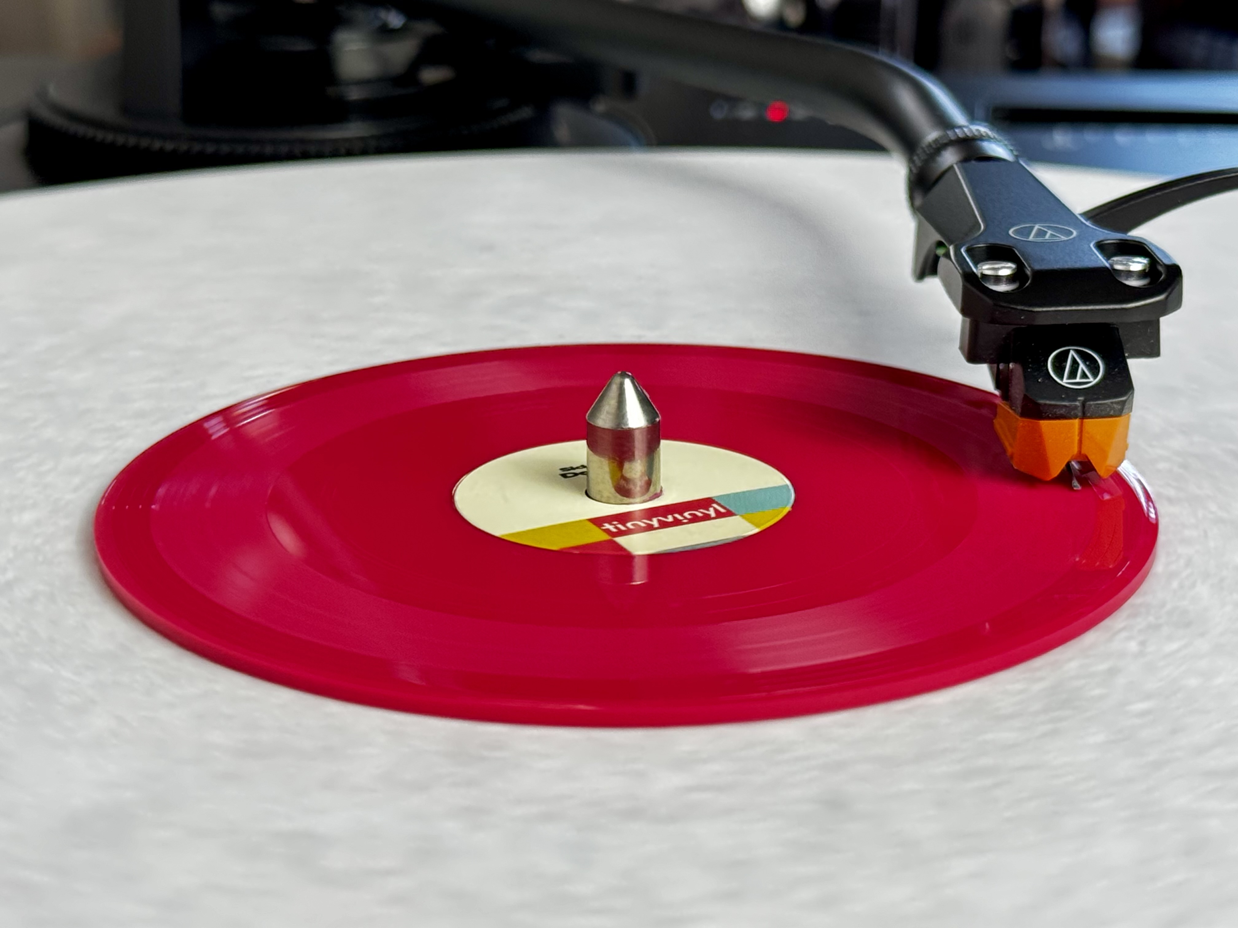
delete,-delete,-delete:-how-fcc-republicans-are-killing-rules-faster-than-ever

Delete, Delete, Delete: How FCC Republicans are killing rules faster than ever


FCC speeds up rule-cutting, giving public as little as 10 days to file objections.

FCC Chairman Brendan Carr testifies before the House Appropriations Subcommittee on Financial Services and General Government on May 21, 2025 in Washington, DC. Credit: Getty Images | John McDonnell

The Federal Communications Commission’s Republican chairman is eliminating regulations at breakneck speed by using a process that cuts dozens of rules at a time while giving the public only 10 or 20 days to review each proposal and submit objections.

Chairman Brendan Carr started his “Delete, Delete, Delete” rule-cutting initiative in March and later announced he’d be using the Direct Final Rule (DFR) mechanism to eliminate regulations without a full public-comment period. Direct Final Rule is just one of several mechanisms the FCC is using in the Delete, Delete, Delete initiative. But despite the seeming obscurity of regulations deleted under Direct Final Rule so far, many observers are concerned that the process could easily be abused to eliminate more significant rules that protect consumers.

On July 24, the FCC removed what it called “11 outdated and useless rule provisions” related to telegraphs, rabbit-ear broadcast receivers, and phone booths. The FCC said the 11 provisions consist of “39 regulatory burdens, 7,194 words, and 16 pages.”

The FCC eliminated these rules without the “prior notice and comment” period typically used to comply with the US Administrative Procedure Act (APA), with the FCC finding that it had “good cause” to skip that step. The FCC said it would allow comment for 10 days and that rule eliminations would take effect automatically after the 10-day period unless the FCC concluded that it received “significant adverse comments.”

On August 7, the FCC again used Direct Final Rule to eliminate 98 rules and requirements imposed on broadcasters. This time, the FCC allowed 20 days for comment. But it maintained its stance that the rules would be deleted automatically at the end of the period if no “significant” comments were received.

By contrast, FCC rulemakings usually allow 30 days for initial comments and another 15 days for reply comments. The FCC then considers the comments, responds to the major issues raised, and drafts a final proposal that is put up for a commission vote. This process, which takes months and gives both the public and commissioners more opportunity to consider the changes, can apply both to the creation of new rules and the elimination of existing ones.

FCC’s lone Democrat warns of “Trojan horse”

Telecom companies want the FCC to eliminate rules quickly. As we’ve previously written, AT&T submitted comments to the Delete, Delete, Delete docket urging the agency to eliminate rules that can result in financial penalties “without the delay imposed by notice-and-comment proceeding.”

Carr’s use of Direct Final Rule has drawn criticism from advocacy groups, local governments that could be affected by rule changes, and the FCC’s only Democratic commissioner. Anna Gomez, the lone FCC Democrat, told Ars in a phone interview that the rapid rule-cutting method “could be a Trojan horse because what we did, or what the commission did, is it adopted a process without public comment to eliminate any rule it finds to be outdated and, crucially, unwarranted. We don’t define what either of those terms mean, which therefore could lead to a situation that’s ripe for abuse.”

Gomez said she’d “be concerned if we eliminated rules that are meant to protect or inform consumers, or to promote competition, such as the broadband labels. This commission seems to have entirely lost its focus on consumers.”

Gomez told us that she doesn’t think a 10-day comment period is ever appropriate and that Carr seems to be trying “to meet some kind of arbitrary rule reduction quota.” If the rules being eliminated are truly obsolete, “then what’s the rush?” she asked. “If we don’t give sufficient time for public comment, then what happens when we make a mistake? What happens when we eliminate rules and it turns out, in fact, that these rules were important to keep? That’s why we give the public due process to comment on when we adopt rules and when we eliminate rules.”

Gomez hasn’t objected to the specific rules deleted under this process so far, but she spoke out against the method used by Carr both times Direct Final Rule method was used. “I told the chairman that I could support initiating a proceeding to look at how a Direct Final Rule process could be used going forward and including a Notice of Proposed Rulemaking proposing to eliminate the rules the draft order purports to eliminate today. That offer was declined,” she said in her dissenting statement in the July vote.

Gomez said that rules originally adopted under a notice-and-comment process should not be eliminated “without seeking public comment on appropriate processes and guardrails.” She added that the “order does not limit the Direct Final Rule process to elimination of rules that are objectively obsolete with a clear definition of how that will be applied, asserting instead authority to remove rules that are ‘outdated or unwarranted.'”

Local governments object

Carr argued that the Administrative Procedure Act “gives the commission the authority to fast-track the elimination of rules that inarguably fail to serve the public interest. Using this authority, the Commission can forgo the usual prior notice and public comment period before repealing the rules for these bygone regulations.”

Carr justified the deletions by saying that “outdated and unnecessary regulations from Washington often derail efforts to build high-speed networks and infrastructure across the country.” It’s not clear why the specific rule deletions were needed to accelerate broadband deployment, though. As Carr said, the FCC’s first use of Direct Finale Rule targeted regulations for “telegraph services, rabbit-ear broadcast receivers, and telephone booths—technologies that were considered outdated decades ago.”

Carr’s interpretation of the Administrative Procedure Act is wrong, said an August 6 filing submitted by local governments in Maryland, Massachusetts, the District of Columbia, Oregon, Virginia, California, New York, and Texas. Direct Final Rule “is intended for extremely simple, non-substantive decisions,” and the FCC process “is insufficient to ensure that future Commission decisions will fall within the good cause exception of the Administrative Procedure Act,” the filing said.

Local governments argued that “the new procedure is itself a substantive decision” and should be subject to a full notice-and-comment rulemaking. “The procedure adopted by the Commission makes it almost inevitable that the Commission will adopt rule changes outside of any APA exceptions,” the filing said.

The FCC could face court challenges. Gerard Lavery Lederer, a lawyer for the local government coalition, told Ars, “we fully anticipate that Chairman Carr and the FCC’s general counsel will take our concerns seriously.” But he also said local governments are worried about the FCC adopting industry proposals that “violate local government rights as preserved by Congress in the [Communications] Act” or that have “5th Amendment takings implications and/or 10th Amendment overreach issues.”

Is that tech really “obsolete”?

At least some rules targeted for deletion, like regulations on equipment used by radio and TV broadcast stations, may seem too arcane to care about. But a coalition of 22 public interest, civil rights, labor, and digital rights groups argued in a July 17 letter to Carr that some of the rule deletions could harm vulnerable populations and that the shortened comment period wasn’t long enough to determine the impact.

“For example, the Commission has targeted rules relating to calling cards and telephone booths in the draft Order as ‘obsolete,'” the letter said. “However, calling cards and pay phones remain important technologies for rural areas, immigrant communities, the unhoused, and others without reliable access to modern communications services. The impact on these communities is not clear and will not likely be clear in the short time provided for comment.”

The letter also said the FCC’s new procedure “would effectively eliminate any hope for timely judicial review of elimination of a rule on delegated authority.” Actions taken via delegated authority are handled by FCC bureaus without a vote of the commission.

So far, Carr has held commission votes for his Direct Final Rule actions rather than letting FCC bureau issue orders themselves. But in the July order, the FCC said its bureaus and offices have previously adopted or repealed rules without notice and comment and “reaffirm[ed] that all Bureaus and Offices may continue to take such actions in situations that are exempt from the APA’s notice-and-comment requirements.”

“This is about pushing boundaries”

The advocacy groups’ letter said that delegating authority to bureaus “makes judicial review virtually impossible, even though the order goes into effect immediately.” Parties impacted by actions made on delegated authority can’t go straight to the courts and must instead “file an application for review with the Commission as a prerequisite to any petition for judicial review,” the letter said. The groups argued that “a Chairman that does not wish to permit judicial review of elimination of a rule through DFR may order a bureau to remove the rule, then simply refuse to take action on the application for review.”

The letter was signed by Public Knowledge; Asian Americans Advancing Justice-AAJC; the Benton Institute for Broadband & Society; the Center for Digital Democracy; Common Sense Media; the Communications Workers of America; the Electronic Privacy Information Center; HTTP; LGBT Tech; the Media Access Project; MediaJustice; the Multicultural Media, Telecom and Internet Council; the National Action Network; NBJC; the National Council of Negro Women; the National Digital Inclusion Alliance; the National Hispanic Media Coalition; the National Urban League; New America’s Open Technology Institute (OTI); The Leadership Conference on Civil and Human Rights; the United Church of Christ Media Justice Ministry; and UnidosUS.

Harold Feld, senior VP of consumer advocacy group Public Knowledge, told Ars that the FCC “has a long record of thinking that things are obsolete and then discovering when they run an actual proceeding that there are people still using these things.” Feld is worried that the Direct Final Rule process could be used to eliminate consumer protections that apply to old phone networks when they are replaced by either fiber or wireless service.

“I certainly think that this is about pushing boundaries,” Feld said. When there’s a full notice-and-comment period, the FCC has to “actually address every argument made” before eliminating a rule. When the FCC provides less explanation of a decision, that “makes it much harder to challenge on appeal,” he said.

“Once you have this tool that lets you just get rid of rules without the need to do a proceeding, without the need to address the comments that are raised in that proceeding… it’s easy to see how this ramps up and how hard it is for people to stay constantly alert to look for an announcement where they will then only have 10 days to respond once it gets published,” he said.

What is a “significant” comment?

The FCC says its use of Direct Final Rule is guided by December 2024 recommendations from the Administrative Conference of the United States (ACUS), a government agency. But the FCC didn’t implement Direct Final Rule in the exact way recommended by the ACUS.

The ACUS said its guidance “encourages agencies to use direct final rulemaking, interim final rulemaking, and alternative methods of public engagement to ensure robust public participation even when they rely properly on the good cause exemption.” But the ACUS recommended taking public comment for at least 30 days, while the FCC has used 10- and 20-day periods.

The ACUS also said that agencies should only move ahead with rule deletions “if no significant adverse comments are received.” If such comments are received, the agency “can either withdraw the rule or publish a regular proposed rule that is open for public comment,” the recommendation said.

The FCC said that if it receives comments, “we will evaluate whether they are significant adverse comments that warrant further procedures before changing the rules.” The letter from 22 advocacy groups said it is worried about the leeway the FCC is giving itself in defining whether a comment is adverse and significant:

Although ACUS recommends that the agency revert to standard notice-and-comment rulemaking in the event of a single adverse comment, the draft Order requires multiple adverse comments—at which point the bureau/Commission will consider whether to shift to notice-and-comment rulemaking. If the bureau/Commission decides that adverse comments are not ‘substantive,’ it will explain its determination in a public notice that will not be filed in the Federal Register. The Commission states that it will be guided, but not bound, by the definition of ‘adverse comment’ recommended by ACUS.

Criticism from many corners

TechFreedom, a libertarian-leaning think tank, said it supports Carr’s goals in the “Delete, Delete, Delete” initiative but objected to the Direct Final Rule process. TechFreedom wrote in July comments that “deleting outdated regulations via a Direct Final Rule is unprecedented at the FCC.”

“No such process exists under current FCC rules,” the group said, urging the agency to seek public comment on the process. “If the Commission wishes to establish a new method by which it can eliminate existing regulations without undertaking a full rulemaking proceeding, it should open a docket specific to that subject and seek public comment,” the filing said.

TechFreedom said it is especially important for the FCC to “seek comment as to when the direct final rule procedures should be invoked… What is ‘routine,’ ‘insignificant,’ or ‘inconsequential’ and who is to decide—the Commissioners or the Bureau chiefs?”

The American Library Association and other groups wrote on August 14 that either 10 or 20 days is not long enough for public comment. Moreover, the groups said the two Direct Final Rule actions so far “offer minimal explanation for why the rules are being removed. There is only one sentence describing elimination of many rules and each rule removal is described in a footnote with a parenthetical about the change. It is not enough.”

The Utility Reform Network offered similar objections about the process and said that the FCC declaring technologies to be “obsolete” and markets “outdated” without a detailed explanation “suggests the Commission’s view that these rules are not minor or technical changes but support a larger deregulatory effort that should itself be subject to notice-and-comment rulemaking.”

The National Consumer Law Center and other groups said that “rushing regulatory changes as proposed is likely illegal in many instances, counterproductive, and bad policy,” and that “changes to regulations should be effectuated only through careful, thoughtful, and considered processes.”

We contacted Chairman Carr’s office and did not receive a response.

FCC delegated key decisions to bureaus

Gomez told Ars that Direct Final Rule could serve a purpose “with the right procedures and guardrails in place.” For example, she said the quick rule deletions can be justified for eliminating rules that have become obsolete because of a court reversal or Congressional actions.

“I would argue that we cannot, under the Administrative Procedure Act and the Constitution, simply eliminate rules because we’ve made a judgment call that they are unwarranted,” she said. “That does not meet the good cause exemption to notice-and-comment requirements.”

Gomez also opposes FCC bureaus making significant decisions without a commission vote, which effectively gives Carr more power over the agency’s operations. For example, T-Mobile’s purchase of US Cellular’s wireless operations and Verizon’s purchase of Frontier were approved by the FCC at the Bureau level.

In another instance cited by Gomez, the FCC Media Bureau waived a requirement for broadcast licensees to file their biennial ownership reports for 18 months. “The waiver order, which was done at the bureau level on delegated authority, simply said ‘we find good cause to waive these rules.’ There was no analysis whatsoever,” Gomez said.

Gomez also pointed out that the Carr FCC’s Wireline Competition Bureau delayed implementation of certain price caps on prison phone services. The various bureau-level decisions are a “stretching of the guardrails that we have internally for when things should be done on delegated authority, and when they should be voted by the commission,” Gomez said. “I’m concerned that [Direct Final Rule] is just the next iteration of the same issue.”

Photo of Jon Brodkin

Jon is a Senior IT Reporter for Ars Technica. He covers the telecom industry, Federal Communications Commission rulemakings, broadband consumer affairs, court cases, and government regulation of the tech industry.

Delete, Delete, Delete: How FCC Republicans are killing rules faster than ever Read More »